Excess Mortality and Vaccination Rates in Europe

Much ink has been spilled making cross-country comparisons since the start of the COVID-19 pandemic. I have made a few of these, such as a comparison of GDP declines and COVID death rates among about three dozen countries in late 2021. I also made a similar comparison of G-7 countries in early 2022. But all such comparisons are tricky to interpret if we want to know why these differences exist between countries, which surely ultimately we would like to know. I tried to stress in those blog posts that I was just trying to visualize the effects, not make any claims about causation.

Here’s one more chart which I think is a very useful visualization, and it may give us some hint at causation. The following scatterplot shows COVID vaccination rates and excess mortality for a selection of European countries (more detail below on these measures and the countries selected):
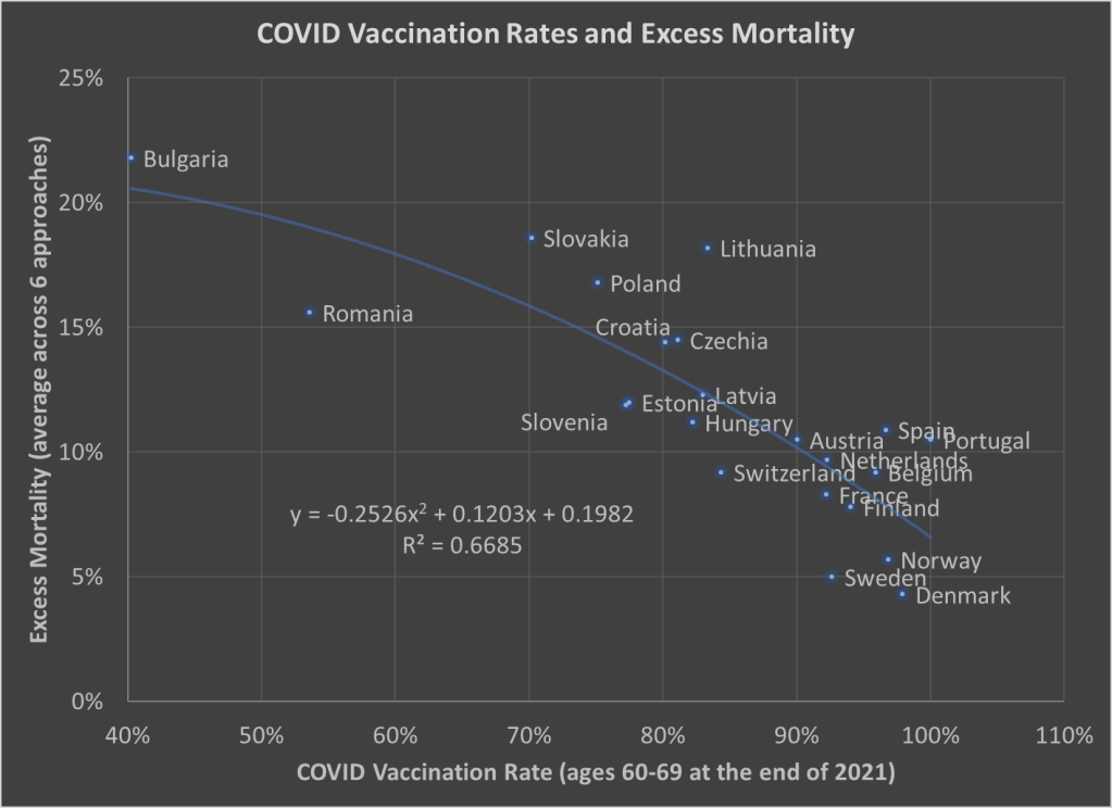
The selection of countries is based on data availability. For vaccination rates, I chose to use the rate for ages 60-69 at the end of 2021. Ages 60-69 is somewhat arbitrary, but I wanted a rate for an elderly age group that was somewhat widely available. There is no standard source for an international organization that published these age-specific vaccine rates (that I’m aware of), but Our World in Data has done an excellent job of compiling comparable data that is available.

Note: I’m using the data on at least one dose of the vaccine. OWID also has it available by full vaccine series, and by booster, but first dose seemed like a reasonable approach to me. Also, I could have used different age groups, such as 70-79 or 80+, but once you get to those age groups the data gets weird because you have a lot of countries over 100%, probably due to both challenging denominator calculations and just general challenges with collecting data on vaccination rates. By using 60-69, only one country in my sample (Portugal) is over 100%, and I just code them as 100%. Using the end of 2021, rather than the most current data, is a bit arbitrary too, but I wanted to capture how well early vaccination efforts went, though ultimately it probably wouldn’t have mattered much.

Also: dropping the outliers of Bulgaria and Romania doesn’t change things much. The second-degree best fit polynomial still has an R2 over 0.60 (for those unfamiliar with these statistics, that means about 60% of the variation is “explained” in a correlational sense).

The excess mortality measure I use comes from the following chart. In fact, this entire post is inspired by the fact that this chart and others similar to it have been shared frequently on social media.
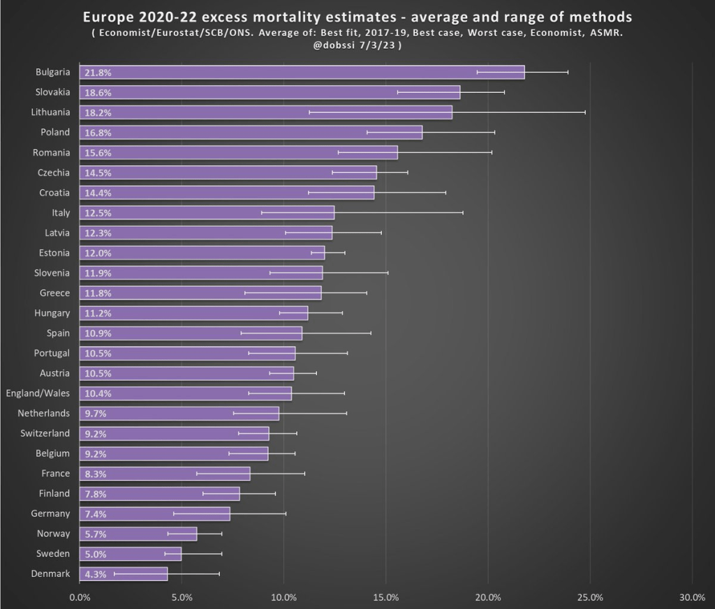
The chart comes from a Tweet thread by Paul Collyer. The whole thread is worth reading, but this chart is the key and summary of the thread. What he has done is shown the average and range of a variety of ways of calculating excess mortality. Read his thread for all the details, but the basic issues are what baseline to use (2015-2019 or 2017-2019? A case can be made for both), how to do the age-standardized mortality, and other issues. I won’t make a claim as to which method is best, but averaging across them seems like a fine approach to me.

For the y-axis in my chart, I just used the average for each country from Collyer’s chart. There are 34 countries in his chart, but in the OWID age-specific vaccination rates, only 22 countries were available the overlapped with his group. Unfortunately, this means we drop major countries like Italy, Spain, the UK, and Germany, but you work with the data you have.

For many sharing this and similar chart (such as charts with just one of those methods), the surprising (or not surprising) result to them is that Sweden comes out with almost the lowest excess mortality rate. Some approaches even put Sweden as the very lowest. Sweden!

Why is Sweden so important? Sweden has been probably the most debated country (especially by people not living in the country in question) in the COVID pandemic conversation. In short, Sweden took a less restrictive (some might say much less restrictive) approach to the pandemic. This debate was probably the most fevered in mid-to-late 2020, when some were even claiming that the pandemic was over in Sweden (it wasn’t). The extent to which Sweden took a radically different approach is somewhat overstated, especially in relation to other Nordic countries. And as is clear in both charts above, the Nordic countries all did relatively very well on excess mortality.

The bottom line from my first chart is that what really matters for a country’s overall excess mortality during the pandemic is how well they vaccinated their population. There seems to be a lot of interest on social media to rehash the debates about whether lockdowns (and lighter restrictions) or masks worked in 2020. But what really mattered was 2021, and vaccines were key. A scatterplot isn’t the last word on this (we should control for lots of other things), but it does suggest that a big part of the picture is vaccines (you can see this in scatterplots of US states too). It’s frustrating that many of those wanting to rehash the 2020 debates to “prove” masks don’t work, or whatever, either ignore vaccines or have bought into varying degrees of anti-vaccination theories. It’s completely possible that lockdowns don’t pass a cost/benefit test, but that vaccines also work very well (this has always been my position).

Why did Sweden have such great relative performance on excess mortality? Vaccines are almost certainly the most important factor among many that matter to a much smaller degree.

What About the US?

Note: for those wondering about the US, we don’t have the vaccination rate for ages 60-69 that I can find. Collyer also didn’t include the US in his analysis, it was only Europe. So, for both reasons, I didn’t include them in this post. The CDC does report first-dose vaccinations for ages 65+ in the US, though they top-code states at 95%. As of the end of 2021, here are the states that were below 95%: Mississippi, Louisiana, Tennessee, West Virginia, Indiana, Ohio, Wyoming, Georgia, Arkansas, Idaho, Alabama, Montana, Alaska, Missouri, Texas, Michigan, and Kentucky. These states generally have very high age-adjusted COVID death rates. Ideally we would use age-adjusted excess mortality for US states, but in the US that is horribly confounded by the rise in overdoses, homicides, car accidents, and other causes that are independent of vaccination rates (though they may be related to 2020 COVID policies — this is still a matter of huge debate).
Warren Buffett’s Secret Sauce: Investing the Insurance “Float”

Warren Buffett is referred to as “the legendary investor Warren Buffett” or “the sage of Omaha”. The success of his Berkshire Hathaway fund is remarkable. He is also a pretty nice guy, and every year writes (with help, I’m sure) a letter describing the activities of his fund, along with general observations on investing and the economy. His letter covering 2022 was published two weeks ago.

Buffett noted that he and his team invest in companies in two ways: by buying shares to become a partial “owner” along with thousands of other shareholders, and also by buying ownership of the whole company. They aim to hold American companies that have a good business model, and will keep growing profits for years or decades. They look for great businesses at great prices, but they would rather buy a great business at a good price, than to buy a (merely) good business at a great price.

He was refreshingly honest about his overall stock picking record:

In 58 years of Berkshire management, most of my capital-allocation decisions have been no better than so-so. In some cases, also, bad moves by me have been rescued by very large doses of luck. (Remember our escapes from near-disasters at USAir and Salomon? I certainly do.) Our satisfactory results have been the product of about a dozen truly good decisions – that would be about one every five years – and a sometimes-forgotten advantage that favors long-term investors such as Berkshire.

In 1994 they bought a then-huge stake ($ 1.3 billion) in Coca-Cola, and another $1.3 billion stake in American Express. As it turned out, these two companies had the staying power that Buffet had anticipated, and have grown enormously in value over the past three decades.

In addition to their wholesome stock-picking philosophy, the “secret sauce” of Berkshire Hathaway is having the available funds to make those great investments in those great companies. These funds came large from the “float” from their insurance businesses. In Buffett’s words:

In 1965, Berkshire was a one-trick pony, the owner of a venerable – but doomed – New England textile operation. With that business on a death march, Berkshire needed an immediate fresh start. Looking back, I was slow to recognize the severity of its problems. And then came a stroke of good luck: National Indemnity became available in 1967, and we shifted our resources toward insurance and other non-textile operations.

The insurance business is interesting, in that clients pay in money “now”, but it does not get paid out until “later”. The insurance company has the money to own and manage until there is some claim event (e.g., someone dies or gets their home flooded) perhaps many years later.  The traditional, conservative way for insurance companies to manage this float money was to invest it in low-paying but ultra-safe investment grade bonds.

Buffett’s key secret to success was to realize that he could invest at least part of these float funds in stocks, which would (hopefully!) over time make much more money than bonds. That gave him the cash to make those great investments in Coke and Amex. And his fund continues to have billions in hand to make strategic investments. He has made a bundle bailing out good companies that fell into short term difficulties. In his words:

Berkshire’s unmatched financial strength allows its insurance subsidiaries to follow valuable and enduring investment strategies unavailable to virtually all competitors. Aided by Alleghany, our insurance float increased during 2022 from $147 billion to $164 billion. With disciplined underwriting, these funds have a decent chance of being cost-free over time. Since purchasing our first property-casualty insurer in 1967, Berkshire’s float has increased 8,000-fold through acquisitions, operations and innovations. Though not recognized in our financial statements, this float has been an extraordinary asset for Berkshire.

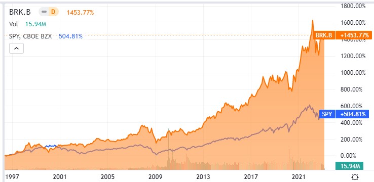
You, too, can participate in Buffett’s investing magic, by buying shares in Berkshire Hathaway. The stock symbol is BRK.B. (Disclosure: I own a few shares). Buffett has been skeptical of flashy tech stocks, and so BRK.B’s performance lagged the S&P 500 fund SPY in 2020-2021, but over the long term Berkshire (orange line in chart below) has crushed the S&P:

Don’t get too mad about bad economics journalism

Rather than channel my inner, but very real, grumpy old economist, I want to instead reassure you that, yes, the NYT article “Is the entire economy gentrifying?” is as bad, if not worse than you think. I have a duty to link to it, but I’d actually prefer you not click through.

It’s bad in the all the ways that can make you feel crazy and gaslit.

  1. The title is a question even though the entire article is an assertion
  2. The subtitle uses colloquial language to signal condescension and superiority
  3. It makes grievous economic errors that betray the authors broad ignorance of the subject

There’s little doubt that part of why it so blatantaly telegraphs that it’s bad is for the very purpose of pulling in an additional audience of hate-readers. I could grump about the addition of that unnecessary question mark in the title to mitigate any culpability for the meandering anecdote driven assertions that follow. I could whine that describing profits as “fat”, rather than “large”, “growing” or, god forbid, without an adjective at all, let’s us know right away that their story has a villain that you can blame while feeling superior to all the fools who don’t realize they’re being taken advantage of.

I could definitely settle into a cathartic, apoplectic rage at the omission of the G*D D**M MONEY SUPPLY as a potential input into inflation. For such an economic sin they should have to take the train to Paul Krugman’s CUNY office and silently wait in contrition until he shows up to absolve them (pro tip: bring snacks).

I could do any of those things. You probably could, too.

But you shouldn’t. These are professional journalists, but amateur economists, filling column inches in the New York Times. Your sibling might have a marginally worse opinion on the economy tomorrow, but let’s be honest: their opinions were already pretty bad. Just enjoy your week.

Complacency and American Girl Dolls 2

It’s time to revisit American Girl Dolls and the Saturn V rocket. The trending topic among millennials is the new “historical” American Girl doll who lives in the year 1999.

Previously, I blogged about the historical Courtney doll from 1986 in “Complacency and American Girl Dolls.” I used Courtney’s accessories to illustrate stagnation in the physical environment (within rich countries) of recent decades. Courtney has a Walkman for playing cassette tapes and she has an arcade-style Pac-Man game to entertain herself. I pointed out that ’80’s Courtney had to be given the World War II doll Molly just to keep life interesting.

What do Isabel and Nicki have a decade later in 1999?  

They have a personal CD player and floppy disks. It’s cute and the toys will sell. However, it does not seem like innovation has introduced many new capabilities. Isabel can listen to music through her headphones and be entertained on screens, just like Courtney could.

Isabel eats Pizza Hut and has dial-up internet access. There is no sense of sacrifice or expanding the frontier. The world was settled, and history had ended.  

What counts for adventure in 1999? Shopping vintage clothing. Just like Courtney, Isabel revisits the past to get a sense of purpose or excitement.

This is Isabel’s diary. Having nothing to do besides look at clothes from past decades, she obsesses over status. Presumably “Kat” complimented her hat in person. Facebook didn’t start until 2004, so Isabel is not worried about “Likes” in social media.

So, what did I do with my kids for their school break on Presidents’ Day?  We went to the U.S. Space and Rocket Center to see the Saturn V rocket.

Continue reading →

Self-Conception, Relative Prices, & Confabulation

We all like to think that we are individuals. We like to think that we grow and that our tastes develop and mature. We begin to appreciate different things in life, and among other behaviors, our spending habits change.

But what would you say if I told you that your maturing tastes didn’t cause your maturing consumption patterns? Indeed, what if it’s the other way around? Maybe, you’re just a bumbling ball bearing bouncing about and pinging off of various stimuli in a very predictable fashion. What if the prices that you face changed over the course of the past two decades, adjusting your optimal bundle of consumption, and then you contrived reasons for your new behavior in an elegant post-hoc fashion.

Have you *really* taken a liking to whole wheat bread and pasta over the past decade because your tastes have developed? Or maybe it’s because you found that scrumptious New York Times recipe that turned you away from potatoes and toward rice. Whether it’s a personal experience, a personal influence, or a personal development, we like to think about ourselves as complex organisms with a narrative that makes sense of the way in which we interact with the world.

On the other hand, we have price theory. Price theory still accepts that you are special and that you have preferences. Then, it asserts that your preferences remain fixed and that your changes in behavior are merely responses to changing costs and benefits that you perceive in the world. Maybe you’re not any more inclined to eat healthily than you were previously, but the price ratio of whole wheat bread to white bread is 10% less than it use to be. Maybe your east-Asian inspired recipe didn’t cause you to spurn potatoes, but instead the price ratio of rice to potatoes fell by 20%.   

Continue reading →

The ACA and Entrepreneurship: The Importance of Age

Thinking about one of my older papers today, since I just heard it won the Eckstein award for best paper in the Eastern Economic Journal in 2019 & 2020.

One big selling point of the Affordable Care Act was that by offering more non-employer-based options for health insurance, it would free people who felt locked into their jobs by the need for insurance. This would free people up to leave their jobs and do other things like start their own businesses. Did the ACA actually live up to this promise?

It did, at least for some people. The challenge when it comes to measuring the effect of the ACA is that it potentially affected everyone nationwide. If entrepreneurship rises following the implementation of the ACA in 2014, is it because of the ACA? Or just the general economic recovery? Ideally we want some sort of comparison group unaffected by the ACA. If that doesn’t really exist, we can use a comparison group that is less affected by it.

That’s what I did in a 2017 paper focused on younger adults. I compared those under age 26 (who benefit from the ACA’s dependent coverage mandate) to those just over age 26 (who don’t), but found no overall difference in how their self-employment rates changed following the ACA.

In the 2019 Eastern Economic Journal paper, Dhaval Dave and I instead consider the effect of the ACA on older adults. We compare entrepreneurship rates for people in their early 60’s (who might benefit from the availability of individual insurance through the ACA) with a “control group” of people in their late 60’s (who are eligible for Medicare and presumably less affected by the ACA). We find that the ACA led to a 3-4% increase in self-employment for people in their early 60’s.

Figure 1 from our 2019 EEJ paper

Why the big difference in findings across papers? My guess is that it’s about age, and what age means for health and health insurance. People in their 60s are old enough to have substantial average health costs and health insurance premiums, so they will factor health insurance into their decisions more strongly than younger people. In addition, the community rating provisions of the ACA generally reduced individual premiums for older people while raising them for younger people.

In sum, the ACA does seem to encourage entrepreneurship at least among older adults. At the same time, our other research finds that the employer-based health insurance system still leads Americans to stay in their jobs longer than they would otherwise choose to.

The Economics of Brushing Teeth and the Tooth Fairy

There are many papers with titles in the style of “The Economics of X” with X covering a wide variety of topics, some deadly serious (“Economics of Suicide“) and others more trivial or unintentionally hilarious (“The Economics of Sleep and Boredom” comes to mind). There is a related genre of papers on “The Political Economy of Y,” once again with papers that are both serious and occasionally silly (or sometimes deadly serious papers with silly-sounding titles, such as “The Political Economy of Coffee, Dictatorship, and Genocide“).

But perhaps the best paper of this sort is a 1974 article on the Journal of Political Economy by Alan Blinder, titled “The Economics of Brushing Teeth.” It is, as you might guess, a paper that is somewhat tongue-in-cheek (tongue-in-teeth?), but the paper carefully follows the formal style you would expect from a JPE paper in 1974. I recommend reading the paper in full, and I can assure you that it is not at all like pulling teeth. But if you prefer not to look a gift horse in the mouth, here are a few favorite parts.

The paper is, of course, full of tooth-related puns, even in the footnotes, such as this acknowledgment: “I wish to thank my dentist for filling in some important gaps in the analysis.”

There are also plenty of jokes about human capital theory, jokes that only an economist could love, such as: “The basic assumption is common to all human capital theory: that individuals seek to maximize their incomes. It follows immediately that each individual does whatever amount of toothbrushing will maximize his income.”

Another section manages to poke fun at both sociologists and economists. In reference to a fake paper (no, there is no Journal of Dental Sociology), Blinder chastises the fake sociologist for misattributing a change in brushing patterns (assistant professors brush more) to advancing hygiene standards over time. No! It must be about maximizing income: “To a human capital theorist, of course, this pattern is exactly what would be expected from the higher wages received in the higher professorial ranks, and from the fact that younger professors, looking for promotions, cannot afford to have bad breath.”

And what good is a paper without a formal model of teeth brushing? This is the kind of model that many young economists cut their teeth on in graduate school.

Continue reading →

Why Have Economists Continually Underestimated Projected Inflation?

I keep reading about how inflation has peaked (even peaked many months ago) and so any minute now the Fed will relent on raising interest rates, and will in fact start reducing them. Every data point that seems to support an early Fed pivot and a gentle “soft landing” for the economy is greeted with optimistic verbiage and a rip higher in stocks.

Except – – other meaningful data points regularly appear which show that inflation (especially core inflation) is remaining stubbornly high. The Personal Consumption Expenditures (PCE) Index is the Fed’s preferred way to track core inflation. It did peak in early 2022, and is falling, but very slowly and fitfully. Just when it seems like it is about to cascade downward, along comes another uptick.  The latest report for 02/24/23 showed the PCE index (excluding the volatile categories of food and energy) increasing 0.6 percent during the month of January, which translated to a 4.7 percent year-on-year gain. That was considerably higher than the 0.4 percent monthly gain (4.3 percent year-on-year) that economists expected.

Source: MV Financial

The chart below illustrates the chronic tendency of the economists at the Fed to lowball the estimates of future inflation. Each of the ten bars depicts quarterly projections of what inflation would be for 2023, starting back in September 2020 (first, green bar).  No one in the craziness of 2020 could be held particularly responsible back then for accurately projecting 2023 conditions. But the Fed embarrassed themselves badly into late 2021 by airily dismissing inflation as “transitory”, due mainly to supply chain constraints that would quickly pass. (See towards the middle of the chart, yellow Sept 2021 and blue Dec 2021 bars projecting a mere 2.2% inflation for 2023.)

Source: Jeremy LaKosh

Only as of December 2022 did estimates of inflation jump up to 3.1% for 2023, and that estimate will surely get revised upward even further.

Many factors probably went into this systematic failure on the part of the Fed economists. There are probably political reasons for erring on the rosy optimistic side, which I will not speculate on here.

One factor in particular was mentioned in the Minutes of the Jan 31/Feb 1 Fed meeting that I thought was significant:

A few participants remarked that some business contacts appeared keen to retain workers even in the face of slowing demand for output because of their recent experiences of labor shortages and hiring challenges.

Jeremy LaKosh notes regarding this feature, “If true across the economy, the idea of keeping employees for fear of facing the labor force shortage would represent a fundamental shift in the employment market. This shift would make it harder for wage increases to mitigate towards historical norms and keep upward pressure on prices.”

This all rings true to my anecdotal observations. In bygone days, when business slowed down, factories would lay off or furlough workers, with the expectation on all sides that they would call the workers back (and the workers would come back) when conditions improved. However, employers have had to struggle so hard this past year to find willing/able workers, that employers are loath to let them go, lest they never get them back. I have read that even though homebuilders are not sure they can sell the houses they are building, they are so worried about losing workers that they are keeping them on the payroll, building away.

Other inflation data points show big decreases in prices for goods (and energy), but not for services. Wages, of course, are the big driver for service costs.

So the inflation story in 2023 seems to come down largely to a labor shortage. This is a large topic cannot be fully addressed here. I will mention one factor for which I have anecdotal support, that the enormous benefits (stimulus money plus enhanced unemployment) paid out during 2020-2021 set up a large number of baby boomers to leave the workforce early and permanently. Studies show that this is a major factor in the drop in workforce participation rate post-Covid. Maybe some of those folks had not planned ahead of time for such early retirement, but they got a taste of the good life (NOT getting up and going to work every day) in 2020-2021 along with the extra cash to pad their savings, and so they decided to just not return to work. That exodus of trained and presumably productive workers has left a hole in the labor force which now manifests as a labor shortage, which drives up wages and therefore inflation and therefore interest rates, which will eventually crater the economy enough that struggling firms will finally lay off enough workers to mitigate wage gains.

I wonder if this unhappy scenario could be staved off with increased legal migration of targeted skilled workers from other countries to alleviate the labor shortage. Dunno, just a thought.

On minimum wages and the devil’s discount

There’s a new paper about the minimum wage and its effects on crime. I wrote a paper (with Amanda Agan) about the minimum wage and crime (here’s a slightly older ungated version). I have received several requests to comment on the new paper because, based on the abstracts, our papers appear to generate conflicting results. Spoiler alert: they don’t. Sorry to disappoint those who came looking for an academic blood bath.

I am happy to talk about the new paper, by Fone, Sabia, and Cesur (FSC), but let’s get the big part out of the way. Our paper on the minimum wage looks at criminal recidivism, defined as a return to prison, for those who have been released from prison. These are people whose conviction resulted in them being in incarcerated in a prison (not jail) who, on average, served nearly 2 years and were subsequently released at age 35. The FSC paper uses arrest data. Their principal observation regards property crime arrests committed by 16-24 year olds.

Our two papers identify fundamentally different results about fundamentally different populations that, in my opinion, hinge on completely different mechanisms.

Our paper is old news, so I won’t belabor the point. Succinctly, we found that minimum wage increase of $0.50 reduced the probability an individual returns to prison within 3 years by 2.15%. The availability of state EITCs also reduced recidivism, but only for women.

The FSC paper use’s Uniform Crime Report data to look at arrests. Here’s the figures and tables that I’ll focus on for our discussion:

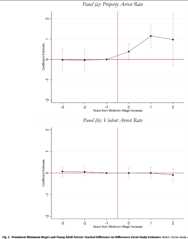
FSC find that property crime arrests increase for 16-24 year olds in an event study estimate, where an increase in the minimum wage of at least $1 serves as an “event”:

Property crime arrests in their diff-in-diff estimate reaffirm this estimate. They also, however, observe negative effects on property crime arrests on 35-49 year olds, though the coefficient is too noisy to be statistically significant. These results are similar to ours, though because we were looking at individual recidivism we had the benefit of estimating over ~6 million observations (vs the 45 thousand county-years of FSC).

When FSC dig into the crime categories further, there is no effect on burglary, robbery, or auto theft. The property crime effect is entirely in larceny. Let’s also note the positive effect of the minimum wage on vandalism.

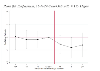
Here’s an important tidbit: UCR data does not distinguish between misdemeanor petty (petit) larceny and felony larceny. One last result: employment is noisily declining for 16-24 year-olds who have not yet completed high school.

Let’s add it all up: when a state increases the minimum wage by at least $1, we observe an increase in larceny and vandalism arrests of 16-24 year-olds, without any effect on robbery, burglary, auto theft, or violent crime, all while reducing the employment of 16-24 olds who have not yet completed high school. Can you see where I’m going with this?

Shoplifting. When states significantly increase the minimum wage, employers stop hiring teenagers. Those teenagers, laden with time but bereft of spending money, rediscover the allure of the five-finger discount. That is my interpretation of these results and nothing about these results seems strange to me or at odds with the earlier findings in our paper on the minimum wage and recidivism.

I don’t think the authors have really done anything wrong here. I could manufacture some of the usual gripes if I really wanted too, but the identification strategy seems at least broadly sound and the data is widely used. The estimated magnitudes seem plausible. If I was going to complain about anything, it would probably be the imputed $766 million dollar price tag placed on the externality, but I’m also not well-versed in the costs of shoplifting (and in case you’re reading something into my tone, I do not think shoplifting can be dismissed as unimportant). If I had to hang my hat on something, though, I’d say that’s probably on the hefty side. In footnote 48 they consider a a more conservative estimate of a $128 million dollar externality. That seems more plausible to me.

The minimum wage literature is one we all, every single one of us, bring our own political and economic baggage to. When our paper found that the minimum wage reduced criminal recidivism, a lot of people latched on to it because what they heard was “minimum wages stop crime”. I’m sure a lot of people will latch on to FSC’s new paper because they want to hear “minimum wages cause crime”. The reality, of course, is vastly more nuanced. We should expect these laws to have heterogeneous effects born of complex interactions, particularly when we stratify populations into those interacting with an institution as rife with peculiarities and pathologies as the US criminal justice system.

Yes, it was SMET

Last week I posted about the transition from SMET to STEM at the National Science Foundation. I was repeating a story that can be found on several websites including an entry in Britannica.

Andrew Ruapp reached out to me about a possible error in my post. He presented some evidence that the term STEM has been used prior to 2001. Casually Googling the topic did not bring me to a reputable source for the claim I had made last week. “SMET” is comically bad. So, I did start to wonder if it had never been officially used at the NSF and was just a funny story getting repeated online.

To solve this problem, I reached out directly to the person who was credited with making the transition. Dr. Judith Ramaley is currently President Emerita and Distinguished Professor of Public Service at Portland State University.

Having her permission to share, here is our email correspondence:

Encouraged by her reply, I looked online and found a public NSF document from 1998 that clearly uses SMET.

Lastly, I asked her several questions, in a mini email interview:

  1. Are you surprised by how widespread the STEM term has become?

Ramaley: I wasn’t surprised because once NSF adopted the new acronym, I expected it would catch on.

2. Do you feel that the “STEM” brand has been successful?

Ramaley: STEM isn’t really a brand. It is simply an acronym. It works better than SMET I think because engineering and technology are framed by science and mathematics rather than trailing along behind as if less important. I am fascinated by the growing pressure to add other elements to STEM, making it STEAM, for instance. 

3. My son in 2nd grade goes to a STEM activity class once a week. (They just call it “STEM.”) This week he tells me they are working on a pollination project. Would you recommend anything different than the current system for encouraging American students to pursue technology fields?

Ramaley: Your third question is a sweeping one. It would help to know what a STEM activity means each week in your son’s second grade class.  I am drawn to ways of learning STEM that encourage students to approach these issues in an inquiry-based way that lets them explore what it means to ask interesting questions and work out ways to try to answer them. Young people are very curious about how the world works. I doubt that I need to tell you that since I bet your son sometimes drives you nuts with WHY and HOW questions. Questions like that are beautiful questions.