What would a Great Reorganization look like?

In our eternal quest to never let go of any effective rhetorical device that can double as a headline, the last 12-18 months have been dubbed The Great Resignation. Within voluntary job separations, a sizable chunk of which appear to be early retirements, many are young people transitioning from low-paying jobs to those that have seen fit to adapt to the labor shortage faster, offering some combination of higher wages, better benefits, or a higher quality of life, often through the channel of relaxed educational or experience prerequisites.

Some, generally from the political left, are framing this as a shift in power from management to labor, particularly for those who hope this can be the moment that pushes unionization back to the forefront. Others, mostly from the political right, are framing this as a catastrophic undercutting of the incentive to work induced by the expanded welfare state. I tend to see these positions as frantic over-optimism or pessimism from those desperate for a sexy political narrative to sell.

I think the closer parallel, in terms of mechanism (not scale), isn’t the Great Depression or the New Deal era that followed, but rather the World War II draft-accelerated entry of women into the workforce. I think what we’re seeing is a massive reorganization of the US labor market. If this half-baked generalization were true, what would it look like?

  1. Education, Training, and Experience reconsidered

My guess is that managers in a range of fields have long had a itch in the back of their minds that they weren’t always hiring the right people. Specifically, they were eliminating large swaths of applicants from the pool of consideration because they lacked the minimum formal education or years of narrowly defined experience. A lot of these requirements, I suspect, existed not as tried and true markers of the subset of optimal candidates, but because they could be routinized through online job applications and human resources triage, largely in an effort to conserve on managerial and administrative time. Combined CYA incentives and other sources of herding behavior both within and across firms (i.e. no one gets fired for only hiring college graduates), these are exactly that kind of sub-optimal practices that can widely embed themselves when an economy is growing, but the labor market is relatively loose, so any suboptimality is lost in the wash.

A negative labor shock, be it a military draft or global pandemic, is exactly the kind of thing that rewards firms that begin hiring from whole strata of previously unconsidered job candidates. Not for nothing, that’s how you end learning all kinds of new things: the relative value of various degrees and training, the cross-applicability of job experience previously treated as irrelevant to an open position, and the marginal products of a firms employment portfolio.

2. Compensation bundles rebalanced

There’s plenty of fuss (rightly so) over the shift towards working from home. Yes, it saves on fixed costs, particularly in cities with sky-high commercial real estate costs, but I suspect the greater impact in the long run will be on the composition of wages+benefits+flexibility in employee compensation bundles, where flexibility is largely a catch-all for the quality of life component associated with any job. Maybe we already knew that health insurance and paid leave were valuable, but I think a lot of employees have discovered they were previously undervaluing the costs of commuting, schedule uncertainty, and existing “on call” for co-workers and superiors. Whether its working from home or as an independent contractor, many people are discovering that recapturing 10 hours a week of the rest of your life is worth a lot more than the wages being foregone. We already know that women are the future, but we also know that women value flexibility in work schedules more than men. A shift towards quality of life in compensation bundles was likely already in the cards, the pandemic just accelerated it.

For firms that have spent the last 20 years burning out the handful of key employees, rewarding their exceptional productivity by turning them into productivity bottlenecks, they are either going to have to find a way to spread the work thinner or recapture those key employees by finding other means of maintaining the quality of their employee lives.

3. The service industry is dead. Long live the service industry?

We’ve been eating on borrowed time. Through the combination of over-priced and over-valued higher education, a gratuitous over-stigmatization of non-violent criminal records, and the employment trap of limited human capital building, but lots of cash in hand, the service industry has been feeding us all on the cheap for a very long time now.

Turns out, though, that the relative frugality of diners has squeezed margins in restaurants razor thin, and has largely come at the expense of servers and kitchen staff. Came at the expense, I should say. I think we’re all going to have find a new normal where outsourcing meal preparation is, at the margin, slightly less of a staple and slightly more of a luxury. I still see Help Needed signs in lots of restaurants, and owners complaining in news stories that “No one wants to work“, but I’m also seeing new employees bring home higher salaries at McDonald’s after 90 days than fine dining cooks in their 3rd year working sauté. Eventually the new equilibrium will be reached, and I predict it’s going to involve higher salaries and better benefits for line cooks, but it’s also going to mean customers are going to have to get over there perceived $28 ceiling on entrees. Also, don’t expect your favorite restaurants to be open on Monday’s and Tuesdays, because it turns out everyone wants to have weekend.

4. The same, but different
What will the labor market look like in 5 years? Forecasting is a fool’s errand, but I never promised anyone I wasn’t a fool. Here’s my best guess:

I don’t expect a revival of unionization, but I do expect that employment will start taking on a lot of the attributes that pro-union people are currently agitating for. There will be more people with 3 and 4-day work weeks, though I suspect those people will be working 10 and 12 hour shifts. I think there will be a lot of flexible office-home work schedules, where firms coordinate their employees around days when everyone is in the office, the rest floating between the office and home as the work dictates. I expect there will be more independent contractors, but unlike previously self-employed people who bounced from contract to contract, they will instead be people who balance a portfolio of employment, with what amounts a small number of long term contracts. Rather than work for one person at a time 40 hours a week, they’ll work for 2 or 3, 8-10 hours each, building up enough firm-specific capital that contracts will last years, even decades, at a time.

I expect kitchens will remain hot, crowded, and loud. I expect chef’s will remain angry and owner’s tight-fisted with every penny. I expect that servers will still finish every shift with sore feet and stories of annoying customers. Maybe even more annoying than before, because those customer’s will be paying 15% more than the prices they already manage to complain about. But it’ll be okay, because everyone in that restaurant is going to be earning a much better living. They’ll have to, because otherwise they’re not coming back.
Car Prices and Quality

Inflation is on everyone’s mind. Everybody freaks out. You cannot do anything about it. As such, lets talk about something mildly related: how price indexes (those that we use to talk about inflation) deal with quality changes.

One big problem when we try to measure the cost of living is that the price information we collect does not reflect the same thing we consume. I know that sentence seems weird. After all, 1$ for a pound of bread is 1$ for a pound a bread. And if prices go up 10%, then the price per pound of bread is 1.10$!

If you think that, you’re wrong. Think about the following example from my native province of Quebec. In the 1990s, Quebec deregulated opening hours for grocery stores. The result was … higher prices at large superstores. Why? Before the reform, stores had shorter hours especially on sundays. This meant that stores were competing with each other on a smaller quality dimension which meant more price-based competition. With deregulation, some consumers were willing to pay slightly higher prices to shop at ungodly hours. What were these consumers consuming? Were they consuming only the breadloafs they bought or were they consuming those loafs and the flexible schedule of the grocery stores? The answer is the latter! Ergo, the change from 1$ per pound to 1.10$ per pound does not mean that the price of bread alone increased — it may have even fallen all else being equal!

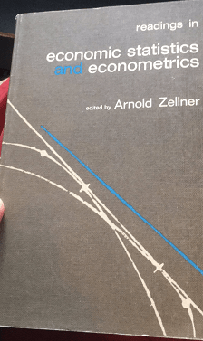
So how do you adjust for that? There are many papers on how to do hedonic adjustments (hedonic is the fancy words we use to say “quality-adjusted”) and they are all a pain to read unless you are very familiar with real analysis, set theory and advanced calculus (and even there, its still a pain). Fortunately, I recently found a neat little application from an old econometrics graduate text from the 1960s (see image below) that allows me to teach this to my students (and now, you too!) in an easy-to-get format.

A neat book

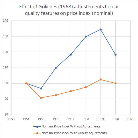
The book has a neat chapter by one of the most famous econometricians of the 20th century, Zvi Griliches, titled “Hedonic Price Indexes for Automobiles: An Econometric Analysis of Quality Change”. In the chapter, Griliches points out that from 1954 to 1960, car prices went up some 20% — well above the overall price index. From 1937 to 1950, prices for cars went up in line with inflation. Taken together, these two facts suggest that the real price of cars stayed constant from 1937 to 1950 and increased to 1960. But that suggestion is wrong Griliches points out because of our aforementioned quality issues. Up until 1960, there were considerable improvement in vehicle quality: better gears, better brakes, more horsepower, safer settings, automatic transmission, hardtops, switching to V-8 engines rather than 6 cylinders engines etc.

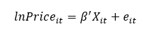
How do you account for these quality changes? Griliches simply went about consulting guide books for autobuyers. He collected price data for the cars as well the details regarding quality. And he used this very simple specification where the log of the nominal price is set as a dependent variable.

Griliches’ specification

The vector X is all the quality dimensions he could find (horsepower, shipping weight, length, V-8 engine, hardtop, automatic transmission, power steering, power brakes, compact car). All of these dimensions were statistically significant determinants of the price of cars (with the exception of V-8 engines which was not significant). Then, Griliches assumed that all quality dimensions were “unchanged” from 1954 to 1960 in order to see how prices would have evolved without any changes in quality. The result is the figure below. The blue line depicts the actual prices he collected where you can see the 20% increase to 1960 (which is a 30%+ increase to 1959). The orange line depicts the price holding quality constant. That orange line is unambiguous: quality-constant car prices didn’t change much during the 1950s. Adjusting for inflation during the period suggests a drop in 10% in the real price of a quality-constant car.

Image

Isn’t that a fascinating way to understand what we are actually measuring when we collect prices to talk about inflation? I find this to be an utterly fascinating example (and a useful teaching tool). Okay, I am done, you can go back to freaking out about inflation and how bad the Fed, Bank of Canada, ECB are.

Watching Get Back

I enjoyed watching Get Back, the new documentary about making a Beatles album. Sometimes I skipped over rehearsal scenes. The streaming format allows you to treat Get Back like a coffee table book, if you choose, as opposed to a feature film that you watch all the way through in one sitting.

I know very little about The Beatles, aside from recognizing their hit songs. Here are my impressions after watching most of Get Back.

Paul McCartney is a rock star. His hair could have its own line in the closing credits. When Paul goofs off, he appears to be entertaining his bandmates because he loves playing for any audience. Conversely, John Lennon seems to joke around because he does not take their music seriously. Paul is motivated to make the Beatles excellent. Ringo’s ability to show up and be quiet is almost as important as Paul’s ability to lead.

I’ll put up my tribute. Then I’ll add more casual observations.

Continue reading →

PSNE: No More, No Less

Today marks the 27th anniversary of John Nash winning The Sveriges Riksbank Prize in Economic Sciences in Memory of Alfred Nobel for his contributions to game theory.

Opinions on game theory differ. To most of the public, it’s probably behind a shroud of mystery. To another set of the specialists, it is a natural offshoot of economics. And, finally a 3rd non-exclusive set find it silly and largely useless for real-world applications.

Regardless of the camp to which you claim membership, the Pure Strategy Nash Equilibrium (PSNE) is often misunderstood by students. In short, the PSNE is the set of all player strategy combinations that would cause no player to want to engage in a different strategy. In lay terms, it’s the list of possible choices people can make and find no benefit to changing their mind.

In class, I emphasize to my students that a Nash Equilibrium assumes that a player can control only their own actions and not those of the other players. It takes the opposing player strategies as ‘given’.

This seems simple enough. But students often implicitly suppose that a PSNE does more legwork than it can do. Below is an example of an extensive form game that illustrates a common point of student confusion. There are 2 players who play sequentially. The meaning of the letters is unimportant. If it helps, imagine that you’re playing Mortal Kombat and that Player 1 can jump or crouch. Depending on which he chooses, Player 2 will choose uppercut, block, approach, or distance. Each of the numbers that are listed at the bottom reflect the payoffs for each player that occur with each strategy combination.

Again, a PSNE is any combination of player strategies from which no player wants to deviate, given the strategies of the other players.

Students will often proceed with the following logic:

  1. Player 2 would choose B over U because 3>2.
  2. Player 2 would choose A over D because 4>1.
  3. Player 1 is faced with earning 4 if he chooses J and 3 if he chooses C. So, the PSNE is that player 1 would choose J.
  4. Therefore, the PSNE set of strategies is (J,B).

While students are entirely reasonable in their thinking, what they are doing is not finding a PSNE. First of all, (J,B) doesn’t include all of the possible strategies – it omits the entire right side of the game. How can Player 1 know whether he should change his mind if he doesn’t know what Player 2 is doing? Bottom line: A PSNE requires that *all* strategy combinations are listed.

The mistaken student says ‘Fine’ and writes that the PSNE strategies are (J, BA) and that the payoff is (4,3)*.  And it is true that they have found a PSNE. When asked why, they’ll often reiterate their logic that I enumerate above. But, their answer is woefully incomplete. In the logic above, they only identify what Player 2 would choose on the right side of the tree when Player 1 chose C. They entirely neglected whether Player 2 would be willing to choose A or D when Player 1 chooses J. Yes, it is true that neither Player 1 nor Player 2 wants to deviate from (J, BA). But it is also true that neither player wants to deviate from (J, BD). In either case the payoff is (4, 3).

This is where students get upset. “Why would Player 2 be willing to choose D?! That’s irrational. They’d never do that!” But the student is mistaken. Player 2 is willing to choose D – just not when Player 1 chooses C. In other words, Player 2 is indifferent to A or D so long as Player 1 chooses J. In order for each player to decide whether they’d want to deviate strategies given what the other player is doing, we need to identify what the other player is doing! The bottom line: A PSNE requires that neither player wants to deviate given what the other player is doing –  Not what the other player would do if one did choose to deviate.

What about when Player 1 chooses C? Then, Player 2 would choose A because 4 is a better payoff than 1. Player 2 doesn’t care whether he chooses U or B because (C, UA) and (C, BA) both provide him the same payoff of 4. We might be tempted to believe that both are PSNE. But they’re not! It’s correct that Player 2 wouldn’t deviate from (C, BA) to become better off. But we must also consider Player 1. Given (C, UA), Player 1 won’t switch to J because his payoff would be 1 rather than 3.  Given (C, BA), Player 1 would absolutely deviate from C to J in order to earn 4 rather than 3. So, (C, UA) is a PSNE and (C, BA) is not. The bottom line: Both players must have no incentive to deviate strategies in a PSNE.

There are reasons that game theory as a discipline developed beyond the idea of Nash Equilibria and Pure Strategy Nash Equilibria. Simple PSNE identify possible equilibria, but don’t narrow it down from there. PSNE are strong in that they identify the possible equilibria and firmly exclude several other possible strategy combinations and outcomes. But PSNE are weak insofar as they identify equilibria that may not be particularly likely or believable. With PSNE alone, we are left with an uneasy feeling that we are identifying too many possible strategies that we don’t quite think are relevant to real life.

These features motivated the later development of Subgame Perfect Nash Equilibria (SGPNE). Students have a good intuition that something feels not quite right about PSNE. Students anticipate SGPNE as a concept that they think is better at predicting reality. But, in so doing, they try to mistakenly attribute too much to PSNE. They want it to tell them which strategies the players would choose. They’re frustrated that it only tells them when players won’t change their mind.

Regardless of whether you get frustrated by game theory, be sure to have a drink and make toast to John Nash.

*Below is the normal form for anyone who is interested.

Lifespan / CNE Merger Economics

The largest hospital system in Rhode Island, Lifespan, is trying to merge with the second-largest hospital system in Rhode Island, Care New England. Next Wednesday I’ll be on a panel discussing the proposed merger, following a panel with the Presidents of the three institutions involved (Lifespan, CNE, and Brown University). I’ll summarize my thoughts here.

Basic economics tells us that if a company with 50% market share buys a company with 25% market share in the same industry, they have strong market power and are likely to use this monopoly position to raise prices.

The real world is often more complicated, especially when it comes to health care, but in this case I think basic economics holds up well. A wealth of empirical evidence, including studies of previous hospital mergers, suggest that reduced hospital competition leads to higher prices without bringing commensurate benefits in quality or efficiency.

I think the Federal Trade Commission will almost certainly challenge the merger, and that they will likely succeed in doing so. The FTC merger guidelines more or less demand it, and current FTC leadership if anything seems to want to be more aggressive than required on antitrust. To me the biggest question is whether they will try to stop the merger entirely, or whether they would allow it to proceed subject to conditions (e.g. spin off one or two hospitals to remain independent)- I’ll be watching with interest and letting you know how it goes.

Has Economic Growth Really Slowed Since 1970?

In the post-WW2 era, by many different measures the US economy performed better before about 1970 than after. You can apparently see this in many different statistics. For example, the productivity slowdown is a well-known and well-studied phenomenon. And even given the productivity slowdown, median wages don’t seem to have kept pace with productivity growth.

I think there are good reasons to doubt these particular statistics. For example, on wages and productivity see this working paper by Stansbury and Summers.

But even considering all these criticisms of the statistics, we do observe that overall GDP growth has been slower since about 1970. Why might this be?

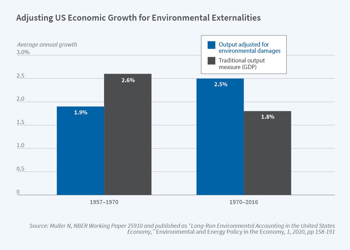
In an NBER summary of his research, Nicholas Muller argues that a big part of the GDP growth slowdown is because we aren’t including environmental damage in the calculation. This is not a new argument (Muller is an important contributor to this literature), and the exclusion of environmental damage is a well-known flaw of GDP, but Muller’s paper does a great job of quantifying how much we are mismeasuring GDP. The following figure is a nice summary of what GDP growth looks like when we consider environmental damage.

2021number3_muller1.jpg

If we use the standard measure of GDP, growth indeed slowed down after 1970. If instead we augment GDP for environmental damages, the period after 1970 was actually faster! The adjustment both slows down growth from 1957-1970, and speeds up growth after 1970.

There are lots of things we can draw from this, but if the results are close to accurate, there is a clear implication: environmental regulations (such as the Clean Air Act) do reduce GDP growth, as traditionally measured. So the skeptics of regulation are partially right: regulation reduces growth!

However, this seems to be a clear case where standard critiques of GDP (as you can find in just about any Econ 101 textbook — yes, really!) need to be incorporated into the complete cost-benefit analysis of the impacts of environmental regulation.

Opening My New Crypto Account: Plaid App Wants My Full Bank Login Information

I finally got around to opening an account at BlockFi where I can buy cryptocurrencies directly. Later I will discuss why I chose BlockFi and what I plan to do there. For now I’d like to mention one roadblock I hit in starting it up.

Signing up for the BlockFi account itself was pretty straightforward. But when it came to actually funding it, I was required to use Plaid to handle transfers of funds to and from my bank accounts – – and Plaid wanted me to tell them my full username and password that I use to log into my bank account. “No,” I said to myself, “they can’t really mean that.” But yes, they do mean that.

Armed with these credentials Plaid is able to not only pull money out of my account (like, for instance, PayPal does), but they can also login as me and have access to every financial transaction I have ever done, every check I have ever written. It’s not that I have anything interesting to hide, but this level of privacy invasion creeps me out. Also, the sad truth is that any company, including Plaid and its partners, are vulnerable to hacking, so I am not thrilled at having my bank login information floating out there in cyberspace.

On their website, Plaid is nice enough to disclose the scope of its snooping:

We collect the following types of identifiers, commercial information, and other personal information from your financial product and service providers:

  • Account information, including financial institution name, account name, account type, account ownership, branch number, IBAN, BIC, account number, routing number, and sort code;
  • Information about an account balance, including current and available balance;
  • Information about credit accounts, including due dates, balances owed, payment amounts and dates, transaction history, credit limit, repayment status, and interest rate;
  • Information about loan accounts, including due dates, repayment status, balances, payment amounts and dates, interest rate, guarantor, loan type, payment plan, and terms;
  • Information about investment accounts, including transaction information, type of asset, identifying details about the asset, quantity, price, fees, and cost basis;
  • Identifiers and information about the account owner(s), including name, email address, phone number, date of birth, and address information;
  • Information about account transactions, including amount, date, payee, type, quantity, price, location, involved securities, and a description of the transaction; and
  • Professional information, including information about your employer, in limited cases where you’ve connected your payroll accounts or provided us with your pay stub information.

The data collected from your financial accounts includes information from all accounts (e.g., checking, savings, and credit card) accessible through a single set of account credentials.

Plaid promises not to sell or rent this personal data. Fine. But even if they don’t formally sell it, they may simply give it away widely. In their words:

We share your End User Information for a number of business purposes:

  • With the developer of the application you are using and as directed by that developer (such as with another third party if directed by you);
  • To enforce any contract with you;
  • With our data processors and other service providers, partners, or contractors in connection with the services they perform for us or developers;
  • With your connected financial institution(s) to help establish or maintain a connection you’ve chosen to make;
  • If we believe in good faith that disclosure is appropriate to comply with applicable law, regulation, or legal process (such as a court order or subpoena);
  • In connection with a change in ownership or control of all or a part of our business (such as a merger, acquisition, reorganization, or bankruptcy);
  • Between and among Plaid and our current and future parents, affiliates, subsidiaries and other companies under common control or ownership;
  • [etc., etc.]

Yeesh.

I’m sure Plaid means well, but I just didn’t like the sound of all that. So, I came up with a plan: I would start up a second account at my bank, with a slightly different name and a different account number, and just give Plaid access to that one account. The only thing I would do with that account is to fund my BlockFi account, so it would not have years and years of my other financial transactions embedded in it.

In the end, that worked, but it took a more time and phone calls than I expected. Opening the new account was a surprising pain, for reasons I won’t go into here. Then, it turns out that the bank doesn’t have a category for one person having two accounts with two different logins. There was nothing I could do about it online, so I had to talk to someone at the bank who had the power to limit my login authority to my new account. This meant that I now have to use my wife’s login to access my/our old account, which is OK. But it probably would have been cleaner simply to start my new account at some different (online) bank.

Anyway, just in time for the current crypto meltdown (Bitcoin is down more than 20% from its high a month ago), my account is active and funded. More on that in future installments.

The stakes have never been higher

These two tweets came through my feed today through secondhand channels

I am not suggesting that these two tweets are equivalent. The first is grotesque cosplay, the second a bit of hyperbole (possibly inspired by the first). Rather, I think they are both part of the same democratic mechanism – the belief that there are more votes to be gained from incentivizing turnout of the base rather than persuading those at the margin. The voters in your base have already decided you and your party are a better option than the rival option, so the only obstacle between you and their vote is the opportunity cost of their time relative to their chances of being decisive in the next election. None of this is new – this uncanny astuteness is how 24 of the last 3 failures of the Median Voter Theorem were predicted. If you want the base to show up, you don’t need to persuade them – you need to scare them.

You need people to vote, so you give them big stakes. Of course, mathematically no stakes short of global extinction are big enough to warrant voting in a national election. The thing about stakes, though, is that even short of extinction-level threats, they still increase the value of a vote that absolves your guilt if the other side wins. You can move on with your life because at least you tried.

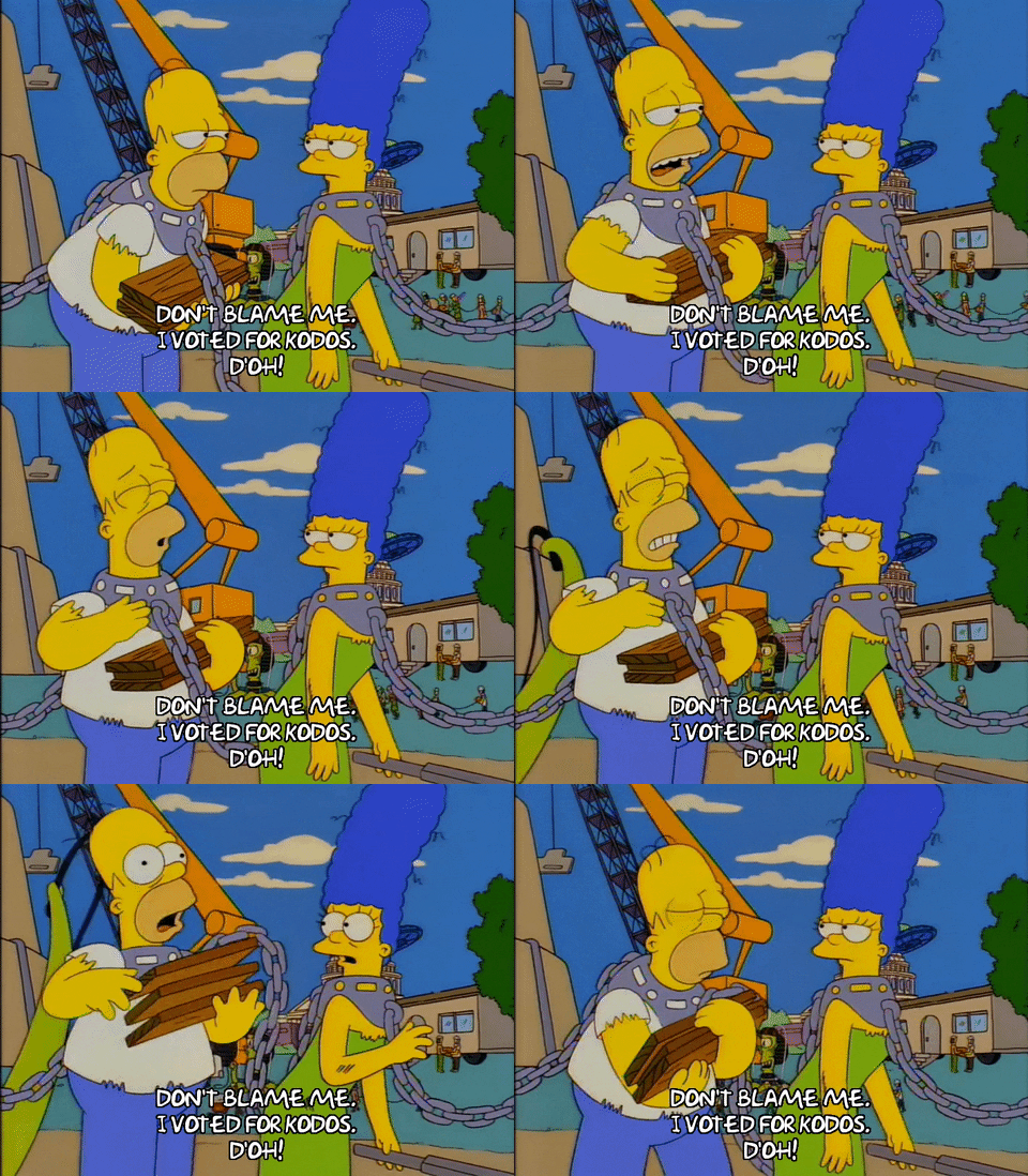
Episode 1 Halloween GIF by The Simpsons

When you’re trying to bring out the base, stakes are everything. Problem is, people start to catch on when every election somehow manages to be the most important one ever. You need to recruit someone to convince your base that this election is the most important one ever. Someone credible. And that’s what politicians and activists have figured out. The most credible source for the potential terror that only our candidate can hold at bay is the opposition. Not their candidates or campaigns, mind you. Their base.

The most credible way to increase the stakes for your base is the rile up the rage and vitriol of the the opposition’s. If you want to truly convince your voters that the stakes are high, all you have to do is chum the water and let the craziest avatars of your political opposition do the work for you. They’ll wave their guns, call each other “comrade”, insult their religious faith, call them stupid, make veiled threats, make unveiled threats, all of which will make perfectly clear that if we don’t win this next election, these people will win. They will win and have power. They must be stopped.

This is the principal reason there has been such a meteoric rise of professional trolls and hyperbolic “reply-guys”. The trolls, your Tucker Carlson’s and Chapo Trap Houses chum the waters, and then an entire ecosystem of reply-guys respond, quote tweet, and record 30 second CNN/Fox News video commentaries. Politicians have discovered that truly horrific people, and the shrieking dystopia fetishists that swarm them, are amazing at bringing out political support, not through persuasion or direct signaling of group identity, but through the specter of the lunacy of the opposition, and the subtle implication that if you don’t signal your affinity for our group, you are by implication associated with the toxicity of our opposition.

Which is why when these sort of messages show up on social media or television sound bites, you can quickly see that they aren’t propaganda or even fan service. They’re bait.

Bait GIF

And just so you don’t get the wrong impression, I fall for this too. I try not to, but these people are professionals for a reason.

Look at me, promoting this image on social media. They played me like a fiddle. I knew exactly what its goal was, and it still put me in such a despairing rage that the rest of the world had to hear about it.

Just because I’m an economist, and one who studies political economy at that, that doesn’t mean I not still a sucker.

Economic freedom and income mobility

A few weeks ago, my friend James Dean (see his website here, he will soon be a job market candidate and James is good) and I received news that the Journal of Institutional Economics had accepted our paper tying economic freedom to income mobility. I think its worth spending a few lines explaining that paper.

In the last two decades, there has been a flurry of papers testing the relationship between economic freedom (i.e. property rights, regulation, free trade, government size, monetary stability) and income inequality. The results are mixed. Some papers find that economic freedom reduces inequality. Some find that it reduces it up to a point (the relationship is not linear but quadratic). Some find that there are reverse causality problems (places that are unequal are less economically free but that economic freedom does not cause inequality). Making heads or tails of this is further complicated by the fact that some studies look at cross-country evidence whereas others use sub-national (e.g. US states, Canadian provinces, Indian states, Mexican states) evidence.

But probably the thing that causes the most confusion in attempts to measure inequality and economic freedom is the reason why inequality is picked as the variable of interest. Inequality is often (but not always) used as a proxy for social mobility. If inequality rises, it is argued, the rich are enjoying greater gains than the poor. Sometimes, researchers will try to track the income growth of the different income deciles to go at this differently. The idea, in all cases, is to see whether economic freedom helps the poor more than the rich. The reason why this is a problem is that inequality measures suffer from well-known composition biases (some people enter the dataset and some people leave). If the biases are non-constant (they drift), you can make incorrect inferences.

Consider the following example: a population of 10 people with incomes ranging from 100$ to 1000$ (going up in increments of 100$). Now, imagine that each of these 10 people enjoy a 10% increase in income but that a person with an income of 20$ migrates to (i.e. enters) that society (and that he earned 10$ in his previous group). The result will be that this population of now 11 people will be more unequal. However, there is no change in inequality for the original 10 people. The entry of the 11th person causes a composition bias and gives us the impression of rising inequality (which is then made synonymous with falling income mobility — the rich get more of the gains). Composition biases are the biggest problem.

Yet, they are easy to circumvent and that is what James Dean and I did. We used data from the Longitudinal Administrative Database (LAD) in Canada which produces measures of income mobility for a panel of people. This means that the same people are tracked over time (a five-year period). This totally eliminates the composition bias and we can assess how people within that panel evolve over time. This includes the evolution of income and relative income status (which decile of overall Canadian society they were in).

Using the evolution of income and relative income status by province and income decile, we tested whether economic freedom allowed the poor to gain more than the rich from high levels of economic freedom. The dataset was essentially the level of economic freedom in each five-year window matching the LAD panels for income mobility. The period covered is 1982-87 to 2013-18.

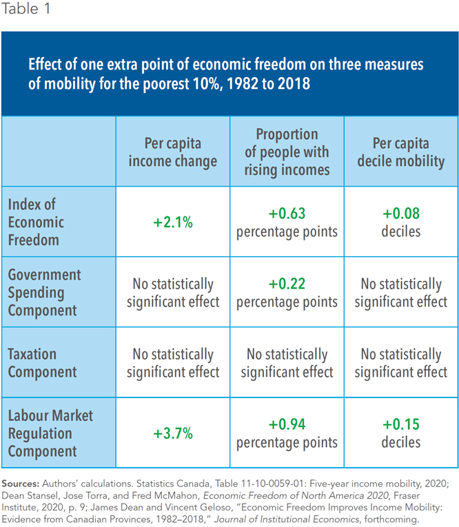
What we found is in the table below which illustrates only our results for the bottom 10% of the population. What we find is that economic freedom in each province heavily affects income mobility.

Image

More importantly, the results we find for the bottom decile are greater than the results “on average” (for all the panel) or than for the top deciles. In other words, economic freedom matters more for the poor than the rich. I hope you will this summary here to be enticing enough to consult the paper or the public policy summary we did for the Montreal Economic Institute (here)

Getting hired by a bot is unsettling

Samford student Savanah Needham identified an interesting recent WSJ article about the use of AI in hiring. Savanah writes:

In The WSJ, we learn that AI is being used for hiring employees rather than a traditional hiring manager, thus job applicants fear that they must impress a robot instead of relying on human interaction to get their dream job. The writer argues that job applicants deserve to know ahead of time how the algorithm will judge them and ought to receive feedback if they are rejected. Her proposal highlights the uncertainty that job candidates face in the newly AI-augmented hiring world.

We desperately need such a system. AI’s widespread use in hiring far outpaces our collective ability to keep it in check—to understand, verify and oversee it. Is a résumé screener identifying promising candidates, or is it picking up irrelevant, or even discriminatory, patterns from historical data? Is a job seeker participating in a fair competition if he or she is unable to pass an online personality test, despite having other qualifications needed for the job?

Julia Stoyanovich, WSJ

Robots can look at social media postings, linguistic analysis of candidates’ writing samples, and video-based interviews that utilize algorithms to analyze speech content, tone of voice, emotional states, nonverbal behaviors, and temperamental clues (HBR 2019). In just a few quick seconds, AI uses all the data it has on you to jump to conclusions. AI uses tools that claim to measure tone of voice, expressions, and other aspects of a candidate’s personality to help “measure how culturally ‘normal’ a person is.”

You spend a large amount of time proving to employers that you are not like the others, you’re different/better than other candidates…but now we need to try and convince a robot that we are “normal.”  

Researchers predict that face-reading AI can soon discern candidates’ sexual and political orientation as well as “internal states” like mood or emotion with a high degree of accuracy. This can be worrisome if the face reader claims that one is “too emotional” or assigns someone to a certain political party.