Here is a chart of the Core Personal Consumer Index for inflation (Core PCE), which is the Fed’s favorite measure on inflation, from 1970 through early 2024:
This chart is from an article by the Richmond Fed, The Origins of the 2 Percent Inflation Target. That article has a long discussion of how and why the Fed decided to name an explicit inflation target of 2% in 2012. Although controlling inflation has been formally part of the Fed’s “dual mandate” since the Federal Reserve Reform Act of 1977, it had traditionally not set a single numerical target. After years of discussions within the Fed, it was decided that the benefits of a clear single target outweighed the potential downsides. 2% was though to be about the lowest you could run, while still giving the Fed some room to cut short term rates in a recession without running up against the dreaded zero lower bound. It was understood that 2% was a loose target, with some years a little over or under to be allowed to balance each other out.
That Richmond Fed article was published in early 2024. At that point, inflation was falling quickly and steadily from its post-Covid high, as consumers finished spending down their gigantic stimulus package windfalls.
Unsurprisingly, this article concludes that “Even during this period, long-run inflation expectations have remained anchored, rising no higher than 2.5 percent, according to the Cleveland Fed.”
That was about 18 months ago. The actual path of inflation since then has not be a descent to 2-2.5%. Between gigantic peacetime deficits by two administrations, and the results of tariffs, inflation seems to have leveled out at around 3%:
The sub-2% inflation that was normal for twenty years (2000-2020) may now be a lost world. This puts the Fed in an awkward spot. Even ignoring the irresponsible squawking from some quarters of the government, it will not be an easy decision to keep cutting rates (to address soft employment) if inflation stays this high. The Fed’s mantra this time around is that the current inflation is just a transient response to tariffs and so can be largely discounted. But I recall similar verbiage in 2021, as the Fed dismissed the ramping inflation back then as merely a transitory effect of pandemic supply chain restrictions. They were wrong then, and I suspect it would be wrong now to be too complacent. The 1970s-80’s showed that once the inflation genie gets out of the bottle, it can be very costly to subdue it. Whether 2.0 % is still the right target, however, may be open to debate.
An overlooked part of being a good Bayesian is revisiting your past failures of imagination, so that past stuggles with Knightian Uncertainty can be transformed into simple failures to accurately forecast probailities.
I posted earlier today about things getting weirder, but it’s worth considering the exercise proposed by Jonathan V. Last over at The Bulwark, where he goes through his own worst case scenario from November of 2024 and then compares it to the current observed reality.
JVL provides the following list of current events that he never even considered as possible. Going through the list below, which of these would you have considered as genuine possibilities? Not whether you predicted they would happen, but whether you would have even considered in your forecast that they could happen.
I think there are only two items, maybe three on that list I would have thought of as >1% chance of happening. That’s a failure of my imagination and I don’t think I am alone. If we’re good Bayesians, I think that means not just updating our priors, but updating how we update, and opening the door to the darker parts of our imagination when forecasting going forward. No, I’m not enjoying it either.
Tomorrow the first of the “deferred resignation program” windows close, adding to the growing sources of a chaos as the signs of a recession continue to mount. The supply chain is filled with tariff uncertainty. The tech sector is scrambling to deal with a potentially crippled H1-B channel (conditional on court rulings). Layoffs are showing up in retail and tech. Employers everywhere are coping with worker absences due to chaotic National Guard call-ups.
Between 150k and 200k employees took the government up on option to defer resignation i.e. collect 8 months of pay before resigning. This is about 2% of the federal workforce, though it’s notable that 20% of the IRS workforce took the offer in anticipation that they were going to be laid off with fewer benefits if they didn’t. For at least half of those who accepted DRP, it appears to simply be letting them coast into an already planned retirement, but it could also feasibly be used to bridge you to your next job, on the only condition that it be outside of the federal government.
A 100k workers showing up in the job market in the next few weeks isn’t catastrophic by any means, but combined with a government shutdown that would turn off benefits weeks or months before individuals planned is just another injection of chaos into an already uncertain labor market.
I’m not telling you if and when a recession will officially hit. I’m not in that kind of forecasting business. But I am comfortable saying their is more uncertainty about the state of the economy and institutions now than at any point since 2008, more concern over a speculative bubble surrounding a new bundle of technologies than any time since 2000, and more uncertainty around the robustness of the rule of law since I was born. Make of that what you will.
Aspiring writers might believe that only writing is creative. Only words you specifically order and set in stone can last, it might seem.
Motions made at committee meetings and cheers for children on the soccer field are creative, too, actually. They leave an indelible mark on the world, even though the specifics of your performance are quickly forgotten.
My new article, “Prohibition and Percolation: The Roaring Success of Coffee During US Alcohol Prohibition”, is now published in Southern Economic Journal. It’s the first statistical analysis of coffee imports and salience during prohibition. Other authors had speculated that coffee substituted alcohol after the 18th amendment, but I did the work of running the stats, creating indices, and checking for robustness.
My contributions include:
National and state indices for coffee and coffee shops from major and local newspapers.
A textual index of the same from book mentions.
I uncover that prohibition is when modern coffee shops became popular.
The surge in coffee imports was likely not related to trade policy or the end of World War I
Both demand for coffee and supply increased as part of an intentional industry effort to replace alcohol and saloons.
An easy to follow application of time series structural break tests.
An easy to follow application of a modern differences in differences method for state dry laws and coffee newspaper mentions.
Evidence from a variety of sources including patents, newspapers, trade data, Ngrams, naval conflicts, & Wholesale prices.
Generally, the empirical evidence and the main theory is straightforward. I learned several new empirical methods for this paper and the economic logic in the robustness section was a blast to puzzle-out. Finally, it was an easy article to be excited about since people are generally passionate about their coffee.
Bartsch, Zachary. 2025. “Prohibition and Percolation: The Roaring Success of Coffee During US Alcohol Prohibition.” Southern Economic Journal, ahead of print, September 22. https://doi.org/10.1002/soej.12794.
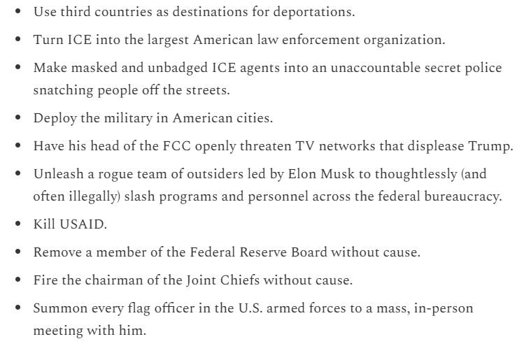
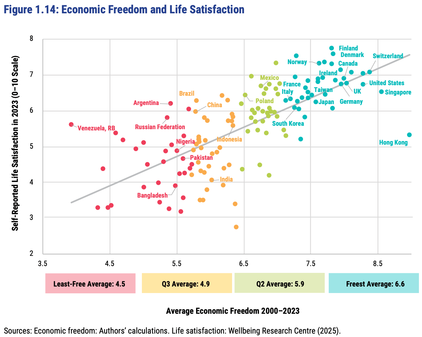
The Fraser Institute released their latest report on the Economic Freedom of the World today, measuring economic policy in all countries as of 2023. They made this excellent Rosling-style graphic that sums up their data along with why it matters:
In short: almost every country with high economic freedom gets rich, and every country that gets rich either has high economic freedom or tons of oil. This rising tide of prosperity lifts all boats:
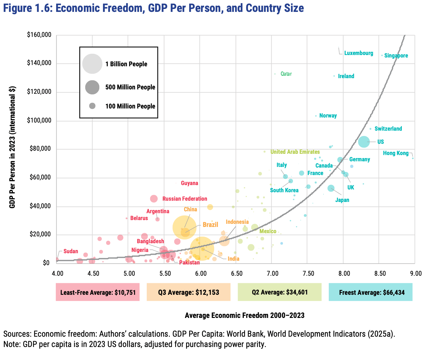
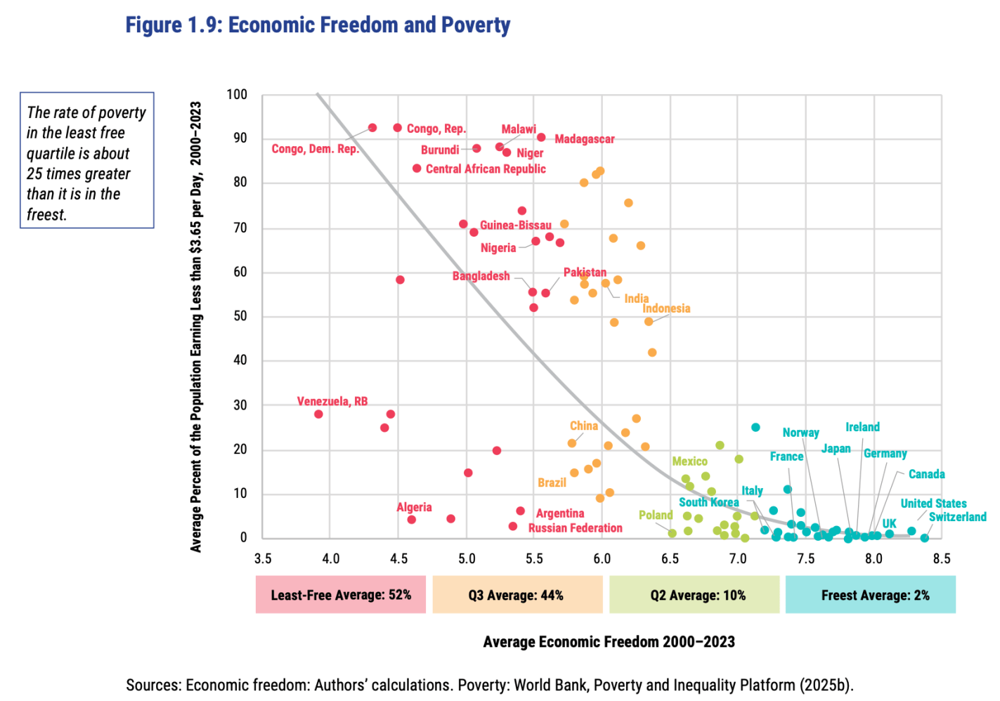
This greater prosperity that comes with economic freedom goes well beyond “just having more stuff”:
The full report, along with the underlying data going back to 1970, is here. The authors are doing great work and releasing it for free, so no complaints, but two additional things I’d like to see from them are a graphic showing which countries had the biggest changes in economic freedom since last year, and links to the underlying program used to create the above graphs so that readers could hover over each dot to identify the country (I suppose an independent blogger could do the first thing as easily as they could…).
FRDM is an ETF that invests in emerging markets with high economic freedom (I hold some), I imagine they will be rebalancing following the new report.
Housing is certainly more expensive than in the past. I have written about this several times, including a post from last year showing that between about 2017 and 2022 housing started to get really expensive almost everywhere in the US, not just on the West Coast and Northeast (as had previously been the case). I don’t think the housing affordability crisis is in serious doubt anymore, and it can’t be explained over the past few years by increasing size and amenities, since those haven’t changed much since 2017 (though it is relevant when comparing housing prices to the 1970s).
But why did this happen? Knowing why is crucial, not merely to blame the causes, but because the policy solution is almost certainly related to the causes. I and many others have argued that supply-side restrictions, such as zoning laws, are the primary culprit. The policy solution is to reduce those restrictions. But a recent op-ed titled “Why your parents could afford a house on one salary – but you can’t on two,” the authors place the blame for housing prices (as well as the stagnation of living standards generally) on a different factor: Nixon’s 1971 “severing the dollar’s link to gold.” The authors have a book on this topic too, which I have not yet read, but they provide most of the relevant data in this short op-ed.
Does their explanation make sense? I am skeptical. Here’s why.
A couple of days ago I spoke with a friend who was troubled by the case of Adam Raine, the sixteen-year-old who was counseled by a ChatGPT AI therapy chatbot into killing himself. That was of course extremely tragic, but I hoped it was kind of an outlier. Then I heard on a Bloomberg business podcast that the number one use for AI now is personal therapy. Being a researcher, I had to check this claim.
So here is an excerpt from a visual presentation of an analysis done by Marc Zao-Sanders for Harvard Business Review. He examined thousands of forum posts over the last year in a follow-up to his 2024 analysis to estimate uses of AI. To keep it tractable, I just snipped an image of the first six categories:
It’s true: Last year the most popular uses were spread across a variety of categories, but in 2025 the top use was “Therapy & Companionship”, followed by related uses of “Organize Life” and “Find Purpose”. Two of the top three uses in 2024, “Generate Ideas” and “Specific Search”, were aimed at task productivity (loosely defined), whereas in 2025 the top three uses were all for personal support.
Huh. People used to have humans in their lives known as friends or buddies or girlfriends/boyfriends or whatever. Back in the day, say 200 or 2000 or 200,000 or 2,000,000 years ago, it seems a basic unit was the clan or village or extended kinship group. As I understand it, in a typical English village the men would drift into the pub most Friday and Saturday nights and banter and play darts over a pint of beer. You were always in contact with peers or cousins or aunts/uncles or grandmother/grandfathers who would take an interest in you, and who might be a few years or more ahead of you in life. These were folks you could bounce around your thoughts with, who could help you sort out what is real. The act of relating to another human being seems to be essential in shaping our psyches. The alternative is appropriately termed “attachment disorder.”
The decades-long decline in face-to-face social interactions in the U.S. has been the subject of much commentary. A landmark study in this regard was Robert Putnam’s 1995 essay, “Bowling Alone: America’s Declining Social Capital”, which he then expanded into a 2000 book. The causes and results of this trend are beyond the scope of this blog post.
The essence of the therapeutic enterprise is the forming of a relational human-to-human bond. The act of looking into another person’s eyes, and there sensing acceptance and understanding, is irreplaceable.
But imagine your human conversation partner faked sympathy but in fact was just using you. He or she could string you along by murmuring the right reflective phrases (“Tell me more about …”, “Oh, that must have been hard for you”, blah, blah, blah) but with the goal of getting money from you or turning you towards being an espionage partner. This stuff goes on all the time in real life.
The AI chatbot case is not too different than this. Most AI purveyors are ultimately in it for the money, so they are using you. And the chatbot does not, cannot care about you. It is just a complex software algorithm, embedded in silicon chips. To a first approximation, LLMs simply spit out a probabilistic word salad in response to prompts. That is it. They do not “know” anything, and they certainly do not feel anything.
Here is what my Brave browser embedded AI has to say about the risks of using AI for therapy:
Using AI chatbots for therapy poses significant dangers, including the potential to reinforce harmful thoughts, fail to recognize crises like suicidal ideation, and provide unsafe or inappropriate advice, according to recent research and expert warnings. A June 2025 Stanford study found that popular therapy chatbots exhibit stigmatizing biases against conditions like schizophrenia and alcohol dependence, and in critical scenarios, they have responded to indirect suicide inquiries with irrelevant information, such as bridge heights, potentially facilitating self-harm. These tools lack the empathy, clinical judgment, and ethical framework of human therapists, and cannot ensure user safety or privacy, as they are not bound by regulations like HIPAA.
AI chatbots cannot provide a medical diagnosis or replace human therapists for serious mental health disorders, as they lack the ability to assess reality, challenge distorted thinking, or ensure safety during a crisis.
Research shows that AI systems often fail to respond appropriately to mental health crises, with one study finding they responded correctly less than 60% of the time compared to 93% for licensed therapists.
Chatbots may inadvertently validate delusional or paranoid thoughts, creating harmful feedback loops, and have been observed to encourage dangerous behaviors, such as promoting restrictive diets or failing to intervene in suicidal ideation.
There is a significant risk of privacy breaches, as AI tools are not legally required to protect user data, leaving sensitive mental health information vulnerable to exposure or misuse.
The lack of human empathy and the potential for emotional dependence on AI can erode real human relationships and worsen feelings of isolation, especially for vulnerable individuals.
Experts warn that marketing AI as a therapist is deceptive and dangerous, as these tools are not licensed providers and can mislead users into believing they are receiving professional care.
There’s nothing to untangle here. No confusion over the underlying economics. No panic or fear mongering through false claims of violent crime. It’s blocking high skilled workers our economy is desperate for in hopes that the prospects of enormous damage will create yet another source of power that will lead to wealth being transferred from industry into the pockets of the administration.
It’s bad. It’s getting worse. It’s the first time I’ve experienced a steady stream of economic policy that there is no one to argue with because there is no earnest belief that this will improve social welfare. It’s just a grift.
The only thing that remains certain is that there will be a new version of this every week and month until they are stopped. I’m pretty sure I can just replace the details of the story, and then copy and paste the rest of this post going forward.
But as Jeremy often points out here, young adults have actually been doing pretty well at building wealth. So why are they so gloomy?
Since I’ve now aged out of the young adult category, I’m obligated to start by wondering if kids these days are just whinier, and need to quit doomscrolling and toughen up. But if I try to see things their way, here’s what I can come up with for why their pessimism could be rational:
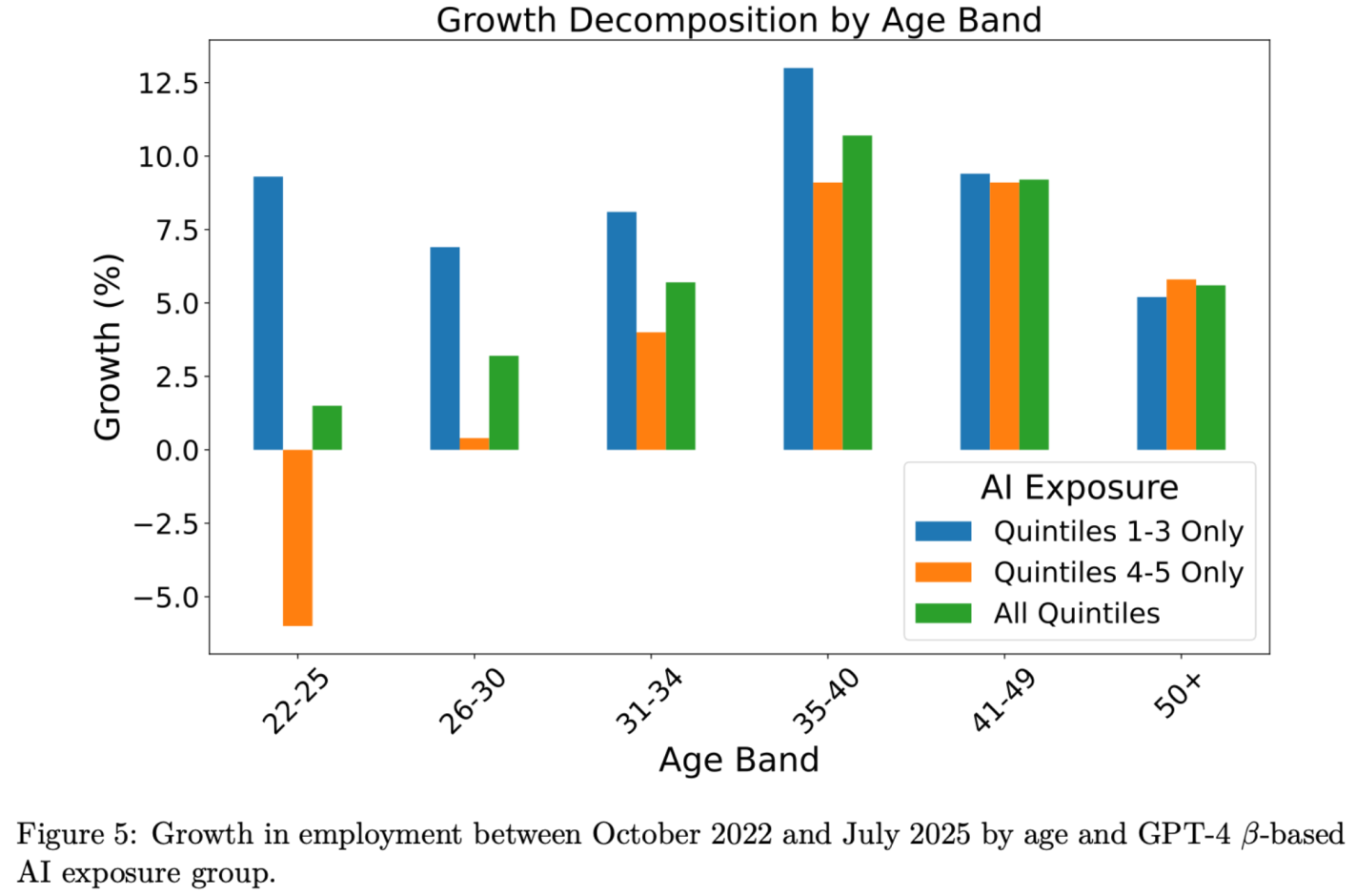
It’s About The Future: Sure things have been fine, but that is about to change. The more farsighted youth know they will be the ones expected to pay back the big deficits the Federal government is running. They have student loans to pay today now that payments have fully resumed. I predicted after the 2022 student loan forgiveness that we would be back to all-time highs in student debt by 2028, but in fact we are there already. The youth unemployment rate is now 10.5%, up from 6.6% in April 2023, and could rise a lot more if AI really starts displacing jobs:
Source: Brynjolfsson, Chandar and Chen 2025.Source: Michigan Consumer Survey
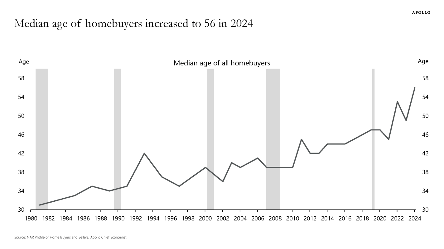
2. It’s About Housing: House prices are at all time highs (far above the prices during the 2000s “bubble”). Mortgage rates remain high, and to the extent that Fed rate cuts push them down, they will likely push prices higher, leaving homes hard to afford. High credit standards post-Dodd-Frank mean younger buyers in particular find it hard to get a mortgage; homeownership rates are falling while the average age of homeowners shoots upward. Most older people already own a house, while most young people want to buy but see that as increasingly out of reach.
Good luck getting a mortgage without super-prime creditEveryone thinks it’s a bad time to buy a house, but this matters most if you’re young and don’t already own oneThe median American is 39 years old but the median homebuyer is 56