Joy on the Barbie movie

I did go see the Barbie movie (last month I had to put up someone else’s blog about it). Kate McKinnon and the Birkenstock choice is my favorite part. You can catch part of that scene in the middle of the trailer.

Here is America Ferrera’s monologue:

It is literally impossible to be a woman. You are so beautiful, and so smart, and it kills me that you don’t think you’re good enough. Like, we have to always be extraordinary, but somehow we’re always doing it wrong.

You have to be thin, but not too thin. And you can never say you want to be thin. You have to say you want to be healthy, but also you have to be thin. You have to have money, but you can’t ask for money because that’s crass. You have to be a boss, but you can’t be mean. You have to lead, but you can’t squash other people’s ideas. You’re supposed to love being a mother, but don’t talk about your kids all the damn time. You have to be a career woman but also always be looking out for other people.

You have to answer for men’s bad behavior, which is insane, but if you point that out, you’re accused of complaining. You’re supposed to stay pretty for men, but not so pretty that you tempt them too much or that you threaten other women because you’re supposed to be a part of the sisterhood…

Movies and Money

The Barbie movie is doing well commercially. So many other special projects, such as the all-female remake of Ghostbusters, flopped at the box office. Barbie and Taylor Swift concert tickets were serving as the primary examples of spending in “Hot Profit Summer“. Congratulations to Greta Gerwig on a huge success.

Barbie has unresolved existential angst, universe portals, mother-daughter conflicts and fight scenes. To that extent, Barbie reminds me of Everything Everywhere All At Once. The big commercial successes within the same decade often share key components. Earlier I wrote about how Frozen and The Queen’s Gambit are similar.

It’s the Barbie doll who quotes John Locke in Toy Story 3. The Toy Story movies are funny and deep, and they are also great for kids.

Barbie is Fun

One could write a very serious post about the Barbie movie and the portrayal of female reality. Instead, let’s acknowledge that the movie is fun, just like American life generally. No one needs Kate McKinnon (to survive). We get to watch her on TV because the world is rich now. Not only has child mortality fallen because of economic development, but life has gotten more fun.

I noted this when I reviewed the movie Austenland. The film shows that when an American woman goes to a Regency-era simulation she gets bored.

… afternoons spent on needlepoint projects were not so much painful as boring to the heroine. Boring. Matt Ridley tells us in The Rational Optimist that life in pre-modern England was more miserable than we imagine in terms of health outcomes. An underrated feature of modernity is how much more interesting the world is now that we can read widely and travel and tweet. If you were rich enough to escape endless manual labor in 1810, your options for leisure time were still very limited.

https://economistwritingeveryday.com/2021/02/27/in-defense-of-austenland-2013/

Is Work Fun?

John Maynard Keynes predicted that future people would only work for 15 hours per week. Why, then, did the Barbie dolls (who don’t need money) talk so much about careers? President Barbie and Doctor Barbie seem happy.

Do we keep working past 15 hours a week because it is fun? (Tyler says it is in Big Business.)

Would it be accurate to say that professionals spend less than 15 hours a week on tasks that they truly hate? Maybe striding down a clean hallway to a meeting with coffee in hand is what we like to do? Or is that a strictly American phenomenon?

Interestingly, the human mom character (America Ferrera) does not love her job. She is not President or a Doctor. Would she prefer to be unemployed?

I want to know if the career barbies sell, but I could not find the data. The Guinness Book of World Records indicates that the best-selling Barbie is “Totally Hair Barbie”.

Further reading: If you are interested in patriarchy (the topic of discussion in the Barbie movie), then follow along with Alice Evans. One of her recent posts is “Why are Gender Pay Gaps so Large in Japan and South Korea?

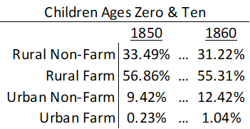
Lastly, Jeremy’s EWED post on “Barbie Dolls and Women’s Wages” got picked up by Reason magazine as “Barbie Girls Now Live in a Much Wealthier Barbie World” They conclude, “Life in modern America might not be as fantastic as living in Barbie Land. But it sure beats the America of the past.”

Interpolation Vs Transition

Sometimes you read an academic article and the author fills in the data gaps with interpolation. That is, they assume some functional form of the data and then replace the missing values with the estimated ones. Often, lacking an informed opinion about functional form, authors will just linearly interpolate between the closest known values. Sometimes this method is OK. But sometimes we can do better.

Historical census data provides a good example because the frequency was only every ten years. Say that we want to know more about child migration patterns between 1850 and 1860. What happened in the intervening years? Who knows. Let’s look at the data.

Using data on individuals who have been linked across censuses allows us to fill in the gaps a little bit. For simplicity, let’s just look at whether a child migrant lived in an urban location and whether they lived on a farm. That means that there are 4 possible ways to describe their residence. Below is a summary of where children migrants lived at the age of zero in 1850 and where the same children lived a decade later at the age of ten in 1860 given that they moved counties.

When I’m the mean time did these children move from one place and to the other? We don’t know exactly. The popular answer is to say that they moved uniformly throughout the decade. That’s ‘fine’. But it assumes that the rate at which people departed places was rising and the rate at which they arrived places was falling. Maybe that’s true, but we don’t really know. Below-left is a graph that shows the linear interpolation.

The nice thing about linear interpolation is that everyone is accounted for at each point in time. The total number of people don’t rise or fall in the intervening interpolation period. But if we were to assume that children departed/arrived at each type of place at a constant rate (maybe a more reasonable assumption), then suddenly we lose track of people. That is, the sum of people dips below 100% as people depart faster than they arrive.

What’s the alternative to linear interpolation?

Continue reading

Long Covid is Real in the Claims Data… But so is “Early Covid”?

I’ve seen plenty of investigations of “Long Covid” based on surveys (ask people about their symptoms) or labs (x-ray the lungs, test the blood). But I just ran across a paper that uses insurance claims data instead, to test what happens to people’s use of medical care and their health spending in the months following a Covid diagnosis. The authors create some nice graphics showing that Long Covid is real and significant, in the sense that on average people use more health care for at least 6 months post-Covid compared to their pre-Covid baseline:

Source: Figure 5 of “Long-haul COVID: healthcare utilization and medical expenditures 6 months post-diagnosis“, BMC Health Services Research 2022, by Antonios M. Koumpias, David Schwartzman & Owen Fleming

The graph is a bit odd in that its scales health spending relative to the month after people are diagnosed with Covid. Their spending that month is obviously high, so every other month winds up being negative, meaning just that they spent less than the month they had Covid. But the key is, how much less? At baseline 6 months prior it was over $1000/month less. The second month after the Covid diagnosis it was about $800 less- a big drop from the Covid month but still spending $200+/month more than baseline. Each month afterwards the “recovery” continues but even by month 6 its not quite back to baseline. I’m not posting it because it looks the same, but Figure 4 of the paper shows the same pattern for usage of health care services. By these measures, Long Covid is both statistically and economically significant and it can last at least 6 months, though worried people should know that it tends to get better each month.

I was somewhat surprised at the size of this “post Covid” effect, but much more surprised at the size of the “pre Covid” or “early Covid” effect- the run-up in spending in the months before a Covid diagnosis. For the month immediately before, the authors have a good explanation, the same one I had thought of- people are often sick with Covid a couple days before they get tested and diagnosed:

There is a lead-up of healthcare utilization to the diagnosis date as illustrated by the relatively high utilization levels 30–1 days before diagnosis. This may be attributed to healthcare visits only days prior to the lab-confirmed infection to assess symptoms before the manifestation or clinical detection of COVID-19.

But what about the second month prior to diagnosis? People are spending almost $150/month more than at the 6-month-prior baseline and it is clearly statistically significant (confidence intervals of months t-6 and t-2 don’t overlap). The authors appear not to discuss this at all in the paper, but to me ignoring this lead-up is burying the lede. What is going on here that looks like “Early Covid”?

My guess is that people were getting sick with other conditions, and something about those illnesses (weakened immune system, more time in hospitals near Covid patients) made them more likely to catch Covid. But I’d love to hear actual evidence about this or other theories. The authors, or someone else using the same data, could test whether the types of health care people are using more of 2 months pre-diagnosis are different from the ones they use more of 2 months post-diagnosis. Doctors could weigh in on the immunological plausibility of the “weakened immune system” idea. Researchers could test whether they see similar pre-trends / “Early Covid” in other claims/utilization data; probably they have but if these pre-trends hold up they seem worthy of a full paper.

What are the Richest and Poorest MSAs in the US? Cost of Living Is Probably Less Important Than You Think

Income varies a lot across the US. So does the cost of living. Does it mostly wash out when you adjust incomes for the costs of living? No, not even close. Apples-to-apples comparisons are always hard, but it’s still worth making comparisons.

Let’s use some data that Ryan Radia put together that I really like, for several reasons. He uses the 100 largest MSAs — these comprise about 2/3 of the US population. He uses median income, so outliers shouldn’t effect the income data. He uses median family income, since the more common median household income is, in my opinion, very difficult to interpret (5 college students living together are a household, and so is one elderly person living alone). And Ryan also limits it to non-elderly, married couples, and then separates the data by the employment status of each member of the couple.

As an illustration, let’s use the data for married couples with only one spouse working full-time (I have played around with the data for other working statuses, and the results are similar). Before adjusting for the cost of living, here are the top MSAs with the highest median incomes:

  1. San Jose, CA: $169,000
  2. San Francisco: $140,000
  3. Bridgeport–Stamford, CT: $130,000
  4. Seattle: $130,000
  5. Boston: $129,000
  6. Washington, DC: $123,000
  7. Hartford, CT: $110,000
  8. Oxnard–Thousand Oaks, CA: $107,390
  9. Austin: $105,420
  10. New York: $105,000
Continue reading

Collapsible Boats You Can Store in Your Apartment: ORU Folding Kayaks and MyCanoe Canoes

My wife and I were sitting on a bench near a local lake, having a picnic dinner. On a little grassy spot nearby I noticed a young woman put down a large bag, and then slide out some large, odd-looking plastic pieces. Then she unfolded something, and, oh my goodness, she had brought a fold-up kayak in that bag:

A friend joined her with sliding some joiner tubular pieces over the seams on top to zip these seams together:

The whole assembly took less than ten minutes. The resulting kayak was very light to carry:

And away she paddled:

I had drifted over to talk to her as she was assembling the kayak, and she said she just stored the boat in its bag in a closet in her apartment. Also, that it was great  fun to use.

This was one of a selection of foldable kayaks sole by ORU. They make smaller, lighter, cheaper models for paddling on still water, and heavier-duty kayaks for ocean waves and white-water rivers. These kayaks get generally very high reviews. They are a bit pricy, and may not stand up for long scraping over rocks. But they are  clearly  full-blown, worth-paddling kayaks with rigid sides and clean lines.

This resonated with me, because maybe twenty years ago, I got a pair of inflatable kayaks that we could store in the basement and pull out and inflate at the lake. Paddling them was an awful experience. Although we inflated them to spec, they sagged in the middle, with the two ends sticking up in the air and catching the wind. It was like paddling a bathtub which was being constantly carried downwind.

I also found through that experience that kayaking was very uncomfortable for me. But I do like canoeing. So, after seeing how great the folding kayak was, I looked online and found a similar collapsible canoe, made by MyCanoe.  The design is a little harder to execute, because with a canoe you have an open top, whereas with a kayak you can seal up the top and get the whole boat to be something of a nice structural tubular structure. But the MyCanoe seems to work OK, and has the same advantages of being lightweight (19 lb for one-person Solo, 43lb for two-person Duo) and of folding into a small package for transport and storage. There is an oar-lock accessory so you can row it with two oars, as an alternative to paddling. The Solo is pretty short and wide, so it is very maneuverable , but I would be surprised if it tracks well in a straight line when you just want to paddle from point A to point B using one paddle.

You can find plenty of demos and reviews on YouTube for these folding kayaks and canoes. And there are other collapsible kayaks out there, per this review, but some of them are heavier and more involved to assemble.

Anyway, these folding craft are a pretty classy, free-enterprise technology solution for folks who like to get out on the water, but don’t have a garage or backyard to store a regular kayak or canoe, much less a trailer for a motorboat or a sailboat.

When is success uncorrelated with competence?

I agree with Tyler’s assessment that the top performers in pretty much any field of endeavor tend to be incredibly intelligent, regardless of whether that field is broadly associated with intelligence per se. He closes with an open question: in what fields can success belie intelligence?

The older I get, the more complex and messier I find intelligence to be as a construct. If we broaden the concept from intelligence to “competence” or “capability”, however, I think it becomes an even more interesting question. In what fields can we expect to observe top performers who are, in actuality, objectively bad at their jobs?

This is not to say I that I believe there are any fields or jobs where success doesn’t positively correlate with capability. Rather, it is to ask in what fields, if any, is the variance on outcomes is so great as to be able to fully obscure average or expected outcomes within individuals? Framed this way, the fields we should be looking for are those that emphasize high leverage, high risk wagers made with low frequencies. If you’re trying to identify ostensibly high-performers who are, in reality, grossly incompetent in the fields that made them wealthy, look for a series of ex ante negative expected value wagers combined with large initial endowments and foolish leverage ratios. Probalistically most such individuals will be punished accordingly, but given enough players, a highly visible few will hit big with an initial sequence of winners. Their subsequent anointment as virtuosos combined with the sheer weight of their capital will permit them to coast for decades before, if ever, their underlying incompetence catches up with them.

As for specific fields, it’s pretty easy for me to see such dynamics at play in real estate and angel investing. Not to be confused with construction or venture capital, in which “wagers” are made with much higher frequency, lower risk, and, in turn, lower returns on investment. Success in such fields reveal competence for the same reason it reveals them in professional poker: the law of large numbers eventually comes for everyone. Real estate speculation, on the other hand, whether its developed or undeveloped properties is exactly the kind of field where otherwise incompetent boobs, if given a large enough initial endowment and the opportunity to leverage to the hilt, can become giants on the heels of a relatively small number of bets. If they were in the right zip codes for the last few decades, it’s entirely possible to turn a half million into a few billion, without any insight in the slightest. Angel investing, on the other hand, tends to be less about leverage than simply buying lottery tickets: negative ROI, but in a landscape of thousands of angel investors, most of whom will experience losses approaching 100% on their portfolio, someone will fall into a 5000x return on something originally coded in a dorm. To be clear, more capable and competent investors will on average perform better speculating in real estate and early stage start-ups, but the absolutely biggest winners will be chosen more by chance than talent.

A similar question we might ask is what are the fields where the quality of outcomes is orthogonal to the capability being ostensibly being selected for? Allow me to explain through a standard scam story. A stock broker cold calls 100 people, tells each his pick for the week, half he says Stock A will go up, half he tells Stock A will go down. He then calls back the 50 people he correctly prognosticated to. He repeat this several times, until there are 3 people who believe that this previously unknown stranger has correctly predicted future stock prices 5 times in a row, a feat that seems unlikely by chance. Customers think the quality they are observing is forecasting expertise, when in actuality it is the ability to spend 60 hours a week being energetic and charismatic on the phone with strangers. This is, unto itself, a rare ability, just not the one that the customers in question think they are observing evidence of. Related to our earlier story, a strong argument can be made the most important skill in real estate speculation isn’t forecasting, but gaining access to leverage i.e. convincing people to loan you enough money that you can particpate in a casino with a such a high minimum stake.

The moral of the story is we should take care when attributing success to narrow capability or competence. Sometimes it’s because of selection on observability, obscuring the role that luck has played in success. Sometimes its because success demands obscuring the criteria on which it is selected, whether because of legality or simple social disapprobation. We should be doubly careful when considering fields/sectors where success remains somewhat mysterious or even magical. When observers are consistently attributing success to intangible factors, whether its charisma in politicians, inspiration in coaches, instinct in investors, or genius in futurists, your antennae should raise. If we don’t really know why and how someone succeeds, then there is a decent chance they don’t know either.

Top EWED Blogs of 2023

It’s the 3-year anniversary of EWED. Thanks for reading and sharing. Our blog has been cited by The Financial Times, The Wall Street Journal, The Atlantic, Reason Magazine, Marginal Revolution, and many others.

The following posts are in order, starting with the entry that got the most page views so far in 2023.

Why Tenure” Mike Makowsky on academic tenure and the unintended consequences of taking it away.

Steal My Paper Ideas!” James offered the internet research ideas that he does not have time to pursue.

“ChatGPT Cites Economics Papers That Do Not Exist” I wrote about a problem with ChatGPT hallucinations. This idea has now been more formally explored in my working paper available on SSRN (which has been trending in top-10 download lists on SSRN throughout the summer). The point is not just that GPT will create fake citations. The important take-away is that GPT can fabricate falsehoods of all kinds that sound serious. Citations are easy to count and verify. Once we have a quantitative measure, we can also demonstrate that accuracy declines when a topic is less general.

On EJMR, status competitions, and tapeworms” Mike on ill will in the profession.

On the paucity of new ideas and the paradox of choice in modern research” It’s Mike. He is a whole pattern in the data this year. (Maybe we can get new ideas from James!)

Bank for International Settlements: $70 Trillion Dollars Is Missing from Official Global Financial Accounting” A December, 2022 report from the Bank for International Settlements stated that $70 trillion was missing missing from normally reported global financial statistics. That is nearly three times the size of the U.S. GDP. Scott’s January post delineated what was going on and why this might turn into a problem.  

The Value of Student Organizations and On-Campus Education: Anecdotal Evidence from Tim Keller” Me on what happens at The University besides delivering information in lectures.

Is College Enrollment Falling?” Jeremy on a big question for academics. Here’s a recent tweet from him on demographics.


Spending on Housing: It Hasn’t Really Increased in the Past 40 Years” Jeremy. Incidentally, some of his posts from last year are still so popular that they have more traffic than the top 2023 posts. That includes: Who is the Wealthiest Generation? and The Wealth of Generations: Latest Update

If you ever want to know what people were saying about my generation when we were fresh out of college, watch an SNL sketch called “The Millennials”. Now we are just the parents at the parent-teacher conferences. Our jams play at the grocery store at 8am (Wonderwall, anyone?). And Jeremy is documenting the state of our finances.

Mortgage Fraud Is Surprisingly Common Among Real Estate Investors” from James. Who knew?

House Rich – House Poor” Zachary created create an affordability index. And also note that he provides tips for getting better teaching evaluations in “5 Easy Steps to Improve Your Course Evals

Lastly, congrats to our friends and mentors at Marginal Revolution who are celebrating 20 years of blogging.

Life Tables are Cool

Demography is cool generally, but life tables are really cool in their elegance. Don’t know what a life table is? Let me ‘splain.

A life table uses data from private or public death registers, or even genealogical records, to identify a variety of survival and death estimates. Briefly, the tables include for each age:

  • Probability of death in the next year
  • Probability of surviving to the age
  • The life expectancy

There is more in the tables, but these are the big items that people often want to know. All of the various table columns can be calculated from survival rates. The US government and the UN each has created many such tables for a variety of time, locations, and development details. For example, the earliest and most dependable one is from 1901 and includes separate tables by race, sex, migrant status, urbanity, and even for some specific states.

Continue reading

The Least Terrible Car Safety Sites

I’m looking for a new car now and would like to know what the safest reasonable option is. There are lots of ways to get some information about this, but none are very good.

The government provides safety ratings based on crash tests they perform. This is better than nothing but the crash tests only test certain things and don’t necessarily tell you how a car performs in the real world. They also have a habit of just giving their top rating (5 stars) to tons of vehicles so it doesn’t help you pick between them, and they only compare cars to other cars in the same “class”, ignoring that some classes are safer than others. On top of all the problems with the ratings themselves, they also don’t provide any lists of their ratings, instead making you search one car at a time.

Several other sites improve on the government ratings by using real-world data on how often cars actually crash (much of which comes from the government, which as usual is great at collecting data but not so great at presenting it in helpful user-friendly ways). The Auto Professor grades cars using real-world data but otherwise has the same problems as the government (NHTSA) site. Cars get letter grades rather than a rank or meaningful number, so it’s not actually clear which car is best, or how much better the good cars are than the average or bad cars. You can search the grades for one car at a time but they don’t just list the safest cars anywhere, including on their page labelled “safest cars list“.

The Insurance Institute for Highway Safety uses real world data and provides actual numbers of fatality rates for different vehicles. This is great because you don’t have the problem of “dozens of cars all have 5-star / A, which is best?” or the problem of “how much better is 5 star than 4 star, or A than B?”. But they don’t include data from the 2 most recent years, and they only post their ratings for a handful of cars. Not only do they not present a complete list, they seem to have no search function whatsoever for their real-world data (they do for their NHSTA-style crash test data). Some 3rd party sites seem to have posted more complete versions of their data, but it still doesn’t show data for most car models.

The least-terrible car safety site I have found is Real Safe Cars. The good: they use real-world safety data, they apply reasonable-sounding corrections and controls do it, they present meaningful quantitative measures like “vehicle lifetime fatality chance” and “vehicle lifetime injury chance”, and they present the data using both a search function and lists of “safest vehicles”. For 2020 you can see that the #1 car, the 2020 Audi e-tron Sportback, has a vehicle lifetime fatality chance of 0.0158%. Compare this to the #100 car, which is about average overall- the 2020 Acura TLX has a vehicle lifetime fatality chance of 0.0435% (almost 3x the safest). The site makes it hard to find the very worst car but near the bottom is the 2020 Hyundai Accent, which “has a vehicle lifetime fatality chance of 0.0744%”.

The lists could be better; the only list that includes all vehicle classes is restricted to only 2020 makes. Meanwhile when you search a car it ranks it only relative to cars in the same year, though you can make comparisons across years yourself using the quantitative “fatality chance” and “injury chance” measures. I’m not totally convinced of the ratings themselves, given how well many smaller sedans do. Their front page explains how taller cars are generally safer, but also lists the Mini Cooper as the #18 safest car of 2020 across all classes. But Real Safe Cars seems like the current best site to me (maybe I’m biased since one of its creators is an economics professor).

I hope these sites will address some of the weaknesses I identified here, though I’m not optimistic about most of them, because other than Real Safe Cars the “bad” decisions seem to be clearly driven by incentives like keeping car companies happy or SEO.

I also think there’s still room for another effort by economists or other quantitatively-skilled people to make another site. The underlying crash data is public and the statistical problems are not especially hard; I think a single economist could run the numbers in about the time it takes to write a typical economics paper (weeks to months for a 1st draft), and a decent website could be built off that quickly as well. You could probably make a decent amount of money off the site, though perhaps not if you do the right thing and publicly post all the data and code. Posting the data would make it easy for others to copy you and make their own sites. You could fight that with copyright, but given the huge public good aspect here and the lives at stake it might make more sense to get grant funding up front and then make the data and code totally public. A sane world would have done this already; NHTSA’s annual budget is over $1 billion, with $35 million of that going to research and analysis. I think any decent funder should be able to do at least as well as the sites above with under $200k, or anyone with good data chops could do it out of the goodness of their heart in a few months. I don’t have a few months right now but perhaps one of you could take this up or start applying for grants to do it.

For everyone who just wants to know about which cars are safe, for now I think Real Safe Cars is the best bet, though I’d also like to hear if you think I missed anything.

Does the Unemployment Rate Tell the Whole Story about the Labor Market?

The answer to that question is, of course, “no.” No one number can alone tell us the whole story, whether we are talking about the economy, health, education, population, or any other social statistic. But when you look at other measures of the health of the labor market, you usually find that they tell a similar story to the unemployment rate.

My goal in this post is to dive a little deeper into the data on the labor market, but really the goal is broader: to give you a little insight about how to interpret data. Some rules of thumb, perhaps. But really there is One Big Rule: numbers need context. A number on its own doesn’t tell us much of anything. How does it compare to the past? How does it compare to other places?

With the unemployment rate at historic lows for both the US and many states, I’ve started to see many people saying that, not only doesn’t the unemployment rate give us the full story, but many other indicators point in the opposite direction. Is this true? Let’s dig into the data. Here’s one example of someone saying this for Arkansas. I’ll focus on Arkansas, since that’s where I live and I pay attention to the economic data here pretty closely, but I’ll also refer to national data where appropriate.

Continue reading