I say what economists are supposed to say. I tell everyone who will listen that they should invest in index funds and then don’t check their balances. I explain that abnormal returns stem from abnormal information. Individuals are unlikely to have abnormal insight about publicly traded companies because other people have more time and resources to find that information. Further, even if a professional has abnormal insight, it’s not likely to persist over time. Index funds get around the problem of idiosyncratic risk and the brevity of abnormal insight by riding on the back of the more informed. I say all of this and I believe it in my heart.
I teach macroeconomics and I’ve published about asset volatility. I know more about inflation and the macroeconomy than the typical investor. From mid-2020 through now the S&P500 has gained 11.3% annually. My personal return has been 21% annually. It’s true, however, that the first half of 2022 was rough. But I can’t help but feel happy and confident.*
I keep reading about how inflation has peaked (even peaked many months ago) and so any minute now the Fed will relent on raising interest rates, and will in fact start reducing them. Every data point that seems to support an early Fed pivot and a gentle “soft landing” for the economy is greeted with optimistic verbiage and a rip higher in stocks.
Except – – other meaningful data points regularly appear which show that inflation (especially core inflation) is remaining stubbornly high. The Personal Consumption Expenditures (PCE) Index is the Fed’s preferred way to track core inflation. It did peak in early 2022, and is falling, but very slowly and fitfully. Just when it seems like it is about to cascade downward, along comes another uptick. The latest report for 02/24/23 showed the PCE index (excluding the volatile categories of food and energy) increasing 0.6 percent during the month of January, which translated to a 4.7 percent year-on-year gain. That was considerably higher than the 0.4 percent monthly gain (4.3 percent year-on-year) that economists expected.
The chart below illustrates the chronic tendency of the economists at the Fed to lowball the estimates of future inflation. Each of the ten bars depicts quarterly projections of what inflation would be for 2023, starting back in September 2020 (first, green bar). No one in the craziness of 2020 could be held particularly responsible back then for accurately projecting 2023 conditions. But the Fed embarrassed themselves badly into late 2021 by airily dismissing inflation as “transitory”, due mainly to supply chain constraints that would quickly pass. (See towards the middle of the chart, yellow Sept 2021 and blue Dec 2021 bars projecting a mere 2.2% inflation for 2023.)
Only as of December 2022 did estimates of inflation jump up to 3.1% for 2023, and that estimate will surely get revised upward even further.
Many factors probably went into this systematic failure on the part of the Fed economists. There are probably political reasons for erring on the rosy optimistic side, which I will not speculate on here.
One factor in particular was mentioned in the Minutes of the Jan 31/Feb 1 Fed meeting that I thought was significant:
A few participants remarked that some business contacts appeared keen to retain workers even in the face of slowing demand for output because of their recent experiences of labor shortages and hiring challenges.
Jeremy LaKosh notes regarding this feature, “If true across the economy, the idea of keeping employees for fear of facing the labor force shortage would represent a fundamental shift in the employment market. This shift would make it harder for wage increases to mitigate towards historical norms and keep upward pressure on prices.”
This all rings true to my anecdotal observations. In bygone days, when business slowed down, factories would lay off or furlough workers, with the expectation on all sides that they would call the workers back (and the workers would come back) when conditions improved. However, employers have had to struggle so hard this past year to find willing/able workers, that employers are loath to let them go, lest they never get them back. I have read that even though homebuilders are not sure they can sell the houses they are building, they are so worried about losing workers that they are keeping them on the payroll, building away.
Other inflation data points show big decreases in prices for goods (and energy), but not for services. Wages, of course, are the big driver for service costs.
So the inflation story in 2023 seems to come down largely to a labor shortage. This is a large topic cannot be fully addressed here. I will mention one factor for which I have anecdotal support, that the enormous benefits (stimulus money plus enhanced unemployment) paid out during 2020-2021 set up a large number of baby boomers to leave the workforce early and permanently. Studies show that this is a major factor in the drop in workforce participation rate post-Covid. Maybe some of those folks had not planned ahead of time for such early retirement, but they got a taste of the good life (NOT getting up and going to work every day) in 2020-2021 along with the extra cash to pad their savings, and so they decided to just not return to work. That exodus of trained and presumably productive workers has left a hole in the labor force which now manifests as a labor shortage, which drives up wages and therefore inflation and therefore interest rates, which will eventually crater the economy enough that struggling firms will finally lay off enough workers to mitigate wage gains.
I wonder if this unhappy scenario could be staved off with increased legal migration of targeted skilled workers from other countries to alleviate the labor shortage. Dunno, just a thought.
Have you heard the hubbub about eggs? People say that they’re expensive. My wife told me that if she’s going to pay an arm and a leg, then she may as well get the organic, pasture raised eggs. Absolutely. That’s what the substitution effect predicts. As the price ratio of low-quality to high-quality eggs rises, we’re incentivized to consume more of the high-quality version. It has to do with opportunity costs.
Consider a world in which the low-quality eggs cost $2 and the high-quality eggs cost $6 per dozen. Every high-quality egg costs 3 low-quality eggs. You might still choose the high-quality option, but you know that you’re giving up a lot by doing so. Consider the current world where low-quality eggs are priced on par with high-quality eggs. Now, the opportunity cost of consuming the fancy, pasture-raised eggs has fallen. When consuming one high-quality egg costs you one low-quality egg, it’s much easier to opt for the high-quality version. You’re not giving up as much when you purchase it.
For vegetarians, the recent price swing has probably been rough. Not eating meat, they’re facing the price squeeze more so than their omnivorous counterparts. Through the magic of math, median wages, and average retail prices, the figure below charts the affordability of eggs and dairy products.* The median person has been facing falling egg affordability for two decades. Indeed, it’s only been the past few years, punctuated by the Covid crisis, that consumers experienced more affordable eggs.
Dairy products, however, have become much more affordable. The median American can now afford 50% more of their namesake cheese. Further, we can afford 20-25% more whole milk and cheddar cheese. So, the vegetarians are not so poorly off after all.
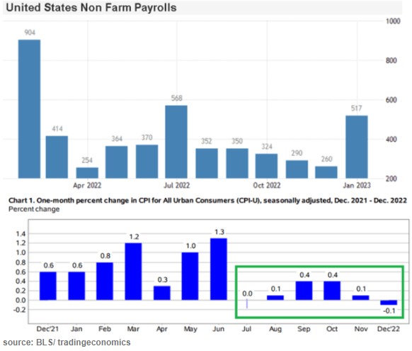
The stock market drools and rips higher at the slightest sign that inflation is abating, since that portends rate cuts instead of rate hikes by the Fed, and a return to the golden days of easy money. But what do the latest data show? Here I’ll show several charts to show what we know so far.
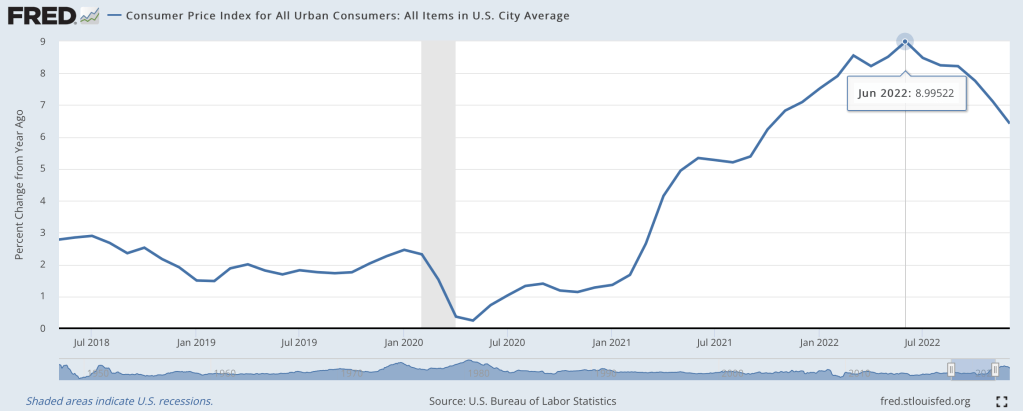
The last couple months’ data points in the lower chart show that inflation (as estimated by CPI) has essentially leveled out and may be starting to decline a little. That is fine but it still leaves inflation far above the Fed’s 2% target. Victor defines a Fed “pivot” not as actually cutting rates, but simply a halt to raising them. By that somewhat anemic definition, sure, a Fed pivot could well come in the next few months. But that leaves rates still very high by recent standards. The real question is when will inflation come down low enough to justify significant rate cuts. The Fed screwed up so abysmally last year with its ridiculous “this inflation is only transitory supply chain issues” that they really cannot afford to relent too soon, and let inflationary psychology take hold.
Side comment: the big “blowout” jobs number for January (last bar on the right, on the top chart above) caused a huge buzz. But there are strong reasons to discount it as an artifact of “ revisions, adjustments, control factors, and recoding “, per Jeffrey Snider.
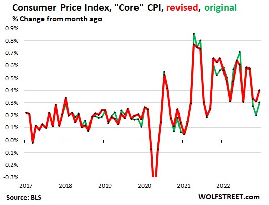
On the other side of the bull/bear divide, Wolf Richter published a glass-half-empty article noting how the Bureau of Labor Statistics recently revised its CPI numbers, and the changes shifted the numbers so as to undermine the argument that inflation has started to drop rapidly:
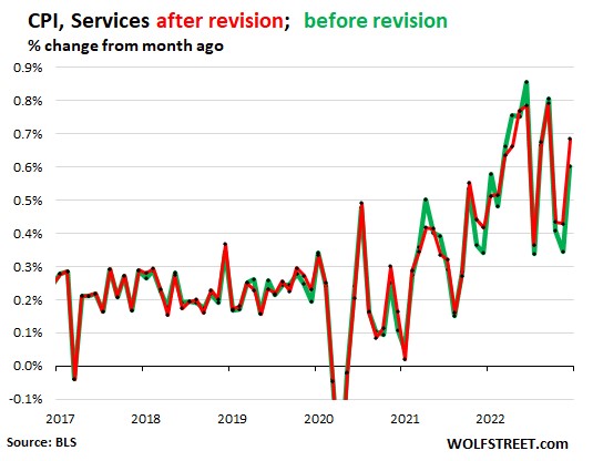
The chart above with revisions (red line) shows core CPI barely declining over the past 9 months or so, and no trend for an acceleration in that decline. The chart below shows CPI for Services (where we consumers spend most of our money, and which is closely correlated to wages) is holding nearly steady around a red-hot 0.55%/month or about 6.6% annualized. It could be longer than the market thinks before there are substantial rate cuts.
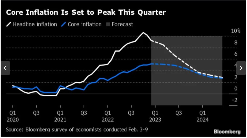
And from the Eurozone, there is this chart, courtesy of Bloomberg via Yahoo, depicting the results of polling economists as to the future course of inflation there:
The consensus view is that inflation in Europe will not approach the 2% target until well into 2024. The European Central Bank is expected to hike by 0.5% in March, followed by another 0.25% to reach 3.25%. (This is much lower than the Fed’s interest rates, but that is probably because the U.S. is still working off the orgy of COVID-related payments that dumped trillions in peoples’ pockets here in 2020-2021). Cuts by the ECB are not expected until the second quarter of 2024.
THIS JUST IN: The January CPI data just came out today (2/14), and pretty much matches up with the picture presented above. Inflation is falling, but ever so slowly, and so it becomes more likely that the Fed will keep its rates higher for longer:
“The Consumer Price Index (CPI) for January showed a 0.5% increase in prices over the past month, an acceleration from the prior reading, government data showed Tuesday. On an annual basis, CPI rose 6.4%, continuing a steady march down from a 9.1% peak last June. Economists had expected prices to climb 6.2% over the year and jump 0.5% month-over-month, per consensus estimates from Bloomberg. …
Core CPI, which strips out the volatile food and energy components of the report, climbed 5.6% year-over-year, more than expected, and 0.4% over the prior month. Forecasts called for a 5.5% annual increase and 0.4% monthly rise in the core CPI reading.”
(For another recent take on the inflation picture, see James Bailey’s The Murky Macro Picture, on this blog).
Last June I wondered if we were seeing the peak of inflation, and by at least one major measure I called the peak exactly:
At the moment, though, I’m feeling more confused than prophetic. The big question a year ago was how long it would take the Fed to get inflation down to reasonable levels, and how much collateral damage they would do to the real economy in that effort. Today most current indicators make it look like they pulled off the miraculous “soft landing”. Inflation over the last 12 months is still high, but over the last 6 months we’re nailing the Fed’s 2% annualized target. This has hit a few sectors of the real economy hard, with housing slowing dramatically and tech doing mass layoffs, but the overall picture is great: GDP growth was around 3% the last 2 quarters, and the 3.4% unemployment is the lowest since 1969.
What’s confusing about this is that we have a hard time believing we really got this lucky. Its like your plane lost power, you diverted course for an emergency crash landing, and once you touch down and find yourself seemingly unharmed you look around and wonder if the plane is about to explode. Consumer sentiment is worse than it was in the depths of Covid; business sentiment has been falling for over a year and is almost down to March 2020 levels. Betting markets forecast a 50% chance of a recession in 2023, and the yield curve is strongly inverted (one of the best predictors of a recession, though the guy who first noticed this says it might not work this time):
Finally, M2 money supply is shrinking for the first time since at least 1960, and I believe the first time since the Great Depression. This bodes well for inflation continuing to moderate, but its also one more indicator of a potential recession.
To sum up, most of the indicators of the current state of the economy look great, while most indicators of its near-term future look awful. So which do we trust?
My guess is that we avoid recession in 2023, but honestly this is mostly the gut feeling of an optimist. There’s no one knock-down piece of data I’d point to in support; its more that things are currently going well, and usually the best prediction is that tomorrow will be like today unless you have a good reason to think otherwise. The main reason people expect a slowdown is because of the Fed’s actions to fight inflation. The Fed itself predicts that they will cause a slowdown, but not a recession. Their most recent summary of economic projections from December predicts GDP growth slowing to 0.5% in 2023 and unemployment rising to 4.6%.
I think the “so what” outlook is also murky. Stocks have already fallen a lot from their highs and a recession already seems somewhat ‘priced in’, so even if I thought one was coming I wouldn’t necessarily sell stocks. On the flip side US stocks are still quite expensive by historical standards, so I don’t want to buy more on the assumption that they’ll rise more on good economic news this year. You might want to lock in decent rates on long-term bonds if you think the Fed will cut rates in response to a recession, but the inverted yield curve shows this is already somewhat priced in. 1-year bonds yielding almost 5% seems decent in either scenario, I have some and I’ll probably buy more, but 5% returns are nothing to get excited about. I’d like to hear suggestions but to me the small direct betting market on a potential recession is the clearest “so what” for anyone who does have a confident view about this year’s macro picture.
Last week I presented a graphic that illustrates the changing average price of homes by state. This week, I want to illustrate something that is more relevant to affordability. FRED provides data on both median salary and average home prices by state. That means that we can create an affordability index. Consider the equation for nominal growth where i is the percent change in median salary (s), π is the percent change in home price (p), and r is the real percent change in the amount of the average home that the median salary can purchase (h).
(1+i)=(1+π)(1+r)
Indexing the home price and salary to 1 and substituting each the percent change equation (New/Old – 1) into each percent change variable allows us to solve for the current quantity of average housing that can be afforded with the median salary relative to the base period:
h=s/p-1
If h>0, then more of the average house can be purchased by the median salary – let’s vaguely call this housing affordability. Both series are available annually since 1984 through 2021 for all 50 states and the District of Columbia. The map below illustrates affordability across states. Blue reflects less affordable housing and green reflects more affordable housing since 1984.
There’s still a few more days left in the year, but at this point it is safe to say, unfortunately, that it was a very bad year for investing. This Google chart shows most of the bad news. Note: nothing in this post is investment advice about the future, just a summary of the past.
The S&P 500, the typical benchmark for US equities, was down 20%. Bonds, usually a safe haven, were down over 14% as measured by the Vanguard Total Bond fund (more on bonds later).
Gold, the traditional hedge against bad times, was flat. I guess that’s not so bad. But gold is also traditionally considered a hedge against inflation, and inflation will probably end up being somewhere in the range of 5-7% this year (depending on your preferred index). So in real terms, even gold was down. And the supposed new hedge against fiat currency? Bitcoin is down 65% (crypto has other potential redeeming features, but inflation hedging was supposed to be one of them).
Did anything do well? Oil was basically flat too, starting and ending the year in the $75-80 range. Of course, oil companies did very well this year — Exxon is up over 70%, since prices were elevated for much of the year. But picking individual stocks is always fraught with danger. For example, you might think electric car companies would have done well in the past year, given the high gas prices for much of the year, yet Tesla was down over 70% (I won’t speculate here about why, but it may have other idiosyncratic explanations).
There is one boring, sleeper investment that would have earned you a decent return. Not a massive return, but one that will likely be slightly higher than the rate of price inflation (once we have complete inflation data). And the investment is totally safe, and by April you would have known exactly your rate of return for the full year: 8.5%.
That investment? Series I Savings Bonds, issued by the US Treasury. Series I Bonds pay a fixed rate of return for 6 months, which you know at the time you buy it. The interest rate rests every 6 months based on the rate of CPI inflation. If you invested in these bonds in January 2022, you would have earned 3.56% for 6 months, and then you would have earned 4.81% for the second half of 2022. And this was all known as early as April 2022 (though not officially confirmed by the Treasury until May).
While a lot of people were talking about the possibility of high inflation at the beginning of 2022, I don’t recall many people advising anyone to buy these bonds. It’s not a super well known investment, and not super exciting. Plus each investor is capped at $10,000 per year in most cases, so you couldn’t have moved all your money into I Bonds. Another restriction is that you lose some of the interest if you pull the money out before 5 years.
Still, this was one bright spot in an otherwise terrible year for most broad investment types.
On Twitter, folks have been supporting and piling on to a guy whose bottom line was that we are able to afford much less now than we could in 1990 (I won’t link to it because he’s not a public figure). The piling on has been by economist-like people and the support has been from… others?
Regardless, the claim can be analyzed in a variety of ways. I’m more intimate with the macro statistics, so here’s one of many valid stabs at addressing the claim. I’ll be using aggregates and averages from the BEA consumer spending accounts.
I make a hobby of reading, and sometimes acting on, investment advice, particularly regarding high-yielding securities (many of my holdings are now yielding over 10%/year). One of the best authors on the Seeking Alpha investing site writes under the name of Colorado Wealth Management. He mainly writes on REIT (real estate investment trust) stocks, but recently opined on the wisdom of raising interest rates to combat inflation regarding some of the major components of CPI.
His article, Why High Yields Will Be Popular Again, may be behind a paywall for some readers, so I will summarize some key points. He kind of sidesteps the influence of massive federal deficit spending that injected trillions and trillions of new dollars into the economy for COVID, which I think has been the major driver for this inflation; and the reignited deficit spending which is already on the books for November and likely even huger for December of this year. However, he does make some interesting (and new to me) points regarding food prices in particular.
He sees the price 2021-2022 price increases in some major food items as being driven by supply constraints, rather then by excessive demand. Specifically eggs, coffee, and vegetable oils have been hit by exogenous factors which have constrained supply; raising interest rates will not help here, and may even hurt if higher rates make it harder for farmers to recover and re-start high production. I’ll transition to his charts and mainly his excerpted words, in italics below:
Avian Flu, Culled Hens, and the Price of Eggs
The background here is that tens of millions of chickens, including egg-laying hens, have been deliberately killed (“culled”) this year in an attempt to slow the spread of avian flu. This, of course, cuts into the egg supply and raises egg prices. We went through a similar cycle in 2015 with avian flu, where culling led to a rise in egg prices, but then prices fell naturally as a new crop of chicks grew into egg-laying hens. Similarly, the current shortage in eggs should correct itself:
Raising interest rates has never produced additional eggs. Raising interest rates and driving a recession (with larger credit spreads) only makes it more difficult for farmers to get the funding necessary to replace tens of millions of hens that were culled to slow the spread of the avian flu….If interest rates don’t work, what will? The cure for high prices is high prices. We can see how it played out with the Avian flu in 2015:
Is Jerome Powell going to lay even one egg? Probably not.
Are farmers going to focus on turning their chicks into egg-laying hens? Absolutely.
Since eggs go into several other products, it drives inflation throughout the grocery store. Even if a product doesn’t use eggs, the drop in egg production means more people eating other foods.
Drought in Brazil and the Price of Coffee
Coffee prices have been rising rapidly. Well, domestic prices have been rising rapidly. Global prices actually declined since peaking in February 2022:
So, what drove the price up? Brazil normally produces over 35% of the world’s coffee and bad weather in Brazil (not to mention the pandemic impacts) drove dramatically lower production in 2021. As the shortfall in production became evident, global prices began rising rapidly. That’s why the global [wholesale] prices were ripping higher in 2021, not 2022. However, [retail] consumers are seeing most of the impact over the last several months.
War in Ukraine and the Price of Sunflower Oil
Margarine requires vegetable oil. Soybean, palm, sunflower, and canola oil are the key ingredients. What country produces the most sunflower oil? Ukraine. This is one of several inflationary impacts of the war. You can see the impact of reduced supply in the following chart:
Government Bungling in Indonesia and the Price of Palm Oil
What happened to palm oil? How could it soar so much and then fall so hard?
The first issue is that dramatic increases in the price of fertilizer made production more expensive. … That contributed to a reduction in supply. However, Indonesia is the world’s largest exporter of palm oil. Yet exports of palm levy were subject to a huge levy. That made exporting far more expensive. Despite the levy, it was still worth producing and exporting palm oil. Then the Indonesian government decided to simply ban exports over concern about higher domestic prices. Banning exports for a country that produces 59% of the world’s total palm oil exports had a predictable impact.
If you guessed that the supply of palm oil couldn’t be sold domestically, you’d be right. The ban was lifted. However, it was only after:
“High palm oil stocks have forced mills to limit purchases of palm fruits. Farmers have complained their unsold fruits have been left to rot. There were 7.23 million tonnes of crude palm oil in storage tanks at the end of May, data from the Indonesian Palm Oil Association (GAPKI) showed on Friday.“
With palm oil prices at all time-record highs, nearly triple the level from two years prior, the supply was left to rot. Each business tried to make the best decision they could, given the ban on exports. Rather than record profits for mills and record profits for farmers, the produce was wasted. That’s supply constraints for the global market, and it destroys the local economy.
Global prices are plunging now as mills seek to unload their storage. As bad as the higher prices were for the rest of the world, no one suffered worse than the farmers whose product became worthless as a result of government failure.
Contrary to today’s popular opinion, higher interest rates won’t do anything to improve production of vegetable oil.
But since then, we’ve got some better news. The chart below shows the data (note: I’m using wages for private production and non-supervisory workers here, rather than for all private workers in the May post).
While the overall inflation picture still looks bad, with 7.1% annual inflation in the latest report, we also see that in the past 5 months wage growth has exceeded CPI growth. It’s also been true compared with the PCE price index for the past 4 available months (November PCE data won’t be available until next Friday). Inflation has cooled slightly in the past few months, while wages have continued to grow.
This all means that real (inflation-adjusted) average wages in the US have been rising consistently since June 2022. Finally, some good news!