Myron Scholes was on top of the world in 1997, having won the Nobel Prize in economics that year for his work in financial economics, work that he had applied in the real world in a wildly successful hedge fund, Long Term Capital Management. But just one year later, LTCM was saved from collapse only by a last-minute bailout that wiped out his equity (along with that of the other partners of the fund) and cast doubt on the value of his academic work.
Roger Lowenstein told the story of LTCM in his 2001 book “When Genius Failed“. I finally got around to reading this classic of the genre this year, and I’d say it is still well worth picking up. The story is well-told, and the lessons are timeless-
Beware hubris
Beware leverage
Bigger positions are harder to get out of (especially once everyone knows you are in trouble)
In a crisis, all correlations go to one
Past results don’t necessarily predict future performance
Sometimes things happen that are very different from anything that happened in your backtest window.
The book came out in 2001 but it presages the 07 financial crisis well- not about mortgage derivatives specifically, but the dangers of derivatives, leverage, using derivatives to avoid regulations restricting leverage, and over-relying on mathematical models of risk based on past behavior. If Fed had let LTCM fail, could we have avoided the next crisis? Perhaps so, as their counterparties (most major Wall Street banks) who got burned would have been more careful about the leverage and derivatives used by themselves and their counterparties, and regulators may have taken stronger stances on the same issues.
Perhaps some more recent well-contained blowups foreshadow the next big crisis in the same way, like FTX or SVB?
Myself and a student coauthor worked hard on our article that is now published in Social Science History. It’s the first modern statistical analysis of the historical deaf population. We bring an economic lens and statistical treatment to a topic that previously included much anecdotal evidence and case study. We hope that future authors can improve on our work in ways that meet and surpass the quantitative methods that we employed.
Our contributions include:
A human capital model of deafness that’s agnostic about its productivity implications and treats deaf individuals as if they made decisions rationally.
A better understanding of school attendance rates and the ages at which they attended.
Deaf children were much more likely to be neither in school nor employed earlier in US history.
The negative impact of state ‘school for the deaf’ availability on subsequent economic outcomes among deaf adults. We speculate that they attended schools due to the social benefits of access to community.
Deaf workers did not avoid occupations where their deafness would be incidentally detectable by trade partners, implying that animus discrimination was not systemically important for economic outcomes.
Tariffs are going up to levels last seen in the 1930 Smoot-Hawley tariffs that helped kick off the Great Depression:
Tariffs are taxes- roughly, a national sales tax with an exemption for domestically-produced goods and services. I think the words make a difference here- “raising tariffs on countries who we run a trade deficit with” just sounds abstruse to most people, while “raising taxes on goods bought from firms in net-seller countries” sounds negative, but they are the same thing.
Of course, in this case the plan is to raise taxes to at least 10% on goods from all other countries even if they aren’t net-sellers, and raise taxes up to 49% on those that are. This is not a negotiating tactic. We know this from the math- the new tax formula uses net imports from a country rather than a country’s tariff rates, so a country could cut their tariffs on US goods to zero today and it wouldn’t necessarily reduce our “reciprocal” tariffs at all; at best it would reduce them to 10%. We also know it isn’t about negotiating because the administration says it isn’t. Their goal, obviously, is to reduce trade, not to free it.
They say they are doing this to bring manufacturing back to America and to promote national defense. But American manufacturers don’t seem happy. Even before the latest huge tax increase, trade war was their biggest concern:
The National Association of Manufacturers Q1 2025 Manufacturers’ Outlook Survey reveals growing concerns over trade uncertainties and increased raw material costs. Trade uncertainties surged to the top of manufacturers’ challenges, cited by 76.2% of respondents, jumping 20 percentage points from Q4 2024 and 40 percentage points from Q3 of last year.
The National Association of Manufacturers responded to the latest tax increase with a negative statement; so even the one major group that might have benefitted from tariffs is unhappy. Foreign producers and US consumers will of course be very unhappy. I think Trump is making a huge political blunder alongside the economic one- he got elected largely because Biden allowed inflation to get noticeably high, but now Trump is about to do the same thing.
I also see this as a huge national security blunder. For tariffs on China, I at least see their argument- we should take an economic hit today in order to become less reliant on our peer-competitor and potential adversary. But the tariffs on allies make no sense- they are hitting the very countries that are most valuable as economic and/or military partners in a conflict with China, like Canada, Mexico, Japan, South Korea, Vietnam, India, and Taiwan (!!!). One of our biggest advantages vs. China has been that we have many allies and they have few, and we appear to be throwing away this advantage for nothing.
What can you or I do about this? Stock up on durable goods before the price increases hit. Picking investment winners is always hard, but things this makes me consider are gold, stocks in foreign countries that trade little with the US, and companies whose stocks took a big hit today despite not actually being importers. Finally, we can try nudging Congress to do something. The Constitution gives the power to levy taxes to the legislative branch, but in the 20th century they voted to delegate some of this power to the executive. Any time they want, Congress could repeal these tariffs and take back the power to set rates. I have some hope they actually will- just yesterday the Senate voted to repeal some tariffs on Canada, and more votes are planned. The alternative is to risk a recession and a wipeout in the midterms:
How much does the US and our trading partners adhere to the principles of free trade? The Fraser Institute’s Economic Freedom of the World report includes a category that helps to answer this question. Fraser’s measure includes not just tariff rates, but also non-tariff barriers, trade regulations, black market exchange rates, and controls on the movement of capital and people. Each country is assigned a score from 0 to 10, with 10 being the most freedom to trade internationally.
Overall, the US gets a pretty good score, slightly over 8 out of 10, which ranks us as the 53rd most free trading country in the world (data from 2022). That’s pretty good, but clearly not the most open: 52 countries have more trade freedom! Here’s how the US and our 10 largest trading partners look on that measure (I’ve truncated the axis to show roughly the current range of country scores worldwide):
Countries/regions with the highest scores on this measure are Hong Kong and Singapore, and almost every European country scores higher than the US.
What if we just look at tariffs? The US has a slightly higher score at 8.3 out of 10, but our rank on tariffs is slightly lower at 59th most free in the world (this includes not just tariff rates, but also the standard deviation of tariff rates and revenue from the trade sector).
Relative to our largest trading partners, the US does look better on this subcomponent for tariffs, but is still lower than some of our trading partners (note the axis is slightly different than the first chart, to once again roughly show the international range on this measure):
Finally, we might be interested in how much these scores have changed over time. You might sometimes hear that the US has opened up more to trade, while the rest of the world has moved in the opposite direction. This might be true on some margins, but not overall according to the Fraser scores. I use 1990 as the baseline, which is before a lot of the free trade agreements and WTO changes that would happen over the next decade or so (Fraser has no data for Vietnam in 1990, so they are excluded):
Overall, the US and our major European trading partners have reduced the ability of their citizens to trade internationally, while places like China and India have opened up massively to trade. In 1990 China had a mean tariff rate of 40% and India’s was a whopping 79%. Today their tariff rates are still higher than the US: 7.5% in China and 18% in India, compared with 3% in the US. But they are the ones who have massively opened up their economies to international trade, when we consider all aspects of international trade, even if this opening up isn’t as complete as the US. The US ranked as the 12th highest on Fraser’s freedom to trade internationally component in 1990, but is down to 53rd in the most recent data.
While I was in southern Vermont last month, I visited a maple syrup production operation. The actual shed is called a “sugar house”, and the operation is called sugaring, even though the main product is the syrup.
When I was a boy, my dad hung some buckets on taps into the two maple sugar trees in our yard to collect the sap. He boiled the sap in a big old copper tub/kettle set on cinder blocks over a wood fire. You do have to boil and boil, since it takes about 45 gallons of sap to make one gallon of syrup. The other 44 gallons is boiled off by the heat of the burning firewood.
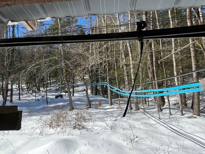
David Franklin’s operation in Guilford, VT (near Brattleboro) is much more efficient than that. The sugar house is set at the base of a long slope. The sap from the taps in the trees goes into tubing that connects into more tubing which goes downhill, so hundreds of trees feed into the long blue tubing shown here, which goes into collection tankage:
The tanks and pumps are arranged to optimize storage and then allow gravity flow into the equipment in the sugar house:
There is a big vat in the shed, around 4 ft wide x 12 ft long, where the sap is boiled by a wood fire kept going in a lower chamber.
The men have been cutting and splitting wood for months, to get ready for the sugaring season. Running this operation takes two or three people. Typically, there is one man keeping his eye fixed on the temperature and other properties of the sap that is being boiled, to make sure that the syrup is drawn off at the right consistency and is not overcooked. The syrup should be drawn off when the temperature reaches 219 degrees F (104 C). Another man keeps a timer set, and every six minutes he opens the door to the fire box and throws in half a dozen pieces of wood to keep the fire burning hot:
There is also filtering and handling of the drawn-off syrup, and checking the tankage outside. As a (retired) chemical engineer, I appreciated an improvement that was added to the boiling operation. Originally, all the steam from the boiling just went into the air of the shed, making it clammy and causing condensation from the roof to drip down onto workers’ heads. The heat of this steam was basically wasted. But they added a fairly high-tech “Steamaway” heat exchanger that sits on top of most of the boiling vat. The steam rises up through channels of incoming sap from the outside. The cool sap is warmed by the rising steam to around 194 F before entering the boiling vat. This preheating means less firewood is needed to make the syrup. Also, much of the steam is condensed into hot water which can be used for washing operations. A bonus is that much less steam ends up in the atmosphere of the shed, so no more dripping onto heads.
The owner, David Franklin, and his family had the vision for this operation. They built the large shed that houses the operation themselves, and invested in the expensive equipment. David is an old-school farmer, of the type skilled in every aspect of workmanship so they can do their own welding and building and equipment repair instead of paying others to do it. Keeping a large farm running smoothly is a complex task that takes more energy and practical know-how than most suburbanites or city dwellers can imagine. The other men running the sugaring operation are all smart and efficient and hard-working, and all retired from responsible, skilled professions. It seems they do the sugaring largely out of the enjoyment of doing a job well alongside worthy companions.
However, they are all over sixty years old. They can’t keep it up indefinitely since there is a lot of physical labor involved, yet the operation can’t afford to hire young people who would do the work just for money.
It is not clear to me, therefore, what the future of operations like this will be in 15 years, as this current generation of workers ages out. Unlike a lot of production, maple syrup making cannot be simply outsourced to Asia.
Anyway, David Franklin’s syrup is delicious. You can buy some on-line here. Or if you swing by the Franklin Family Farm in Guilford, you can also get some farm fresh eggs and certified organic hamburger, and stew meat.
Certificate of Need laws require many types of health care providers to obtain the permission of a state board before they are allowed to open or expand in many US states. But there is a lot of variation from state to state in which types of providers are covered by these laws. I put together this map to show the 15 states that require new home health care agencies to obtain a Certificate of Need:
CON states see reduced competition, which tends to be bad news for patients and new entrants, but good for existing providers and the private equity firms consideringbuying them.
But some CON states like Rhode Island have proposed reforms that would exempt home health agencies from the CON process, putting them in line with the majority of states that put new entrants on an even footing with incumbent providers.
For your upcoming summer road trips, even with a family, I recommend you check out the Acquired podcast. Each episode is the history (or partial history) of one business, told in a way that is entertaining and informative on many levels.
I was first introduced to the podcast when someone recommended the episode on Costco. It’s 3 hours long. I thought to myself “Really? I’m interested in Costco, but isn’t 3 hours a bit much?” But I had a long road trip, so I gave it a try. I was floored by how much I learned about Costco, the history of retail in the US, and the connections to other businesses. For example, Sam’s Club, which I thought was just kinda doing the same thing as Costco in different geographic areas, but no — Sam Walton copied Costco, as well as many other ideas from Sol Price (what a great name for a retailer!), the man behind the companies that would eventually become Costco today.
If you are at all interested in the history of business (especially mid-to-late Twentieth century businesses, though they do have one on Standard Oil), you will love this podcast. But I have found that the podcast is also great for children — well, at least if you have a roughly eleven-year-old boy. They will have many questions, so you may stop the podcast often, but that’s OK with me.
I think the reason some of the episodes appeal to children is because many of the stories focus on a single entrepreneur that started a business, and the hosts always spend a little bit of time on the childhood of those entrepreneurs. Often, they were entrepreneurial or innovative in some way as a child. For example, Warren Buffett in the first Berkshire Hathaway episode (there are 3 episodes on BH, totaling over 9 hours!), selling sticks of gum and cans of Coke door-to-door. Or Ingvar Kamprad (founder of IKEA, told in a 3-hour episode) selling matchboxes and fountain pens. Or the young Bill Gates being privileged enough in middle school to have access to computers, but also turning this into a business in high school (told in the first of two episodes on Microsoft, totaling once again over 9 hours).
As I mentioned in the above paragraph, if you thought that 3 hours on Costco was a lot, just wait until you listen to some of the others. You probably can’t imagine yourself listening to 9 hours on the history of a single company, much less your kids following along too. But I highly recommend that you give it a shot.
Here I’ll outline a model of the optimal protein consumption bundle. What does this mean? This means consuming the quantities of protein sources that satisfy the recommended daily intake (RDI) of the essential amino acids and doing so at the lowest possible expenditure. Clearly, this post includes a mix of both nutrition and economics. Since a comprehensive evaluation that includes all possible foods would be a heavy lift, here I’ll just outline the method with a small application.
Consider a list of prices for 100 grams of Beef, Eggs, and Pork.* We can also consider a list that identifies the quantity that we purchase in terms of hundreds of grams. Therefore, the product of the two yields the total that we spend on our proteins.
Of course, not all proteins are identical. We need some characteristics by which to compare beef, eggs, and pork. Here, I’ll use the grams of essential amino acids in 100 grams of each protein source. Because there are different RDIs for each amino acid, I express each amino acid content as a proportion of the RDI (represented by the standard molecular letter).
Then, we can describe how much of the RDI of each amino acid that a person consumes by multiplying the amino acid contents by the quantities of proteins consumed.
Our goal is to find the minimum expenditure, B, by varying the quantities consumed, Q, such that the minimum of C is equal to one. If the minimum element of C is greater than one, then a person could consume less and spend less while still satisfying their essential amino acid RDI. If the minimum element is less than one, then they aren’t getting the minimum RDI.
How do we find such a thing? Well, not algebraically, that’s for sure. I’ll use some linear programming (which is kind of like magic, there’s no process to show here).
The solution results in consuming only 116.28 grams of Pork and spending $1.093 per day. The optimal amino acid consumption is also below. Clearly, prices change. So, if eggs or beef became cheaper relative to pork, then we’d get different answers.
In fact, we have the price of these protein sources going back almost every month to 1998. While pork is exceptionally nutritious, it hasn’t always been most cost effective. Below are the prices for 1998-2025. See how the optimal consumption bundle has changed over time – after the jump.
I never thought of myself as a businessman- until 2015 when the IRS told me I was, and that I therefore needed to pay them more money to cover the self-employment tax. Naturally I was confused and angry about this at first, but in the long run it turns out they were doing me a favor.
If you make a tiny amount of 1099-MISC or 1099-NEC income on occasion, the IRS is probably* fine with characterizing this as ordinary income from a hobby. But if you earn 1099 income at all regularly, they will likely want to characterize you as a business, and want you to pay a self-employment tax similar to the payroll tax that W2 employees pay (though it will look higher to you, since you will pay both the employee and employer halves of the tax). If you make an intermediate amount of 1099 income, you might have the choice of whether to call this hobby income or business income; I had thought it would be better to avoid the complications and extra taxes of being a business, but it turns out that being a business unlocks new opportunities for deductions than can far outweigh the self-employment tax.
For example, a home office, business-related travel expenses, and advertising expenses can be deductible. For a writer, this could cover conferences, website expenses, computers, and much more. It also means you can start a SEP IRA– in addition to a personal IRA if you like. This alone could allow you to deduct thousands of dollars in income per year (technically up to $69k if you make at least $276,000 per year in business income, though if you make that much, you’re the one who should be giving me advice). The SEP IRA has the advantage over a personal IRA of a much higher income limit and, potentially a higher contribution limit, though again the beauty is that you don’t have to choose- you can just do both.
While this post is mainly about business, I also think regular IRAs might still be underrated. I didn’t start one until 2022, but I should have done it much earlier. First I thought I was too poor (low income, then higher income but with student loans to pay off first), then I thought I was too rich (above the income limits). It turns out though that you can still start a personal IRA even when you are above the income limits- it just means you only get one tax benefit instead of two, but that one tax benefit is still pretty good.
Every IRA has the benefit of investments growing tax-free; if you meet the income limits then IRAs get the additional benefit of avoiding income taxes either when you put the money in (for traditional) or when you pull it out (for Roth). But even if you “only” get the benefit of tax free growth, that can still be a huge monetary benefit depending on your investment strategy. It is also a big time benefit- every taxable brokerage account means at least one** extra tax form to deal with every year, while an IRA account avoids this.
Another great benefit to IRAs (SEP or regular) is that you can still start one now and make contributions for the 2024 tax year. I was just doing my taxes and kicking myself for not doing some things differently back in 2024 when it would have helped; but IRAs are like a form of time travel where you can still go back and fix things, at least until April 15th.
*Disclaimer- Not official tax advice, I’m not an accountant, I’m just a 37 year old guy with lifetime 1-1-1 record against the IRS. Three times they have told me I owed them more than I paid on a tax return. Once I won (I told them I owed nothing and explained why, and they agreed). Once I lost (I told them oh shit, you’re right and paid them). For the story I started this post with, I call it a draw (they told me I owed them X, I told them I owed nothing and explained why, then they told me I actually owed them 1/3X and I just paid it).
**More than one if like me you accidentally invest in a partnership and as a resultget a K-1 on top of the usual 1099-DIV for that overall brokerage account
Everyone is talking about the price of eggs. Even the President. That’s despite the fact eggs, on average, constitute about 0.1% of consumer spending (according to the Consumer Expenditure Survey for 2023). Even so, economists always get excited when people talk about prices.
On prices at the current moment, I wrote a blog post for the Cato Institute looking at the relevant supply and demand factors, and trying to explain why wholesale egg prices are falling so quickly. When will these falling wholesale prices translate into lower retail prices? The NY Times asked this question, and I tried to answer it for them (answer: perhaps in a few weeks).
But let’s step back from the current moment and take a longer-term perspective on egg prices. This chart shows the long-run real price of eggs, measured in terms of how much time an average worker would need to work to afford 1 dozen eggs: