Lately I’ve been experiencing personal advertising barrages. Sometimes, I actually buy a product online before realizing that I had been living in a fake information environment complete with fake AI-generated product reviews. What I want for myself right now is to hear more product reviews from real people. I’m not against earning money from affiliate links, but I will earn nothing from this post. Here’s what I’m using right now.
Sourdough Bread Baking gear kit – I got a kit with “bannetons” (if you’re not interested, don’t ask) back when I decided to get into sourdough baking. The appeal was the savings from buying it all in a bundle (i.e. “dough whisk,” etc.). The investment is worthwhile if you are going to make your own sourdough bread. As I wrote earlier, this is a big investment of time. I do not recommend starting the process at all if you will make homemade bread less than 5 times a year.
Homemade Driveway Pickleball Court – if you have a paved level driveway or large patio, you might be able to create a non-regulation-sized Pickleball court. It used to be that billionaires could have their own tennis court and the rest of us could have ping pong tables. Now there is a Third Thing. You will likely need to rig up nets as a backstop by piecing together sports gear meant for baseball backstops. The actual mid-court net can come cheap from Amazon (I went with 14 feet wide). A small Pickleball court is fun for children/teens, but adults will prefer going to a real court where you can hit the ball much harder. Pickleball facilities are appearing all over the country and many cities now provide free courts in parks and gyms.
Canvas LMS and New Quizzes – Samford University uses Canvas, and I have always liked the interface. Finally, in the year 2026, I have decided to build a new course using “New Quizzes” instead of Classic Quizzes. The rollout of this product has been so awkward, but if you are starting from scratch, Item Banks and “New Quizzes” works well now.
The book Misbehaving by Richard Thaler is about his career and the field of Behavioral Economics. I think anyone could learn from how the field evolves in the face of new evidence. It’s been helpful for me with my project on LLMs and financial decision making.
Codex – Thanks to Codex, I can finally do something teaching-related that ChatGPT had failed to do for me in summer of 2025. Codex can write straight to a subfolder on my computer, with coaching. For technical details, follow Aniket. What I used to say to people who wanted to “learn computer programming” is that it’s impossible to learn from reading books. Build something that you care about, even if it is just a tiny website. I would say the same for Codex. Use it to build something, even if that’s something for your personal life like a sourdough bread baking scheduling assistant.
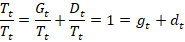
I wrote a post about debt delinquency way back in 2023. At the time, people were concerned about an impending recession. I argued that, if there were to be a recession, then debt defaults would not be the cause. The delinquency numbers were low and stable. Though delinquencies did rise some, no recession materialized. I’ll say a little more about how to interpret the numbers and give an update.
There exists a stock of loan balances. Most loans are in good standing with scheduled payments being made. This is good debt. Some debt is delinquent, meaning that payments are not being made. This is bad debt. What happens to bad debt? Sometimes those borrowers catch up on their payments and their loan balances switch to being good debt. Borrowers can also transform their bad debt into good debt by restructuring it with new terms. Temporary administrative adjustments can also change the classification from bad to good debt. At any moment, the total stock of debt is composed of good and delinquent debt. We can express these as proportions of all debt.
But the lenders also recognize that not all bad debt will be made good. For one reason or another, sometimes borrowers just don’t repay. It doesn’t make sense to list delinquent debt as a balance sheet asset if it will never be paid. Rather than accumulating more bad debt every year that will never be paid, banks ‘charge off’ some of that bad debt. Charging off bad debt lets banks realize losses and makes for a more realistic balance sheet. The flow of charge offs is deducted from the stock of delinquent debt.
If banks charge off some delinquent debt, then the proportion of delinquent debt should be lower in the next period, all else constant. But all else isn’t constant. Some good debt will become delinquent and some delinquent debt will become good. Though, after a charge off it’s true that delinquent debt is less than it would have been otherwise. Below, I denote the net flow of good & bad debt transitions as ‘r’ and solve for it.
The variable ‘r’ is the net transition to good or to bad debt after charge offs. If r>0, then net new delinquencies occurred faster than banks realized their losses with charge offs. Is that good or bad? A higher rate of net new delinquencies can be bad because it reflects that people aren’t paying their contractually obligated debts. But it can also be good if the new delinquencies are a result of experimental entrepreneurship and an innovative economy. The bad interpretation is probably relevant cyclically as a short or medium run variable. The innovation interpretation probably changes in the medium or long run as a structural variable.
Let’s look at the numbers. There are several categories of loans, but let’s start with just consumer loans.
The delinquency rate is higher than it was after the pandemic stimulus checks, but is still lower than historical rates. The charge off rate is also near the historical average. Below right graphs ‘r’ and it’s always greater than zero, meaning that there’s always more people transitioning from good debt to delinquency than the reverse. There was more debt becoming delinquent as post-pandemic interest rates rose, but net delinquency transitions have been falling since 2024q1 until 2026q1 when they mildly up-ticked. In other words, the aggregate consumer debt picture looks pretty average except for the secular decline in rates of delinquency. I don’t know why that is. Maybe banks have gotten better are identifying risk? Or maybe newer forbearance rules are friendlier to borrowers who need to pause payments?
Below are the same two graphs for single-family residential mortgages. These delinquencies are close to historical lows and charge offs are average. However, the ‘r’ graph below has been rising for a decade and is currently at a twelve-year high. Since the data only goes back so far, it’s hard to say whether the low numbers of the late twenty-teens were an aberration of the post GFC, low interest rate environment or whether we should be concerned. It is worth noting that the ‘r’ values are often below zero, which means that people do often come back from delinquency. We know it’s not simply charge offs doing the work there since the charge off rate has been steady and very low.
Non-alcoholic beer always used to mean O’Doul’s, which is a poor substitute for real beer.
Then Athletic Brewing cracked the code of how to make something that tastes much more like real beer.
Their new process and the higher demand that came with it have led to an explosion in variety, with many new and established breweries offering their own new NA beers.
I tried many of these recently when my wife was pregnant, and was pleased enough that I plan to keep drinking them. Partly as an occasional healthier substitute for real beer (less alcohol also means fewer calories), and partly as a nice drink to have with lunch or in the afternoon when I wouldn’t normally drink beer.
My recommendations:
Re-created the category, pretty good taste, easiest to find: Athletic Brewing
Best NA version of a beer you know: Guinness
Best NA beer from a brewery you probably haven’t heard of: Collective Arts Brewing, Emerald Dark
“Spirituous liquors might remain as dear as ever, while at the same time the wholesome and invigorating liquors of beer and alemight be considerably reduced in their price.” -Adam Smith
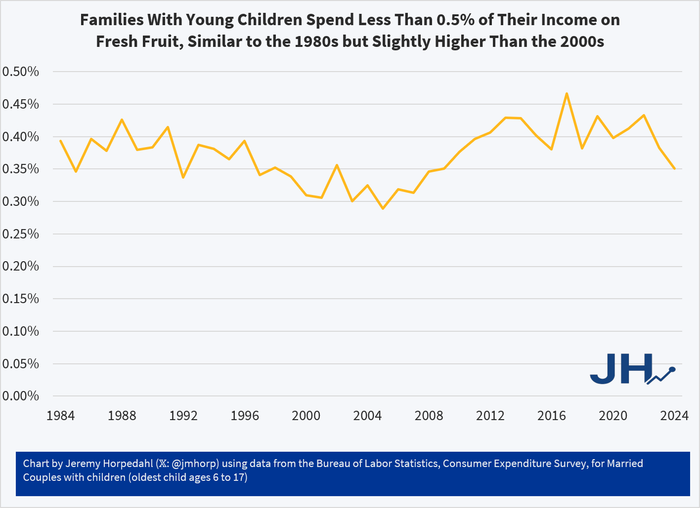
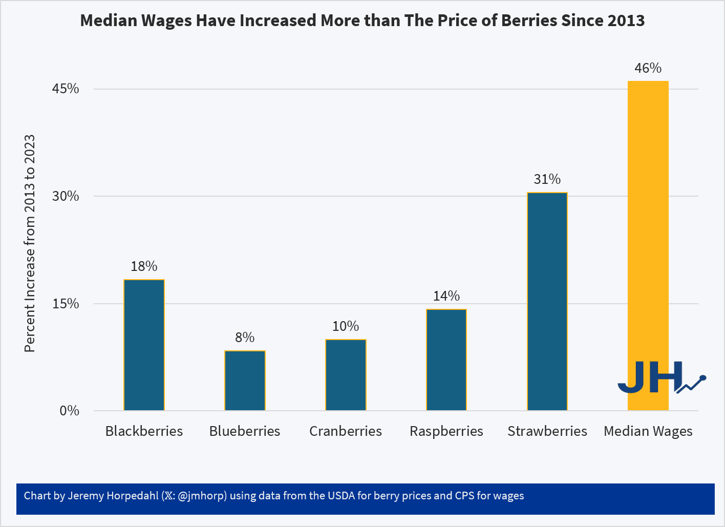
The Washington Post recently ran a fun, data-filled article on berry consumption and parenting. Lots of good tidbits in the article, including that Americans eat a lot more berries than in the recent past, and that a lot of the availability is thanks to foreign trade and imports. But despite being somewhat light-hearted, the article does seem very negative, especially in the title and introduction, about how parents are spending a lot of money on berries.
First things first, are berries breaking the budget for parents? Probably not. While the Consumer Expenditure Survey doesn’t give us data on specific types of berry spending, the broader category of Fresh Fruits is a very small share of consumer spending. It has pretty consistently consumed between 0.30% and 0.45% of income for families with children over the past 4 decades. That’s less than $1 out of every $200 of income. True, there has been a slight rise since over the past 20 years or so, but this is still a small share of the budget.
On average, families with children are spending around $600 per year on Fresh Fruit. And that’s all fruit, not just berries! Just a little over $10 per week. But even for an item that families spend a small share of their income on, such as eggs, perhaps the fact that prices have increased so much recently makes families stand up and notice. Berry spending might seem out of control, even if it’s a small share of income.
What does the price data on berries show? My usual source on this the BLS average price data that forms the basis for the CPI, but they only publicly publishes a series for strawberries, not the other famous berries (blueberries, raspberries, etc.). There is one chart on prices in the WaPo article, but it only compares strawberries to bananas over time (they got both of these from BLS). Because banana prices have been very stable in nominal prices over time, it looks like strawberry prices are exploding! But it’s really more notable that banana prices haven’t rise.
USDA does have some fruit and vegetable specific retail price data, but it only goes from 2013 to 2023. That’s shorter than I would normally like, but it can give us a clue about whether there has been some recent explosion in berry prices. And ending in 2023 isn’t ideal either, but overall inflation has been moderate since 2023, so it’s probably an OK source to use. Here’s what the data shows (prices are for fresh berries, except cranberries which are for dried):
Relative to median wages, berries of all kinds are now more affordable than a decade ago. Parents may still feel squeezed by all the berries their kids are eating, but in terms of affordability and share of the family budget, there is probably no need for a Berry Panic.
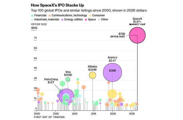
Here is a graphic that compares the size of the initial public offering (vertical axis) and the total company market cap (size of circle) of SpaceX to everything that has come before:
Elon Musk’s space launch/AI conglomerate spin-off SpaceX went public on Friday. Retail investors were all over it like a pack of starving dogs, driving up prices of SPCX from its opening $162 to $192 as of the close Monday. This has been grand theater, with Musk serving up signature visions of gargantuan total addressable markets, while investors are in fact getting crumbs of a money-loser. In the restaurant biz, this is known as selling the sizzle instead of the steak.
Let us pause for a reverent moment to savor the grand vision used to sell SpaceX: making humanity multiplanetary by dramatically lowering the cost of access to space. It extends beyond launch services into global communications (via Starlink), space infrastructure, in-space manufacturing, resource extraction, transportation, and ultimately a potential Mars economy—expanding from billions to trillions of dollars in theoretically addressable markets. Ooh, ahh, who would not want a piece of that?
Well, there are some problems here. It is hard not to splutter when trying to explain it, it is so bad for investors. I will just call out three issues I see:
( 1 ) Governance: You Own It But Can’t Influence It The IPO float represents roughly 4-5% of total shares, so we the people only get a sliver of the company. But it gets worse. Public shareholders receive Class A shares with one vote each, while Musk holds Class B shares carrying ten votes each, giving him approximately 85% voting control. More unusually, the company bylaws explicitly prohibit shareholder proposals — meaning investors cannot even put advisory resolutions to a vote. This is governance subordination beyond what even Zuckerberg imposed on his investors.
( 2 ) Valuation: Priced for Perfection Without Profits There is no price/earnings ratio because there are no earnings. At $2 trillion, SpaceX trades at approximately 20 times REVENUE. That price/sales is not unheard of for a small, fast-growing software company with almost no capital requirements (think: early-stage Amazon, Google, Palantir, etc.). But it makes no sense to apply it to a capital-intensive hardware and infrastructure business with negative GAAP earnings. Starlink is growing rapidly but requires continuous heavy capital expenditure to maintain and expand its satellite constellation. And SpaceX faces meaningful competition for orbital launches from Blue Origin, ULA (for military missions), maybe Rocket Labs, and the Chinese (for non-West payloads). And, if you dig into it, over 90% of their proposed addressable market is not space at all, but enterprise AI (!!). SpaceX pitches a total addressable market of $28.5 trillion, with AI opportunities alone accounting for $26.5 trillion. This is essentially the entire global GDP of the planet for a single year, and I guess they assume their pitiful Grok will claw back lots of market share from Claude, ChatGPT, and Gemini. As we said, priced for perfection.
( 3 ) Unbuilt Revenue Streams SpaceX has announced contracts to provide AI compute services to other companies — potentially a significant revenue source — but the data centers required don’t yet exist. Investors are therefore paying partially for infrastructure that is neither built nor generating revenue, on a timeline that remains speculative.
OK, but we have seen shares of Musk’s other baby, Tesla (TSLA), remain at uniquely high price/sales and price/earnings, seemingly indefinitely. So, investing in SpaceX is much like investing in that shiny yellow metal called gold: there will never be conventional earnings payback, but there might well be some greater fool out there who will pay more for my shares than I did. This really comes down to a psychological head game, not fundamentals. Gold has in fact done very well over the years, and the pros learned the hard way not to short TSLA, not matter how unsupportable its price is.
Final comments on index fund buying to drive up the share price – one of the bull drivers for SpaceX has been the prospect that the huge company market cap (around $2 Trillion) would force index funds like NASDAQ and S&P500 to buy boatloads of SPCX stock, driving up the price. But it turns out this will not be such a big factor. These indices only take into account the publicly traded shares, not locked-up, non-traded founder shares. So, we are looking at around $100 billion in traded SPCX shares, not the full $2 billion, which is mainly shares controlled by Musk and venture capital. $100 billion is only about 0.15% of the total S&P500 market cap of about $70 trillion. This means fund purchases of SPCX should not by itself drive down prices of other companies.
It is true that inclusion in Nasdaq-100 and Russell indexes will force automatic buying of around $25 billion in SPCX shares from funds tracking those indices. That seems like a significant driver, but (a) everyone knows this, so it is already factored into today’s prices, and (b) index fund purchases will be offset by billions in sales from VC’s as they sell shares when their lock-up periods expire in a few months.
Side comment: Historically, the major indices have had a little gravitas about what companies to include. The Nasdaq-100 typically requires at least a 3 month “seasoning” period for an IPO to trade, and then waiting till the next regularly-scheduled reconstitution. Thus, it might take around six months for an IPO to make it into the Nasdaq-100 index. For SpaceX (and presumably for Anthropic and OpenAI IPOs), NASDAQ changed the rules to allow REALLY big IPOs to be included within 15 days. (This means that some other company will get booted from the Nasdaq-100). Russell caved even further than NASDAQ, with almost immediate inclusion in the Russell 3000.
Staid Standard and Poor’s alone has maintained its dignity here, refusing to compromise on its principles. For inclusion in the S&P 500, a company must be publicly listed for at least one full year, must show positive GAAP earnings in the most recent quarter and positive cumulative earnings across the trailing four quarters (this is going to be tough for a cash-burner like SpaceX), and at least 10% (not 5%) of its shares must be publicly traded. So, no S&P listing for SpaceX in the near future.
The Knicks won the NBA championship and the Canes won the Stanley Cup. The World Cup is here, with all of its grim authoritarian appeasement and absolutely incredible drama. It all serves as a reminder that so much of the joy is in the noise, the inability to forecast, both as individuals and collectively in the market, what will happen. Make no mistake, the hockey playoffs are grossly unfair as a measure of who exactly is the best hockey team (that was the Colorado Avalanche who were unceremonially swept in the conference finals). Pucks bounce, refs make mistakes, goalies get hot. Any knockout tournmanent is outrageously unfair to identify the best soccer/football team. Dominating teams losing 1-0 on a fluke goal is sufficiently frequent as to be commonly referred to as “getting footballed”.
And that, to be exceptionally clear, is the point. Sports remain an opportunity to watch something that is not only unscripted, but highly difficult to forecast with any sense of certainty. Upsets are joyful not just because they are unexpected, but because they happen just often enought that you don’t feel a fool hoping and cheering for one.
With all of the growing concern over sports gambling and prediction sites, I do wonder what people are more upset about. The self-debasement of individuals eroding their financial security in pursuit of a not-so-cheap high? Or the threat to unpredictability as the incentives of actors inside and outside the games being rearranged to undermine what is supposed to be a random number generator with a multi-agent human engine purposed towards creation of drama unpolluted by audience service and manipulation.
Because here’s the thing. People want to get hurt. They want the disappointmen of losing. Of failing. Or coming up just short. Of giving it away when victory was all but assured. They want that so that when things finally do work out they can wholly and earnestly give themselves away to celebration of something that really actually happened as a product of forces we cannot control. Movies, televisions, books, they all want to give you happy endings so you’ll come back. If they don’t they know what someone else will.
But sports? Sports cannot be bullied by the customer into any such contract because any competition there always and forever has to be a loser. And as a sports fan you will lose. Sometimes a lot. Sometimes for your entire life. But you keep coming back because the noise in the system says that you might win next time. You might get a lucky bounce. A hot goalie. Or a generationally great guard so grotesquely undervalued by another team that for the cost of having the 46th highest salary in the league, you get to have an NBA finals MVP lead you to your first championship in 53 years.
The joy is in the noise. Congrats to any and all Knick fans, especially my Aunt Jean, a dyed in the wool New Yorker who’s been waiting a long time for this.
Ozempic is not new anymore, and my friend is now losing weight on Wegovy. The miracle of science has been incredible to watch, because I know how difficult it was to lose weight by just trying to change habits before while the cravings persisted. (None of this is medical advice. These drugs are not for everyone.)
I have written about how the global apparel industry created something historically remarkable: a world in which almost everyone has abundant clothing in many styles. For most of human history, clothing was expensive and scarce. Today, Shein sells a dress for $8 and ships it to your door in a week.
Food abundance has some parallels with textile abundance. Once food became cheap, many people started complaining that we consume too much of it. We cannot seem to get it just right with consumption.
For most of human history, the primary nutritional problem was not having enough to eat. Famine was recurring and childhood hunger was normal. Innovation and globalization resulted in food abundance for most people. Caloric availability per person has risen dramatically.
The unintended consequence of that success is the fast-food era: a world in which cheap calories are engineered for palatability in ways that overwhelm the body’s natural satiety mechanisms. We solved scarcity, but now we have to deal with the abundance paradox.
These two abundance problems (clothes and calories) are at different stages of resolution.
The fast fashion critics are still waiting for their solution. The alternatives to disposable clothing seem to be either to get more expensive clothes or to change an entire culture (which rarely happens without violence). The political response of implementing bans or taxes amounts to restricting the abundance rather than addressing its side effects. Nobody has invented the equivalent of a metabolic thermostat for textile waste.
Fast food, by contrast, has just received something extraordinary: a drug that quietly recalibrates the neurochemical machinery driving overconsumption.
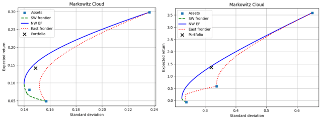
This is the third and final installment of my series on portfolio performance measures among separate assets groups. First, I summarize the earlier posts, then I introduce relative performance measures. I start with the Markowitz cloud of possible portfolio weights, returns, and volatilities.
Absolute measures of performance contrast the realized portfolio performance with the performances that were possible simply by calculating the difference in, say, return or volatility. The drawback of this method is that different spreads of statistics can affect these differences apart from portfolio performance. That is, even if a portfolio of assets return was very high, some reference return can still be much higher and make the performance look poor.
Quasi-relative measures tackle this problem of different spreads by calculating the percentile of possible returns or volatilities. This allows us to compare portfolio returns to what was possible even among portfolios of different assets with Markowitz clouds of different volatility ranges. The drawback of quasi-relative measures is that the return at some percentile of possible returns is not the same as the return of the same percentile among possible portfolios. Said another way, each possible rate of return in the Markowitz cloud is not equally as likely. So, a low percentile among possible returns be due to a very high and unlikely return.
It should be obvious that returns and volatilities among possible portfolio weights are not equally likely. To help visualize the idea, see the below 3D quadratic for a simplified example that represents a portfolio of three assets. The x-axis represents returns and the z-axis represents standard deviation. The y-axis represents the weight on the 3rd assets (returns and weights map directly to one another linearly). The set of possible portfolios lie on the surface of the quadratic function.
“Boomers- live it up now at the expense of your kids, the government, charities, and your future selves.” That’s what I worried the popular book “Die With Zero” by Bill Perkins* might advocate based on its title and the brief descriptions I heard. After reading it, I’d say it’s at most 20% the book I worried about. A more accurate summary would be “planning ahead is great but it doesn’t always mean saving more” or even “here’s how to plan out your optimal consumption path like an economist”.
The core argument is that you’ll be happiest if you spend or dispose of all your money while you’re alive, then die right as you run out of money. He acknowledges that “dying with exactly zero is an impossible goal” because you don’t know when you’ll die, but he thinks most people could get much closer to zero than they do and would be better off for trying.
He then considers a variety of obvious objections.
Q: Isn’t the risk of running out of money early worse than the risk of not spending everything?
A: It’s a real risk, but one that can easily be eliminated with financial products like annuities and long-term care insurance.
R (My reaction): This is basically right. In fact, the best argument for his thesis he seems to miss is that there’s also always Social Security and Medicaid, so in America you’d never really hit zero; still less so in a country with a stronger welfare state.
Q: What about kids? Or charity?
A: Figure out how much you want them to have, then give it to them before they die. They’d rather have it sooner- right now the modal recipient of an inheritance is 60 years old, but money is more useful to people when they are younger, closer to 30.
R: True as far as it goes, but my guess is that most people would end up giving much less this way. Especially if they also listen to Perkins’ advice about working less. He mentions giving money away early but his heart doesn’t seem in it compared to planning out the optimal consumption path.
Highlights: Your ability to enjoy your wealth depends on your health, since many fun activities can’t be done when you are frail or sick. It seems obvious when you hear it, but the idea of measuring the marginal utility of wealth with respect to health is underrated even in health economics. The book does lots of good work with data on Americans’ finances; maybe the best argument for Perkins’ idea that many people over-save is that 1/3 of Americans end up increasing their wealth after retirement.
Lowlights: Graph of optimal net worth by age (page 166) contradicts graph of optimal spending by age (page 172). Arguing that John Arnold should have retired earlier than he did (age 38) because he already had more than enough money for himself, without considering how this would have made one of the world’s most innovative and effective charities much less effective. Arguing that Warren Buffett should have given his money away sooner because the charities would rather have it sooner- arguably this is true for most people, but definitely not for the one guy who really can beat the market and give much more later!
Do I recommend Die With Zero? It’s a quick and easy read that I enjoyed, but I don’t think it changes any of my financial plans. If we over-simplify its message to be “consume more now”, it’s a bad message for the typical American (who saves only 2.6% of their income), but perhaps a good message for the typical reader of personal finance books. As always it’s good to ask yourself “who is this for” and “should you reverse any advice you hear”.
“the people I’m writing for- people who are saving too much for their own good” -Die With Zero
“Objectivism might be a vicious cycle. The people who are already too selfish see an opportunity to be selfish with a halo. They join Objectivism, egg each other on, and become even more selfish still. Meanwhile, the people who could really have benefitted from Objectivism, the people who feel guilted into living for others all the time while ignoring their own needs, are off in some kind of effective charity group, egging each other on to be even more self-destructively altruistic….. Every piece of social commentary is most likely to go to the people who need it least.” – Scott Alexander
*Bill Perkins is the only name on the cover, but the Acknowledgements and the ending note that the book was co-written by Marina Krakovsky with some work done by economist Kay-Yut Chen.
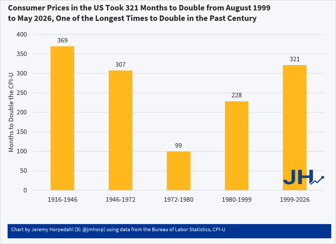
Two years ago I wrote about post about how long it took consumer prices to double in the US. The most recent time period looked pretty good compared to most of the 20th century. But lately I’ve seen a lot of social media posts talking about prices doubling (e.g., “you need twice as much income as the 1990s to match the standard of living back then”), so it’s worth looking at again.
The results aren’t that different:
Using the CPI-U, consumer prices in the US doubled in the most recent 321 months. Not only is that a longer period of time to double than most of the 20th century, in the prior 321 months (November 1972 to August 1999) consumer prices doubled twice: nominal prices were almost 4 times higher in August 1999 than in November 1972!
While the CPI-U does slightly overstate inflation, we don’t get much different results if we used chained indexes. For example, using the PCEPI, it took 390 months for prices to double between October 1993 and April 2026. Either way, prices roughly doubling from some time in the 1990s to today is accurate. But wages have more than doubled since then: you only have to go back to July 2005 for average wages to double (they are up 139% since August 1999 and 190% since October 1993). Or if we use a median wage series (such as EPI’s using CPI data), nominal wages doubled from 2002 to 2025 (I have readjusted that series back to nominal wages). In real terms, median wages are 22 percent since 1999 and 29 percent since 1993.
Of course, it would be better if prices weren’t doubling over any time frame! But the most recent doubling of prices that we lived through is the longest period to double in the lifetime of almost everyone alive in the US today.