Demography is cool generally, but life tables are really cool in their elegance. Don’t know what a life table is? Let me ‘splain.
A life table uses data from private or public death registers, or even genealogical records, to identify a variety of survival and death estimates. Briefly, the tables include for each age:
Probability of death in the next year
Probability of surviving to the age
The life expectancy
There is more in the tables, but these are the big items that people often want to know. All of the various table columns can be calculated from survival rates. The US government and the UN each has created many such tables for a variety of time, locations, and development details. For example, the earliest and most dependable one is from 1901 and includes separate tables by race, sex, migrant status, urbanity, and even for some specific states.
I’m looking for a new car now and would like to know what the safest reasonable option is. There are lots of ways to get some information about this, but none are very good.
The government provides safety ratings based on crash tests they perform. This is better than nothing but the crash tests only test certain things and don’t necessarily tell you how a car performs in the real world. They also have a habit of just giving their top rating (5 stars) to tons of vehicles so it doesn’t help you pick between them, and they only compare cars to other cars in the same “class”, ignoring that some classes are safer than others. On top of all the problems with the ratings themselves, they also don’t provide any lists of their ratings, instead making you search one car at a time.
Several other sites improve on the government ratings by using real-world data on how often cars actually crash (much of which comes from the government, which as usual is great at collecting data but not so great at presenting it in helpful user-friendly ways). The Auto Professor grades cars using real-world data but otherwise has the same problems as the government (NHTSA) site. Cars get letter grades rather than a rank or meaningful number, so it’s not actually clear which car is best, or how much better the good cars are than the average or bad cars. You can search the grades for one car at a time but they don’t just list the safest cars anywhere, including on their page labelled “safest cars list“.
The Insurance Institute for Highway Safety uses real world data and provides actual numbers of fatality rates for different vehicles. This is great because you don’t have the problem of “dozens of cars all have 5-star / A, which is best?” or the problem of “how much better is 5 star than 4 star, or A than B?”. But they don’t include data from the 2 most recent years, and they only post their ratings for a handful of cars. Not only do they not present a complete list, they seem to have no search function whatsoever for their real-world data (they do for their NHSTA-style crash test data). Some 3rd party sites seem to have posted more complete versions of their data, but it still doesn’t show data for most car models.
The least-terrible car safety site I have found is Real Safe Cars. The good: they use real-world safety data, they apply reasonable-sounding corrections and controls do it, they present meaningful quantitative measures like “vehicle lifetime fatality chance” and “vehicle lifetime injury chance”, and they present the data using both a search function and lists of “safest vehicles”. For 2020 you can see that the #1 car, the 2020 Audi e-tron Sportback, has a vehicle lifetime fatality chance of 0.0158%. Compare this to the #100 car, which is about average overall- the 2020 Acura TLX has a vehicle lifetime fatality chance of 0.0435% (almost 3x the safest). The site makes it hard to find the very worst car but near the bottom is the 2020 Hyundai Accent, which “has a vehicle lifetime fatality chance of 0.0744%”.
The lists could be better; the only list that includes all vehicle classes is restricted to only 2020 makes. Meanwhile when you search a car it ranks it only relative to cars in the same year, though you can make comparisons across years yourself using the quantitative “fatality chance” and “injury chance” measures. I’m not totally convinced of the ratings themselves, given how well many smaller sedans do. Their front page explains how taller cars are generally safer, but also lists the Mini Cooper as the #18 safest car of 2020 across all classes. But Real Safe Cars seems like the current best site to me (maybe I’m biased since one of its creators is an economics professor).
I hope these sites will address some of the weaknesses I identified here, though I’m not optimistic about most of them, because other than Real Safe Cars the “bad” decisions seem to be clearly driven by incentives like keeping car companies happy or SEO.
I also think there’s still room for another effort by economists or other quantitatively-skilled people to make another site. The underlying crash data is public and the statistical problems are not especially hard; I think a single economist could run the numbers in about the time it takes to write a typical economics paper (weeks to months for a 1st draft), and a decent website could be built off that quickly as well. You could probably make a decent amount of money off the site, though perhaps not if you do the right thing and publicly post all the data and code. Posting the data would make it easy for others to copy you and make their own sites. You could fight that with copyright, but given the huge public good aspect here and the lives at stake it might make more sense to get grant funding up front and then make the data and code totally public. A sane world would have done this already; NHTSA’s annual budget is over $1 billion, with $35 million of that going to research and analysis. I think any decent funder should be able to do at least as well as the sites above with under $200k, or anyone with good data chops could do it out of the goodness of their heart in a few months. I don’t have a few months right now but perhaps one of you could take this up or start applying for grants to do it.
For everyone who just wants to know about which cars are safe, for now I think Real Safe Cars is the best bet, though I’d also like to hear if you think I missed anything.
The answer to that question is, of course, “no.” No one number can alone tell us the whole story, whether we are talking about the economy, health, education, population, or any other social statistic. But when you look at other measures of the health of the labor market, you usually find that they tell a similar story to the unemployment rate.
My goal in this post is to dive a little deeper into the data on the labor market, but really the goal is broader: to give you a little insight about how to interpret data. Some rules of thumb, perhaps. But really there is One Big Rule: numbers need context. A number on its own doesn’t tell us much of anything. How does it compare to the past? How does it compare to other places?
With the unemployment rate at historic lows for both the US and many states, I’ve started to see many people saying that, not only doesn’t the unemployment rate give us the full story, but many other indicators point in the opposite direction. Is this true? Let’s dig into the data. Here’s one example of someone saying this for Arkansas. I’ll focus on Arkansas, since that’s where I live and I pay attention to the economic data here pretty closely, but I’ll also refer to national data where appropriate.
For maybe three purchases of celery, bought in 2023 from different stores, the fibers or strings in them were so tough that we could not chew them to point of chopping them into small enough pieces to comfortably swallow. We would chew away for several minutes, masticating and swallowing most of what we bit off from the stalk, but this left a tangle of intact strings in our mouths, to be spit out. Prior to 2023, we never recall having a batch of celery that was simply inedible like this. For at least one batch we were so disgusted that we just threw it out.
I tried steaming a couple of stalks for a minute or so in microwave. This turned most of the celery into unappealing mush, whilst doing the stalks no apparent harm.
For the most recent bunch of unchewable celery, I finally got wise and harnessed the vast power of the internet to solve this problem. I did not have to invoke ChatGPT, so I was perhaps spared an AI hallucination regarding string theory. A simple DuckDuckGo search (this search engine respects your privacy, unlike You Know Who) found there are at least three reasonable ways to strip the offending strings out of a celery stalk. This article from Kitchen Ambitions does a great job describing these three ways:
( 1 ) Carefully snap the stalks in half the correct way (it is obvious when you think about it; or see the article), leaving the two halves connected by the strings. Then you can peel the strings down the lengths of the stalks. This is the easiest and cleanest way. I found I usually had to do a second round of snapping and peeling to get the rest of the strings.
Or
( 2 ) At one end of the stalk, use sharp knife to tease up the ends of several strings at a time, and peel them down the length of the stalk.
Or
( 3 ) A brute force approach is to use a vegetable/carrot peeler. This does work, but removes more of good celery along with the strings.
Hurray for economical life hacks – – the internet knows everything.
The Writer’s Guild of America and the Screen Actors Guild of America are currently on strike. They are on strike because the highest paid actors are and, as best I can tell, all of the writers were getting entirely screwed by previous deal. A deal, I would note, they negotiated after realizing that they were getting screwed by the previous deal. Screenwriters do not appear to be a position to negotiate particularly good deals.
There’s no shame in that, by the way. This isn’t necessarily about shrewdness. The NFL players union has never been able to negotiate the deals on the level of major league baseball. Sometimes the structure of an industry and a labor market simply favor one side of the bargain. In the case of Hollywood, actors have always struggled with the reservation wages of non-guild members i.e. people will to act in movies for free in the hopes of hitting the jackpot and becoming a big star. I think the writers have a different problem.
The problem for writers is that the studios don’t know anything. They don’t know what they want, who’s good, who’s not. More importantly they don’t know what anybody or anything is worth. As best I can tell, the only thing they know is that paying less is better than paying more.
“Nobody knows anything…… Not one person in the entire motion picture field knows for a certainty what’s going to work. Every time out it’s a guess and, if you’re lucky, an educated one.” ― William Goldman, Adventures in the Screen Trade
This is a problem for writers because you can’t collectively bargain on behalf of thousands of writers against an idiot. The writers guild will tell you that they have no choice to bargain with said idiot because that idiot controls the studios and without the studios there is no business.
Ok, I get that. I’m not going to play the “Just make all your movies on an iPhone and distribute them on YouTube card…<whispers> even though a lot of you would be better off making your movies on an iPhone and distributing them independently. What I am saying that you don’t have to negotiate with studios. Plural. You can negotiate with a studio. Singular. Get it?
I’m telling you to break the cartel. DC is getting killed by Marvel. Negotiate a deal with DC. A24 is making the best movies in the world. They are small and they need their output in theaters selling tickets. Negotiate a deal with just them. Will it pay more than Marvel? Of course not. But it will employ 0.3% of your members for 6 weeks and set a precedent for small individual studio deals. Pretty soon that turns into 4.1%. Set the precedent that your guild is here to play hardball and will play the studios off against each other on behalf of your members. Each new deal is a valve that lowers the pressure on your members while simultanesouly ratcheting it up for the hold out studios that aren’t producing anything. If the larger studios attempt to punish those who negotiate deals with the guild, sue them for antitrust. Sue them for $200 billion. When it comes to “cartel-like” behavior, unions have vastly more legal latitude than industry players. It’s your job to take advantage of it.
And while you’re at it, negotiating all these bespoke deals, maybe add in a little flexibility. Maybe be a little more humble about your ability to prognosticate the future and don’t tie your selves to outragenously bad arrangements that leave writers of hit shows walking away with $3000 and a negative account balance. And if and when you realize your deal is this bad, strike sooner. Years sooner. The whole point of a union is gain bargaining power through collective action. If you can’t take action until something has passed the point of complete disaster, that doesn’t speak well of the union.
I am in the somewhat unusual position of generally liking private unions* that can survive on their own merits specifically because they represent another power player that balances the playing field, which leads to more competition, and more competition is better for everyone. But just because a union is a collective entity does not mean that they have to treat the opposition as a de facto collective entity. Play them off against each other. Break them down. Play dirty.
This isn’t show friends. Or even show cartels. This is show business. Bloody start acting like it.
*Public unions are a vastly different story and, full disclosure, I tend to be far more skeptical of them.
I’m gearing up to teach macroeconomics for the first time. The following is a story that I will keep in mind as I work to make technical material relevant to undergraduates.
Years ago, I was an undergraduate sitting in a macroeconomics class. As it happened, I was in an intermediate-level macro class with no relevant background or context for the material. (If I had taken principles-level econ, then maybe I wouldn’t have been in this situation.)
My instructor was grinding through theory in a methodical way. By the end of the first month, as I remember it, we had covered the short run and the medium-term effects of monetary policy.
For anyone who is not familiar, see these MRU videos on shifting the aggregate supply curve.
In summary, the government can inject money into the economy to achieve a short-term increase in output. For a short amount of time, you can help, and that seemed good to me. I had signed up for the course to understand how to reduce poverty and make the world better. I was acing the exams. Things were going well at first.
Then we got bad news. Increasing the money supply does not work for long. Consumers realize that everything is more expensive, so they cut back on real spending. The economy shifts back to where it was before. Nothing actually improves. I had spent a month of my life on this class and we were getting nowhere.
After the lecture on returning to the long-run aggregate supply curve, I went up to the professor after class. I asked him what was going on and when would we learn something that matters. (I was polite. I realized I was going to sound dumb to him, but life is short. I needed to know if this class was going to deliver anything.)
He looked at me, surely confused that I was unsatisfied with the standard progression of material in his course. Then he explained, “Oh. You are talking about the long term, and we will get to that next month.” That’s what I needed. I did not drop the course or the major. I’m an economics professor today because I didn’t mind looking like an idiot if I could get my questions answered.
This story helps me remember what it was like to be an undergrad in an economics class. Tyler says “context is that which is scarce.” Economics teachers need to do two things at once: present technical material and provide context. I will try to get that mix right going forward.
Note to students: Students, don’t be afraid to ask stupid questions. This is your chance. A good teacher will be glad you took the initiative. However, if the question occurs to you right in the middle of a lecture, then it may or may not be the appropriate time for the lecturer to stop and have a conversation with you. Teachers will be most amenable to having a deep conversation after class or during office hours.
I like a good lump sum tax. People *must* pay the tax without exception and the advantage over current progressive marginal income taxes is that the marginal wage received doesn’t fall with greater earnings. Employment rises and output rises. To the extent that college students fail to understand their student loans, the indebted graduates essentially pay a lump sum tax each period.
Of course, the exception is income based repayment (IBR) – especially with forgiveness after X years. IBR adjusts the incentives substantially. Under the standard system, your wages are garnished if you fail to make loan payments. Under IBR, lower earnings trigger lower monthly payments. Clearly, in contrast to the standard method, IBR incentivizes more leisure, less income, more black market activity, and higher loan balances. Indeed, all the more so if there is a forgiveness horizon. Someone just has to have low enough income for say 15 years, and their past debt is forgiven (with caveats & conditions).
My principal objection to IBR policy is the resulting malinvestment in human capital. Defaulting on loans is a sign that some investment was inadequately productive to repay the resources consumed by its endeavor. We call that a loss. Real resources of time, attention, and goods and services were consumed in order to produce capital that failed to serve others more than the opportunity cost of those resources.
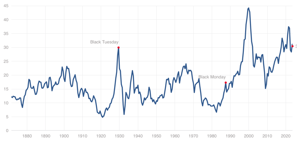
While we have stepped back from the meme stock craziness of 2021, US stocks remain quite expensive by historical standards, with our Cyclically Adjusted Price to Earnings (CAPE) ratio at almost twice its long-run average:
Even at a high price, US stocks could still be worth it, and I certainly hold plenty. But I also think it it a good time to consider the alternatives. US Treasury bond yields are the highest they’ve been since 2007. But there are also many countries where stocks are dramatically cheaper than the US- and not just high-risk basket-cases, but stable “investable” countries.
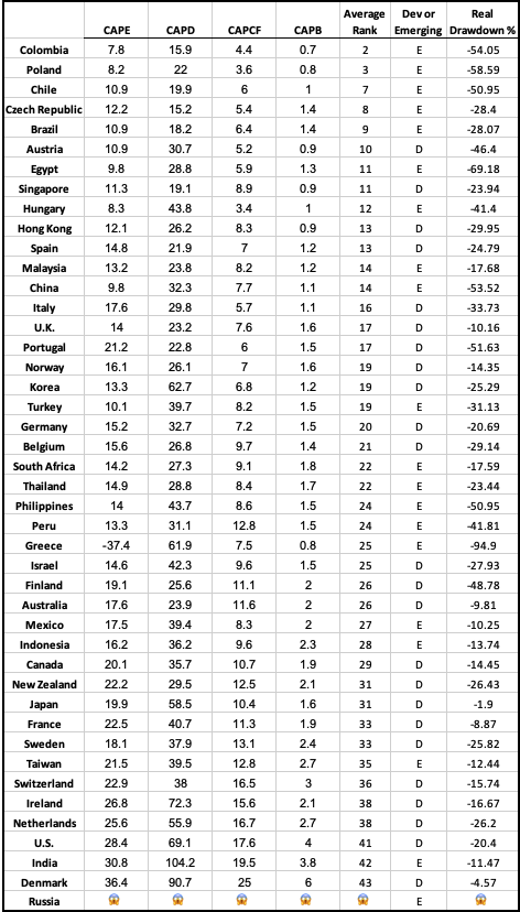
There are several reasonable ways to measure what counts as “expensive” for stocks in addition to the CAPE ratio I mention above. The Idea Farm averages out four such measures to determine how expensive different “investable” (large, stable) country stock markets are. Here is their latest update:
You can see that US stocks are expensive not only relative to our own history, but also relative to other countries, lagging only India and Denmark. That means that much of the world looks like a relative bargain, with the cheapest countries being Colombia, Poland, Chile, Czech Republic, and Brazil.
Of course, sometimes stocks, just like regular goods and services, are cheap for a reason: they just aren’t that good. They might be cheap because investors expect slow growth, or a recession, or political risk. But if you don’t share these expectations about a cheap stock (or country), that’s when to really take a look. I certainly did well buying Poland after I saw they were the cheapest in last year’s global valuation update and thought there was no good reason for them to stay that cheap.
I like that the chart above provides a simple ranking of investable markets. But if you wish it included more valuation measures, or small frontier markets, you can find that from Aswath Damodaran here. Some day I hope to provide a data-based, rather than vibes-based, analysis of which countries are “cheap/expensive for a reason” vs “cheap/expensive for no good reason”, featuring measures like industry composition, population growth, predictors of economic growth, and economic freedom. For now you just get my uninformed impression that Poland and Colombia seem like fine countries to me.
Disclosure: I’m long stocks or indices in several countries mentioned, including EPOL, FRDM, PBR.A, CIB, and SMIN. Not investment advice.
You may have heard that there is a new viral song which deals with a few economic issues. Noah Smith has a good analysis of “Rich Men North of Richmond,” which he mostly finds to be incorrect in its analysis (for example, of welfare policy). But Smith does say that the song has a point: manufacturing wages haven’t performed well in recent years. Not only has pay for factory workers “[lagged] the national average in recent years,” for those workers in Virginia, it’s lower in real terms than in 2010.
Well that all doesn’t sound good! Smith is only going back to about 2000 with the data he shows. What if we took a longer run perspective? What if we took a really long-run perspecitive?
Here’s wages for blue-collar factor workers that goes back to 1939 in the US:
The wage data (for manufacturing production workers) is from BLS and the PCE price index is from the BEA. What do you notice as you look at the data?
First, it is true that the last 20 years or so hasn’t been great. Only about 8% cumulative growth since 2002. That’s not great!
But as you look back further, you’ll notice that gains are substantial. Compared to what some might consider the “golden age” of manufacturing wages, the early 1950s, real wages have roughly doubled. It’s true, the growth rate from 1939-1973 is much, much better than the following 50 years. Wouldn’t it be nice if that growth rate had continued! But no doubt you’ve seen many memes saying something like “in the 1950s you could support a family on one high-school graduate income, but not today!” This data suggests that view of the 1950s is a little distorted by nostalgia.
One final thing to note: we might think that one big change in recent decades is that a lot more compensation goes to benefits, rather than wages. There’s actually a total compensation series for blue-collar workers going all the way back to 1790:
The total compensation data, as well as the CPI data that I used to inflation-adjust the figures (to 2022 dollars), comes from the fantastic resource Measuring Worth. This is a total compensation measurement, so it includes benefits, but the source data tells us that up until the late 1930s, it’s really just a wage measure. So potentially we could splice this together with the above chart, to get a “wage only” series covering the entire history of the US.
However, when we look at total compensation, we still see the post-1970s stagnation. Real compensation is roughly the same as about 1977. Yikes! Note here that we’re using the CPI, since the PCE index only goes back to 1929, and the CPI tends to overstate inflation (yes, that’s right, sorry CPI truthers). Still, it’s not the most optimistic picture.
Or isn’t it? With all of the automation and global competition in manufacturing coming on board in the past 50 years, perhaps our baseline is that things could have been much worse. In any case, if we look at total compensation, it’s currently about double what it was in the post-WW2 era. That’s even with the dip in 2022 due to high CPI inflation.
Wages and compensation of blue-collar productions workers have indeed been growing slowly for the past few decades. That much is true. On the other hand, they are still among the highest they have ever been in history, over 50 times (not 50%, 50 times!) higher than at the birth of this nation. This ranks them as probably the highest wages anywhere in world history for an occupation that doesn’t require an advanced degree. That history is worth knowing.
The spread of highly-contagious and sometimes fatal Covid-19, and the responses to it (lockdowns and then trillions of dollars of federal giveaway money to mitigate the effects of the lockdowns and now huge interest rate hikes to counter the inflation caused by that giveaway money) have been arguably the most economically momentous events of this decade so far. Thus, it behooves us to keep an ongoing eye on this beast, since it seems to keep coming back in waves.
We all know that Covid is spread by little “aerosol” droplets coming out the infected people’s mouths and noses. Those aerosols are mainly generated by speaking and singing. So being in a room full of talking or singing people (e.g., a happy convention or bar, or a hymn-singing church) can be a super-spreader situation.
I have reasons to try to avoid respiratory diseases, and so I attended church on-line or outdoors for most of the past three years. The Covid numbers finally got low enough this spring that I started attending inside, and even going unmasked the past two months.
Alas, Covid cases and hospitalizations are back on the rise, it seems due to the new Eris or EG.5 subvariant. Like the infamous omicron variant of a year ago, it is very transmissible and resistant to existing vaccines, but is not as deadly as the original strain. Much of the population has some immunity due to vaccines and/or prior exposure. Also, antivirals like Paxlovid are widely available to help mitigate symptoms. Still, a case of Covid often makes for an uncomfortable and disruptive week or two, and can still be fatal or debilitating.
So, I have done a quick amateur scan of the internet, trying to get a fix on what to expect. One thing that stands out is that actual case numbers are far higher than officially reported, for a couple of reasons. One is that the rigorous, systematic reporting of cases has fallen off, since Covid was deemed no longer an emergency. Also, with the end of free test kits and the generally more lax public attitude (we just want to be done with this), there is far less testing done than in 2022. (In communities with systematic testing, it turns out that the best way to track Covid is by analyzing wastewater).
Will the Latest Vaccines Save Us?
The vaccine story seems somewhat mixed. The latest booster vaccine, to be available around October, will target the XBB.1.5 subvariant, which is what was mainly circulating earlier this year. However, it is expected that since EB.5 is closely related to XBB.1.5 (both of these are of the general omicron family), the booster will confer some immunity to EB.5. That is the good news.
The bad news is that the public’s uptake of boosters in general is well under 50%, so we may expect EB.5 or whatever the next subvariant is to continue to circulate, and probably surge during the colder months when respiratory diseases tend to spread. Also, vaccines do not really stop you from getting Covid, they mainly act to mitigate the symptoms by helping your body’s defenses to react faster.
Starting next week, I will resume wearing an effective KN-95 or my preferred KF-94 mask at church and other venues where a lot of people are talking or singing.