In his NY Times column today, Ross Douthat argues that legalizing marijuana is a big mistake. Douthat makes a number of arguments, but let me focus on one point he makes in the column: that recent research suggests legalizing marijuana increases opioid deaths. This point is made in just one sentence of the essay, so let me quote it in full:
There was hope, and some early evidence, that legal pot might substitute for opioid use, but some of the more recent data cuts the other way: A new paper published in the Journal of Health Economics finds that “legal medical marijuana, particularly when available through retail dispensaries, is associated with higher opioid mortality.”
Kudos to Mr. Douthat for actually linking to the paper. That’s what the internet is for! Yet so many writers in traditional news sources fail to do this.
Now, on to the paper itself. There is nothing untrue in what Douthat writes. First, there was plenty of “early evidence” that legalizing marijuana reduced opioid deaths. More on this in a moment. And the study he cites by Mathur and Ruhm is particularly well done. It is published in the top health economics journal. But the main point of the paper is to say “we think the rest of the literature is wrong, and we’re going to try really hard to convince you that we are right.”
What does the rest of this literature say? Here’s a brief tour (all of these are cited in Mathur and Ruhm). The variable in question is opioid deaths.
I have done various maintenance and repairs on my cars over the decades. Usually, they turn out to be harder and more time-consuming than I thought. Changing the engine oil and oil filter has become genuinely harder since the oil filters have migrated deep up under the engine, where it is hard to access them without putting the car on a lift, and disposing of a milk jug of used oil has gotten more difficult. I used to be able to easily change out a light bulb in the headlight, but the last car where that needed doing required you to take apart much of the front end of the car to get at the headlight. However, I recently found that changing the cabin air filters in my two vehicles (van and sedan) is so easy, I wish I had started doing it years ago.
Why Change the Cabin Air Filter?
The cabin air filter filters the air coming into the passenger section of the car. It knocks out road dust and pollen, and other bits of whatever that might get sucked into your air system as you are going down the road. So, it protects your and your family’s lungs as well as the components of the air handling system. Typical recommendations are to change out the filter about once a year or every 15,000-20,000 miles.
The photo below shows the cabin air filter I just pulled out of my van after maybe 2 years and 25,000 miles, next to a relatively clean filter. Obviously, I let this one go a bit too long: it is grey with dust/dirt, and partly blocked with plant debris.
I have not been quick to change out these filters because garages or dealers often charge something like $80-$100 for this. And until recently, I never considered doing it myself, because for some reason I thought it was a hard job. I had read of people having to contort in unnatural positions with heads inserted under dashboards as they disassemble layers of car to get at the filter.
It Is (Often) Super Easy to Change a Cabin Air Filter
It all depends on where the filter is located. For most models of cars, you can find guidelines on line, including YouTube videos. There are some models where you indeed may have to unscrew a cover plate somewhere below the dashboard to expose the filter. But in most cars, you remove the glove box to expose the filter. That may involve undoing come screws or a snap or strut, and squeezing the edge of the glove box inward. For my Hondas, all I had to do was empty the glovebox, (authoritatively) squeeze in the edges, and the glove box pivoted down, and behold, there was the filter in its little holder. Then slide out the holder, pull out the old filter and put in the new filter (purchased at AutoZone for $20 each), slide the holder back in place, and finally tilt the glovebox back up until it snapped in place.
Ten minutes max, easy-peasy. Obviously, this saved money, but it also felt empowering. I highly recommend trying it.
Here are some show notes to a talk I gave in April 2023. I had the opportunity to talk to an undergraduate macroeconomics class at Indiana University East.
Minute
Topic
2:00
Research on Behavioral economics and Macroeconomics
4:25
Labor Market Equilibrium Concepts and Incomplete Labor Contracts
6:50
The Gift Exchange Game and the Fair Wage-Effort Theory
The “If Wages Fell…” paper directly inspired the “My Reference…” experiment. But I don’t cite “If Wages Fell…” in “My Reference…,” so you would never know how closely they are connected unless you listen to this talk.
The president of my university said that he wants the following strategy publicized.
The purpose of an admission application is to find good matches between students and the university. We want the application to be easy for people to complete, but to filter out those with low conscientiousness and those who aren’t a good mission fit. If the application is arbitrarily difficult or convoluted, then we’ll lose great applicants. But, if it’s not costly enough, we’ll attract students who are closer to indifferent about attending. Those are the freshmen who don’t return for their sophomore year.
Predicting elections is hard. Poll aggregators and prediction markets can help. Many of the usual suspects like FiveThiryEight and PredictIt aren’t covering Sunday’s election in Turkey, partly due to their ownissues, and partly because US organizations often ignore foreign elections. But we do have several good predictors to consider, and they all list opposition candidate Kiliçdaroglu as a slight favorite.
Polymarket is most optimistic for the opposition, giving them a 67% chance. British betting site Smarkets gives them a 61% chance. Play-money site Manifold Markets gives them 56%. Finally, no-money prediction site Metaculus gives a 60% chance that the opposition wins, and a 79% chance that Erdogan leaves office if he loses the election. I’m not sure how the count the Swift Centre, a small closed panel of forecasters, but they are the exception in seeing Erdogan as a slight favorite.
My economist’s instinct is to trust the real-money markets more here, although Manifold and Metaculus outperformed them in the 2022 US midterms. The usual bias is to predict a win for the candidate you like more (which for Westerners on these markets means betting against Erdogan), and have real money on the line can help counteract this. On the other hand, some might use betting markets as a hedge and bet on the outcome they don’t want. In this case the betting markets are slightly more favorable to the opposition, but the gap is small.
Of course, the biggest real-money markets are those that don’t ask directly about the election: the markets for Turkish stocks and bonds. These have generally performed well in the past year as the opposition’s chances have risen, which may indicate that markets think a new Prime Minister with more conventional economic views will get inflation under control.
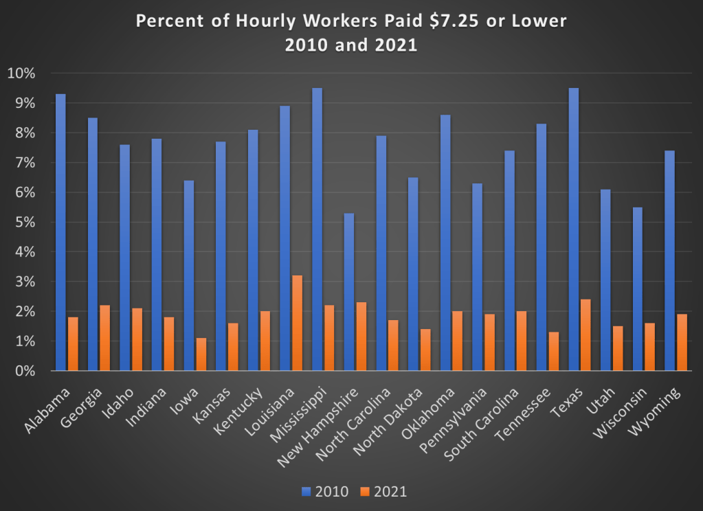
70,000: that’s the number of adults (age 25 and older) in the US that earned the federal minimum wage of $7.25 per hour in 2021.
Another 538,000 adults reported earning below the minimum wage, but these are likely to be workers that earn tips, which aren’t reported in their hourly wages. Legally, they must make at least $7.25 including their tips, though many of them earn more. The data comes from a 2022 report by BLS using CPS data (hopefully the 2023 report is coming out soon).
If we include all workers 16 and older, there are about 1.1 million people earning the federal minimum wage or less. That’s just 1.4% of hourly wage earners, and only 0.8% of all workers (including salaried workers). Crucially, this number has declined dramatically over time from a high of 15.1% of hourly wage earners (8.9% of all workers) in 1981. It has even declined significantly since 2010, the first full year that the $7.25 federal minimum was in effect, when 6% of hourly wage earners (3.5% of all workers) earned $7.25 or lower.
Perhaps, though, a big part of this decline is because most states (and even some cities and counties) now have minimum wages that are above the federal level, in some cases significantly above. Today, only 20 states use the federal minimum wage. No doubt this is important!
However, even if we focus just on those 20 states that use $7.25 per hour as the minimum, there were also large declines in the percent of hourly wage earners that earned $7.25 or less. Some states declined by 7 percentage points or more from 2010 to 2021, though all declined by at least 3 percentage points.
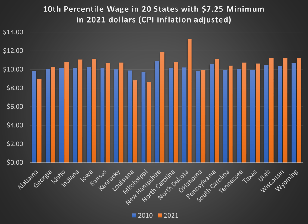
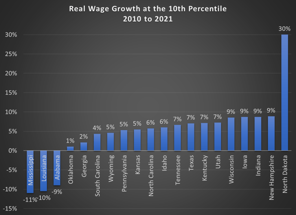
But maybe what’s going on is that employers are just providing wage increases that keep up with price inflation. So while fewer workers are earning the federal minimum wage, maybe they are no better off. We can address that possibility using BLS’s occupational wage data, which allows us to look at wages at the 10th percentile (these aren’t exactly minimum wage earners, but they are close). Real wage declines did happen in a few states (Alabama, Louisiana, and Mississippi), but most of these states experienced clear real wage growth from 2010 to 2021 at the 10th percentile of earners.
Here are the changes in percentage terms (once again, adjusted for CPI inflation).
Some might look at this growing irrelevance of the minimum wage as a reason to increase the federal minimum wage. But as the data from most states suggests, there are clear increases in wages happening already, suggesting that these are competitive labor markets. The case for raising the legal minimum wage in a competitive labor market is weak (it is stronger in a monopsony labor market).
Here I will draw on a recent article Leads And Lags: Timing A Recession by Seeking Alpha author Eric Basmajian. His overall points are (1) that some indicators are associated with leading segments of the economy (which have historically turned down well before the rest), while others are more lagging, and (2) the leading indicators are strongly flashing recession. Direct quotes from his article are in italics.
Leading Economy, Cyclical Economy & Total Economy
When economic data is released, the information should be contextualized based on where the data point falls in the economic cycle sequence.
We can separate the economy into three buckets: the Leading Economy, the Cyclical Economy, and the Total Economy.
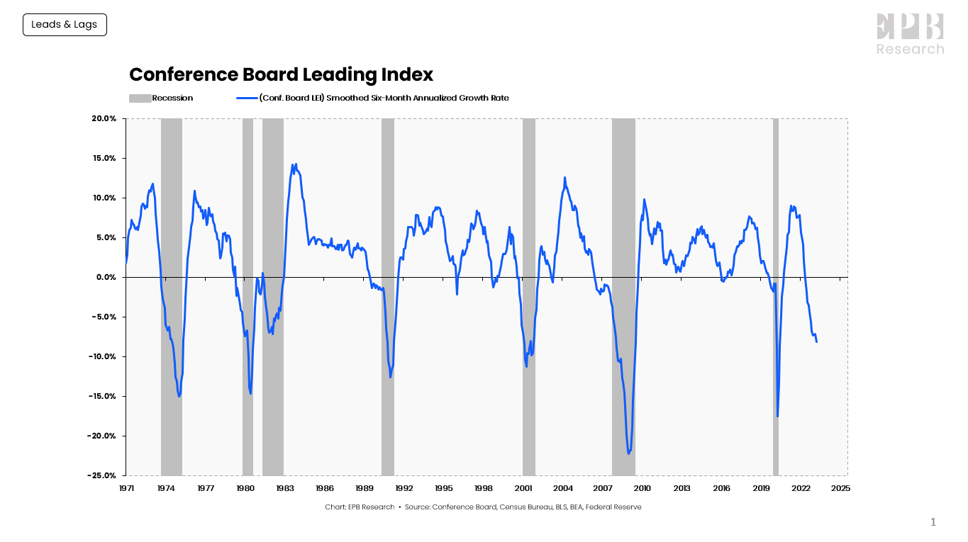
The Leading Economy is defined by the Conference Board Leading Index, which is a basket of ten leading economic variables such as building permits, new orders, and stock prices.
The Leading Index has turned negative before every recession, without exception.
Conference Board, Census Bureau, BLS, BEA, Federal Reserve
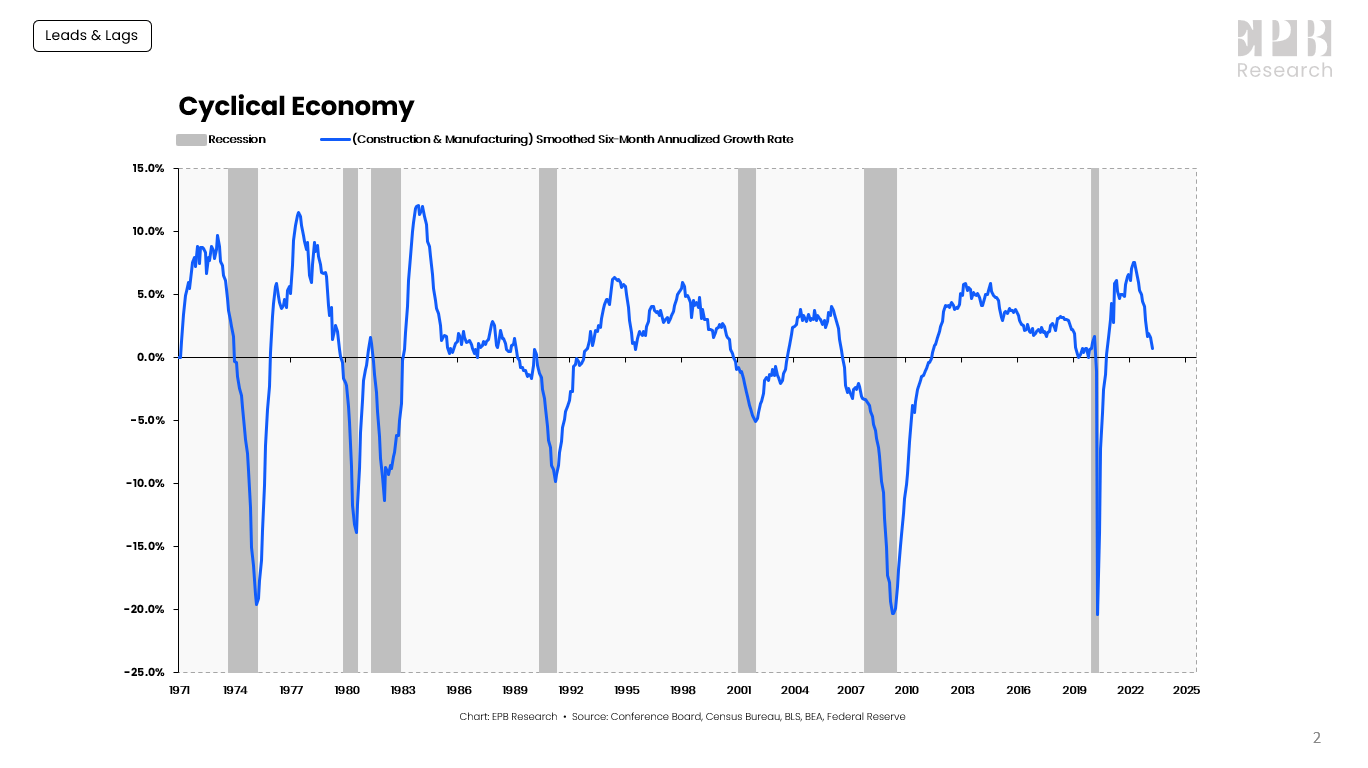
The Cyclical Economy represents the construction and manufacturing sectors. The Cyclical Economy is the driving force behind recessions, always turning negative before the Total Economy, and never giving a false signal; when the Cyclical Economy turns negative, the Total Economy turns negative several months later.
Conference Board, Census Bureau, BLS, BEA, Federal Reserve
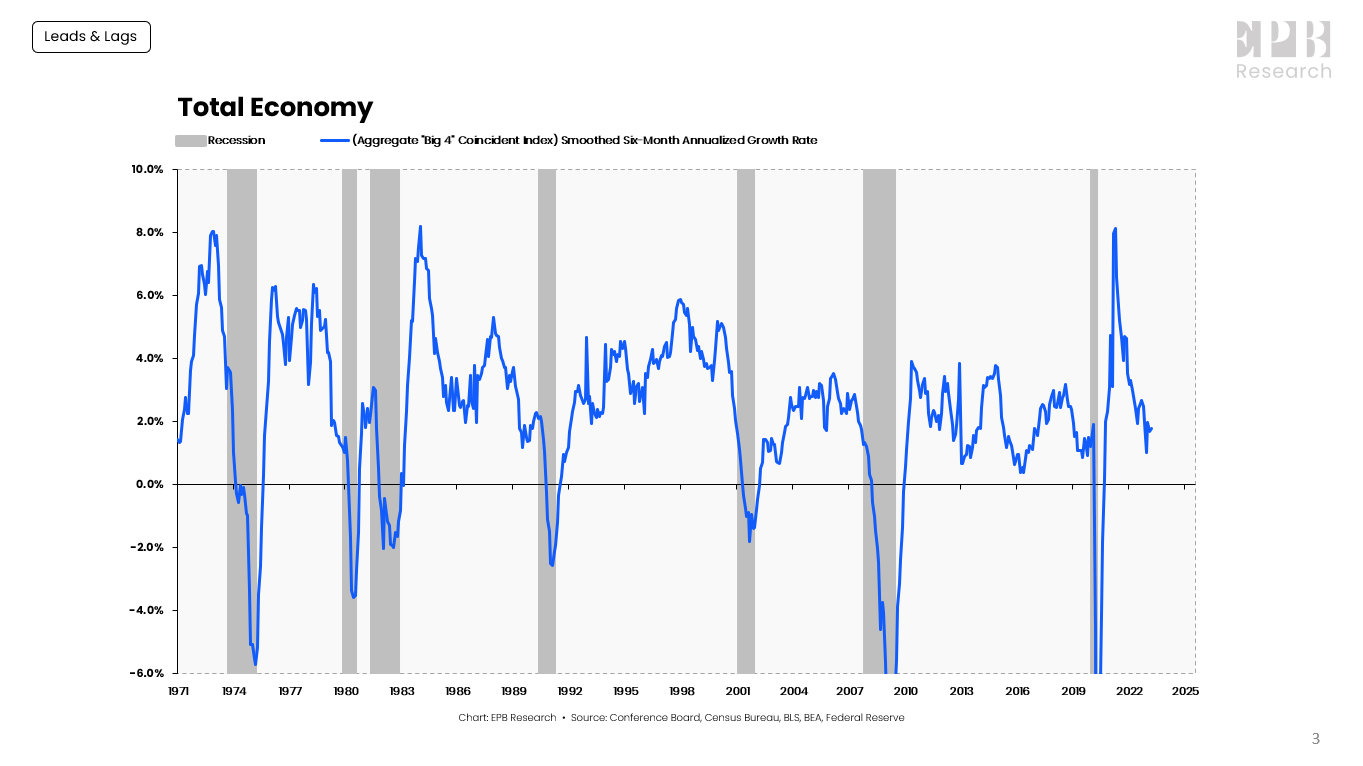
The Total Economy is defined by the “Big-4” Coincident Indicators of economic activity. Nonfarm payrolls, real personal income less transfer payments, real personal consumption, and industrial production are four major economic indicators that the NBER uses as the core of their recession dating procedure.
Conference Board, Census Bureau, BLS, BEA, Federal Reserve
A sustained contraction in the “Big-4” Coincident Indicators is the definition of a recession.
The Total Economy starts showing contracting growth rates about four months into the recession.
Could This Time Be Different?
If we do finally get a recession, it will be probably the most long-expected recession ever. Pundits have been warning for over a year that the Fed’s well-telegraphed program of rate hikes will crater the economy, as the only way to tame inflation.
According to Basmajian, When the Leading Economy and Cyclical Economy are both lower than -1%, a recession, as dated by the NBER, occurred an average of 5 months later, with a range of a 4-month lag to a 14-month lead.
His Leading indicator went negative about 11 months ago (June, 2022). However, it looks like the economy is still humming along and employment remains robust. His Cyclic Economy is on track to go negative right about now, but that has an unusually long lag between Leading and Cyclical:
The Cyclical Economy will likely turn negative with April data and potentially below -1% by May data should the current downward slope remain.
That would push the lag between the Leading Economy and the Cyclical Economy to 11 months, the longest on record.
And the lag before we finally get a bona fide recession in the Total Economy may keep dragging out longer yet. There is even a possible Soft Landing scenario where the rate hikes manage to cool the economy down without causing a severe recession at all.
It seems to me that we collectively are still spending down our excess pandemic benefits, and no recession will come till we finish running through those monies.
My kids go to public school, and I love our Parent Teacher Organization (PTO). I’m going to keep this focused on one wonderful bit of collective action.
Students need to show up on the first day of school in August with certain school supplies. For example, first graders must have a 24-count crayon box. The school posts a list of supplies that parents must pay for. One option is to go to the store yourself to get all these items.
Or the PTO will do it for you if you pay a fee online. So, you don’t go shopping at all, and your kid just walks into school and the supplies are on their desk.
One reason for sharing this is just to spread this particular idea, although many PTOs around the country already do it. It requires some volunteers to coordinate activity.
In my experience, collecting money and handling new office supplies is something American volunteers will do. There are certain jobs that seemingly always have to be paid positions in any organization, because no one wants to do it no matter how warm the fuzzies are.
Another reason for mentioning it is as just one of thousands of examples of how my life is improved by the networks of volunteers and local leaders that I live near. These kinds of benefits do not automatically follow from people living in proximity to each other, but they are one of the potential benefits of clustering together geographically.
The UN estimates this milestone event – when the number of people in urban areas overtook the number in rural settings – occurred in 2007.
Gifs are really cool. They’re like the animated photos on loop from Harry Potter. They’re also great for teaching. You can show students exactly what you want them to see over, and over, and over. They don’t need to navigate to the right part of the video, wait for ads, or worry about whether the particular grammar of a book is opaque. They can just look and think.
For example: Why are prices higher than 3 years ago? We can use the Aggregate Supply- Aggregate Demand model (AS-AD) to help us think about it. Prices have increased because demand has grown faster than long-run aggregate supply (LRAS).
At first, the SRAS, which does the work of finding the long run equilibrium, increased rightward. This is because we’ve had a decade of low, stable inflation and inflation expectations were anchored at a low level. Greater demand was met with greater output. But, as AD continued to grow and people began to confront the unavoidable reality of scarcity, SRAS began moving upward, increasing the price to ration the quantity demanded.*
See the below gif. I made it in Stata and ezgif.com. It’s pretty cool.


