A recent Wall Street Journal declares “More High-School Grads Forgo College in Hot Labor Market.” An accompanying chart and data show the apparent plunge, with just 62% of recent high school grads enrolled in college, down from 66.2% before the pandemic, and well down from the high in 2009 of 70.1%.
The article recites the usual reasons. The high and increasing financial cost of attending college. The increasing opportunity cost due to the “hot labor market” mentioned in the headline. Large numbers of young people getting apprenticeships: apparently a 50% increase over some unstated timeframe!
They give anecdotes. A 21-year-old male in Maryland was put off by the high cost of a four-year degree. He likes working on cars, so instead got a job as a service technician at a Toyota dealership.
We’ve heard this all before. In fact, we know we’ve heard it before, because the WSJ article links to other WSJ articles saying the same thing over the past few years.
But are young people really skipping traditional four-year colleges for other opportunities? The answer is a big fat No. And we can even use the same data the WSJ used (from the CPS) to prove it, but slice it more finely. The percent of recent high school graduates enrolled in 4-year colleges and universities in 2022 was 45.1%. That’s slightly higher than 2019 (44.4%) and is, in fact, the second highest level ever in this data, with only 2016 being higher at 46%.
So what gives? The decline that the WSJ is reporting is entirely driven by a decline in enrollment at 2-year colleges, though you would never get a hint of that in the article. You might even think it was the opposite: perhaps young people are forgoing 4-year colleges in favor of trade schools! Nope. Here’s the data.
Most recent annual rates, compiled by Trading Economics. The US is right in the middle:
Argentina 109% Turkey 43.7% United Kingdom 8.7% Italy 8.2% Germany 7.2% Australia 7% Euro Area 7% South Africa 6.8% Mexico 6.3% France 5.9% Singapore 5.7% Netherlands 5.2% United States 4.9% India 4.7% Canada 4.4% Indonesia 4.3% Brazil 4.2% Spain 4.1% South Korea 3.7% Japan 3.5% Saudi Arabia 2.7% Switzerland 2.6% Russia 2.3% China 0.1%
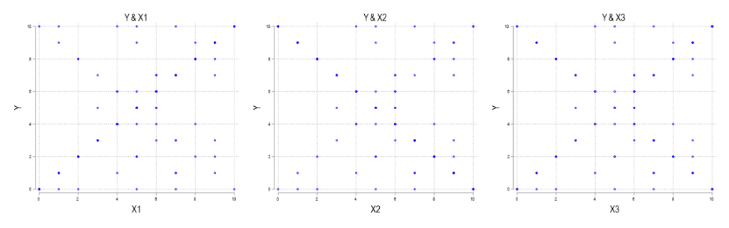
Scatterplots are a great investigatory tool. You can scatterplot raw data for two variables and, if the relationship is strong, then you can see the functional form that relates x and y (linear, polynomial, exponential, etc.). However, there are two data characteristics that are a scatterplots Achilles’ heel: large samples and discrete variables. And they create misleading scatterplots for the same reason.
Examine the below scatterplots for y vs the discrete variables x1, x2, & x3 on the interval [0,10]. What do you think slopes or correlations are?
70,000: that’s the number of adults (age 25 and older) in the US that earned the federal minimum wage of $7.25 per hour in 2021.
Another 538,000 adults reported earning below the minimum wage, but these are likely to be workers that earn tips, which aren’t reported in their hourly wages. Legally, they must make at least $7.25 including their tips, though many of them earn more. The data comes from a 2022 report by BLS using CPS data (hopefully the 2023 report is coming out soon).
If we include all workers 16 and older, there are about 1.1 million people earning the federal minimum wage or less. That’s just 1.4% of hourly wage earners, and only 0.8% of all workers (including salaried workers). Crucially, this number has declined dramatically over time from a high of 15.1% of hourly wage earners (8.9% of all workers) in 1981. It has even declined significantly since 2010, the first full year that the $7.25 federal minimum was in effect, when 6% of hourly wage earners (3.5% of all workers) earned $7.25 or lower.
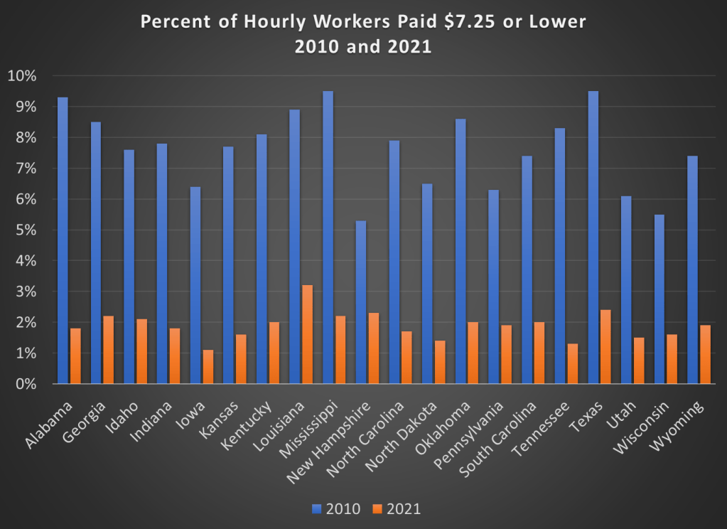
Perhaps, though, a big part of this decline is because most states (and even some cities and counties) now have minimum wages that are above the federal level, in some cases significantly above. Today, only 20 states use the federal minimum wage. No doubt this is important!
However, even if we focus just on those 20 states that use $7.25 per hour as the minimum, there were also large declines in the percent of hourly wage earners that earned $7.25 or less. Some states declined by 7 percentage points or more from 2010 to 2021, though all declined by at least 3 percentage points.
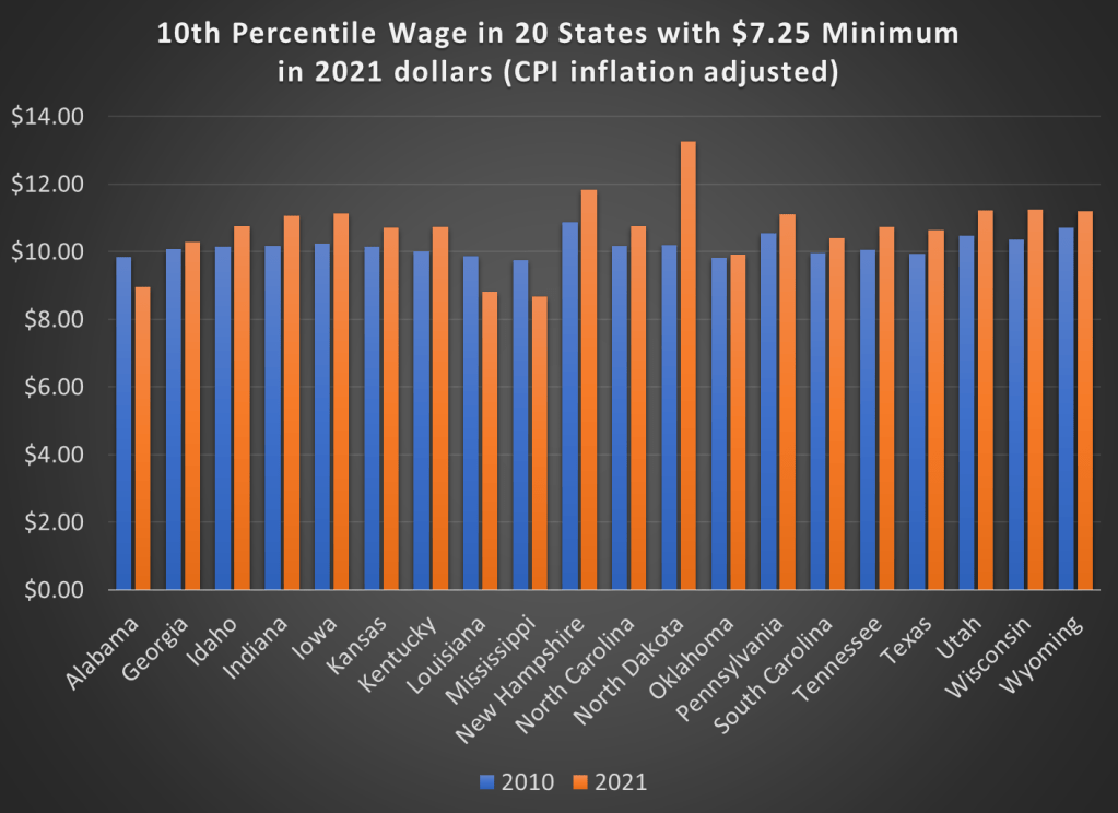
But maybe what’s going on is that employers are just providing wage increases that keep up with price inflation. So while fewer workers are earning the federal minimum wage, maybe they are no better off. We can address that possibility using BLS’s occupational wage data, which allows us to look at wages at the 10th percentile (these aren’t exactly minimum wage earners, but they are close). Real wage declines did happen in a few states (Alabama, Louisiana, and Mississippi), but most of these states experienced clear real wage growth from 2010 to 2021 at the 10th percentile of earners.
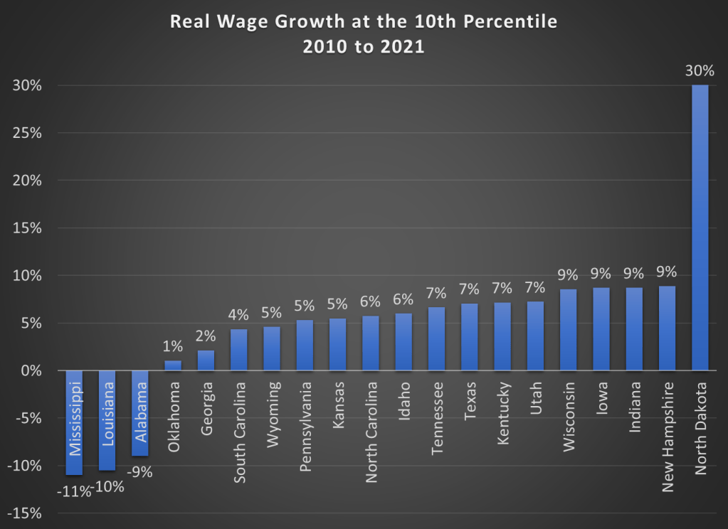
Here are the changes in percentage terms (once again, adjusted for CPI inflation).
Some might look at this growing irrelevance of the minimum wage as a reason to increase the federal minimum wage. But as the data from most states suggests, there are clear increases in wages happening already, suggesting that these are competitive labor markets. The case for raising the legal minimum wage in a competitive labor market is weak (it is stronger in a monopsony labor market).
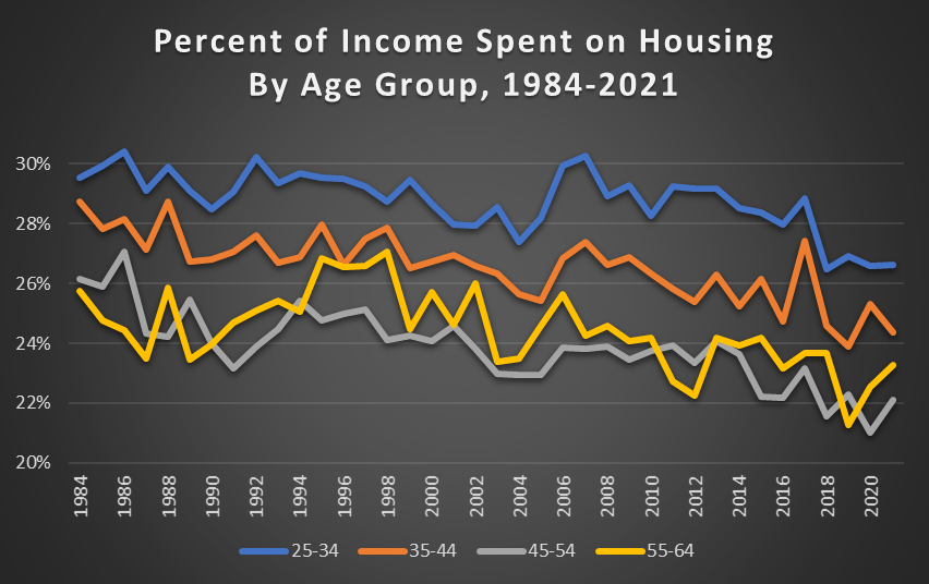
Kevin Erdmann has written a detailed and thoughtful response to my post from last week on housing spending as a percent of income. My goal in that post was to look at consumer spending as a percent of income for a variety of different sub-groups (my primary interest was by age group, but I tried to get into more detail for other sub-groups).
As Erdmann emphasizes in his post, I left out one set of sub-groups that the CEX data allows us to use: renters vs. homeowners. And these are very important groups to look at, since for homeowners (as he points out) many of the costs are implicit (such as the opportunity cost of those that don’t have a mortgage). Lumping all of these households together may obscure some of the different trends.
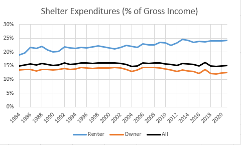
Be sure to read Erdmann’s post in full (he says many smart and correct things), but the key result is in his Figure 2 (reproduced here). Renters have seen the share of their income spent on shelter rise from 19% in 1984 to 24% in 2021. This is not a trivial increase. Owners, by contrast, have seen their share of spending fall, which is how it all gets washed out in the average.
I will concede that Erdmann is probably right on many of his many points. Still, I wanted to see this at a much finer level of detail, since national aggregates might be giving us confusing results. The micro-data in the CEX is probably not detailed enough to give us good breakdowns by MSA.
One of the oldest theories in economics is the idea of compensating differentials. A job represents not just a certain amount of money per hour, but a whole package of positive and negative things. Jobs have more or less stability, flexibility, fun, room to grow, danger… and non-cash benefits like health insurance. The idea of compensating differentials is that, all else equal, jobs that are good on these other margins can pay lower cash wages and still attract workers (thus, the danger of doing what you love). On the other hand, jobs that are bad on these other margins need high wages if they want to hire anyone (thus, the deadliest catch)
I think this theory makes perfect sense, and we see evidence for it in many places. But when it comes to health insurance, everything looks backwards. A job that offers employer-provided health insurance is better to most employees than one that doesn’t, so by compensating differentials it should be able to offer lower wages. There’s just one problem: US data shows that jobs offering health insurance also offer significantly higher wages. The 2018 Current Population Survey shows that workers with employer-provided health insurance had average wages of $33/hr, compared to $24/hr for those without employer insurance.
All the economists are thinking now: that’s not a problem, compensating differentials is an “all else equal” claim, but not all else is equal here. The jobs with health insurance pay higher wages because they are trying to attract higher-skilled workers than the jobs that don’t offer insurance.
That’s what I thought too. It is true that jobs with insurance hire quite different workers on average:
The problem is, once we control for all the observable ways that insured workers differ, we still find that their wages are significantly higher than workers who don’t get employer-provided insurance. Like, 10-20% higher. That’s after controlling for: year, sex, education, age, race, marital status, state of residence, health, union membership, firm size, whether the firm offers a pension, whether the employee is paid hourly, and usual hours worked. I’ve thrown in every possibly-relevant control variable I can think of and employer-provided health insurance always still predicts significantly higher wages. Of course, there are limits to what we get to observe about people using surveys; I don’t get any direct measures of worker productivity. Possibly the workers who get insurance are more skilled in ways I don’t observe.
We can try to account for these unobserved differences by following the same person from one job to another. When someone switches jobs, they could have health insurance in both jobs, neither, only the new, or only the old. What happens to the wages of people in each of these situations? It turns out that gaining health insurance in a new job on average brings the biggest increase in wages:
What could be going on here? One possibility is that health insurance makes people healthier, which improves their productivity, which improves their wages. But we control for health status and still find this effect. The real mystery is that papers that study mandatory expansions of health insurance (like the ACA employer mandate and prior state-level mandates) tend to find that they lower wages. Why would employer-provided health insurance lower wages when it is broadly mandated, but raise wages for individuals who choose to switch to a job that offers it?
My current theory is that “efficiency benefits” are offered alongside “efficiency wages”. The idea of efficiency wages is that some firms pay above-market wages as a way of reducing turnover. Workers won’t want to leave if they know their current job pays above-market, and so the company saves money on hiring and training. But this only works if other firms aren’t doing it. The positive correlation of wages and insurance could be because the same firms that pay “efficiency wages” are more likely to pay “efficiency benefits”- offering unusually good benefits as a way to hold on to employees.
I still feel like these results are puzzling and that I haven’t fully solved the puzzle. This post summarizes a currently-unpublished paper that Anna Chorniy and I have been working on for a long time and that I’ll be presenting at WVU tomorrow. We welcome comments that could help solve this puzzle either on the empirical side (“just control for X”) or the theoretical side (“compensating differentials are being overwhelmed here by X”).
Are Americans spending more of their income on housing than in the past? Using data from the Consumer Expenditure Survey back to 1984, the answer is pretty clear: no. In fact, it has declined mildly.
This concern is usually raised on the context of young people. Are young people spending more of their income on housing than in the past? No.
For working-age Americans, the percent of their income spent on housing has declined mildly since 1984, but I think it’s accurate to say it’s pretty stable (I have truncated the y-axis so you can see the detail). It’s true that young people spend more of their income on housing than older people, but this has always been true, and the gap is pretty constant.
I have a list of economics topics that I like to teach about because they conflict with the biases of my average student. The list includes fiat currency, inflation, deficits, net exports, and immigration. The list also includes the importance – or lack thereof – of the federal government’s debt. This post walks through a few graphs to do a gut-check of what we think is true and how it compares to reality. For example, do you have a sense of when the debt grew historically and when it was constant? Do you have a sense for when it shrank?
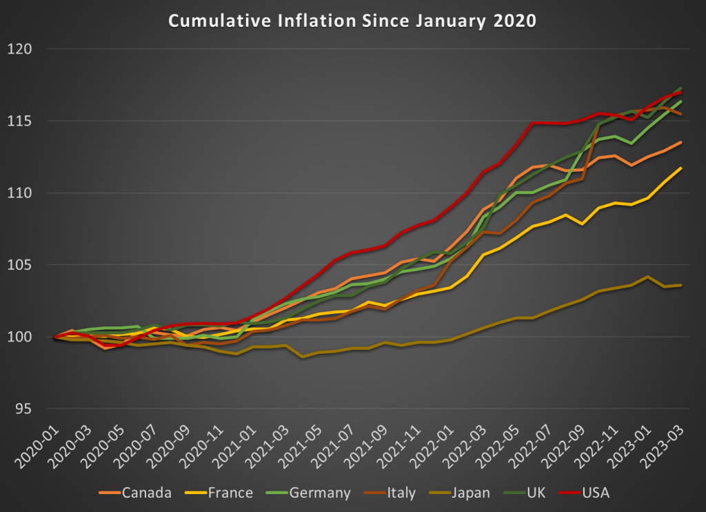
In August 2022, I wrote a post showing that among G7 nations, the US had the highest inflation during the pandemic, but also the highest rate of real economic growth. But since the economic situation is evolving rapidly, I wanted to update that data from mid-2022 (I also use core inflation, but I’ll use total inflation in this post).
Here’s how inflation has looked during the pandemic:
While the US had the most cumulative inflation for much of the pandemic, the cooling of inflation in the US and the acceleration in Europe has changed things a bit. By late 2022, the UK and Italy had caught up to the US, and Germany is closing in too. These countries have cumulative inflation of between 15 and 17 percent since January 2020.
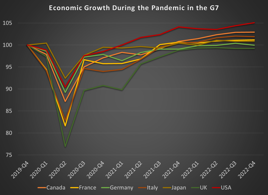
Japan looks to be the winner here. But wait, we don’t only care about low and stable inflation. We also want economic growth. Here’s the data through the 4th quarter of 2022 (we’ll start to get 2023q1 data from countries next week):
By this measure, the US comes out as the clear winner, with real GDP being about 5 percent higher than the end of 2019. That might not sound impressive for 3 years of growth, until you realize that 5 of the 7 nations had growth below 2 percent, with Germany and the UK actually still smaller than the end of 2019! And this doesn’t take account of the cumulative losses. Notice that the US had the second smallest dip in 2020q2 as well.
It’s hard to know exactly what the right non-COVID counterfactual would be, since these countries all had different rates of growth before the pandemic. But adding up the GDP scaled to 100 before the pandemic, the US is the only G7 country where these 12 quarters of data add up to more than 1,200. The other countries haven’t even had enough growth since the 2020 recession to make up for the losses during the recession, to say nothing of what their potential growth would have been. Japan comes the closest to making up the losses, while the UK stands out as the worst.
Here’s the figures for all the G7 countries, with 100% meaning they have had enough growth to offset the losses from the 2020 recession:
Is the federal government spending at a faster rate? Your answer probably has more to do with your biases than with anything else. Most people don’t know the numbers or they imagine some more appropriate past. Below is logged current federal expenditures (this does not include government fixed investment, only consumption. Yes, we can argue about measures. This doesn’t include transfers).
The line of best fit is about 1.6% per quarter or 6.4% per year. Golly! Our spending is rising so fast! But, US federal spending grew relatively slowly in the 90s – maybe due to that fiscal conservative, Bill Clinton. And our federal spending grew even more slowly between 2010 and 2016 – maybe due to that other fiscal conservative, Barack Obama.
But, inflation varied over this period. What about real, inflation adjusted federal spending? See Below.