The French magazine L’Express is widely read as magazines go. I was asked to give comments on fast fashion. An interview with me has been published in French at
Idées: Alors que Shein provoque une controverse nationale en France, l’économiste américaine invite à un regard nuancé sur la fast fashion, rappelant que le trop-plein de vêtements est un problème très récent dans l’histoire humaine.
Ideas: While Shein is causing a national controversy in France, the American economist urges a more nuanced view of fast fashion, reminding us that the overabundance of clothing is a very recent problem in human history.
I enjoyed talking with their reporter Thomas Mahler (kindly for me, in English). He informed me that French politicians are proposing to ban Shein from the country, meanwhile millions of people in France shop through Shein regularly.
Previously, I plotted the possible portfolio variances and returns that can result from different asset weights. I also plotted the efficient frontier, which is the set of possible portfolios that minimize the variance for each portfolio return.* In this post, I elaborate more on the efficient frontier (EF).
To begin, recall from the previous post the possible portfolio returns and variances.
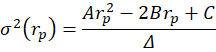
From the above the definitions we can see that the portfolio return depends on the asset weights linearly and that the variance depends on the asset weights quadratically because the two w terms are multiplied. Since the portfolio return can be expressed as a function of the weights, this implies that the variance is also a quadratic function of returns. Therefore, every possible portfolio return-variance pair lies on a parabola. So, it follows that every pair along the efficient frontier also lies on a parabola. Not every pair lies on the same parabola, however – the efficient frontier can be composed on multiple parabolas!
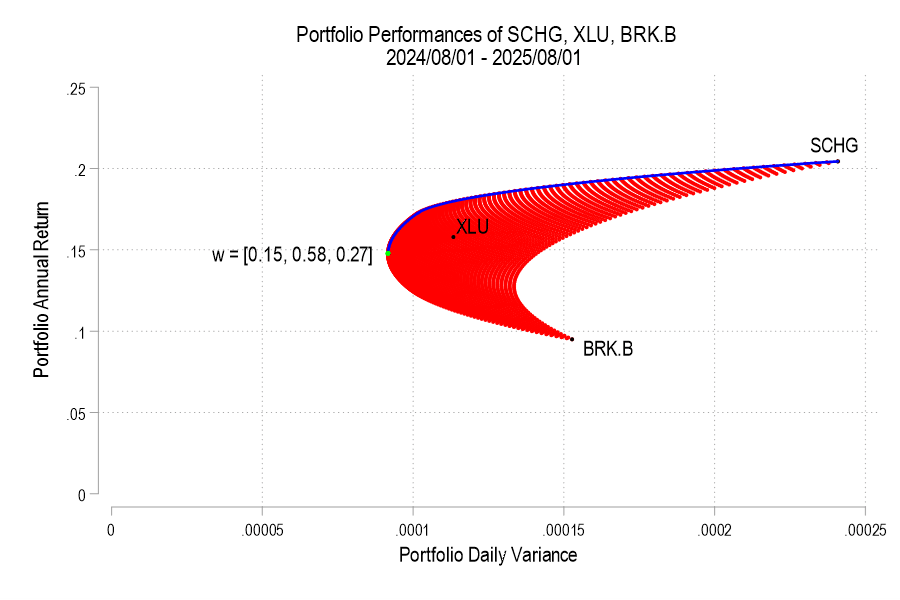
I’ll use the same 3 possible assets from the previous post, below is the image denoting the possible pairs, the EF set, and the variance-minimizing point.
One way to find the EF is to calculate every possible portfolio variance-return pair and then note the greatest return at each variance. That’s a discrete iterative process and it definitely works. One drawback is that as the number of assets can increase the number of possible weight combinations to an intractable number that makes iterative calculations too time consuming. So, we can instead just calculate the frontier parabolas directly. Below is the equation for a frontier parabola and the corresponding graph.
Notice that the above efficient frontier doesn’t appear quite right. First, most obviously, the portion below the variance-minimizing return is inapplicable – I’ve left it to better illustrate the parabola. Near the variance-minimizing point, the frontier fits very nicely. But once the return increases beyond a certain level, the frontier departs from the set of possible portfolio pairs. What gives? The answer is that the parabola is unconstrained by the weights summing to zero. After all, a parabola exists at the entire domain, not just the ones that are feasible for a portfolio. The implication is that the blue curve that extends beyond the possible set includes negative weights for one or more of the assets. What to do?
As we deduced earlier, each pair corresponds to a parabola. So, we just need to find the other parabolas on the frontier. The parabola that we found above includes the covariance matrix of all three assets, even when their weights are negative. The remaining possible parabolas include the covariance matrices of each pair of assets, exhausting the non-singular asset portfolios. The result is a total of four parabolas, pictured below.
12 states representing 21% of US high schoolers passed mandates for personal finance classes just since 2022. This sounds like a good idea that will enable students to navigate the modern economy. But does it work in practice?
A 2023 working paper “Does State-mandated Financial Education Affect Financial Well-being?” by Jeremy Burke, J. Michael Collins, and Carly Urban argues that it does, at least for men:
We find that the overall effects of high school financial education graduation requirements on subjective financial well-being are positive, between 0.75 and 0.80 points, or roughly 1.5 percent of mean levels. These overall effects are driven almost entirely by males, for whom financial education increases financial well-being by 1.86 points, or 3.8 percent of mean financial well-being.
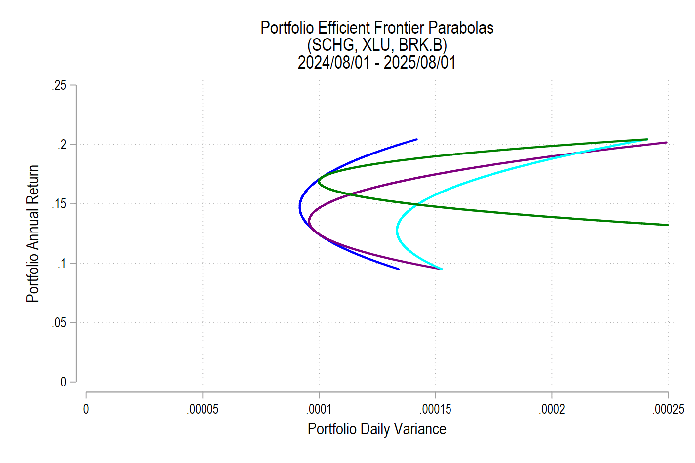
The paper has nice figures on financial wellbeing beyond the mandate question:
As soon as I heard about the rapid growth in these mandates from Meb Faber and Tim Ranzetta, I knew there was a paper to be written here. I was glad to see at least one has already tackled this, but there are more papers to be written: use post-2018 data to evaluate the new wave of mandates, evaluate the economics mandates in addition to the personal finance ones, and use a more detailed objective measure like the Survey of Consumer Finances.
There’s also more to be done in practice, hiring and training the teachers to offer these new classes:
our estimates are likely attenuated due to poor compliance by schools subject to new financial education curriculum mandates. Urban (2020) finds evidence that less than half of affected schools may have complied. As a result, our estimated overall and differential effects may be less than half the true effects
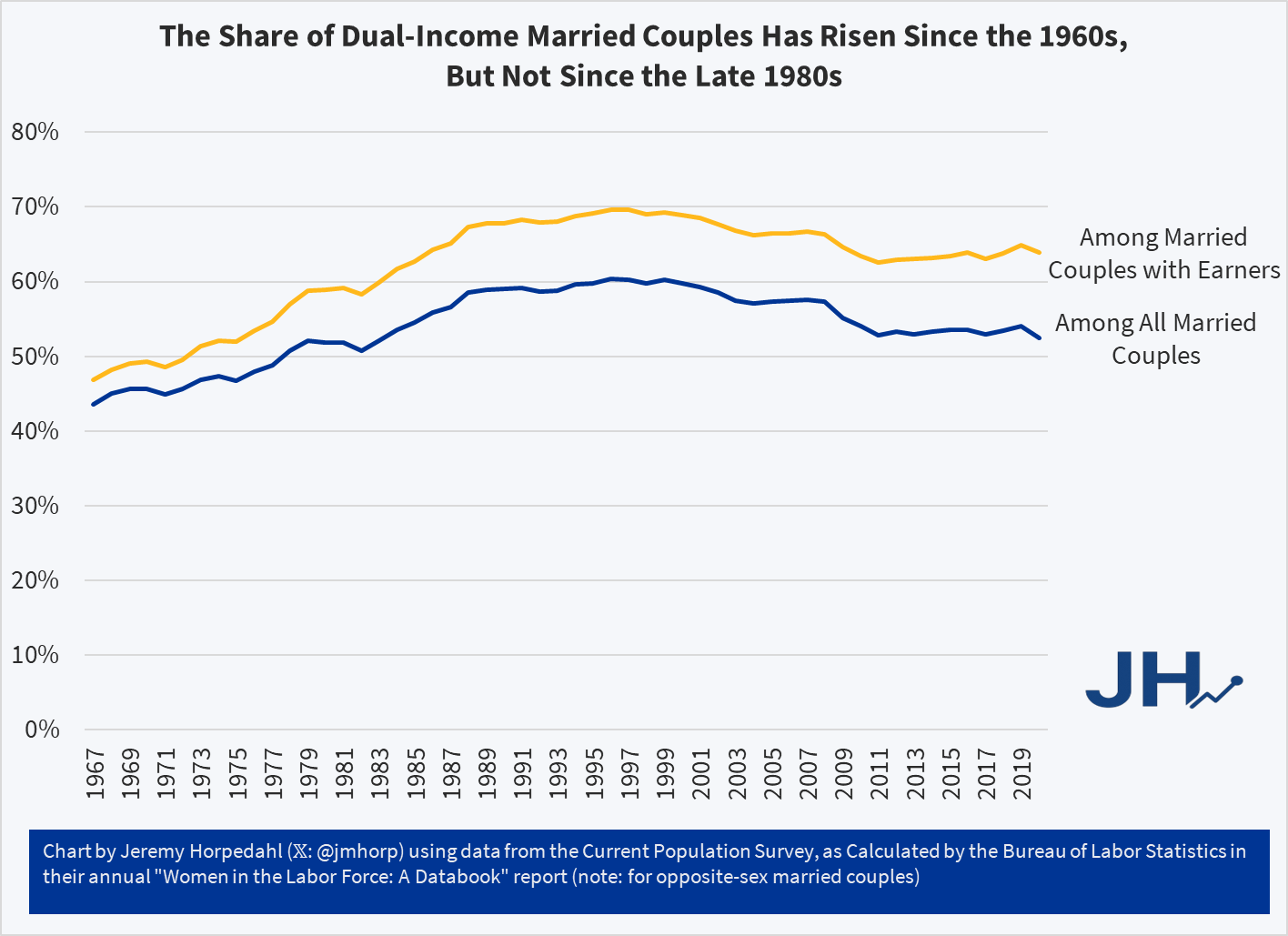
In addition to questions about inflation adjustments and general disbelief, one of the more common questions about this data is how much of it is driven by rising dual-income families, where both the husband and wife work (for purposes of this post, I will look only at opposite-sex couples, since going back to the 1960s this is the only way we can really make consistent comparisons).
In short: most of the growth of high-income families can not be explained by the rise of dual-income families. The basic reason is that the growth in dual-income families had mostly already occurred by the 1980s or 1990s (depending on the measure). So the tremendous growth since about 1990, when just about 15 percent of families were above $150,000 (in 2024 dollars), is better explained by rising prosperity, not a trick of more earners.
You can see this in a number of ways. First, here is the share of married couples where both spouses are working. I have presented the data including all married couples (blue line), as well as only married couples with some earners (gold line), since the aging of the population is biasing the blue-line downwards over time.
All of us have assets. Together, they experience some average rate of return and the value of our assets changes over time. Maybe you have an idea of what assets you want to hold. But how much of your portfolio should be composed of each? As a matter of finance, we know that not only do the asset returns and volatilities differ, but that diversification can allow us to choose from a menu of risk & reward combinations. This post exemplifies the point.
1) Describe the Assets
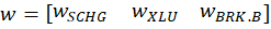
I analyze 3 stocks from August 1, 2024 through August 1, 2025: SCHG (Schwab Growth ETF), XLU (Utility ETF), and BRK.B (Berkshire Hathaway). Over this period, each asset has an average return, a variance, and co-variances of daily returns. The returns can be listed in their own matrix. The covariances are in a matrix with the variances on the diagonal.
The return of the portfolio that is composed of these three stocks is merely the weighted average of the returns. In particular, each return is weighted by the proportion of value that it initially composes in the portfolio. Since daily returns are somewhat correlated, the variance of the daily portfolio returns is not merely equal to the average weighted variances. Stock prices sometimes increase and decrease together, rather than independently.
Since the covariance matrix of returns and the covariance matrix are given, it’s just our job to determine the optimal weights. What does “optimal” mean? This is where financiers fall back onto the language of risk appetite. That’s hard to express in a vacuum. It’s easier, however, if we have a menu of options. Humans are pretty bad at identifying objective details about things. But we are really good at identifying differences between things. So, if we can create a menu of risk-reward combinations, then we’re better able to see how much a bit of reward costs us.
2) Create the Menu
In our simple example of three assets, we have three weights to determine. The weights must sum to one and we’ll limit ourselves to 1% increments. It turns out that this is a finite list. If our portfolio includes 0% SCHG, then the remaining two weights sum to 100%. There are 101 possible pairs that achieve that: (0%, 100%), (1%,99%), (2%,98%), etc. Then, we can increase the weight on SCHG to 1% for which there are 100 possible pairs of the remaining weights: (0%,99%), (1%, 98%), (2%, 97%), etc. We can iterate this process until the SCHG weight reaches 100%. The total number of weight combinations is 5,151. That means that there are 5,151 different possible portfolio returns and variances. The below figure plots each resulting variance-return pair in red.
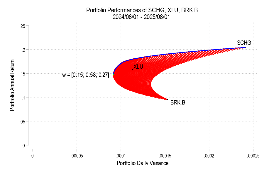
In September we covered the release of the Fraser Institute’s 2025 Economic Freedom of the World report. I said then:
The authors are doing great work and releasing it for free, so no complaints, but two additional things I’d like to see from them are a graphic showing which countries had the biggest changes in economic freedom since last year, and links to the underlying program used to create the above graphs so that readers could hover over each dot to identify the country
Well, now Matthew Mitchell of the Fraser Institute has done that:
I can only post a screenshot of a scatterplot here, but if you click through to the Fraser report you can hover over any dot to see which country it represents:
Today is a big day not only for Supreme Court watchers, but for everyone following economic policy: the Court will hear oral arguments for the case Learning Resources, Inc. v. Trump. The case concerns whether Trump’s tariffs imposed under the International Emergency Economic Powers Act are legal, which includes the famous “Liberation Day” tariffs from April 2025.
You should be able to livestream the arguments from the SCOTUS website starting at 10am ET (though it may start a little later). SCOTUS blog has a liveblog which should cover most of the legal arguments, but if you want to follow the economic arguments there are several people you can follow on Twitter, such as Scott Lincicome and Phil Magness (you can follow me too).
Jerome Powell’s term as Fed Chair ends in late May 2026. President Trump has said that he will nominate a new chair and the US senate will confirm them. It may take multiple nominations, but that’s the process. The new chair doesn’t govern monetary and interest rate policy all by their lonesome, however. They have to get most of the FOMC on board in order to make interest rate decisions. We all know that the president wants lower interest rates and there is uncertainty about the political independence of the next chair. What will actually happen once Jerome is out and his replacement is in?
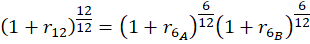
The treasury markets can give us a hint. The yields on government debt tend to follow the federal funds rate closely (see below). So, we can use some simple logic to forecast the currently expected rates during the new Fed Chair’s first several months.
Here’s the logic. As of October 16, the yield on the 6-month treasury was 3.79% and the yield on the 1-year treasury was 3.54%. If the market expectations are accurate, then holding the 1-year treasury to maturity should yield the same as the 6-month treasury purchased today and then another one purchased six months from now. The below diagram and equation provide the intuition and math.
Since the federal funds rate and US treasury yields closely track one another, we can deduce that the interest rates are expected to fall after 6 months. Specifically, rates will fall by the difference in the 6-month rates, or about 49.9 basis points (0.499%). This cut is an expected value of course. Given that the cut is between a half and a zero percent, we can back out the market expectation of for a 0.5% vs 0.0% cut where α is the probability of the half-point cut.* Formally:
The author of The Psychology of Money, Morgan Housel, has a new book “The Art of Spending Money” out this month. Its main point is that people tend to be happier spending money on things they value for their own sake- rather than things they buy to impress others, or piling up money as a yardstick to measure themselves against others (this is repeated with many variations).
Overall it is well-written at the level of sentences and paragraphs with well-chosen stories and quotes, but I’m not sure what it all adds up to. The main points seem obvious to me, though maybe that’s my fault for reading a book titled this when I’m already fairly happy with how I spend money. I think I err a bit on the frugal side, but I just don’t see many opportunities to turn money into happiness by spending it- I was maybe hoping for ideas on that front but I got none from the book. After reading it I don’t plan to do anything differently and don’t find myself thinking about spending differently.
Still, some highlights. The book is full of well-chosen quotes from others:
One of the likely effects of the federal government shutdown is that recipients of SNAP benefits (what used to be officially called “food stamps,” a term still used by the general public, especially those that dislike the program) may lose their benefits next month. This would obviously be a hardship for those that depend on this program, but it has also led to bad claims being made about the program, from both supporters and opponents of the program.
Let’s start from the political right: Matt Walsh makes the claim that by subsidizing food consumption “obviously drives up the cost” of groceries.
The number one thing that artificially inflates the price of groceries is the food stamp program. The federal government is subsidizing groceries for 40 million people which obviously drives up the cost. That's why the increase in the cost of groceries tracks exactly with the…
As with all bad claims, there is a nugget of truth baked into them. If the government subsidizes anything, we would expect demand to increase, and thus unless supply is perfectly elastic, there will be some effect on prices. However, we need to think more carefully about the nature of the subsidy.
The way SNAP works is that beneficiaries receive an electronic voucher to spend at the grocery store, which is about $300 per month on average for a household. That $300 must be spent on groceries. However, if that household had already planned to spend $300 or more on groceries, it is unlikely they will spend all of the additional $300 on food. In the limit, it’s entirely possible they will spend no additional money on groceries, merely reducing their out-of-pocket spending on groceries by $300. They will then effectively have $300 more to spend on other goods. More likely is that they will spend some of the additional $300 on groceries, and some of it on other goods.
Many studies have tried to look at the extent to which SNAP benefits affect household spending, but these were mostly observational studies. There was no treatment and control group. But a 2009 paper titled “Consumption Responses to In-Kind Transfers: Evidence from the Introduction of the Food Stamp Program” has a better approach to studying the question. Since the original Food Stamp program was slowly rolled out across the country over more than a decade, you can compare counties that entered the program first to counties that entered it later. By doing so, Hilary Hoynes and Diane Schanzenbach find out some first interesting things about the causal effects of SNAP benefits.
For the claim by Walsh in his Tweet, the most relevant result from the paper is that food stamps impact household spending similarly to a cash transfer. Yes, the program increases household spending on groceries, but it also increases spending on other goods and services. And it does so almost identically to how cash transfers impact household spending. In other words, while pitching the program as assistance for buying groceries may make it more politically palatable, SNAP benefits are no different from a similarly-sized cash transfer for the average recipient. If they do cause any inflation, they do so in the same way as a cash transfer would, and thus there is no specific impact on food inflation.
A second bad claim about SNAP comes from the political left, in this case Minnesota Governor Tim Walz: