But it was that idea that real wages weren’t countercyclical, that said, you have to start thinking about not only sticky wages, I have to start thinking about sticky prices.
And if I’m gonna start thinking about sticky prices, you have to have firms that are not competitive, that are price setters, not price takers. Because if you’re going to think about the incentives that firms have to adjust prices, you can’t have them being price takers. And it was that that got me to write my small menu cost paper…
There is a lot more on that topic in the transcript, for those who are interested.
How do we feel about big models?
I think people were getting a little tired of these big models because they were large, non intuitive. They seemed very black boxy, so you didn’t really know what was happening in them.
Haha. Here comes ChatGPT. ‘Leeroy Jenkins’ and all that.
One thing I’ll say about being Chair of the Council, which I did from 2003 to 2005. And I worked harder those two years than any two years of my life, by far, because the days are long. In the Bush administration, every day started with the 7:30 AM staff meeting in the Roosevelt room, which is the conference room right next to the Oval office.
In all my years at Harvard, I’ve been in Harvard almost 40 years, nobody’s ever called a 07:30 AM meeting. While I was at the White House, every day it was at 7:30 AM meeting. It’s not like you take off early at the end of the day, you work long hours at the end of the day too.
So they’re are very, very long days. I left my family behind in Boston, my wife was a saint and took care of my three small kids. And I basically moved into a hotel just a few blocks from the White House…
Note the saints lurking behind the intellectual contributions. With falling fertility all over the world, it raises the question of who watches the three small kids? Something I am pondering this week is that I’m glad I didn’t try to homeschool my kids this semester. I support others who make that choice, but it wouldn’t have been good for us.
The seminal paper in the theory of human capital by Paul Romer. In it, he recognizes different types of human capital such as physical skills, educational skills, work experience, etc. Subsequent macro papers in the literature often just clumped together some measures of human capital as if it was a single substance. There were a lot of cross-country RGDP per capita comparison papers that included determinants like ‘years of schooling’, ‘IQ’, and the like.
But more recent papers have been more detailed. For example, the average biological difference between men and women concerning brawn has been shown to be a determinant of occupational choice. If we believe that comparative advantage is true, then occupational sorting by human capital is the theoretical outcome. That’s exactly what we see in the data.
Similarly, my own forthcoming paper on the 19th century US deaf population illustrates that people who had less sensitive or absent ability to hear engaged in fewer management and commercial occupations, or were less commonly in industries that required strong verbal skills (on average).
Clearly, there are different types of human capital and they matter differently for different jobs. Technology also changes what skills are necessary to boot. This post shares some thoughts about how to think about human capital and technology. The easiest way to illustrate the points is with a simplified example.
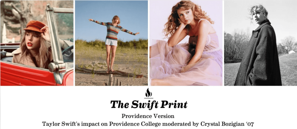
Cowen’s 2nd Law states that there is a literature on everything. I would certainly expect there to be a literature on the best-selling musician in the world. And of course there is; Google Scholar returns 23,500 results for “Taylor Swift”, and we’ve done 5 posts here at EWED. But surprisingly, searching EconLit returns nothing, suggesting there are currently no published economics papers on Taylor Swift, though searching “Taylor” and “Swift” separately reveals hundreds of articles about the Taylor Rule and the SWIFT payment system. Google Scholar does report some economics working papers about her, but the opportunity to be the first to publish on Taylor Swift in an economics journal (and likely get many media interview requests as a result) is still out there.
Swift presents a variety of angles that could be worthy of a paper; re-recording her masters forcopyright reasons, her efforts to channel concert tickets to loyal fans over re-sellers, or her sheer macroeconomic impact. I’ve added a note about this to my ideas page (where I share many other paper ideas).
In the mean time, I’ll be giving a short talk on the Economics of Taylor Swift at 7pm Eastern on Monday, September 16th, as part of a larger online panel. The event is aimed at Providence College alumni, but I believe anyone can register here.
Update 10/25/24: A recording of the event is here, and a recording of a followup interview I did with local TV is here.
Are you better off than you were four years ago? That question was asked at the Presidential debate last night. But more importantly, we also got a massive amount of new data on income and poverty from Census yesterday. That data allows us to make that just that comparison, although somewhat imperfectly.
The Census data is excellent and detailed, but it’s annual data, meaning that the release yesterday only goes through 2023. We won’t have 2024 data for another year. Such is the nature of good data. (Note: I’ve tried to address this same question with more real-time data, such as average wages). Still, it’s a useful comparison to make. It’s especially useful right now because the new 2023 data on income are (for most categories) the highest ever with one exception: 4 years ago, in 2019.
A reasonable read of the data on income (whether we use households, families, or persons) is that in 2023 the median American was no better off than in 2019, after adjusting for inflation. In fact, they were probably slightly worse off. I fully expect this will no longer be true when we have 2024 data: it will certainly be above 4 years prior (2020) and likely above 2019 too (more on this below). But we can’t say that for sure right now.
So let’s do a comparison of “are you better off than 4 years ago” for recent Presidents that were up for reelection (treating 2024 as a reelection year for Biden-Harris too), using the 4-year comparison that would have been available at the time using real median family income. Notice that this data would be off by one year, but it’s what would have been known at the time of the election.
Most of us have read or heard references to flat-earthers. I have always assumed they are some tiny tongue-in-cheek group which is just playing out an elaborate joke on the rest of us. The Greeks figured out by 300 A.D. that the earth was round, and this tidbit was incorporated into medieval scholarship, so there has never been much religious or traditional impetus for a flat earth. I was therefore a bit surprised to learn that flat earth beliefs are very serious to many folks, and that such beliefs seem to be on the rise.
In 2020, it was reported that based on polling by Datafolha, 7% of Brazilians believed in a flat Earth. A 2018 YouGov poll found that around 4% of the population of the United States believed in flat Earth while the POLES 2021 Survey found around 10% of the United States population believed that the Earth is flat. A 2019 YouGov survey found that around 3% of British people supported flat Earth.
Digging into that 2018 YouGov poll finds that 2% of Americans resolutely say the earth is flat, but many others who lean towards a round earth are not quite sure. Flat-earthism is more prevalent in Millennials than in older folks, only 66% of Millennials firmly believe the earth is round :
While an overwhelming majority of Americans (84%) believe that the Earth is round, at least 5% of the public say they used to believe that but now have their doubts. Flat earthers find traction in their beliefs among a younger generation of Americans. Young millennials, ages 18 to 24, are likelier than any other age group to say they believe the Earth is flat (4%).
Apparently, a YouTube channel launched in 2015 by real-life pinball wizard Mark Sargent (“…a competitive video game player, winning one virtual pinball tournament”), which has amassed over two million views, has played a role in popularizing flat earth beliefs. In his brand of geography, the center of the earth-disk is roughly the North Pole, and the edge of the earth-disk lies in what we normally think of the extreme south, and is surrounded by an ice-wall. Several basketball players (Kyrie Irving, Wilson Chandler, Draymond Green) and a rapper (B.o.B) have come out in favor of flatness. The NASA conspiracy of a round earth is crumbling…
I think some of this flat-earth polling is just ignorance, especially those who are not sure. But there are those who “have their reasons”, often citing various (pseudo) scientific arguments to support their beliefs:
Research by Carlos Diaz Ruiz and Tomas Nilsson on the arguments that flat Earthers wield, shows three factions, each one subscribing to its own set of beliefs.
The first faction subscribes to a faith-based conflict in which atheists use science to suppress the Christian faith. … their arguments use the Scripture – word-by-word – to support an argument that enables God to really exist.
The second faction believes in an overarching conspiracy for knowledge suppression. Building upon the premise that knowledge is power, the flat Earth conspiracy argues that a shadowy group of “elites” control knowledge to remain in power. In their view, lying about the fundamental nature of the Earth primes the population to believe a host of other conspiracies. …
The third faction believes that knowledge is personal and experiential. They are dismissive of knowledge that comes from authoritative sources, especially book knowledge.
Belief in geocentricity (i.e., that the earth is stationary and the sun goes around the earth) is even more widespread than belief in a flat earth. From Wikipedia:
According to a report released in 2014 by the National Science Foundation, 26% of Americans surveyed believe that the Sun revolves around the Earth. Morris Berman quotes a 2006 survey that show currently some 20% of the U.S. population believe that the Sun goes around the Earth (geocentricism) rather than the Earth goes around the Sun (heliocentricism), while a further 9% claimed not to know. Polls conducted by Gallup in the 1990s found that 16% of Germans, 18% of Americans and 19% of Britons hold that the Sun revolves around the Earth. A study conducted in 2005 by Jon D. Miller of Northwestern University, an expert in the public understanding of science and technology, found that about 20%, or one in five, of American adults believe that the Sun orbits the Earth. According to 2011 VTSIOM poll, 32% of Russians believe that the Sun orbits the Earth.
Geocentrism seems particularly driven by religious concerns, although I think the polls also heavily reflect plain ignorance. There are passages in the Bible which, if taken literally, seem to mandate a stationary earth and a moving sun. The Roman Catholic church has tiptoed away from its condemnation of Galileo four hundred years ago, and essentially accepted his contention that such passages were never intended to be taken literally. Nevertheless, Catholic layman Robert Sungenis has vigorous argued for geocentricity and Bible literalism, publishing books such as Galileo Was Wrong. On the fundamentalist Protestant side, there is the Association for Biblical Astronomy, with its web site www.geocentricity.com, and apologist Dean Davis.They make arguments to dismiss the usual scientific conclusions on this matter, e.g., that according to relativity, it could be true that the earth is stationary and the entire universe is spinning around the earth.
Geocentricity is somewhat poignant for me, because a good friend of mine from college later became deeply attached to it, to the point that he rejected my thinking as apostate when I disagreed. He was a bright guy and an Ivy League graduate. Which just goes to show that fringe beliefs can have unexpected appeal.
This post might seem lazy. Because it is. But it’s also a measure of my accumulated wisdom. Not so much that I’ve perfectly internalized the wisdom of this piece in my bodhisattva-like personification of enlightenment. Rather, it is a demonstration of my wisdom because I have written and posted it in lieu of an anger-filled rant about the horrors of politicians pandering to their base in which I imply vast swaths of humanity are less-than-perfect people. Nope. Don’t need it. This is better. Listen to what Dana has to say and think about how it applies to your career.
“Why do our students (even the ones paying a jillion dollars!) *want* to skip their lessons?”
“You give us work fit for machines. You want rote answers.”
He asks why students want to cheat and what is wrong with education. Why did this tweet take off? This is obvious.
I’m not of the opinion that education is entirely signaling (see Bryan Caplan). However, anyone can see that education is partly signaling. It’s difficult to get good grades. Good grades is a noisy signal of excellence. Students want to cheat so that they can obtain the good grades and signal to employers that they are excellent. There is nothing mysterious about that.
Part of a professor’s job is to make it hard to cheat and costly if you are caught.
Now we get to the “rote answers” part. How is a professor who has over 100 students every semester supposed to monitor the students’ performance and make it hard to cheat and be fair to every student? The “rote answers” part is a technology called the multiple-choice test with auto or semi-auto (e.g. Scantron machine) grading. Multiple choice tests serve an important role in our society, and they aren’t going anywhere.
A professor who has only 10 students per semester could give personalized assignments and grade oral exams and be an Oxford tutor for the students hand-written essays or whatnot. However, that kind of education would be extremely expensive/exclusive and does not scale.
Readers are more scarce than writers. AI’s can read now. The implications that will have for education and assessment have yet to be seen.
This post is quick and simple. We all know that states have different land areas and different populations. We also know that different states produce different amounts of output. We have a pretty good sense for which are the ‘big’ states since these things often go hand-in-hand. But what about household spending on consumption? It’s easy to imagine that some states produce plenty but then invest the proceeds. So, which states consume the most relative to their income?
The map above illustrates which states consume more of their income. There’s not much correlation geographically. But, among the ‘big’ states (Texas, California, New York, Illinois), the consumption per GDP is below the average of 67%. Can we make sense of this? As it turns, out more productive states also tend to have a higher per capita output. So, those higher GDP states also have richer populations on average. And, sensibly, those richer populations have lower marginal propensities to consume. They save more. But this is just spit-balling.
The answer sure seems to be “nothing”. I just went for an eye exam for the first time since Covid and realized that I’ve been wasting my money by paying for vision insurance.
The problem isn’t the eye exam- that went fine, and was covered fine with a $35 copay. But it was covered by my health insurance, not my vision insurance. So what is the vision insurance good for, if it doesn’t cover eye exams?
The answer is supposed to be “glasses”. It is supposed to cover frames up to $150 with a $0 copay, and basic lenses with a $25 copay, from in-network providers. That sounds ok- but there are two problems.
One is that almost none of the in-network providers (like Glasses dot com or Target optical) appear to actually offer lenses where the $25 copay applies; instead the minimum lens price is at least $85.
The second problem is that the premiums are high enough that even if I use them to get $25 glasses (which I eventually found I could through LensCrafters), it wouldn’t be worth it. They don’t sound high at first, which is how I got suckered into signing up for this scam in the first place. It’s just $5/month for single coverage; that sounds like nothing, especially for an employer benefit. It is a rounding error compared to health insurance premiums, and it comes out of pre-tax money. A small waste, but still a waste. Why?
Glasses are just so cheap if you can avoid the monopoly retailers and get them somewhere like Zenni. Zenni will sell you perfectly functional (and IMHO good-looking) prescription eyeglasses for $16. Their frames start at $6.95, lenses at $3.95, and shipping at $4.95. Catch a sale, or order enough to get free shipping, and you could actually get glasses for well under $16.
Or you can do what I did- order glasses from Zenni with premium options that pushed them up to $50- and find it is still cheaper than using the insurance I already paid for to get the cheapest pair available at most of their in-network retailers. The cheapest possible deal with insurance would be to pay $60/year in premiums, get glasses as often as the insurance allows so as not to waste the benefit (every 12 months- much more often than I find necessary), find frames listed under $150 to get for $0 copay, and find an in-network provider that actually offers lenses for the $25 copay. In this best-case scenario you are still paying $85 per pair of glasses. Given that the $60 in premiums came from pre-tax money, perhaps you can argue that it was really more like $40 in real money; but you can also buy glasses from a competitive retailer like Zenni using pre-tax money from an HSA or FSA.
So as far as I can tell, vision insurance really is useless. I certainly decided not to use it for my latest pair of glasses even though I had already paid years of premiums; Zenni was still much cheaper for a comparable product. I’m dropping vision insurance now that open enrollment is here. My take-home pay will be going up, and EyeMed will stop getting my money for nothing.
Is there anyone vision insurance makes sense for? I think it could makes sense for someone who really wants brand name glasses, or for someone who really wants to get their glasses in-person at the optometrist, and wants new glasses every year. For everyone else, run the numbers for your own plan, but I suspect you would also be better off just buying glasses directly.
Disclaimer: This post is not sponsored & doesn’t use affiliate links; Zenni is the best option I currently know of, but I’d be happy to hear of other competitive retailers you think are better, or an argument for when vision insurance is actually useful.
A recent post from the blogger (Substacker?) Cremieux called Rich Country, Poor Country showed how small differences in economic growth add up over time. Because he used nominal GDP growth rates, I don’t think that post is exactly the right way to analyze the question, but I still think it’s a very important one. So in this post I will offer, not necessarily a critique of that post, but perhaps a better way of looking at the data.
For the data, I will use the Maddison Project Database, which attempts to create comparable GDP per capita estimates for countries going back as far as possible… for some, back thousands of years, but for most countries at least the last 100 years. And the estimates are stated in modern, purchasing power adjusted dollars, so they should be roughly comparable over time (if you think these estimates are a bit ambitious, please note that they are scaled back significantly from Angus Maddison’s original data, which had an estimate for every country going back to the year 1 AD). The most recent year in the data is currently 2022, so if I slip up in this post and say “today,” I mean 2022, or roughly today in the long sweep of history.
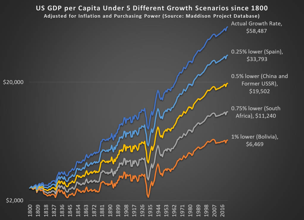
Like Cremieux’s post, I am interested in how much slightly lower economic growth rates can add up over time. Or even not so slightly lower growth rates, like 1 percentage point less per year — this is a huge number, because the compound annual average growth rate for the US from 1800 to 2022 is 1.42%. So let’s look at the data way back to 1800 (the first year the MPD gives us continuous annual estimates for the US) to see how changes in growth rates affect long-term growth.
It probably won’t surprise you that if our 1.42% growth rate had been 1 percentage point lower, the US would be much poorer today, but to put a precise number on it, we would be about where Bolivia is today (that is, ranked 116th out of the 169 countries in the MP Database). Note: I’m using a logarithmic scale, both so it’s easier to see the differences and because this is standard for showing long-run growth rates.
What is very interesting, I think, is that if our growth rate had been just 0.25 percentage points lower per year since 1800, we would be about where Spain is. Now, Spain is certainly a fine, modern developed country (they rank 34th of the 169 MPD countries). But Spain’s growth has not been spectacular lately. Average income in Spain is almost half of the US today (purchasing power adjusted!), which is another way to say that just 0.25 percentage points lower over 222 years reduces your growth rate by half.
That’s the power of economic growth.
And if our growth rate had been 0.5 percentage points lower, we’d be about where the big former Communist countries are today (both China and the former countries of the USSR are about equal today — about 1/3 of the income of the US).
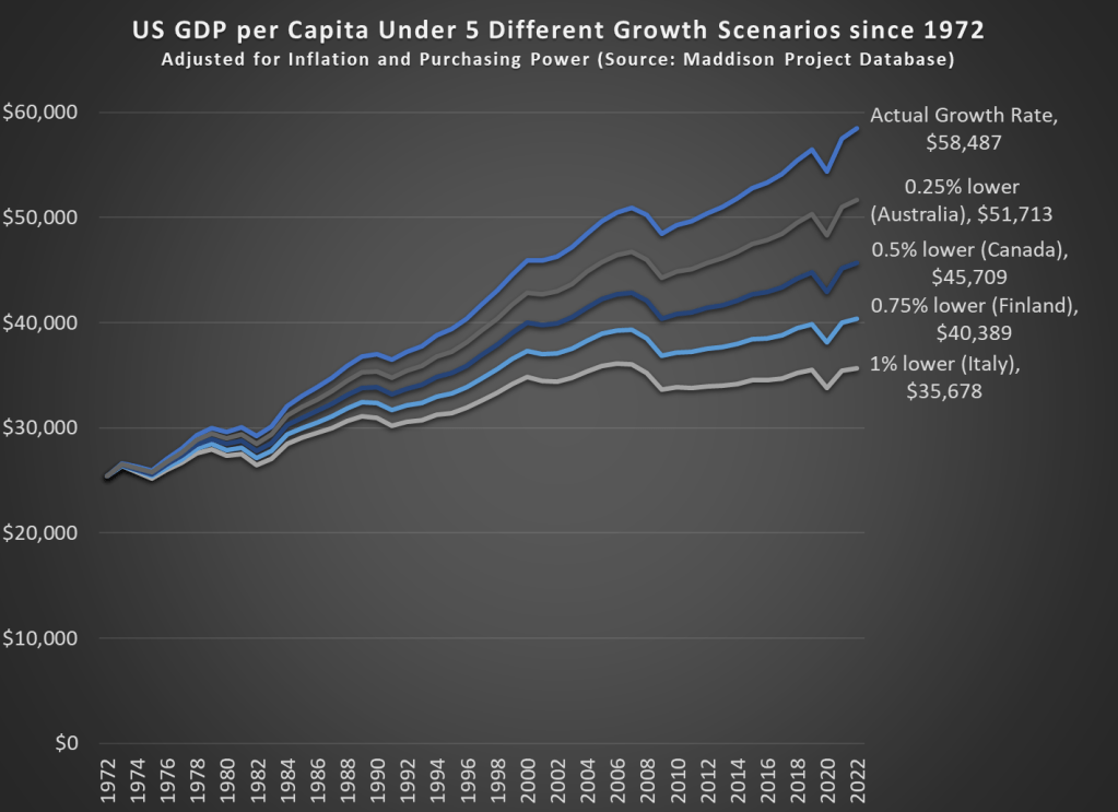
What if we perform the same analysis for a shorter time horizon? If we go back 50 years to 1972, the effects are not quite as dramatic, but still visible.
Our cumulative annual growth rate since 1972 has been a bit higher than the long-run average, around 1.68%. Under these four alternative growth scenarios since 1972, the comparable countries don’t sound so bad. It probably wouldn’t be a huge deal if we were only at Australia’s level, losing just about a decade of economic growth. But it would be a huge failure if we were only at Italy’s current level of development. Under that 1 percentage point lower growth scenario, we would have had no net growth since about year 2000, which has roughly been the case for Italy.
All of these alternative scenarios show the power of economic growth to add up over time, but they do so in pessimistic way: what if growth had been slower. What if we look at the opposite: what if growth had been faster over some time horizon. Sticking with the 1972 medium-run example, if real growth rates had been 1 percentage point higher, our income today would be almost double what it actually is, about $95,000 compared with the current $58,000 (the MPD data is stated in 2011 dollars, so that sounds lower than it actually is now: over $80,000).
What if we went back even further? If our economic growth rate since 1800 had been 1 percentage point higher every year, our average income in 2022 would be an astonishing $517,000 — almost 10 times what it actually was in 2022. That’s a dizzying number to think about, and maybe that’s not a realistic alternative scenario.
But what if it had only been 0.25 percentage points higher since 1800 — that probably is a world that was possible. In that case, GDP per capita would be about double what it actually was in 2022, at over $100,000 (again, stated in 2011 dollars).