Coming In to Land

And I twisted it wrong just to make it right
Had to leave myself behind
And I’ve been flying high all night
So come pick me up, I’ve landed

-Fed Chair Ben Folds on the Covid inflation

The Fed has now almost landed the plane, bringing us down from 9% inflation during the Covid era to something approaching their 2% target today. But it is not yet clear how hard the landing will be. Back in March I thought recurrent inflation was still the big risk; now I see the risk of inflation and recession as balanced. This is because inflation risks are slightly down, while recession risk is up.

Inflation remains somewhat above target: over the last year it was 3.3% using CPI, 2.7% by PCE, and 2.8% by core PCE. It is predicted to stay slightly above target: Kalshi estimates CPI will finish the year up 2.9%; the TIPS spread implies 2.2% average inflation over the next 5 years; the Fed’s own projections say that PCE will finish the year up 2.6%, not falling to 2.0% until 2026. The labels on Kalshi imply that markets are starting to think the Fed’s real target isn’t 2.0%, but instead 2.0-2.9%:
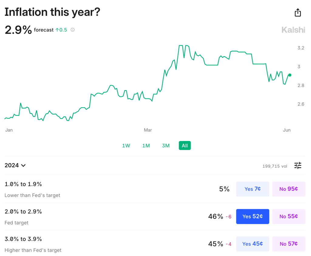
The Fed’s own projections suggest this to be the somewhat the case- they plan to start cutting over a year before they expect inflation to hit 2.0%, though they still expect a long run rate of 2.0%. In short, I think there is a strong “risk” that inflation stays a bit elevated the next year or two, but the risk that it goes back over 4% is low and falling. M2 is basically flat over the last year, though still above the pre-Covid trend. PPI is also flat. The further we get from the big price hikes of ’21-’22 with no more signs of acceleration, the better.

But I would no longer say the labor market is “quite tight”. Payrolls remain strong but unemployment is up to 4.0%. This is still low in absolute terms, but it’s the highest since January 2022, and the increase is close to triggering the Sahm rule (which would predict a recession). Prime-age EPOP remains strong though. The yield curve remains inverted, which is supposed to predict recessions, but it has been inverted for so long now without one that the rule may no longer hold.

Looking through this data I think the Fed is close to on target, though if I had to pick I’d say the bigger risk is still that things are too hot/inflationary given the state of fiscal policy. But things are getting close enough to balanced that it will be easy for anyone to find data to argue for the side that they prefer based on their temperament or politics.

To me the big wild card is the stock market. The S&P500 is up 25% over the past year, driven by the AI boom, and to some extent it pulls the economy along with it. The Conference Board’s leading economic indicators are negative but improving overall this year; recently their financial indicators are flat while non-financial indicators are worsening.

Overall things remind me a lot of the late ’90s: the real economy running a bit hot with inflation around 3% and unemployment around 4%; the Fed Funds rate around 5%; and a booming stock market driven by new computing technologies. Naturally I wonder if things will end the same way: irrational exuberance in the stock market giving way to a tech-driven stock market crash, which in turn pushes the real economy into a mild recession.

Of course there is no reason this AI boom has to end the same way as the late-90’s internet boom/bubble. There are certainly differences: the Federal government is running a big deficit instead of a surplus; there are barely a tenth as many companies doing IPOs; many unprofitable tech stocks already got shaken out in 2022, while the big AI stocks are soaring on real profits today, not just expectations. Still, to the extent that there are any rules in predicting stock crashes, the signs are worrying. Today’s Shiller CAPE is below only the internet and Covid meme-stock bubble peaks:
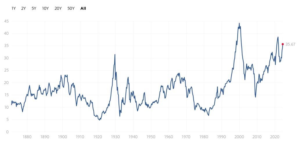
Again, this doesn’t mean that stocks have to crash, or especially that they have to do it soon; the CAPE reached current levels in early 1998, but then stocks kept booming for almost two years. I’m not short the market. But the macro risk it poses is real.
Young Americans Continue to Build Wealth, Across the Distribution

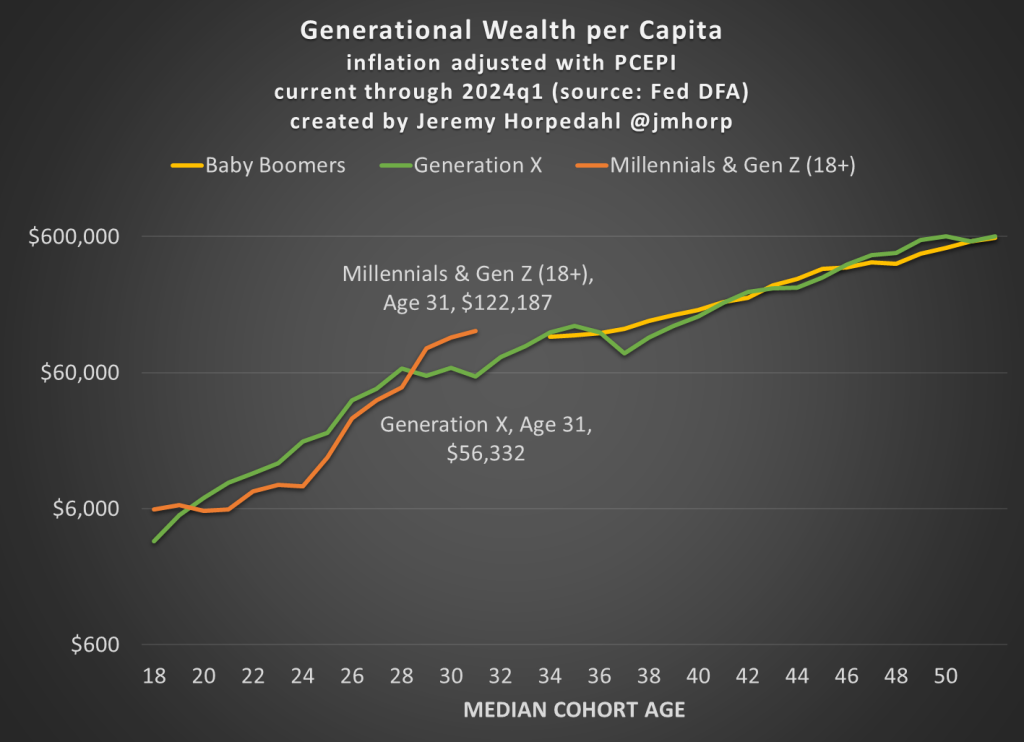
First, here is an updated chart on average wealth by generation, which gives us the first glimpse at 2024 data:

I won’t go into too much detail explaining the chart here, as I have done that in more detail in past posts. But one brief explanatory note: I’m now labeling the most recent generation “Millennials & Gen Z (18+).” Because of the nature of the data from the Fed’s DFA, I can’t separate these two generations (it can be done with the Fed SCF data, but that is now 2 years old). This combined generation now includes everyone from ages 18 to 43 (which means that technically the median age is 30.5, not quite 31 yet), somewhere around 116 million people, which makes it a bit of a weird “generation,” but you work with the data you have. Note though that this makes the case even harder for young Americans to be doing well, as every year I am adding about 400,000 people to the denominator of the calculation, even though 18-year-olds don’t have much wealth.

What’s notable about the data is just how much the youngest “generation” in the chart has jumped up in recent years. They have now have about double the wealth that Gen X had at roughly the same age. Average wealth is about as much as Gen X and Boomers had 5-6 years later in life — and while there are no guarantees, odds are Millennial/Gen Z wealth will be much, much higher in another 5-6 years. You may notice at the tail end of the chart that Gen X and Boomers now have roughly equal amounts of average wealth at the same age (Gen X’s current age), while 2 years ago they were $100,000 ahead. I suspect this is just temporary, and Gen X will soon be ahead again, but we shall see.

Of course, the most common complaint about my data is that these are just averages, so they don’t tell us a lot about the distribution of wealth and could be impacted by outliers. That’s why I’m really excited to share this new data on wealth by decile from the 2022 Fed SCF survey. This data was put together by Rob J. Gruijters and co-authors, and it allows us to compare the wealth of Boomers, Gen X, and Millennials across the wealth distribution. You should read their analysis of the data, but in this post I’ll give my slightly different (and optimistic) interpretation of it.

For all three generations, wealth in the bottom 10% is negative when that generation is in their 30s. And for Millennials, it is the most negative: -$65,000 compared to -$30,000 for Gen X and -$17,000 for Boomers in the bottom decile (as always, the figures are adjusted for inflation). While I haven’t dug into the data, my suspicion is that student debt is driving a lot of the increase. Since this is households in their 30s, I suspect a lot of the bottom decile is composed of folks that just finished graduate and professional school, and are only now starting to acquire assets and pay down debt — they have very high earning potential, which means over their lifetime they will do great, but they are starting from behind. Again, we’ll have to wait and see, but I suspect many in the bottom will quickly climb up the wealth distribution over their working years.

That being said, in the following chart I have left off the bottom 10% for each generation, since displaying negative wealth would make the chart look a little weird. But this chart shows a very optimistic result: Millennials are doing better than Boomers across the distribution, and Millennials are ahead of almost all deciles for Gen X except a few, where they are essentially equal to Gen X (2nd, 7th, and 8th deciles).

The chart may be a little confusing (give me your suggestions to improve it!), but here’s how to read it. The blue bars show Millennial wealth relative to Gen X, at the same age, for each decile (excluding the bottom 10%). For example, the first bar shows that Millennials in the 2nd wealth decile had 100% of the wealth that Gen Xers in the 2nd wealth decile had at the same age — in other words, they were equal. The orange bars show Millennial wealth relative to Baby Boomer wealth at the same age, in the same decile (to repeat, it’s all adjusted for inflation).

Notice that other than the very first bar (Millennials vs. Gen X in the 2nd wealth decile), all of the other bars are over 100%, indicating that Millennials have more wealth than the two prior generations for almost every decile. For some of these, they are much, much greater than 100%. In the 5th decile (close to the median), Millennials have over 50% more wealth than Gen X and almost 200% (double the wealth) of the wealth of Boomers. That’s a massive increase!

A pessimistic read of the chart is that the biggest gains went to the top 10%. Though notice that’s only true relative to Baby Boomers. When compared with Gen X, the 4th and 5th deciles did better than the top 10% in terms of relative improvement. To relate this to the earlier chart in this post, it suggests that relative to Boomers, outliers at the top end might be skewing the average a bit, but that’s probably not the case relative to Gen X. And again, the broad-based gains are visible throughout the distribution from the 2nd decile on up.

Finally, on social media I’ve got several objections about the chart, such as folks not liking the log scale y-axis, and preferring the CPI-U for inflation adjustments instead of the PCEPI that I use. For those objectors, here is a different version of the chart:

Boardroom Backstabbing: The Rise of “Lender-on-Lender Violence”

When I first started reading of “Lender-on-Lender Violence” this year, images of bankers in three-piece suits brawling in the streets of Lower Manhattan came to mind. It turns out that this is a staid legal term for a practice which has been around for some time, but is becoming more common and consequential.

Consider a case where say three lenders (e.g. banks or more likely venture capital funds) have lent money to some startup or struggling company XYZ. Let’s call these lenders A, B, and C. Now XYZ needs even more funding, perhaps because they need to build another factory, or perhaps because things are not working out as they hoped and they cannot pay off the original loans and still stay in business.

Now Lenders A and B get together and cook up a scheme. They will lend some more money to company XYZ to largely replace the original loan, but they contrive to get legal terms for that new loan that give it a higher priority for payment than the original loan. This is called “up-tiering” the new loan.  This has the effect of reducing the market value of the original loan.

Lender C is now hosed. It faces murky prospects for repayment on that original loan. Lenders A and B offer to buy them out of the original loan for 40 cents on the dollar. Lender C proceeds to sue Lenders A and B.

Will Lender C prevail? Probably not, if the course of recent cases is any guide. Unless there is very specific language in the legal “covenant” regarding the first loan forbidding this practice, it seems to be legal.

A similar maneuver would be for a new Lender D to offer a replacement loan to Company XYZ, with legal language giving it priority over the original loan. This is called “priming.”

Yet another tactic by the aggressive lenders includes working with Company XYZ to move its more valuable assets into a subsidiary or shell company, and to get the new loan to hold that as collateral. This again hoses the “victim” lenders, since again the assurance that they will be repaid has gone down.

My Personal Experience with Lender-on-Lender Violence

Some years ago, I bought the bonds of a company called SeaDrill. I bought the bonds instead of the common or preferred stock, for an additional margin of safety. Unlike the stock, the bonds must be repaid in full, right? Both the bonds and the preferreds were paying about 9%, back when general interest rates were much lower than that are now. So, I was a lender to the company.  

Silly me. Times got tough in the oil patch, and the company would have had difficulty paying off its bonds AND paying its management their high salaries. So, they went for Chapter 11 bankruptcy. I had not realized the difference between Chapter 7 bankruptcy, where the company shuts down and liquidates and pays off its creditors in pecking order, and Chapter 11, which is largely a chance for the company to put the losses on its creditors and to keep on operating.

As with the example above, some big institution offered to refinance things with new secured bonds that had priority ahead of the old bonds (which I held). In the end I got about 44 cents on the dollar for my bonds. I was not happy about that, but I did make out better than the hapless preferred stockholders, who got just a tiny crumb to make them go away. It was a learning experience. I did feel, well, violated.

Implications for the Burgeoning Private Credit Market

I will be writing more on the booming “private credit” market. Many of the loans in this space are “covenant-lite.” Back before say 2008, a large fraction of loans to business were through banks, who would insist on strong legal protection for their money. But in recent years, private equity funds have competed for this lending, allowing the borrowers to borrow on terms that give much less protection to the lenders. Cov-lite is now the norm.

Traditionally, loans (as distinct from bonds) to businesses have enjoyed decent recoveries (e.g., around 70%) in case of defaults, thanks to strong collateral backing the loans. But if we face any sort of prolonged recession and elevated defaults, the recoveries on all these loans will be far less than in the past. These are uncharted waters.

A Reference for “Lender-on-Lender Violence”

A solid description  of these matters is found in “ Uptier Transactions and Other Lender-on-Lender Violence: The Potential for More Litigation and Disputes on the Horizon “ at dailydac.com.

We are all leading with what bleeds

Derek Thompson has been writing about the “exporting of despair” from the US, both in terms of the news and social media. His thoughts are always worth reading. Here’s mine.

If you want to be terrified of stepping outside your front door, the surest method is to simply watch the local news every day. Your experienced life will become overweighted towards tragedy, born of both bad luck and malign intent, and soon your distorted personal data set will yield the logical conclusion that the only viable strategy is to isolate and insulate yourself from the outside world. One man’s agoraphobia is another man’s purest sanity.

The root of this tragically distorted information set held by our dedicated local news consumer is the old adage “if it bleeds it leads.” If you are programming the local news, you know the best way to grab and hold viewers’ attention is a “Lucy and Ethel at the chocolate factory” conveyor belt of tragedy and violence, preferably both. This logic has extended to the “rivalry” based news model, where tragedy and violence is coupled with blame, specifically blame for either the “other side” or just “others” who are pointedly not “us”. That’s a model of news bias. Let’s bring it back to despair.

Social media means that we are all, to varying degrees, local news. In the “local news programming” portion of our minds that are trying gain and retain attention, we know that if it bleeds it leads. The catch, of course, being that bleeding is both costly and unstainable. With all due respect to the cast of Jackass, most of us don’t have the ability to consistently manifest attention with our own steady physical destruction. What we can do, however, is be sad.

Professing despair is a manner in which we can garner attention for the metaphorical trainwreck or dumpster fire that is our lives. Good news, or even just positive vibes, feels like bragging. It’s the “Live Laugh Love” wall art of public status updays. It’s cringe. You scroll through cringy good vibes. You comment-prayer hands-heart emoji states of despair.

People respond to incentives, so when you receive greater love and approbation the more grisled your public emotional state, the more you lead with what’s bleeding. Climate change fears, rage over Gaza, abortion, Trump, Biden, student loans, etc. You don’t talk about these things, however. You talk about how they make you feel. And how they make you feel seems to get worse and worse. Perhaps because you feel worse, but I suspect what is more likely is that the professed negativity of your emotional state has to compete for attention with the negativity of everyone else’s emotional state. You are in a race to the emotional bottom, a status competition where everyone is competing to be the worst off.

So here we are, with millions of local news channels, all trying to lead with the very worst news. Ask any actor and they’ll tell you they take their performances home with them. There is an emotional residue to any professed state, doubly so when there is considerable truth underneath it. An actor playing a cancer patient will take home that anxiety and despair, but at the end of the day they don’t actually have cancer. The route to emotional recovery is direct and observable. Fears over climate change or student loan payments, on the other hand, are based in something very real. Elevating your public despairing over them is going to create an emotional state that is far trickier to undo in the rest of your life. You’ve added fuel to real, rather than artificial, emotional fire. I think many people are finding that the anxiety they’ve pantomimed for humor and sympathy becomes very real over time.

TL;DR: What if it is actually fine? We used to just enjoy our coffee, but it seems like more and more are dumping gasoline on our floors because nobody reacted to story on instagram before we added the fire.

Real and Nominal Rigidities Research

This week, I’m doing some review for a macro-related project. In economics, the concepts of real and nominal rigidities help explain why prices and wages do not always adjust quickly in response to shocks. These rigidities create frictions that affect how markets function. A well-known rigidity is downward nominal wage rigidity (I have an experimental paper on that).

“Nominal rigidities” refer to the stickiness of prices and wages in their nominal (monetary) terms. These rigidities prevent immediate adjustment of prices and wages to changes in the overall economic environment.

Examples of Nominal Rigidities

  • Menu Costs: The costs associated with changing prices, such as reprinting menus or reprogramming point-of-sale systems. For instance, a restaurant might avoid changing its menu prices frequently because of the costs involved in printing new menus and the risk of confusing or losing customers.
  • Nominal Wage Contracts: Many workers are employed under contracts that fix their wages for a certain period, such as a year. This means that even if the demand for labor changes, wages cannot adjust immediately. For example, a factory might have a one-year wage contract with its workers, preventing it from lowering wages even during a downturn.
  • Price Stickiness Due to Psychological Factors: Prices may remain rigid because businesses fear that frequent changes might upset customers or erode their trust. A classic example is a retail store keeping prices stable to maintain a reputation for reliability, even when costs fluctuate.

Side note: Lars Christensen predicts less nominal rigidity in our future. Menu costs are getting smaller and customers could become accustomed to, for example, watching the price of milk fluctuate in real time in response to statements by the Fed. Click here for related Twitter joke.

Continue reading →

Advice For Travelling With Children

My family regularly takes long trips up and down the east coast of the US. It takes us about 6 hours just to travel through Florida. We have several kids between the ages of 1 & 7 and we’ve got it down to a pretty good science. Here’s some great advice for travelling with children. A lot of it is OK advice if you cherry pick, but together their benefits compound.

1) Depart Early

It doesn’t matter if it’s a 3 hour trip or a two day trip. To us, ‘early’ means that our target departure time is 5 AM, but ‘early’ may mean something different for you and yours. Benefits include:

  • Kids may remain or resume sleeping for the first portion of the travel. That’s time that they are occupied.
  • Earlier arrival at your destination gives kids time to burn off some energy and adults time to decompress. For multi-day trips, we like to stop at a hotel that has a pool.

2) Carry-on Backpacks

Just as you would have a small personal item on an airplane, such as a purse, give each child a backpack that contains car-ride content (make sure that they put away one thing before beginning the next). Maybe ensure that each kid has a different color. This puts their stimulation in their own hands. The idea is not to avoid interacting with your kids. The idea is to help them take care of themselves. Here’s what to include:

Continue reading →

The Calming Psychology of Money

Morgan Housel’s Psychology of Money is not much like other personal finance books. Rather than making recommendations about exactly what to do and how to do it, Housel tells stories about how people’s different attitudes toward money serve them well or poorly. His stance is that most people already know what they should do, so he doesn’t need to explain that, but instead needs to explain why people so often don’t do what they know they should (e.g. save more). The book is not only pleasant to read, but at least for me exerts a calming effect I definitely do not normally associate with the finance genre, as if the subtext of “just be chill, be patient, follow the plan and everything will be alright” is continually seeping into my brain. Some highlights:

The idea of retirement is fairly new. Labor force participation for men over 65 is only about 20% today, but was well over 50% prior to the introduction of Social Security. Even once it started, Social Security paid in real terms about a quarter of what it does today. Plus pensions weren’t as common as people think; as of 1975 only a quarter of those over 65 had pensions, and most of those didn’t pay much. The 401k didn’t exist until 1978; the Roth IRA until 1998. “It should surprise no one that many of us are bad at saving and investing for retirement. We’re not crazy. We’re all just newbies.”

If you are disappointed whenever the price of your stocks goes down, you are in for a bad time, though you will do well if you can just ignore it:

“Netflix stock returned more than 35,000% from 2002 to 2018, but traded below its previous all-time high on 94% of days. Monster Beverage returned 319,000% from 1995 to 2018- among the highest returns in history- but traded below its previous high 95% of the time during that period…. this is the price of market returns.”

Housel isn’t very prescriptive because he recognizes how much people differ: “I can’t tell you what to do with your money, because I don’t know you. I don’t know what you want. I don’t know when you want it. I don’t know why you want it.”

At the end explains what he does with his own money: “Effectively all of our net worth is a house, a checking account, and some Vanguard index funds.” He convincingly argues that his way isn’t for everyone; he paid off his house early but “I don’t try to defend this decision to those pointing out its flaws, or to those who would never do the same. On paper it’s defenseless. But it works for us. We like it. That’s what matters.”

The closest he gets to specific recommendation is “for most investors, dollar-cost averaging into a low-cost index fund will provide the highest odds of long-term success.” There are lots of more general recommendations about good mindsets to take, for instance:

The few people who know the details of our finances ask, ‘What are you saving for? A house? A boat? A new car?’ No, none of those. I’m saving for a world where curveballs are more common than we expect.

Overall this is an easy book to recommend- it is both pleasant and easy to read, and gives good advice. My main complaint is that it is short on the nuts and bolts of how you actually do this stuff; for someone who doesn’t already know, it would pair well with a book that is stronger on that front, like I Will Teach You to Be Rich.

The Growth of Black Wealth and Income in the United States

African Americans have seen much adversity throughout US history, but also significant economic progress. One way to measure economic progress is by looking at wealth. There is a fantastic paper by Derenoncourt and co-authors recently published titled “Wealth of Two Nations: The U.S. Racial Wealth Gap, 1860–2020” which puts together the best historical data on Black and White wealth in the US.

The paper primarily focuses on wealth inequality, and here it paints a pessimistic picture since 1950: while the racial wealth gap was closing up until 1950, it stalled after that, and possibly got worse after the 1980s. But using that same data, we can focus on the growth of Black wealth, and here the results are quite optimistic: inflation-adjusted Black wealth per capita was about 7 times larger in 2019 than it was in 1950. Black wealth per capita has roughly doubled since from about 1992 to 2019 (inflation adjusted).

Here’s the long-run data in a chart, which shows that in 2019 Black wealth per capita was 86 times greater than in 1870 (inflation adjusted). That’s some real economic progress!

For income data, there is no long-run historical series similar to the wealth series that I am aware of, but there are estimates for particular years. For example, Robert Margo estimates that Black income per capita was about $1,500 in 1870 (inflation adjusted to 2022 dollars) and $2,400 in 1900 (once again, inflation adjusted to 2022). Margo says that these data should be comparable to the Census CPS Historical Income tables, and the 2022 estimate from this series is $31,180 for Blacks. This data suggests that Black per capita income is 21 times was it was in 1870, and about 3 times what it was in 1967 (first year in the Census CPS series).

Using the same census data for families, rather than individuals, we can also look at the growth of Black family income since 1967. This data suggests that both median and mean family income for Blacks roughly doubled in inflation-adjusted terms from 1967 to 2022, which isn’t as impressive as the tripling of per capita income, but keep in mind that families are smaller today than in 1967. When we look at the distribution of those incomes, the progress becomes very clear:

In 1967, half of Black families had incomes under $35,000 (in 2022 inflation-adjusted dollars), which is close to the official definition of poverty (depending on family size). By 2022, this had been cut in half: just 25 percent of Black families were under $35,000.

The number of “rich” Black families (incomes of at least $100,000) in 1967 was miniscule: only about 200,000 families, just 5 percent of the total. In 2022, there were an additional 3 million rich Black families, now comprising almost one-third of the total, and outnumbering poor Black families. The number of rich Black families has grown by about 1 million in just the past decade — no stagnation there! The Black “middle class” (incomes between $35,000 and $100,000) now has 4.5 million families — the same number as the total count of Black families in 1967.

Of course, there is still much work to be done on economic progress in the US. But the astonishing economic progress of Blacks since emancipation and since the Civil Rights era is worth celebrating, even if racial gaps haven’t closed much recently.

How To Drive a Turbocharged Car, Such as a Honda CR-V

My old Honda Civic was a fairly small sedan. It had a 1.8 liter engine, that generated about 140 horsepower. It would not win any drag races, but had functional acceleration.

I recently got a Honda CR-V, a much larger, heavier vehicle. I was nonplussed to learn that it only had a 1.5 liter engine. Would I have to get out and push it up steep hills? As it turns out, this small engine can crank out some 190 horsepower. Given the size of this crossover SUV, this still does not make for a peppy drive, but at least I can actually pass another car as needed.

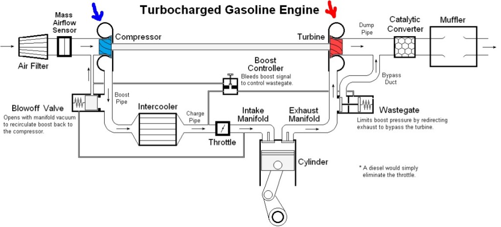
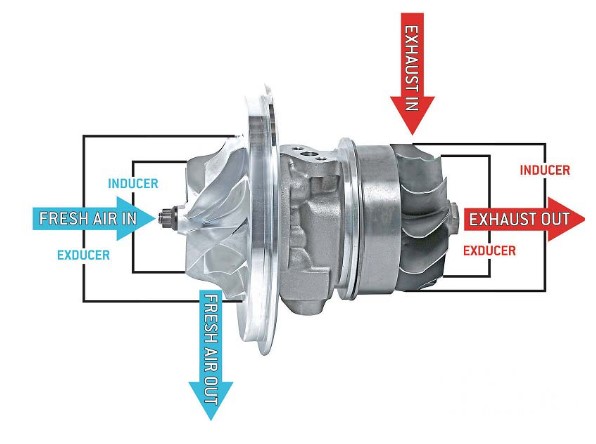
This high power with small engine displacement is made possible by the magic of turbocharging. As the (hot, expanded) exhaust gas leaves the engine, it goes through a turbine and makes it spin. A connected power shaft then spins a compressor, which takes outside air and jams it into the engine at higher pressure, i.e., higher density. With extra air stuffed into the engine cylinders, the engine can inject extra gasoline (keeping the air/fuel ratio roughly constant) – -and voila, high power output.

A schematic of this setup is shown below. I drew in a red arrow to mark the exhaust turbine, and a blue arrow for the intake air compressor. The rest should be fairly self-explanatory.

Source: Wikipedia

Also, here is a diagram of what the actual turbo hardware might look like:

Source: TurbochargersPlus

When the engine is turning at low-moderate speeds (say below 2000-3000 RPM), the turbine is doing relatively little, and so you are essentially driving around with a small (1.5 L) engine. This is good for gas mileage. When you floor it, the engine spins up and the turbo boost kicks in, giving considerably more power. [1]

What’s not to like? Apart from the potential maintenance headache of a rapidly spinning, complex chunk of precision machinery, there are a couple of issues with driving turbocharged engines that drivers should be aware of. There are articles  and videos (see good comments there) that address these and other issues in some detail.

( A ) Time Lag Before Turbo Boost Kicks In

With a normal non-turbo engine, you can feel the power kick in nearly immediately when you depress the pedal. The pedal opens the throttle, and instantly the engine is gulping more air (and fuel).

With a turbo, there can be a detectible time lag. The engine must rev up until the turbo effect starts to kick in, and then it spins faster, and there is more air shoved into the engine. As long as you know this, you can drive accordingly. This might be a life and death matter if as you are in the middle of passing a car on a two-lane highway, and suddenly an oncoming car appears in your passing lane. If you are not up to full power by that point, such that you can complete the passing quickly, you could become a statistic. I have only faced that situation maybe once every ten years in my driving, but it should be figured in.

The actual time lag varies from one model to another. I’d suggest just testing this out on your car. In some safe driving scenario, floor it and assess how much of a lag there is.

( B ) Don’t turn the engine off immediately if it has been running fast.

The thought here is to let the engine slow down to idle, and maybe even cool down a hair, before turning it off. The reason is that if the engine is revving at say 2000 rpm, and you suddenly turn the engine off, the oil pumping action stops, but the turbo is still spinning away in there. Having the turbine spinning away with no oil circulation can wreck the bushings.

There are articles  and videos (see good comments there) that address these and other issues in some detail.

Comment on Driving Honda CR-V Turbo Engine

Various engines have been used in CR-Vs. The 1.5 L turbo has been common in North America since 2017. It was designed to not have a very noticeable lag, in the sense that nothing happens for two seconds, and then the vehicle lurches forward. The turbo effect reportedly starts to kick in at 2000 rpm. However, this effect is progressive, so the power at 2000-3000 rpm is still modest. So, if you just push halfway down on the accelerator, the response is modest. If you floor it, the engine will within a second or two scream up to like 5000 rpm, and then start to really accelerate. That said, I have a visceral aversion to revving my engines that close to the red-line danger zone on the tachometer (my previous non-turbo cars I never took above about 3500 rpm, never needed to). Even with all that revving, the net acceleration is still modest.

Another factor with driving a CR-V is the “Econ” fuel-saving engine setting. When that is on, it seems to prevent the engine from revving over about 3500 rpm. So, if I plan to pass another car, or if I need power for some other reason, I need to remember to punch the leafy green Econ button to turn off this mode.

The bottom line is that I will think twice, maybe thrice, before passing another vehicle on a two-lane road in my CR-V.

ENDNOTE

[1] That is the theory anyway: great gas mileage most of the time, and bursts of power available for those rare times when you need it. The reality seems to be a little different. There may be reason to believe that turbocharged small engines give good idealized EPA test gas mileage numbers, but that in ordinary driving, the results are not so great. The turbo is never actually turned off, it just contributes more or less at various RPMs. The turbocharging forces the manufacturer to adjust the air/fuel mixture to be less efficient, in order to avoid knock. So, the manufacturer may be essentially manipulating things to look good on the EPA tests.  A larger engine, where some of the cylinders are shut off when not under load, may be more efficient. See video.

What is the optimal amount of time off?

I don’t have an answer, research to reference, or really even ideas regarding the optimal amount of time off. All I know is that I took 5 days off – actually off, with no work to speak of other unless you count reading short stories on a couch as work – and I feel much better. Not that I felt bad before, it wouldn’t even be that noticeable save that working is easier now. Focusing is easier, following through is easier. Enjoying the work is the easier. I never stopped caring, but I had become easier to distract.

Five days isn’t a lot. I didn’t go off the grid for a month. I didn’t try on a new identity in a foreign country. I ate granola with my wife at top of a beautiful mountain, so maybe that counts as eating, praying, and loving. I liked my job before and I still like it now, but sometimes you can end up too deep and caring a little too much, particularly about the bureaucratic details and status-oriented outcomes.

I am firmly team vacation, but with the caveat that your vacation actually be a vacation. Something stimulating and relaxing at the same time. The kind of thing where you are excited to get out of bed to do stuff but also free to do nothing for long languid periods of time, preferably with the hot or cold beverage of your choice.

As for the question presented at the outset, I still don’t know what the optimal length of time is. My closest approximation is a period of time long enough that don’t remember what you were working on the day that you left but not so long that the discontinuity becomes a source of stress and anxiety.

Or maybe its a schedule – 3 days every 2 months, 1 week every year, 1 month every 3 years, 3 months every decade. I’d love to say there is no rule, that you’ll know what you need when you need it, but I didn’t. I might schedule rereading this post every 6 months though.