Consumption Then and Now: 2019-2025

In aggregate, consumer spending on different broad categories of goods is relatively stable. The year 2019 feels like forever ago – and it was more than half a decade ago. But since then we’ve been hit by a pandemic and an AI shock and a trade war, and tariffs, and… plenty. We live in different times. Except, broadly, consumers are spending their money much as they did six years ago. Let’s compare some data from the 2nd quarter of 2019 and 2025.

First the Spending

Consumption spending is categorized in the below table.    

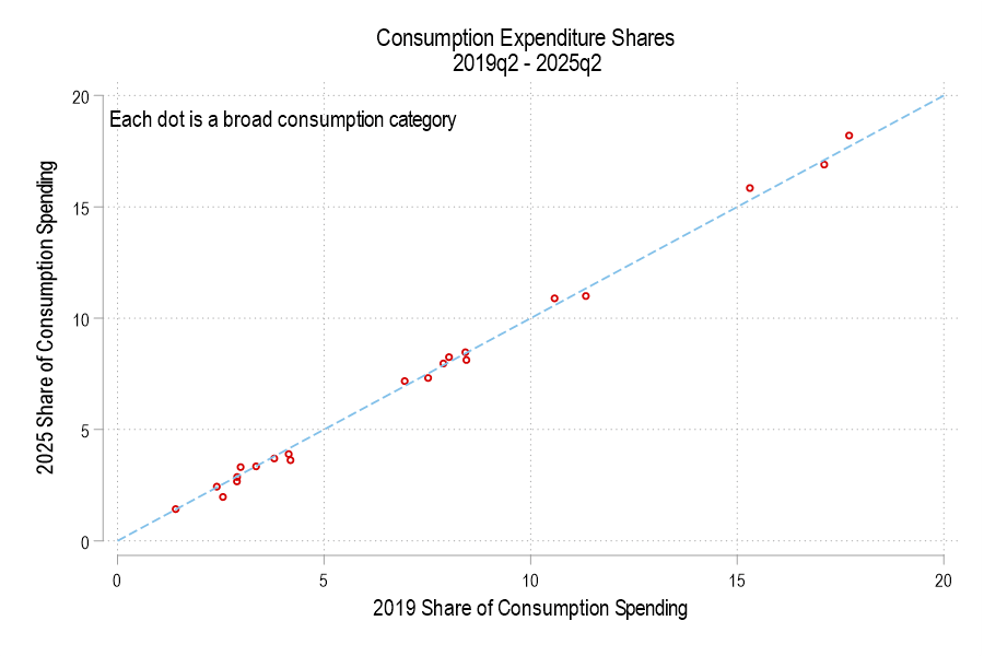
If total consumption spending (not inflation-adjusted) is 100%, then how has the allocation of spending changed? Below is a graph comparing each consumption component’s 2019 share versus 2025. The dotted line denotes an identical share. I haven’t labeled the categories because, suffice it to say, that spending shares are little different. None is more than one percentage point different.

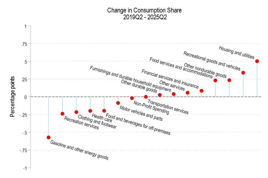
The below figure displays the spending share difference. We’re spending less of our consumption on gasoline and the like, recreational services, and clothing. Surprisingly, we’re also spending less on healthcare and food for off-premises consumption (non-restaurants). However, we’re spending a greater share on housing, recreational goods, food services for on-premises consumption (restaurants). 

Let’s get Real

Continue reading

Per Capita Consumption: 1990 Vs 2024

This is an update to a previous post that I did on per-capita real consumption in 1990 vs 2021. As of 2021, we still weren’t sure after the pandemic what was transitory vs structural, and it was unclear whether incomes would keep up with inflation. We now have three more years of data through 2024. News flash: We’re even richer.

I like to use the BEA real quantity indices. Those track what is actually consumed in volumes rather than by deflating total spending by price indices. Divided by population, we can calculate the real quantities of goods and services that people actually consumed per capita.

Even after the pandemic policies have settled down, we are still SO MUCH RICHER – and even richer than we were with all of the pandemic-related stimulus. The worst consumption category since the pandemic has been food and beverage for off-premise consumption, and that is *up* 4.6% since 2020, increasing 31% since 1990. So, while I understand that people can’t enjoy the the low prices of yesteryear, we are still better off in that category than pre-pandemic. In the other categories, everything is awesome.

Since 1990, our consumption of communication services has risen 332%, our houses are 254% better furnished, and we have 118% greater quality-adjusted clothing consumption. All of this is already adjusted for inflation and is per-capita. Since the pandemic, these numbers are still up by 20.4%, 9.8%, and 31.1% respectively. People didn’t like the post-pandemic inflation. I get that. But these improvements in average consumption are mind boggling.

Continue reading

The Consumingest States of 2023

This post is quick and simple. We all know that states have different land areas and different populations. We also know that different states produce different amounts of output. We have a pretty good sense for which are the ‘big’ states since these things often go hand-in-hand. But what about household spending on consumption? It’s easy to imagine that some states produce plenty but then invest the proceeds. So, which states consume the most relative to their income?

The map above illustrates which states consume more of their income. There’s not much correlation geographically. But, among the ‘big’ states (Texas, California, New York, Illinois), the consumption per GDP is below the average of 67%. Can we make sense of this? As it turns, out more productive states also tend to have a higher per capita output. So, those higher GDP states also have richer populations on average. And, sensibly, those richer populations have lower marginal propensities to consume. They save more. But this is just spit-balling.

Continue reading

Services, and Goods, and Software (Oh My!)

When I was in high school I remember talking about video game consumption. Yes, an Xbox was more than two hundred dollars, but one could enjoy the next hour of that video game play at a cost of almost zero. Video games lowered the marginal cost and increased the marginal utility of what is measured as leisure. Similarly, the 20th century was the time of mass production. Labor-saving devices and a deluge of goods pervaded. Remember servants? That’s a pre-20th century technology. Domestic work in another person’s house was very popular in the 1800s. Less so as the 20th century progressed. Now we devices that save on both labor and physical resources. Software helps us surpass the historical limits of moving physical objects in the real world.


There’s something that I think about a lot and I’ve been thinking about it for 20 years. It’s simple and not comprehensive, but I still think that it makes sense.

  • Labor is highly regulated and costly.
  • Physical capital is less regulated than labor.
  • Software and writing more generally is less regulated than physical capital.


I think that just about anyone would agree with the above. Labor is regulated by health and safety standards, “human resource” concerns, legal compliance and preemption, environmental impact, and transportation infrastructure, etc. It’s expensive to employ someone, and it’s especially expensive to have them employ their physical labor.

Continue reading

Future Consumption Has Never Been Cheaper

Economics as a discipline really likes to boil things down to their essentials. There are plenty of examples. How many goods can one consume? Just two, bread and not bread. How can you spend your time? You can labor or leisure. How do you spend your money? Consume or save. It’s this last one that I want to emphasize here.

First, all income ultimately ends up being spent on consumption. Saving today is just the decision to consume in the future. And if not by you, then by your heirs. One determinant of inter-temporal consumption decisions is the real rate of return. That is, how many apples can you eat in the future by forgoing an apple eaten today? The bigger that number is, the more attractive the decision to save.

Further, since most saving is not in the form of cash and is instead invested in productive assets, we can also characterize the intertemporal consumption problem as the current budget allocation decision to consume or invest. The more attractive capital becomes, the more one is willing to invest rather than consume. The relative attractiveness between consumption and investment informs the consumption decision.

How attractive is investment? I’ll illustrate in two graphs. First, if the price of investment goods falls relative to consumption goods, then individuals will invest more. The graph below charts the price ratio of investment goods to consumption goods. Relative to consumption, the price of investment has fallen since 1980. Saving for the future has never been cheaper!

Of course, as in a price taker story, I am assuming that individuals don’t affect this price ratio. Truly, prices are endogenous to consumption/investment decisions. For all we know, it may be that the prices of investment goods are falling because demand for investment goods has fallen. But that doesn’t appear to be the case.

Continue reading

Average US Consumption: 1990 Vs 2021

On Twitter, folks have been supporting and piling on to a guy whose bottom line was that we are able to afford much less now than we could in 1990 (I won’t link to it because he’s not a public figure). The piling on has been by economist-like people and the support has been from… others?

Regardless, the claim can be analyzed in a variety of ways. I’m more intimate with the macro statistics, so here’s one of many valid stabs at addressing the claim. I’ll be using aggregates and averages from the BEA consumer spending accounts.

Continue reading

Norway is a Wealthy Country (even after making the appropriate adjustments)

I have previously wrote about living standards in Ireland, and how GDP per capita overstates typical incomes because of a lot of foreign investment.

This is not to say that foreign investment is bad — to the contrary! But standard income statistics, such as GDP, aren’t particularly useful for a country like Ireland.

Norway has a similar challenge with national income statistics, but a different reason: Oil. Norway has a very large supply of oil revenues relative to the size of the rest of its economy, and oil revenues are counted in GDP. But those oil revenues don’t necessarily translate into higher household income or consumption.

Using World Bank data, Norway appears to be very rich: GDP per capita in nominal terms was about $90,000 in 2021. Compare that with $70,000 in the US, which is a very rich country itself. Sounds extremely wealthy!

Of course, by that same statistic, average income in Ireland is $100,000. But after making all the proper adjustments, as we saw in my prior post, Ireland is right around the EU average in terms of what individuals and households actually consume.

What if we make similar adjustments for Norway?

Continue reading

Not so Great Expectations

People have expectations about the world. When those expectations are violated, they usually change their behavior in order to account for the new information (on the margin at least). Does unexpected inflation affect people’s behavior? Of course. William Phillips thought so (the famous version of the Phillips Curve assumes constant inflation expectations).

Macroeconomists often separate the world into reals and nominals. Sometimes we produce more and other times we produce less. Those are the reals. The prices that we pay and the money that we spend are the nominals. There is what’s sometimes called a ‘loose joint’ between reals and nominals. That is, they do not move in tandem, nor are they entirely independent. If the Fed suddenly slows the growth of the money supply, then economic activity growth might also slow – but not by the same amount. In the long run, reals and nominals are largely independent. Whether we have 2% vs 3% annual inflation over the course of some decade is probably not important for our real output at the end of that decade.

It Takes Two to Tango.

It is often said that the Fed can achieve any amount of total spending in the economy that it prefers. It can achieve any NGDP. But, the Fed doesn’t control NGDP as a matter of fiat. The Fed changes interest rates and the money supply in order to change the total spending in our economy. Importantly, the effect of Fed policy changes is contingent on how the public reacts. After all, the Fed can increase the money supply. But it is us who decides how much to spend.

Continue reading

It’s Still Hard to Find Good Help These Days

Consumption is the largest component of GDP. In 2019, it composed 67.5% of all spending in the US. During the Covid-19 recession, real consumption fell about 18% and took just over a year to recover. But consumption of services, composing 69% of consumption spending, hadn’t recovered almost two years after the 2020 pre-recession peak.  For those keeping up with the math, service consumption composed 46.5% of the economic spending in 2019.

We can decompose service consumption even further. The table below illustrates the breakdown of service consumption expenditures in 2019.

I argued in my previous post that the Covid-19 pandemic was primarily a demand shock insofar as consumption was concerned, though potential output for services may have fallen somewhat. When something is 67.5% of the economy, ‘somewhat’ can be a big deal. So, below I breakdown services into its components to identify which experienced supply or demand shocks. Macroeconomists often get accused of over-reliance on aggregates and I’ll be a monkey’s uncle if I succumb to the trope (I might, in fact be a monkey’s uncle).

Before I start again with the graphs, what should we expect? Let’s consider that the recession was a pandemic recession. We should expect that services which could be provided remotely to experience an initial negative demand shock and to have recovered quickly. We should expect close-proximity services to experience a negative demand and supply shock due to the symmetrical risk of contagion. Finally, we should expect that services with elastic demand to experience the largest demand shocks (If you want additional details for what the above service categories describe, then you can find out more here, pg. 18).

Continue reading

Covid Evidence: Supply Vs Demand Shock

By the time most students exit undergrad, they get acquainted with the Aggregate Supply – Aggregate Demand model. I think that this model is so important that my Principles of Macro class spends twice the amount of time on it as on any other topic. The model is nice because it uses the familiar tools of Supply & Demand and throws a macro twist on them. Below is a graph of the short-run AS-AD model.

Quick primer: The AD curve increases to the right and decreases to the left. The Federal Reserve and Federal government can both affect AD by increasing or decreasing total spending in the economy. Economists differ on the circumstances in which one authority is more relevant than another.

The AS curve reflects inflation expectations, short-run productivity (intercept), and nominal rigidity (slope). If inflation expectations rise, then the AS curve shifts up vertically. If there is transitory decline in productivity, then it shifts up vertically and left horizontally.

Nominal rigidity refers to the total spending elasticity of the quantity produced. In laymen’s terms, nominal rigidity describes how production changes when there is a short-run increase in total spending. The figure above displays 3 possible SR-AS’s. AS0 reflects that firms will simply produce more when there is greater spending and they will not raise their prices. AS2 reflects that producers mostly raise prices and increase output only somewhat. AS1 is an intermediate case. One of the things that determines nominal rigidity is how accurate the inflation expectations are. The more accurate the inflation expectations, the more vertical the SR-AS curve appears.*

The AS-AD model has many of the typical S&D features. The initial equilibrium is the intersection between the original AS and AD curves. There is a price and quantity implication when one of the curves move. An increase in AD results in some combination of higher prices and greater output – depending on nominal rigidities. An increase in the SR-AS curve results in some combination of lower prices and higher output – depending on the slope of aggregate demand.

Of course, the real world is complicated – sometimes multiple shocks occur and multiple curves move simultaneously. If that is the case, then we can simply say which curve ‘moved more’. We should also expect that the long-run productive capacity of the economy increased over the past two years, say due to technological improvements, such that the new equilibrium output is several percentage points to the right. We can’t observe the AD and AS curves directly, but we can observe their results.

The big questions are:

  1. What happened during and after the 2020 recession?
  2. Was there more than one shock?
  3. When did any shocks occur?

Below is a graph of real consumption and consumption prices as a percent of the business cycle peak in February prior to the recession (See this post that I did last week exploring the real side only). What can we tell from this figure?

Continue reading