According to the most recent TSA data, on December 21st of this year there were 1,979,089 people traveling by plane. That’s almost exactly equal to the number of people that flew in the US on the same date in 2019: 1,981,433 travelers. It’s also double the number of people that few on December 21, 2020 (about 992,000). These numbers are encouraging. Does that mean that we’re back to normal levels of travel?
Not quite. We shouldn’t read too much into one day of data, for a variety of reasons, but most importantly because while we’re looking at the same date, travel varies throughout the week and December 21st is a different day of the week every year (Tuesday this year, Saturday in 2019). It’s better to use a weekly average and compare it to 2019. Here’s what the data looks like for 2020 and 2021.
With this data, we can see that airline travel is back to about 85 percent of 2019 levels. That’s not bad, but airline travel was already back to 85 percent by early July 2021, with some variation since then, but generally staying in the 70-90 percent range for most of the second half of the year.
For those that are flying this year, there is good news in terms of prices (unusual to have good prices news right now): airfares are still about 20 percent cheaper than pre-pandemic levels. In fact, airline prices are the cheapest they have been since 1999. In nominal terms! If you are interested in even more historical price data, take a look at my May 2021 post on the “golden age” of flight.
And of course, flying is not the most common way that people travel for Christmas and the holiday season. According to estimates from AAA, only about 6 percent of holiday travelers choose to fly. This was true in 2019, and will be roughly true in 2021 (as usual, 2020 was the exception: around 3 percent). By far the most common mode of travel in the US is driving, accounting for over 90 percent of holiday travel.
If you are traveling by car, there isn’t much good news for prices. As you have no doubt heard constantly for the past few months, gasoline costs a lot more than it did last Christmas, on average about $1 per gallon more. But even compared to Christmas 2019, gasoline prices are almost 29 percent higher. The last time gasoline prices were this high (in nominal terms) around Christmas was in 2013.
I hope you all have safe holiday travels, and we’ll all look forward to better prices in the New Year!
I remember people talking about Covid-19 in January of 2020. There had been several epidemic scare-claims from major news outlets in the decade prior and those all turned out to be nothing. So, I was not excited about this one. By the end of the month, I saw people making substantiated claims and I started to suspect that my low-information heuristic might not perform well.
People are different. We have different degrees of excitability, different risk tolerances, and different biases. At the start of the pandemic, these differences were on full display between political figures and their parties, and among the state and municipal governments. There were a lot of divergent beliefs about the world. Depending on your news outlet of choice, you probably think that some politicians and bureaucrats acted with either malice or incompetence.
I think that the Federal Reserve did a fine job, however. What follows is an abridged timeline, graph by graph, of how and when the Fed managed monetary policy during the Covid-19 pandemic.
February, 2020: Financial Markets recognize a big problem
The S&P begins its rapid decent on February 20th and would ultimately lose a third of its value by March 23rd. Financial markets are often easily scared, however. The primary tool that the Fed has is adjusting the number of reserves and the available money supply by purchasing various assets. The Fed didn’t begin buying extra assets of any kind until mid-March. There is a clear response by the 18th, though they may have started making a change by the 11th. One might argue that they cut the federal funds rate as early as the 4th, but given that there was no change in their balance sheet, this was probably demand driven.
March, 2020: The Fed Accommodates quickly and substantially.
In the month following March 9th, the Fed increased M2 by 8.3%. By the week of March 21st, consumer sentiment and mobility was down and economic policy uncertainty began to rise substantially – people freaked out. Although the consumer sentiment weekly indicator was back within the range of normal by the end of April, EPU remained elevated through May of 2020. Additionally, although lending was only slightly down, bank reserves increased 71% from February to April. Much of that was due to Fed asset purchases. But there was also a healthy chunk that was due to consumer spending tanking by 20% over the same period.
In the 18 months prior to 2020, M2 had grown at rate of about 0.5% per month. For the almost 18 months following the sudden 8.3% increase, the new growth rate of M2 almost doubled to about 1% per month. The Fed accommodated quite quickly in March.
April, 2020: People are awash with money
Falling consumption caused bank deposit balances to rise by 5.6% between March 11th and April 8th. The first round of stimulus checks were deposited during the weekend of April 11th. That contributed to bank deposits rising by another 6.7% by May 13th.
By the end of March, three weeks after it began increasing M2, the Fed remembered that it really didn’t want another housing crisis. It didn’t want another round of fire sales, bank failures, disintermediation, collapsed lending, and debt deflation. It went from owning $0 in mortgage-backed securities (MBS) on March 25th to owning nearly $1.5 billion worth by the week of April 1st. Nobody’s talking about it, but the Fed kept buying MBS at a constant growth rate through 2021.
May, 2020 – December, 2021: The Fed Prevents Last-Time’s Crisis
Jerome Powell presided over the shortest US recession ever on record. The Fed helped to successfully avoid a housing collapse, disintermediation, and debt deflation – by 2008 standards. The monthly supply of housing collapsed, but it had bottomed out by the end of the summer. By August of 2021, the supply of housing had entirely recovered. The average price of new house sales never fell. Prices in April of 2020 were typical of the year prior, then rose thereafter. A broader measure of success was that total loans did not fall sharply and are nearly back to their pre-pandemic volumes. After 2008, it took six years to again reach the prior peak. A broader measure still, total spending in the US economy is back to the level predicted by the pre-pandemic trend.
The Fed can’t control long-run output. As I’ve written previously, insofar as aggregate demand management is concerned, we are perfectly on track. The problem in the US economy now is real output. The Fed avoided debt deflation, but it can’t control the real responses in production, supply chains, and labor markets that were disrupted by Covid-19 and the associated policy responses.
What was the cost of the Fed’s apparent success? Some have argued that the Fed has lost some of its political insulation and that it unnecessarily and imprudently over-reached into non-monetary areas. Maybe future Fed responses will depend on who is in office or will depend on which group of favored interests need help. Personally, I’m not so worried about political exposure. But I am quite worried about the Fed’s interventions in particular markets, such as MBS, and how/whether they will divest responsibly.
Of course, another cost of the Fed’s policies has been higher inflation. During the 17 months prior to the pandemic, inflation was 0.125% per month. During the pandemic recession, consumer prices dipped and inflation was moderate through November. But, in the 16 months since April of 2020, consumer prices have grown at a rate of 0.393% per month – more than three times the previous rate. Some of that is catch-up after the brief fall in prices.
Although people are genuinely worried about inflation, they were also worried about if after the 2008 recession and it never came. This time, inflation is actually elevated. But people were complaining about inflation before it was ever perceptible. The compound annual rate of inflation rose to 7% in March of 2021. But it had been almost zero as recent as November, 2020. That March 2021 number is misleading. The actual change in prices from February to March was 0.567%. Something that was priced at $10 in February was then priced at $10.06 in March. Hardly noticeable, were it not for headlines and news feeds.
According to the Johns Hopkins COVID tracker, the US has now surpassed 800,000 COVID deaths during the pandemic. The CDC COVID tracker is almost to 800,000 too. But is this number right? Confusion about COVID deaths and total deaths has been rampant throughout the pandemic, especially when comparing across countries.
One method that many have suggested is excess deaths, which is generally defined as the number of deaths in a country above-and-beyond what we would expect given pre-pandemic mortality levels. It’s a very rough attempt at creating a counterfactual of what mortality would have looked like without the pandemic. Of course, you can never know for sure what the counterfactual would look like. Would overdoses in the US have increased anyway? Hard to say, though they had been on the rise for years even before the pandemic.
So don’t treat excess deaths as a true counterfactual, but just a very rough estimate. I wrote about excess deaths in the US way back in January 2021 (feels like a lifetime ago!), and at the time for 2020 it looked like the US had about 3 million total deaths (in the first 48 weeks of 2020), which was about 357,000 deaths more than expected (again, based on historical levels of the past few years), or about 13.6% above normal.
But once we had complete data for 2020, deaths were even higher: about 19% above expected, or somewhere around 500,000 excess deaths. This compares with the official COVID death count of about 385,000 in 2020 for the US.
What happens if we update those numbers with the most recent available mortality data for 2021? Keep in mind that data reporting is always delayed, so I’ll just use data through October 2021. The following chart shows both confirmed COVID deaths and total excess mortality, cumulative since the beginning of 2020.
As we can see in the chart, there are a lot more excess deaths than confirmed COVID deaths. There were already over 1 million excess deaths through the end of October 2021 in the US, cumulative since January 2020. This compares with about 766,000 confirmed COVID deaths. That’s a big gap!
We could spend a lot of time trying to understand this gap of 250,000 deaths. Is this under-reporting of COVID deaths? Is it deaths caused by government restrictions? Is it caused by the overwhelming of the health system?
I won’t be able to answer any of those questions today. Instead, let’s ask a different question: is the potential US undercount of COVID deaths unusual?
In the post-WW2 era, by many different measures the US economy performed better before about 1970 than after. You can apparently see this in many different statistics. For example, the productivity slowdown is a well-known and well-studied phenomenon. And even given the productivity slowdown, median wages don’t seem to have kept pace with productivity growth.
I think there are good reasons to doubt these particular statistics. For example, on wages and productivity see this working paper by Stansbury and Summers.
But even considering all these criticisms of the statistics, we do observe that overall GDP growth has been slower since about 1970. Why might this be?
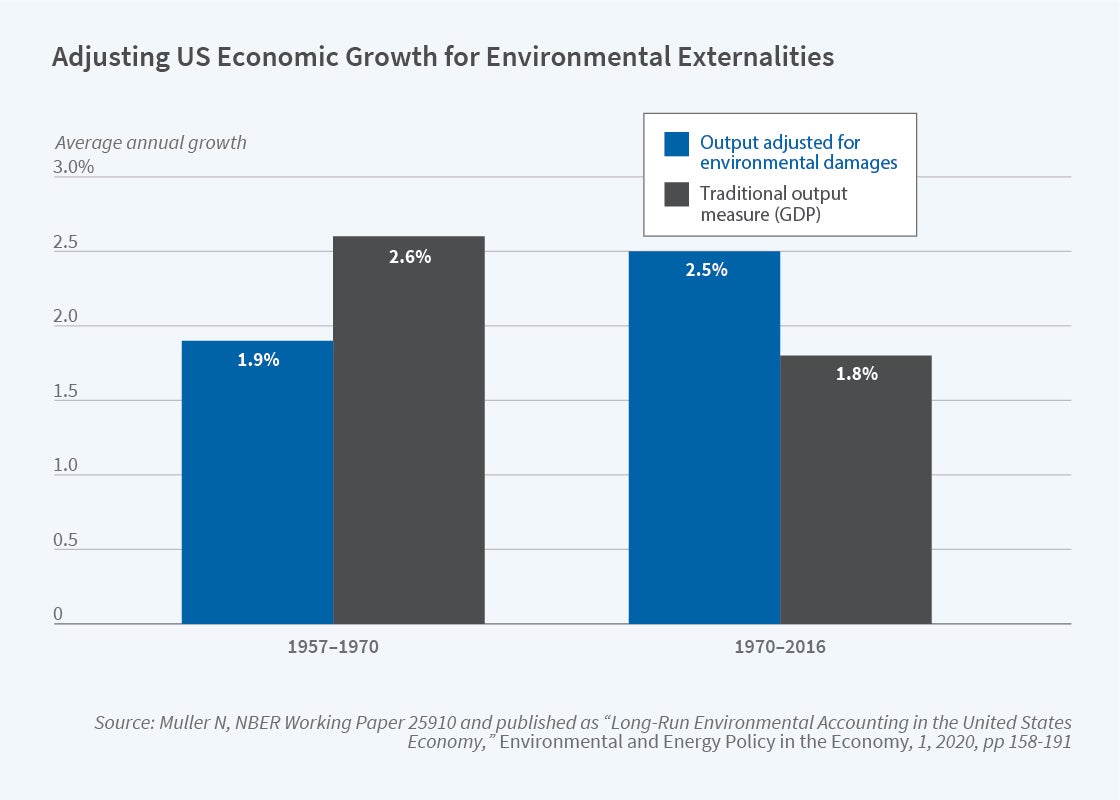
In an NBER summary of his research, Nicholas Muller argues that a big part of the GDP growth slowdown is because we aren’t including environmental damage in the calculation. This is not a new argument (Muller is an important contributor to this literature), and the exclusion of environmental damage is a well-known flaw of GDP, but Muller’s paper does a great job of quantifying how much we are mismeasuring GDP. The following figure is a nice summary of what GDP growth looks like when we consider environmental damage.
If we use the standard measure of GDP, growth indeed slowed down after 1970. If instead we augment GDP for environmental damages, the period after 1970 was actually faster! The adjustment both slows down growth from 1957-1970, and speeds up growth after 1970.
There are lots of things we can draw from this, but if the results are close to accurate, there is a clear implication: environmental regulations (such as the Clean Air Act) do reduce GDP growth, as traditionally measured. So the skeptics of regulation are partially right: regulation reduces growth!
However, this seems to be a clear case where standard critiques of GDP (as you can find in just about any Econ 101 textbook — yes, really!) need to be incorporated into the complete cost-benefit analysis of the impacts of environmental regulation.
I was pleased to see yesterday the announcement of a new journal, the Journal of Comments and Replications in Economics. As the name implies, it will publish articles that comment on or attempt to replicate previously published economics papers.
While empirical economics papers have in some ways become more believable over time, it is still rare for anyone to verify whether the results can actually be replicated, and formal comments on potential problems in published papers have actually become less common over time (though Econ Journal Watch has been a good outlet for comments).
The ability to independently verify and replicate findings should be at the core of science. But economists, like most other disciplines, are generally too focused on publishing original work to test whether already-published papers hold up. When we do try to replicate existing work, the results aren’t very encouraging; at best 80% of economics papers replicate.
If we want people to trust and rely on our work, we need to do better than that. The US Department of Defense agrees, and funded a huge project to determine what types of social science research hold up to scrutiny. I’ve been a bit involved in this and hope to sum up some of the results once this semester is over. For now, I’ll just say I’m happy to see the new Journal of Comments and Replications in Economics (and that it is both free and open-access, a rare combo) and I hope this represents one more small step towards economics being a real science.
It’s pumpkin spice season. That means that not only can you get pumpkin spice lattes, but also pumpkin spice Oreos, pumpkin spice Cheerios, and even pumpkin spice oil changes.
The most important thing to know about “pumpkin spice” things is that they don’t actually taste like pumpkin. They taste like the spices that you use to flavor pumpkin pie. (Notable exception: Peter Suderman’s excellent pumpkin spice cocktail syrup, which does contain pumpkin puree.)
Last week economic historian Anton Howes posted a picture of the spice shelf at his grocery store and guessed that this would have been worth millions of dollars in 1600.
Just thinking about how much this shelf would have been worth in England in the year 1600. Presumably at least tens of millions in today’s money. pic.twitter.com/Vc9HDBlQxL
Some of the comments pushed back a little. OK, probably not millions but certainly a lot. Howes was alluding to the well-known fact that spices used to be expensive. Very expensive. Spices, along with precious metals, were one of the primary reasons for the global exploration, trade, and colonialism for centuries. Finding and controlling spices was a huge source of wealth.
But how much more expensive were spices in the past? One comment on Howes’ tweet points to an excellent essay by the late economic historian John Munro on the history of spices. And importantly, Munro gives us a nice comparison of the prices of spices in 15th century Europe, including a comparison to typical wages.
As I looked at the list of spices in Munro’s essay, I noticed: these are the pumpkin spices! Cloves, cinnamon, ginger, and mace (from the nutmeg seed, though not exactly the same as nutmeg). He’s even included sugar. That’s all we need to make a pumpkin spice syrup!
Last week in my Thanksgiving prices post I cautioned against looking at any one price or set of prices in isolation. You can’t tell a lot about standards of living by looking at just a few prices, you need to look at all prices. So let me just reiterate here that the following comparison is not a broad claim about living standards, just a fun exercise.
That being said, let’s see how much the prices of spices have fallen.
But is it true? In short: no. I’ll explain why, but my larger goal is to get you to think more clearly about inflation.
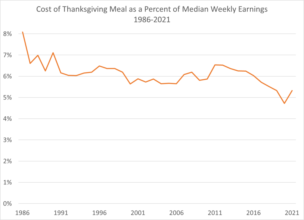
How should we measure the cost of a Thanksgiving meal? A widely used measure comes from the Farm Bureau, which shows that the cost of a traditional turkey-centric meal costs about 14% more than last year. In dollar terms it is $53.31 for a turkey, a pumpkin, cranberries, sweet potatoes, stuffing, etc. That’s more that it has ever been, in dollar terms. Farm Bureau has been tracking the cost of this same meal since 1986.
So in one sense, it seems like the headline claim is true. Most expensive Thanksgiving ever!
But we need to think deeper. A nominal price doesn’t actually tell us much. If a long-lost cousin from the Republic of Horpedahl told you it costs 1 million Jeremys to buy a Thanksgiving dinner, what would your reaction be? The first and best reaction is: how much do people earn in the Republic of Horpedahl?
We should ask the same question in the United States today: how do incomes today compare to incomes in the past? Which measure of income you use is important, but if we use median usual weekly earnings of full-time workers, we can make a simple comparison of how much of your weekly earnings would be needed to buy a traditional Thanksgiving meal. This chart shows exactly that. In 2021 that meal will be the second lowest it has ever been as a percent of median earnings — higher than last year, but tied with 2019 for the second lowest. And much less than in the late 1980s and early 1990s (I use third quarter data for each year, the most recent available).
Adjusting for income is the best way to look at this question. It’s not perfect — part of this depends on what income measure you use — but it’s much better than the alternative. The worst approach is to just look at nominal prices. This tells you virtually nothing.
This weekend I’ll be at the Southern Economic Association Conference in Houston Texas. I’m organizing and chairing a session called Education Policy Impacts by Sex (you should come by and see me if you will be there too!).
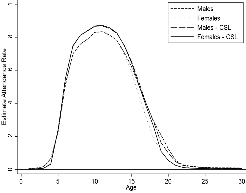
Personally, I will be presenting on the impact of compulsory school attendance laws on attendance. Today I just want to share and discuss a single graph that’s not my presentation.
Prior to my research, there was already a canon of existing literature on compulsory attendance legislation (CSL) and I’ve previously written on this blog about it (attendance, CSL, and differences by sex). However, the literature had some limitations. Authors examined smaller samples, ignored gender, or ignored different effects by age.
I examine full-count IPUMS data from the 1850-1910 US censuses of whites in order to investigate the so-far-omitted margins mentioned above. Here are some conclusions:
Prior to CSL:
Males and females attended school at similar rates until the age of 14.
After 14, women stopped attending school as much as men.
By the age of 18, the attendance gender gap was 10 percentage points.
After CSL
Male and female attendance increased from the ages of 6 to 14
Women began attending school more than prior to CSL until about age 18.
After the age of 18, women experienced no greater attendance than previously.
But, both sexes attended school less than prior to CSL for ages 5 and younger.
Men began attending school less after the age of 17.
CSL increased lifetime attendance for both males and females
Overall, examining the impact of CSL across many ages allows us to see when and not just whether people attended more school. Previous authors would say something like “CSL increased total years of school by about 5% on average”. For men, almost all of those gains were between the ages of 6 & 16. But women experienced greater attendance from ages 6 to 18.
Additionally, examining the data by age reveals that there was some intertemporal substitution. Once it became legally mandatory for children to attend school between the ages of 6 & 14, parents began sending their younger children to school at lower rates. Indeed – why invest in education for two or three early years of life if you’ll just have to send your children to school for another eight years anyway. Older boys dropped out of school at higher rates after CSL too. Essentially, the above figure became compressed horizontally. People ‘put in their time’, but then reduced investments at non-mandatory ages.
This reveals a shortcoming of the current literature, which focuses mostly on 14 year olds. By focusing on a popular age of attendance that was also compulsory, previous authors have missed the compensating fall in attendance at other ages. Granted, the life-time effect is still positive – but it’s attenuated by a richer picture. The picture reveals that individuals were not attending school by accident. Students or their parents had in mind an amount of educational investment for which they were aiming. When children were forced to attend school at particular ages, the attendance for other ages declined.
The recent debate over US inflation seems to be full of mood affiliation on both sides, where people start with a mood (“panic” or “don’t worry”) and then look for facts to fit the mood.
My natural temperament is “don’t worry” and that is what I’ve generally thought about inflation, but the latest number of 6.2% inflation over the last year is a bit concerning, and makes me glad the the Fed has announced they plan to taper off of new asset purchases. But overall I think people are still talking past each other, and I wish more people would answer these questions:
What will CPI inflation be over the next 12 months?
What specifically should the Fed do differently, if anything? How quickly should they taper and raise rates?
If you are currently thinking “panic” or “don’t worry”, what data could come in that would change your mind?
I’ll start with my answers, informed more by my gut than by quantitative models: my guess for inflation over the next year is 4-5%, the Fed has things about right but I’d say “tighten faster” rather than “tighten slower” if I had to pick. I expect inflation to slow noticeably in the spring as the economy transitions from the unusual boom in demand for goods back to demand for services after Christmas and the Delta wave, as more people get back to work and supply bottlenecks have time to work themselves out. I would start to get more seriously concerned if we see no slowing by June, or if market-based measures of inflation or NGDP projections start to move substantially (2pp) higher.
To the extent that I’ve been on the wrong side of this, I blame the cognitive bias I seem to fall prey to most often- mistaking reversed stupidity for intelligence. Just because lots of people make obviously incorrect predictions of hyperinflation doesn’t mean that inflation will be low.
No, 6.2% inflation per year is not in the same universe as hyperinflation (50% inflation per month)
*The usual disclaimer applies- my affiliation with the Fed gives me zero insider information about or influence over monetary policy and I don’t speak for them.
Joy: As a Data Analytics teacher, I often think about the applications of machine intelligence to work processes. Samford undergraduate Copeland Petitfils has written the following blog, which is a reminder to me that there are still many potential areas for growth.
Since “Moneyball”, we have seen the growth of analytics throughout sports. However, many teams have stuck to the same old way of playing baseball, like the Braves. This past May, the Braves took a new innovative approach and saw room for growth on their defensive side.
The general manager, Alex Anthopoulos, implemented a radical strategy and improved the defense by using shifts with data analytics. While “Moneyball” looked at the statistics of acquiring cheaper players who had good batting averages and improved the offensive side, the Braves looked at improving the defensive side and the way they shift between pitches to improve their chances of getting a ground ball out. A defensive shift in baseball refers to the infield changing positions from normal to a certain area of the infield based on the pitches and using stat cast to predict where the batter is most likely to hit the ball depending on the type of pitches. Shifting can increase the probability for players to get ground balls out rather than hits.
Statistically, the Braves ranked at the bottom of defensive shifts in the MLB, and Anthopoulos, the general manager, saw this as an opportunity to improve. The Braves started the 2021 season with no shifting at all to shifting on 50.6% of pitches by the end of the year, which was the highest in baseball this year only behind the Dodgers. The shifting ultimately allows the Braves to improve in converting ground balls to out rather than turning into hits. At the start of the season, the Braves converted under 75% of ground balls into outs which ranked middle of the pack in defense. However, since implementing the shift the number jumped to 77%, which was the second-best in baseball. Although these jumps in percentages seem small, they allowed the Braves to field 25 more ground balls into outs rather than hits.
The data analytics the Braves used allowed the players to be put in a better position to succeed, and as the season progressed, they started to get better and better at it. These decisions turned around the Braves’ season, and now they are on their way to the World Series for the first time since 1999 after beating the Dodgers in the NL Championship.
Coda by Joy: That said, guess who failed at data driven decision making? Zillow!
In a statement Tuesday, Chief Executive Rich Barton said Zillow had failed to predict the pace of home-price appreciation accurately, marking an end to a venture the company once said could generate $20 billion a year. Instead, the company said it now plans to cut 25% of its workforce… “We’ve determined the unpredictability in forecasting home prices far exceeds what we anticipated and continuing to scale Zillow Offers would result in too much earnings and balance-sheet volatility,” Mr. Barton said.