The implication here is that many of the social beliefs we hold today are very different from what people held 50 years ago, and (possibly, therefore) it’s not radical to still hold those beliefs today. The Tweet above doesn’t specify exactly what those beliefs are, but we can use survey data to dig into what those might be. Thankfully, one of the greatest social surveys out there was first conducted in 1972, exactly 50 years ago: the General Social Survey.
What exactly did a normal person believe around 1972, according to the GSS?
The financial crisis recession that started in late 2007 was very different from the 2020 pandemic recession. Even now, 15 years later, we don’t all agree on the causes of the 2007 recession. Maybe it was due to the housing crisis, maybe due to the policy of allowing NGDP to fall, or maybe due to financial contagion. I watched Vernon Smith give a lecture in 2012 in which he explained that it was a housing crisis. Scott Sumner believes that a housing sectoral decline would have occurred, and that the economy-wide deep recession and subsequent slow recovery was caused by poor monetary policy.
Everyone agrees, however, that the 2007 recession was fundamentally different from the 2020 recession. The latter, many believe, reflected a supply shock or a technology shock. Performing social activities, including work, in close proximity to others became much less safe. As a result, we traded off productivity for safety.
The policy responses to each of the two were also different. In 2020, monetary policy was far more targeted in its interventions and the fiscal stimulus was much bigger. I’ll save the policy response differences for another post. In this post, I want to display a few graphs that broadly reflect the speed and magnitude of the recoveries. Because the recessions had different causes, I use broad measures that are applicable to both.
Silicon Valley venture-backed tech startups have had a wildly successful twenty years, coming to dominate the markets. But tech remains a relatively small sector in terms of the total number of businesses and employees, and by many measures entrepreneurship and small business have been in relative decline in the US during the 2000’s.
Covid accelerated many pre-existing trends, like the shift to remote work. But it reversed other trends, and seems to have led to a revival in entrepreneurship broadly.
This wasn’t all good at first- in 2020, the share of “necessity entrepreneurs” also reached record highs. These are people who start a business because they can’t get the job they want, not because they expect their business to be wildly successful. But in 2021, the rate of new entrepreneurs remained high while the share of “necessity entrepreneurs” and “opportunity entrepreneurs” returned to their normal balance.
Another good sign is that the share of businesses surviving at least a year is also at record levels:
This semester I am participating in a reading group with undergraduate students that focuses on the history and prospects for capitalism and socialism. Lately we have been reading Joseph Stiglitz, who has long argued that China’s transition to a market economy has gone much better than the former Soviet Union. Gradual transition is superior to “shock therapy,” according to Stiglitz.
There’s an extent to which this is true. If we just look at economic growth rates since, say, 1995, China has clearly outpaced Russia.
It’s hard to know exactly what year to start, since GDP figures for former planned economies immediately after transition aren’t reliable, but the start date is mostly irrelevant for everything I’ll say here (please play around with the start year in the charts to see if I’m cherry-picking years). 1995 seems a reasonable enough year to start for reliable post-transition starting point.
As we see above, while Russia has had a rough doubling of GDP per capita since 1995 (respectable, and yes, it’s all adjusted for inflation!), China has soared almost 600%. Wow! But this is something of a cheat. Despite all that growth, average income in China is still lower than Russia: only about 60% of Russia in 2020. China started from a much lower level, meaning that faster growth, while not guaranteed, is at least easier to achieve. In fact, if we go back to 1978, when China’s first reforms began, GDP per capita in the Former USSR was about 6 times as high as China (that’s according to the latest Maddison Project estimates, which will always be speculative for non-market economies, but are the best we have).
Furthermore, Russia hasn’t really transitioned to a democracy either. China clearly hasn’t, but no one doubts that. But despite having the outward symbols of democracy (elections, a legislature, etc.), Russia still scores low on most indexes of democracy and civil liberties. For example, Freedom House scores them at 19/100, a little better than China (9/100), but nothing like Western Europe.
So, did the quick transition to market economies fail? Not so fast. While it did fail in Russia, in most of Eastern Europe and the eastern part of the former USSR seems to have been a major success. Take a look at this chart, which shows the former Soviet Republics in and near Europe (I exclude Central Asian FSRs).
Overall, I’ve been disappointed with the reporting on the US embargo against Russian oil. The AP reported that the US imports 8% of Russia’s crude oil exports. But then they and other outlets list a litany of other figures without any context for relative magnitudes. Let’s shine some more light on the crude oil data.*
First, the 8% figure is correct – or, at least it was correct as of December of 2021. The below figure charts the last 7 years of total Russian crude oil exports, US imports of Russian crude oil, and the proportion that US imports compose. That 8% figure is by no means representative of recent history. The average US proportion in 2015-2018 was 7.8%. But the US share as since risen in level and volatility. Since 2019, the US imports compose an average of 11.9% of all Russian crude oil exports.
As an exogenous shock, the import ban on Russian crude oil might have a substantial impact on Russian exports. However, many of the world’s oil importers were already refusing Russian crude. The US ban may not have a large independent effect on Russian sales and may be a case of congress endorsing a policy that’s already in place voluntarily.
Gasoline prices are high and rising. Anecdotally, they seem to be increasing at the pump by the hour. And indeed, in nominal terms they are now the highest they have ever been in the US (this is true with both the AAA daily price level and the EIA weekly price level). At over $4.10 per gallon, the price now exceeds the peaks briefly hit in 2008, 2011, and 2012. And it’s looking like this peak might not be so brief.
But we all know you can’t compare nominal dollars over long periods of time. We need some context for this price! Plenty of news stories provide what they think is the right context: adjust it for inflation! For example, USA Today reports that today’s price “would come to around $5.25 today when adjusted for inflation.”
$5.25: that’s a pretty concrete number. But it’s not really useful. OK, so clearly that’s higher than the current price, about 20% higher in fact. Still, it doesn’t really give us the right context.
As I argued in a previous post on housing costs, inflation adjustments aren’t always the best way to contextualize a historical number. Yes, when you want to compare income or wages over time, it’s good to adjust for inflation. It’s necessary, in fact. And a good economist will always do that.
However, when comparing particular prices over time, it doesn’t really make sense to adjust for other prices. All you are really saying is “if the price of gasoline increased at the same rate as the average price level, here’s what it would be.” Perhaps slightly useful, but it doesn’t really get at the thing we’re really try to address: is gasoline more or less affordable than in the past?
The best approach is to adjust the prices for changes in wages or income. Which measure of wages or income you choose is important, but it’s the best adjustment to make. No need to make any inflation adjustments, are worrying about whether the index you choose is properly accounting for quality changes, substitution effects, etc. If you want to know how affordable something is, compare it to income.
Here’s what I think is the best simple comparison for gasoline, which I’ll explain it below. In short, it tells us how many minutes the average worker would need to work to purchase one gallon of gasoline.
Since the price of gasoline is rising sharply every day lately, my chart will surely be out of date very soon. But right now, it’s the most current data I could provide with a comparable historical series: EIA weekly data current through March 7th, 2022 (Monday). We can see that at current prices, it takes about 9 minutes of work at the average wage to purchase a gallon of gasoline. At the peak in 2008, it took over 13 minutes of work to purchase a gallon, and it fluctuated between 10 and 12 minutes of work for much of 2011-2014.
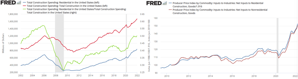
Total spending on real estate construction has been rising since 2011. By 2016 it had reached its previous 2006 peak. However, total spending on *residential* real estate construction didn’t reach its previous 2006 peak until November of 2020. The graph below also includes the proportion of residential construction spending (Green). It has been rising since 2009. In and of itself, nothing is good or bad about this figure. We might be spending less on non-residential construction because we are getting better at using less land per unit of good or service produced. Or, it could be that our real investment in future production is falling relative to our current residential consumption. Regardless, the share of residential construction hasn’t been at this level since 2003.
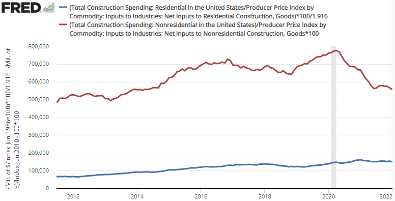
Importantly, the difference in spending has not been driven by different construction costs. Both residential and non-residential construction costs have moved in tandem since 2010. Therefore, the rise in residential construction spending is not merely nominal – a greater proportion of resources are being consumed by residential construction. Indeed, real residential construction is up about 25% from 2019. The figure below illustrates real residential and nonresidential construction.
Last week I wrote about the Simpsons’ mortgage payment. In short, I found that using a reasonable assumption of Homer’s income, the median housing price, and the rate of interest, the Simpsons are likely paying less of their household budget on housing today than in the 1990s.
But what about the family’s taxes? Are they getting squeezed by the taxman? Taxes are referenced throughout The Simpsons series. Here’s an article that collects a lot of the references. And that makes sense: the Simpsons are a normal American family, and normal American families love to complain about taxes.
Using the same reasonable assumption about Homer’s income from last week’s post (that Homer earns a constant percentage of a single-earner family, rather than merely adjusting for inflation), we can calculate the family’s average tax rate and how it has changed over the year. Conveniently, “average tax rate” is just economist speak for “how much of your family’s budget goes to the government.”
First, let’s just look at the federal income tax, since this is where most of the changes happen. Don’t worry, I’ll add in payroll taxes below, though this is a constant percent of the family’s budget since it is a flat tax on income!
The chart below shows the average tax rate the Simpsons paid for their federal income taxes. I didn’t go through every year, because: a) it’s a lot of work (I’m doing each year manually); and b) it’s more interesting to look at years right after or before major changes in the tax code. So no cherry picking here — the years selected are picked to tell a mostly complete story.
I’ll now briefly explain each of the years chosen, and what changes in the tax code impacted the Simpsons. But as you can see, just like their mortgage payment, the Simpsons are now spending less of their household income on federal income taxes (don’t worry, the trend is similar with payroll taxes included). In fact, they are now getting a net rebate from the federal government, and have been since the late 1990s!
The AEA Data Editor kicked it all off with this tweet:
Please stop using "cd" (in Stata) or "setwd()" (in R) all over the place. Once (maybe, not really), that's enough. Can we mark those commands as "deprecated"?
“Please stop using “cd” (in Stata) or “setwd()” (in R) all over the place. Once (maybe, not really), that’s enough.”
Replies proliferated on #EconTwitter this week. In this blog post I am collecting solutions for R. These days you might share the code used to generate your results for an empirical paper. That code would ideally be easy for other people to run on their own computers. File paths are hard (as I blogged previously).
A project for a single paper might have multiple code files. The code interacts with data stored somewhere. Part of the task of the code is to point the statistical program to the data set. It is frustrating if an outsider is trying to replicate a result and must alter the code in multiple places to point to their own location of the data.
Here is a concise summary of good practice, for any code language: “cd and setwd() specify the directory. When you share code and run on a different computer, they don’t work. Therefore, good practice to only specify once, at the beginning”
Way back in the late 1970s and early 80s, Kydland and Prescott proposed rational expectations theory. This line of research arose, in part, because the Phillips curve ceased to describe reality well. Amid increasing inflation, people began to anticipate higher prices to a relatively correct degree when making labor, supply chain, and pricing decisions. Kydland and Prescott argued that individuals understand the rules of the game or how the world works – at least on average.
An increase in the money supply would increase total national spending, and increase demand for goods. However, firms also experienced increasing revenues and demanded more inputs such as commodities, capital, and intermediate goods. Because there were no greater productivity earlier in the supply chain, price roses. Firms began to understand that greater demand would eventually find its way to causing greater costs. Therefore, firms began raising prices before the cost of resources rose, increasing their willingness to pay for inputs and, ironically, hastening the increase in input prices. As a result, increases in the money supply began having substantial short-run price effects and negligible output effects.
However, assuming that people understand the rules of our economic system and ‘how the world works’ is hard to swallow. It is not at all clear that the typical economist understands monetary theory, much less clear that the typical person has a good understanding. Fortunately, another theory of expectations can help carry some of the load and achieve similar results.