To try and encourage vaccination during the on-going COVID pandemic, there have been many public and private incentives offered. For example, free doughnuts. Or offering $200 to state employees in Arkansas (taxable income, of course!).
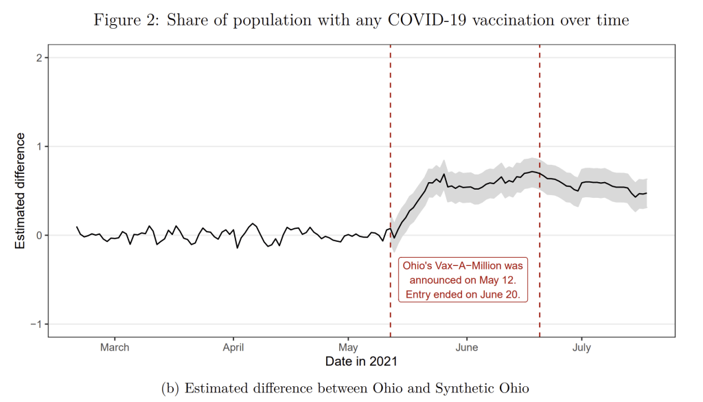
But when the governor of Ohio announced on May 12, 2021 that they would be offering a $1 million lottery prize, with 5 winners, it took the incentive game to a new level (college scholarships were also a prize for 5 winners under 18).
So do the lotteries “work”? Do they get more people vaccinated? And even if they do “work,” does it pass a cost benefit test? Many expressed concern that, even if more people get vaccinated, that this is a lot of money to spend in uncertain budget times.
What do they find? First, vaccine lotteries do work! They estimate that vaccination rates increased by 1.5% in Ohio because of the lottery. This amount is above and beyond the increase that would have been expected without the lottery (by comparing Ohio to other states that didn’t use a lottery — this is what the synthetic control method does).
Lately there has been lots of both good and bad news about the pandemic and its impact on the economy. But here’s once piece of good news you might have missed: the recession which began in February 2020 ended in April. And not April 2021… it ended in April 2020. At least, that’s according to the NBER Business Cycle Dating Committee, which made the announcement last week.
The 2020 recession of just 2 months is by far the shortest on record. NBER maintains a list of recessions with monthly dates going back to 1854 (there are annual business cycles dates before that, including important modern revisions of the original estimates, but the monthly series starts in 1854). In that timeframe, there have been 7 recessions in the 6-8 month range, but nothing this short. Still, it was mostly definitely a recession, as unemployment briefly spiked to levels not seen since the Great Depression. But only for 2 months. Keep in mind that the first part of the Great Depression last 43 months.
Unemployment Rate, 1948-present
But how can this be? Is the recession really over? There are still about 6-7 million fewer people working than before the pandemic began. Lots of businesses are still hurting. The unemployment rate is still 2 full percentage points above pre-pandemic levels. How in the world can we say the recession ended 15 months ago?
To answer that question, it helps to know what NBER and most macroeconomists mean by a “recession” — essentially, it is used interchangeably with “contraction.” It means the economy, by a broad array of measures (NBER uses about 10 measures), is shrinking — or we might say, going in the wrong direction. The only other option, at least in the NBER chronology, is an expansion — when the economy is going in the right direction.
Does an economic expansion mean that everything is fine the economy?
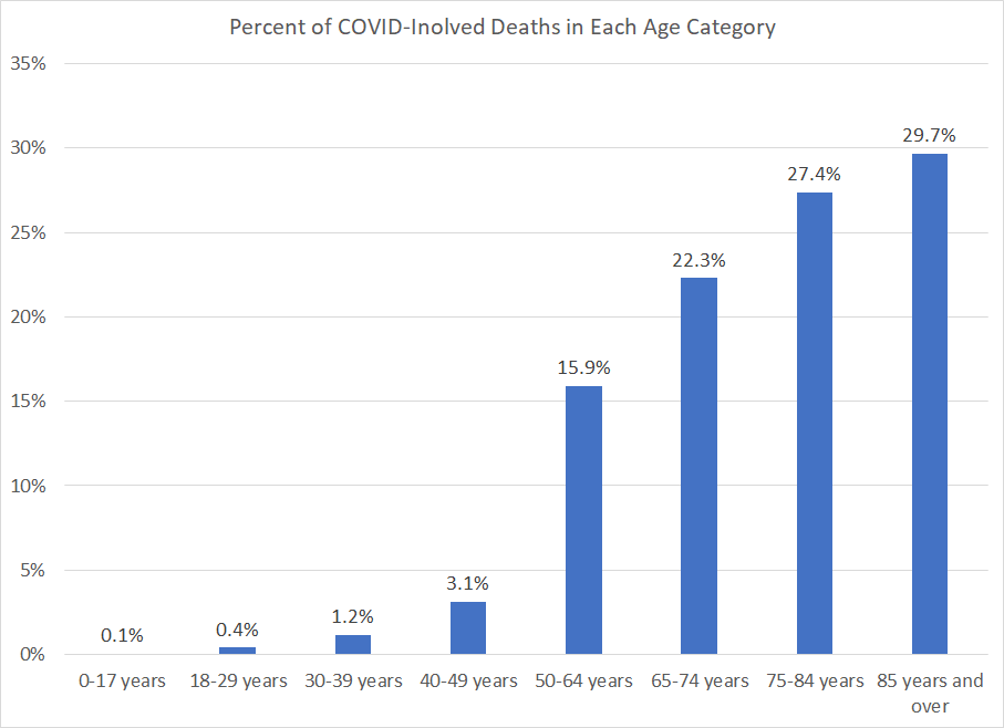
We have known for a long time (basically since the start of the pandemic) that COVID primarily affects the elderly. Infection fatality rates are hard to calculate (since not all infections are reported), but most of the data suggest that the elderly are much more likely to die from COVID than other age groups.
For some, this has become one of the most important aspects of the pandemic. For example, Don Boudreaux emphasizes the age distribution of deaths many times in a recent episode of Econtalk, and he uses this point to argue that we addressed the pandemic incorrectly (to say the least). Boudreaux specifies that COVID is only deadly for those 70 and older. And while I won’t rehash the argument here, please also see my exchange with Bryan Caplan, where he argues that elderly lives are worth a lot less than younger lives (I disagree).
At first blush, the data seems to bear that out. The CDC reports that almost 80% of COVID-involved deaths were among those aged 65 and older (I will use the CDC’s definition of COVID-involved deaths throughout this post). In other words, of the currently reported almost 600,000 COVID deaths in the US, about 475,000 were 65 and older. Throw in the 50-64 age group, and you’ve now got 570,000 of the deaths (95% of the total).
But is this the right way to think about it? Remember, the elderly always account for a large share of deaths, around 75% in recent years. So it shouldn’t surprise us that most deaths from just about any disease are concentrated among the elderly.
According to the 2020 Census, Alabama’s population grew by 5% since 2010. Recently, the death rate started to exceed the birth rate in Alabama, as I think it has in most states. Tom Spencer of PARCA reports that most of the population growth in Alabama was driven by people migrating to the state. From 2011 to 2016, those new people were mostly immigrants from other countries. International migration slowed down in 2017, but that is exactly when Alabama experienced a surge (well, a few tens of thousands of people) in domestic migration. I arrived, as it happens, precisely at the start of the domestic migration surge. See my earlier post on the nice weather here.
It’s pretty humid currently in mid-summer. Could that be why Alabamians take summer vacation so seriously? This place really shuts down around the 4th of July so that people can be undisturbed at “the lake”.
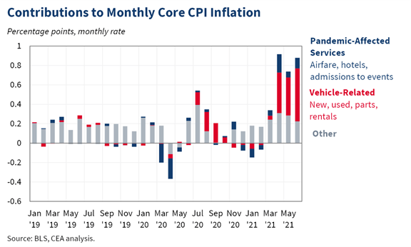
You have probably seen the latest inflation data. The headline number is 5.4% increase in prices in the past year as measured by the CPI-U. That’s a lot! Even the Core CPI (removing volatile food and energy) is up 4.5%.
If you follow the data closely, you may also have heard that a big chunk of that increase comes from prices related to automobiles: new cars, used cars, rental cars, car parts. All way up!
If you are in the market to buy a car, or if you really need a rental, it’s a bad time for prices. (Conversely, if you have an extra car sitting around, it’s a great time to sell!)
But what if you aren’t in the market for a car? What does the inflation data look like? The White House CEA tweeted out this chart to deconstruct the factors in the recent CPI release.
Yesterday, co-blogger Jeremy asked “Should Andrew Yang Wait To Concede?” in the New York City mayoral race. He argued that while Yang finished 4th in 1st-place primary votes, the new Ranked Choice Voting system meant he could still win. This is of course true in theory- but today I argue it is very unlikely in practice.
I say this not because I have scrutinized all the polls to predict the exact distribution of 2nd- and 3rd-place votes, or because I think I know more than Jeremy about political science or New York. Instead, any time I’m wondering about whether something will happen and I don’t have a strong opinion based on my own knowledge, I simply check what markets have to say. In this case, there are prediction markets bearing on this exact issue. The odds from PredictIt, shown below, have Adams (who finished with the most 1st-place votes, 32%) as the heavy favorite, with Yang reduced to an approximately 1% chance of winning.
But Jeremy is right to highlight that the Ranked-Choice system makes it less obvious who will win. You can see PredictIt traders still think that Garcia, who finished with 19% of 1st-place votes, is substantially more likely to win than Wiley, who finished with 22% (though the new system didn’t matter in the Republican primary, where Sliwa won with a clear majority of 1st-place votes).
Crypto-based betting platform Polymarket has actually closed their market for Yang already, declaring that he lost, though they agree with PredictIt that the overall election isn’t over and that Garcia still has a real chance despite coming in 3rd for 1st-place votes.
Of course, prediction markets aren’t perfect- they are certainly less accurate (easier to beat) than the stock market, as my track record of betting in both shows. But they make for a great first approximation on subjects you don’t know well, and if you think you do know better, they offer you the chance to make money and to make the odds more accurate. If you think Yang will still win, you can go bet on PredictIt and potentially 100x your money. Or if you think this ranked choice stuff is nonsense and Adams obviously won, you can pick up an easy 10% return. Or if you’re like me in this case, you can stay out of it, take a quick glance at the markets, and get a good idea of what is likely to happen without having to read the news or the pundits.
Yesterday New York City held their mayoral primary elections. This was an exciting event for election system nerds (political scientists and public choice economists) because NYC is now using a form of ranked choice voting to determine the winner.
While this is not the first place in the US to use RCV (Maine, Alaska, and a handful of cities use it), it is still notable for a few reasons. First, this is America’s largest city. Second, there are a lot of viable candidates, which makes RCV especially interesting and useful.
Specifically, NYC is using a form of voting called instant runoff. There are currently 13 candidates, and voters indicate their top 5 in order. If no one has a majority (>50%) of the votes, then the rankings entered by voters come into play. And indeed that is what happened yesterday.
On the first round, only counting first place votes, Andrew Yang came in 4th with just under 12% of the votes. So last night he conceded.
But should Yang have conceded? Maybe not! Let’s explore how instant runoff works.
For population to be steady or rising, the average women needs to have at least two kids. In almost every rich country- including the United States, all of Europe, and all of East Asia- this isn’t happening. In the extreme case of South Korea, where total fertility averages about one child per woman, the population will fall by half each generation. If this were to go on for 10 generations, South Korea would go from a country of 50 million people- larger than any US state- to one of 50 thousand people, far smaller than any US state. This sounds crazy and I don’t expect it will actually happen- but I can’t say what exactly will stop it from happening.
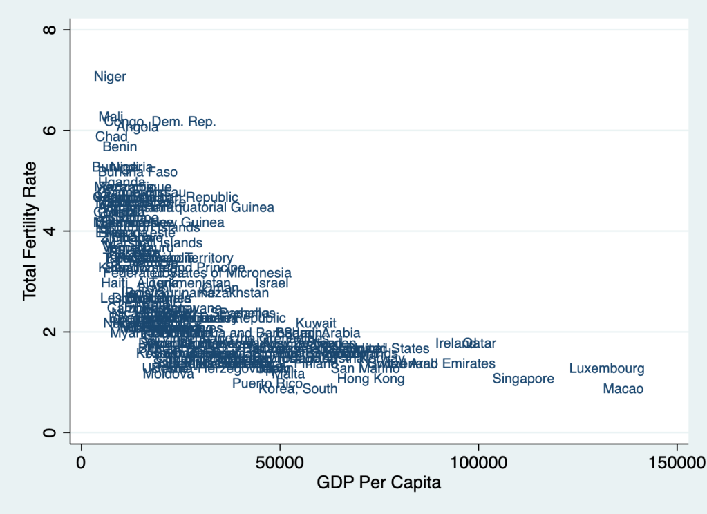
Global population growth has fallen from a peak of 2.1% per year to the current 1%, and is expected to fall to 0 by 2100. The remaining population growth will happen in poor countries, then stop for the same reasons it did in rich countries- the demographic transition from poverty, argicultural work, and high infant mortality to high incomes, high education, and low infant mortality. As the graph below shows, higher income is an incredibly strong predictor of low fertility- and so if economic growth continues, we should expect fertility to continue falling. But where does it stop?
2019 TFR from Population Reference Bureau vs 2019 PPP-adjusted GDP Per Capita fron World Bank
Some have theorized a “J-curve” relationship, where once incomes get high enough, fertility will start rising again. You can see this idea in “Stage 5” of Max Roser’s picture of the demopgraphic transition here:
This makes sense to me in theory. As countries get richer, desired fertility (the number of kids each woman wants to have) has fallen, but realized fertility (the number of kids each woman actually has) has fallen faster. In a typical rich country women would like to have 2-2.5 kids, but actually ends up having about 1.5. There are many reasons for this, but some are clearly economic- the high cost of goods and services that are desired by rich-country parents, like child care, education, and spacious housing near high-paying jobs. Perhaps in a rich enough country all these could be obtained with a single income (maybe even from a part-time job). But it seems we aren’t there yet. Even zooming in on higher-income countries, higher incomes still seem to lead to lower fertility.
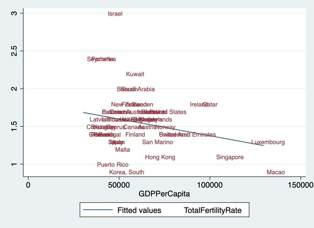
TFR vs GDP Per Capita in countries with GDP Per Capita over 30k/yr
The only rich countries with fertility above replacement are Panama and the Seychelles (barely meeting my 30k/yr definition of rich), Kuwait (right at replacement with 2.2 kids per woman), and Israel- the biggest outlier, with 3 children per woman at a 42k/yr GDP. This hints that pro-fertility religious culture could be one way to stay at or above replacement. But in most countries, rising wealth seems to drive a decline in religiousity along with fertility. Will this trend eventually come to Israel? Or will it reverse in other countries, as more “pro-fertility” beliefs and cultures (religious or otherwise) get selected for?
To do one more crazy extrapolation like the disappearance of South Korea, the number of Mormons is currently growing by over 50% per generation from a base of 6 million while the rest of the US is shrinking. If these trends continue (and setting aside immigration), in at most 10 generations the US will be majority-Mormon. Again, I don’t actually expect this, but I don’t know whether it will be falling Mormon fertility, non-Mormon fertility somehow rising back above replacement, or somethingelse entirely that changes our path.
What would a secular pro-fertility culture look like? For my generation, I see two big things that make people hold back from having kids: a desire to consume experiences like travel and nightlife that are harder with kids, and demanding careers. I see more potential for change on the career front. Remote work means that more quality jobs will be available outside of expensive city centers. Remote work, along with other technological and cultural changes, could make it easier to work part-time or to re-enter the work force after a break. Improving educational productivity so that getting better-education doesn’t have to mean more years of school would be a game-changer; in the short run I think people will spend even more time in school but I see green shoots on the horizon.
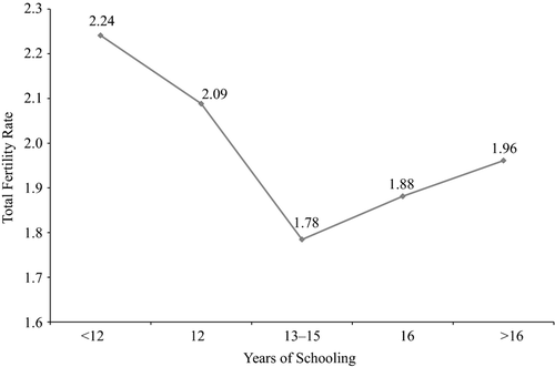
Looking within the US, we are just beginning to see what looks like the “J-curve” happening. Since about the year 2000, women with advanced degrees began to have more children than those with only undergraduate education (though still fewer than those with no college, and still below replacement):
From Hazan and Zoabi 2015, “Do Highly Educated Women Choose Smaller Families?”
We see a similar change with income. In 1980 women from richer households clearly had fewer children, but by 2010 this is no longer true:
Fertility of married white women, from Bar et al. 2018, “Why did rich families increase their fertility? Inequality and marketization of child care”
The authors of the papers that produced the two graphs above argue that this change is due to “marketization”, the increasing ability to spend money to get childcare and other goods and services that make it easier to take care of kids. If this is true, it could bode well for getting back to replacement- markets first figure out how to make more excellent daycare and kid-related gadgets, then figure out how to make them cheap enough for wide adoption.
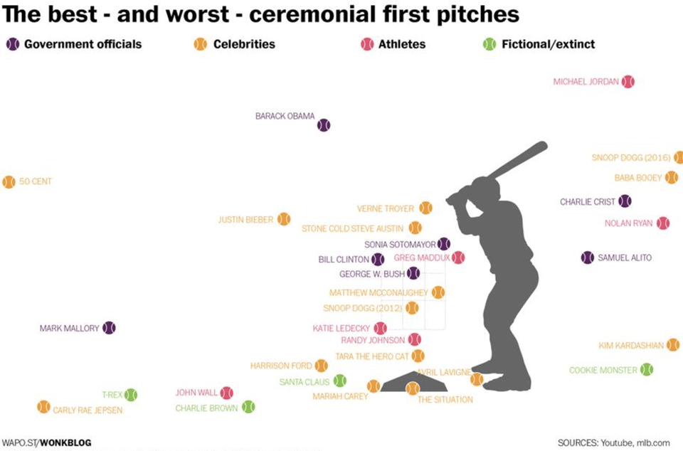
The Washington Post created a fun infographic of celebrity baseball pitches.
I use this graphic in my Data Analytics class. Students are tempted to draw inferences about individuals from this data set. John Wall and Michael Jordan are great athletes, but in this case they are underperforming Avril Lavigne and George W. Bush. Do we conclude that Sonia Sotomayor missed her calling as an MLB player?
The first lesson here is that we should not assume we can predict where Harrison Ford’s next pitch will go based on observing just one pitch. A single pitch should be considered a random draw from a distribution centered around Ford’s average ability. Any single pitch could be an outlier.
Snoop Dog features twice on this graph. In 2012 he got the ball in the strike zone. Had we only seen that, we would want to conclude that he is a great pitcher. However, in 2016 he was way off to the right. In either case, overconfidence that he is predictably near a single pitch would have been a mistake.
Lastly, I use this graph to illustrate the concept of overfitting (investopedia definition). I suggest a model that is obviously inappropriate. What if we conclude from these data that anyone with the last name of Bieber will not be able to throw the ball in the strike zone? That model surely will not generalize. The problem is that if we test that prediction on the same data we used to train the model, the misclassification rate will be zero. If possible, start with a large data set and set aside some portion of the data for validation, before training a model. Having validation data for assessment is a good way to check that you haven’t modeled the noise in your training set.
My article, coauthored with Sarah Kerrigan and published last week, tries to answer the question. In short, the answer seems to be yes- cohabitation before marriage is associated with a 4.6 percentage point increase in the rate of marital dissolution. This is in line with much of the previous literature, which notes one big exception- choosing right (or getting lucky) the first time: “cohabitation had a significant negative association with marital stability, except when the cohabitation was with the eventual marriage partner”.
But we found some even more interesting facts while digging through the National Survey of Family Growth.