Shifts in Labor Participation: The Great Resignation Becomes the Great Reshuffling

More than 47 million workers quit their jobs in 2021, in what has become known as The Great Resignation. However, many of these workers are getting re-hired elsewhere. Hiring rates have outpaced quit rates since November, 2020.

The U.S. Chamber of Commerce has published some statistics on this reshuffling of the labor force, which I will reproduce here.  As shown in the chart below, quit rates in leisure and hospitality  (which require in-person attendance and pay lower salaries) were enormous. However, the recent hiring rates have been even higher in this area, so the shortage of labor there is only moderate.

When taking a look at the labor shortage across different industries, the transportation, health care and social assistance, and the accommodation and food sectors have had the highest numbers of job openings.

But yet, despite the high number of job openings, transportation and the health care and social assistance sectors have maintained relatively low quit rates. The food sector, on the other hand, struggles to retain workers and has experienced consistently high quit rates.

I am not sure I understand exactly what the following chart represents, but it was deemed important:

I think the % of yellow is the ratio of unemployed persons with experience in the field (i.e., who could readily participate) to the total job openings in that field. E.g., “…if every unemployed person with experience in the durable goods manufacturing industry were employed, the industry would only fill 65% of the vacant jobs.” These are interesting data, although I’d be even more interested in seeing  numbers on unfilled job openings as fraction of total (filled and unfilled) job openings to give a better idea on how much each industry is hurting for labor. Anyway, here is some of the commentary from the article:

It is interesting to look at labor force participation across different industries. Some have a shortage of labor, while others have a surplus of workers. For example, durable goods manufacturing, wholesale and retail trade, and education and health services have a labor shortage—these industries have more unfilled job openings than unemployed workers with experience in their respective industry. Even if every unemployed person with experience in the durable goods manufacturing industry were employed, the industry would only fill 65% of the vacant jobs.

Conversely, in the transportation, construction, and mining industries, there is a labor surplus. There are more unemployed workers with experience in their respective industry than there are open jobs.

The manufacturing industry faced a major setback after losing roughly 1.4 million jobs at the onset of the pandemic. Since then, the industry has struggled to hire entry level and skilled workers alike.

And finally:

Some industries have been less impacted by labor shortages but are grappling with how to deal with the rise of remote work. For example, the rise of remote work might explain why there has been less “reshuffling” in business and professional services.

US Households Have a Lot More Income Than 1967, and It’s Probably Not Just Because of the Rise of Dual-Income Households

We are going through some tough economic times right now: high rates of inflation (generally exceeding wage growth) with the strong possibility of a recession in the near future. In times like this, I think it is useful to also consider the historical perspective. The US economy has gone through challenging times in the past, but the long-run track record is impressive.

Here is one way to show the data. It comes from the Census Bureau, and shows the total money income of households in the US. The data is, of course, adjusted for inflation, and not just with the regular CPI-U: they use the superior CPI-U-RS, which attempts to maintain a consistent methodology for how prices are measured (BLS is constantly improving the CPI, but that sometimes makes historical comparisons challenging). I present the data both as a percent of the total number of households, and the absolute numbers.

I’ve shaded the chart to suggest that over $100,000 of annual income is high income, and under $35,000 is low income, with everything else considered “middle class.” By these definitions, the number of high-income households in the US increased dramatically from 6.6 million (10.9% of the total) in 1967 to 43.7 million (33.6% of the total) in 2020. The number of low-income households also rose, unfortunately, from 21.4 million in 1967 to 34 million in 2020, but the portion of the total fell (from 35.2% to 26.2%) since it increased slower than the overall growth of the number of households. Today, there are more high-income households (43.7 million) than low-income households (34 million) in the US.

But even if you don’t like those definitions, I’ve provided as much detail in the chart as Census makes available publicly. For example, let’s say you think $200,000 is what makes you high income. There were fewer than 1 million of these households in 1967 (1.3% of the total). Today, there are over 13 million of them (10.3% of the total). However we slice the data, there are a lot more high-income households in the US than in the past. (Remember remember, this is all adjusted for inflation.)

Many people found this data interesting when I posted it to Twitter, including the world’s richest person. But among the many objections raised is that this is driven by the rise of female employment and dual-income households. And indeed, that is a factor. But how much of a factor?

Let’s dig into the data.

Continue reading →

The NFT Market Is Mushrooming – Why??

Saturday Night Live fans were introduced to Non-Fungible Tokens (NFTs) a year ago with this skit. Most people know that an NFT is a digital ownership certificate of some asset. That could be a physical asset, or a purely digital asset, like a crude graphic of an ape wearing a sailor’s hat which people are willing to pay hundreds of thousands or millions of dollars for.

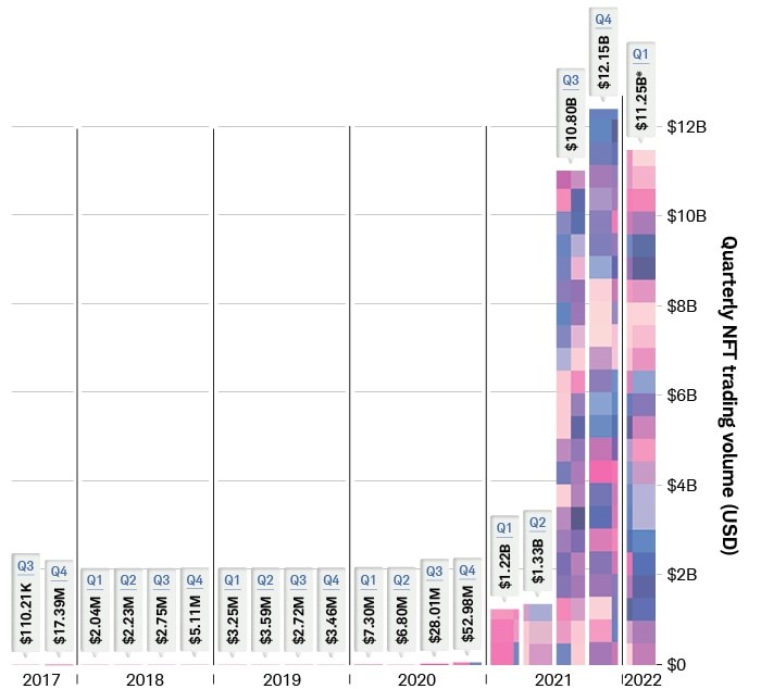
The NFT market volume exploded in the second half of 2021:

On-line chain transactions as tracked by DappRadar. Source: Schwab.

The global NFT market is projected to grow from $1.9 billion in 2021 to $5.1 billion by 2028, an annual growth rate of some 18%.

But, why??? Why would people plunk down millions of dollars for just a certificate of ownership of something which may not be particularly beautiful or functional? It is just not something that would ever occur to me.

Part of the answer must be that there are a lot of people who have a lot of money that they don’t really need. This may be a function of the ever-increasing income inequality, but we will not go down that rabbit hole. But still, assuming some 30-something has 50 grand that he doesn’t need  — why spend it on an NFT?

I did a real quick search on this topic. The most common reason appears to be the same reason many people buy rare coins or rare wines or other “collectibles” – they hope that someone else will pay them a higher price in the future. There also seems to be a sense of participating in some “community”, e.g., of Bored Ape Yacht Club aficionados. Much of it comes down to the psychology of what others will pay for something, which can be often explained in hindsight, but can be hard to predict if some asset class has not yet become “hot”.

It turns out that there are some other nuances to NFTs beside just hoping some “greater fool” will pay you more for the ownership of your ape drawing five years from now. I will conclude by pasting in some excerpts from an article on the Hyperglade blog, which frames the discussion partly in terms of the familiar economic concept of scarcity:

The key value proposition that NFTs often claim is scarcity. NFTs, as their name suggests, are each inherently unique on the blockchain, i.e. they can be attributed to a specific ‘hash’ or ID. But scarcity alone doesn’t drive value – it has to be a ‘scarcity’ that people want. 

One of the first types of scarcity that people want is exclusivity. Exclusivity in this context means something that is very rare and has attributes of originality. Long before NFTs existed, collectibles took center stage in this arena. For example, trading cards, comic books, and antique toys were very valuable due to their scarcity and history associated with them. For example, the Captain America Comics No. 1, from 1941 sold for over $3 million! The NFT equivalent of this would be Jack Dorsey’s first tweet, which went for $2.9 million. Jack’s tweet illustrates the quintessential NFT qualities; distinct historical moment, a special creator, and only one of them. 

Collectible NFTs come in many forms (in image, audio, or video formats), but the primary category is art (e.g. the Beeple NFT), followed by music, and sports moments (e.g. NBA top shot). Subsequently, given the depth of the cultural penetration of the content involved, collectibles are the most popular reason for investing in NFTs. According to Crypto.com’s NFT survey of ~30,000 polled users, 47% of those who own NFTs bought them for collectible value. Their primary motive – to be able to ‘flip’ (sell) at a higher price.

Access to a Network

More recently however, is the emergence of NFT collections that empower communities. These collections give holders access to special privileges, primarily access to special cryptocurrency related services and benefits (e.g. higher investment rates). For example, The famous Bored Ape Yacht club holders get to attend special events, E.g. in October 2021, members celebrated annual Ape Fest in New York City, Bright Moments Gallery.

Assets in virtual worlds and gaming

If you haven’t heard of them already, Virtual digital worlds are computer-simulated environments in which users roam around using their personal avatars. So NFTs neatly solve the problem of immutable land ownership. And depending on the demand, access and foot-traffic to certain places in these simulated world prices for virtual lands have skyrocketed. For example, even the cheapest land in decentraland exceeds $10,000. In a very similar way, web 3.0 games are expanding the use case by digitizing in-game assets so that they can be physically owned by players on the blockchain. In-game assets can include characters, cards, skins, etc. a list of which you can find here.

Inflation for Thee, But Temporarily Not for FL

On May 6, 2022, the governor of Florida, Ron DeSantis, signed House Bill 7071. The bill was touted as a tax-relief package for Floridians in order to ease the pains caused by inflation. In total, the bill includes $1.2 billion in forgone tax revenues by temporarily suspending sales taxes that are levied on a variety of items that pull at one’s heartstrings. Below is the list of affected products.

A minor political point that I want to make first is that the children’s items are getting a lot of press, but they are only about 18.4% of the tax expenditures. The tax break on hurricane windows and doors received 37% of the funds and gasoline is receiving another 16.7%. There are ~$150 million in additional sales, corporate, and ad valorem tax exemptions. Looking at the table, it seems that producers of hurricane windows and doors might be the biggest beneficiary and that that the children’s items are there to make the bill politically palatable. Regardless, this is probably not the best use of $1.2 billion.


There are at least three economic points worth making.

Continue reading →

Is this the peak of inflation?

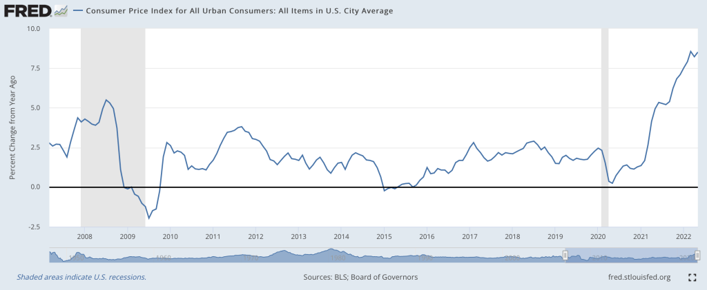
I think so, though the path back to 2% is a long one. Two months ago I wrote that “the Fed is still under-reacting to inflation“. We’ve had an eventful two months since; last Friday the BLS announced CPI prices rose 1% just in May, and that:

The all items index increased 8.6 percent for the 12 months ending May, the largest 12-month increase since the period ending December 1981

Then this Wednesday the Fed announced they were raising interest rates by 0.75%, the biggest increase since 1994, despite having said after their last meeting that they weren’t considering increases above 0.5%. I don’t like their communications strategy, but I do like their actions this month. This change in the Fed’s stance is one reason I think we’re at or near the peak.

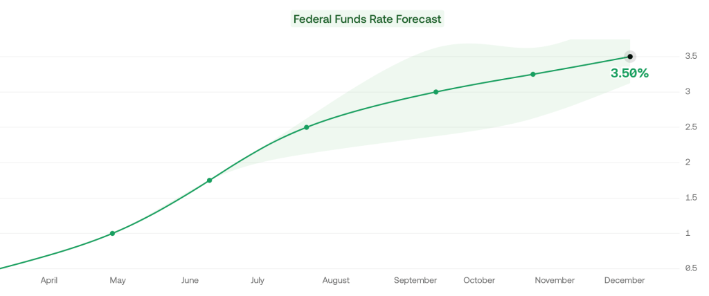
Its not just what the Fed did this week, its the change in their plans going forward. As of April, the Fed said the Fed Funds rate would be 1.75% in December, and markets thought it would be 2.5%. But now the Fed and markets both project 3.5% rates in December.

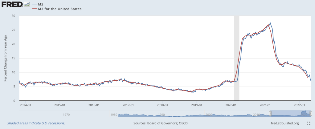
The other reason I’m optimistic is that the days of rapid money supply growth continue to get further behind us. From March to May 2020, the M2 and M3 supply exploded, growing at the fastest pace in at least 40 years:

Rapid inflation began about 12 months later. But the rate of money supply growth peaked in February 2021, then began a rapid decline. Based on the latest data from April 2022, money supply growth is down to 8%, a bit high but finally back to a normal range. Money supply changes famously influence prices with “long and variable lags”, so its hard to call the top precisely. But the fact that we’re now 15 months past the peak of money supply growth (and have stable monetary velocity) is encouraging. Old-fashioned money supply is the same indicator that led Lars Christiansen to predict this high inflation in April 2021 after successfully predicting low inflation post-2009 (many people got one of those calls right, but very few got both).

Stocks also entered an official bear market this week (down 20% from highs), which is both a sign of excess money no longer pumping up markets, and a cause of lower demand going forward.

Markets seem to agree with my update: 5-year breakevens have fallen from a high of 3.6% back in March down to 2.9% today, implying 2.9% average inflation over the next 5 years. Much improved, though as I said at the top the path to 2% will be a long one- think years, not months. Even the Fed expects inflation to be over 5% at the end of this year, and for it to fall only to 2.6% next year.

What am I still worried about? The Producer Price Index is still growing at 20%. The Fed is raising rates quickly now but their balance sheet is still over twice its pre-Covid level and is shrinking very slowly. The Russia-Ukraine war drags on, keeping oil and gas prices high, and we likely still have yet to see its full impact on food prices. Making good predictions is hard.

While I’m sticking my neck out, I’ll make one more prediction, though this one is easier- Dems are in for a bad time in November. A new president’s party generally does badly at his first midterm, as in 2018 and 2010. But this time the economy will be a huge drag on top of that. November is late enough that the real economy will be notably slowed by the Fed’s inflation-fighting effects, but not so late that inflation will be under control (I expect it to be lower than today but still above 5%). Markets currently predict a 75% chance that Republicans take the House and Senate in November, and if anything that seems low to me.

How Zoning Affects Your Home, Your City, and Your Life (a book review)

As you drive, walk, or bike around your city, what do you think about as you see the various buildings and other structures? Perhaps you think about the lives of the people in them, or the architecture of the buildings themselves, or the products and services that the businesses offer for sale. For me, lately I’ve been thinking about one thing as I make my way around town: zoning. It’s not something I had thought about before very much, but after reading Nolan Gray’s new book Arbitrary Lines: How Zoning Broke the American City and How to Fix It, I’ve been thinking about zoning a lot more.

(Disclosure: I know the author of the book, but I paid for my own copy and got it in advance through the luck of the Amazon-pre-order draw.)

The book does a wonderful job of explaining what zoning is (and importantly, also what it is not), where zoning comes from historically (it’s a development of the early 20th century), and how zoning affects our cities. I really like the way that the book encourages the reader to be a part of the story of zoning. In Chapter 2, Gray encourages you to put down the book and locate your city’s zoning map to learn more about how zoning impacts your life.

I immediately did so and had no trouble finding zoning maps for the city I live in, Conway, Arkansas. Conveniently, my city provides both a simple PDF map and an interactive map, which provides a lot more detail. The interactive map even has embedded links with historical information on different pieces of property. For example, I found the ordinance for when my college, the University of Central Arkansas (previously Arkansas State Teachers College), was annexed by the City in 1958. Pretty cool!

Looking over the map, it’s pretty clear that most of the city that I live in is covered by R-1 and R-2 zoning. But what exactly do these designations mean? You can probably guess that “R” designates residential, but what does it proscribe about land use?

For that, you must dig into the zoning ordinances. And as Gray cautions in the book (somewhat tongue-in-cheek), you might not want to get in too deep with your zoning ordinances, since they can run hundreds or thousands of pages. But I was brave enough to do so, and located my zoning code online (the PDF runs a modest 253 pages).

What did I learn about the zoning that covers my city?

Continue reading →

Raging Inflation, Spiking Rates, Plunging Stocks, Oh, My!

It has been such a volatile couple of days in the markets that you hardly know where to focus.  Friday’s inflation print was 8.6% (year/year), higher than expected and the highest in forty years, showing (yet again) that the Fed’s “transitory inflation” line was always just fantasy. Despite its glacial, foot-dragging pace of response to date, the Fed will need to raise short-rates (which they directly control) faster and farther than earlier planned. The Fed does not directly control long-term rates, but they influence them by buying and selling bonds on the open markets. For years, they have been buying bonds (driving interest rates lower), but they will have to stop that and maybe go the other way, being net sellers of bonds.  This will make financing government deficits much more difficult.

Anyway, both short and long term rates have gone vertical in the past few days as markets price in all this, reaching levels not seen since the aftermath of the 2008 Global Financial Crisis:

Rates of U. S. 1-Year Bills. From Wolf Richter.

Rates of U. S. 10-Year Notes. From Wolf Richter.

https://seekingalpha.com/article/4518160-treasury-bonds-plunge-yields-spike-stock-crypto-mess

Mortgage rates will likely march even further upward, increasing the monthly payments for most homeowners. At some point, this will deflate the housing market. Some of today’s eager new homebuyers who paid over asking price, assuming that housing only goes up, may be in for a rude awakening.

It seems like the only way to tamp down inflation is old-fashioned demand destruction. Stock market participants are starting to price in the dreaded R-word (recession). The plunging stock market has been in the news the last few days. Yes, it has dropped a lot, but shown on a five-year chart below it may not be so apocalyptic. It is dropping from ridiculously over-optimistic market highs at the end of 2021.  We are still slightly above the pre-COVID peak:

S&P 500 Index. From Seeking Alpha.

If you are young and working, you should see lower prices as a buying opportunity. If you are making regular contributions to a savings plan in stocks (dollar cost averaging), your dollars are buying you more stocks. If you feel you must DO something, you could always rebalance your portfolio, shifting some funds into stocks from something else, to maintain a say 70/30 stock/bond portfolio. Peace…

Not so Great Expectations

People have expectations about the world. When those expectations are violated, they usually change their behavior in order to account for the new information (on the margin at least). Does unexpected inflation affect people’s behavior? Of course. William Phillips thought so (the famous version of the Phillips Curve assumes constant inflation expectations).

Macroeconomists often separate the world into reals and nominals. Sometimes we produce more and other times we produce less. Those are the reals. The prices that we pay and the money that we spend are the nominals. There is what’s sometimes called a ‘loose joint’ between reals and nominals. That is, they do not move in tandem, nor are they entirely independent. If the Fed suddenly slows the growth of the money supply, then economic activity growth might also slow – but not by the same amount. In the long run, reals and nominals are largely independent. Whether we have 2% vs 3% annual inflation over the course of some decade is probably not important for our real output at the end of that decade.

It Takes Two to Tango.

It is often said that the Fed can achieve any amount of total spending in the economy that it prefers. It can achieve any NGDP. But, the Fed doesn’t control NGDP as a matter of fiat. The Fed changes interest rates and the money supply in order to change the total spending in our economy. Importantly, the effect of Fed policy changes is contingent on how the public reacts. After all, the Fed can increase the money supply. But it is us who decides how much to spend.

Continue reading →

Cost Plus Drugs

A new online pharmacy funded by Mark Cuban promises to sell prescription drugs at a fixed markup, 15% over cost plus a $3 flat fee. What’s the catch?

As far as I can tell, there are two- they only sell generics, and they don’t take insurance. But I think this will still save many people a lot of money.

The most expensive drugs get that way because they are sold by monopolies, almost always because they were invented less than 20 years ago and are still on-patent. But it’s still possible for older drugs to be sold at huge markups, as Martin Shkreli could tell you now that he’s out of prison (Shkreli’s case is supposedly what inspired Dr. Alex Oshmyansky to start this pharmacy). Sometimes you can still blame these markups on monopolies, just induced by the FDA instead of patents. But even for generic drugs with competitive manufacturing, you still sometimes see large and variable markups at the pharmacy level. So I think there’s still huge value in a pharmacy offering a low and stable markup on generics.

What about not taking insurance? First of all, lower cash prices obviously still benefit the 28 million Americans who don’t have health insurance. But even for those with insurance, it’s surprisingly common throughout health care to find cash prices lower than their copay. I have relatively good insurance but when I checked Cost Plus Drugs for the last two prescriptions my family got, I found that one was 80% cheaper than our copay (the other was about the same as our copay, so we’d only come out even, though we’d presumably save our insurer a lot).

Cost Plus Drugs originally wanted to also work through insurance as a Pharmacy Benefit Manager, but seems to have pivoted to being an “unPBM” that just offers generics to employers to supplement their existing plans. They also want to manufacture some of their own drugs, which seems on track to happen. They were started as a Public Benefit Corporation, so while they are for-profit this lends credibility to the idea that they really do want to keep prices down, not just start with low prices to make a name for themselves. Anyway, this seems like a worthy experiment and I encourage anyone with an expensive prescription to see if you can get it cheaper here.

Sick of high drug prices? Try some low-price anti-nausea mediation

No in-group bias from financial choices in latest experiment

“How Dictators Use Information about Recipients” is my new project with Laura Razzolini. A working paper is up at SSRN. We use the Dictator Game to measure if people are generous toward others who made a similar choice.

In the first stage of the experiment, every player gets to make their own choice about whether or not to invest in a risky option (called Option B). Players can pick Option A if they do not want to invest.

In the second stage, participants get to decide if they will send any money to another anonymous player. If a “dictator” (the person who determines the final allocation of money) decided to take the risk on Option B in stage 1, would they be more generous toward a counterpart if they know that person also picked Option B?

We explain in our paper why the literature indicates such a form of favoritism could be expected.

Social identity theory is the psychological basis for intergroup discrimination. Economic experiments have created feelings of group identity in various ways, leading to significant effects on behavior. Chen & Li (2009) demonstrate that group identity formation can affect social preferences.

Chen and Li (2009) started by having subjects review paintings by two different modern artists. The subjects were divided into two groups, based on their reported painting preferences. Subjects were informed about their group membership by the experimenter.

The Chen and Li paper has been cited almost 2000 times. Group identity is a topic of interest. Several experimental papers demonstrate that strangers can have team feelings induced quickly with the right procedures. Those team loyalties affect behavior in incentivized tasks.

Group feelings artificially induced in the lab by Eckel & Grossman (2005) influence levels of cooperation and contributions to public goods. Pan & Houser (2013)  induce group identities by asking subjects to complete tasks in groups.  Pan & Houser (2019) found that investors trust in-group members more. The in-group has been induced in several different ways in lab experiments. In this paper, we investigate whether in-group effects arise from making a common financial decision in the first stage of the experiment.

Do you think our manipulation in the beginning affected giving?

Nope. There was no effect. Dictators who chose Option B did not give more to recipients who also chose Option B.

Not every result in the paper is a null result. One piece of information caused a large increase in giving. If we inform the dictator that their counterpart started with less money in the first stage (due to bad luck) then the dictator would give more. Sympathy was inspired, as we predicted, by knowing if a recipient was “poor” in the experiment. Conversely, if dictators are informed that their counterpart is “rich” then they excused themselves from having to give up money to help.

Information about financial choices, at least in our sterile simple environment, neither polarized nor united the participants. The giving with only choice information was higher than giving to “rich” but lower than giving to “poor”. Lastly, we provided all of the information at once. With full information, dictators were still heavily influenced by the starting endowments and choices information had no effect.

Understanding polarization is important. Humans exhibit tribal instincts to not help those who are perceived as different. In our experiment we seem to have found one difference that that people are willing to tolerate or overlook.

See also my Works in Progress blog about polarization and a different experiment.  

References

Chen, Yan, and Sherry Xin Li. “Group Identity and Social Preferences.” American Economic Review 99, no. 1 (March 2009): 431–57.

Eckel, Catherine C., and Philip J. Grossman. “Managing Diversity by Creating Team Identity.” Journal of Economic Behavior & Organization 58, no. 3 (2005): 371–92.

Pan, Xiaofei, and Daniel Houser. “Why Trust Out-Groups? The Role of Punishment under Uncertainty.” Journal of Economic Behavior & Organization 158 (2019): 236–54.

Pan, Xiaofei Sophia, and Daniel Houser. “Cooperation during Cultural Group Formation Promotes Trust towards Members of Out-Groups.” Proceedings of the Royal Society B: Biological Sciences 280, no. 1762 (July 7, 2013): 20130606.