I live in southwest Florida where it is quite tropical. We don’t have four seasons. We mark the passage of time with the rainy season for 8 months and the dry season for 4 months. We also mark time with ‘season’. Season is when the snow-birds – those who live in places further north – migrate to and occupy Florida for about 4-5 months. During those times the roads are more crowded and the grocery store customers are less friendly. We can also mark the passage of time with mosquitos. January has fewer mosquitos. The rest of the year we know not to go outside at dusk.
Therefore, we have the Collier Mosquito Control District. This little government entity does several things. But I want to focus on spraying. On some nights, more so during the rainy season, the CMCD flies airplanes and sprays our inland bodies of water that are susceptible to mosquito infestation. Let’s put aside for the moment any alleged negative human health effects that spraying might cause.
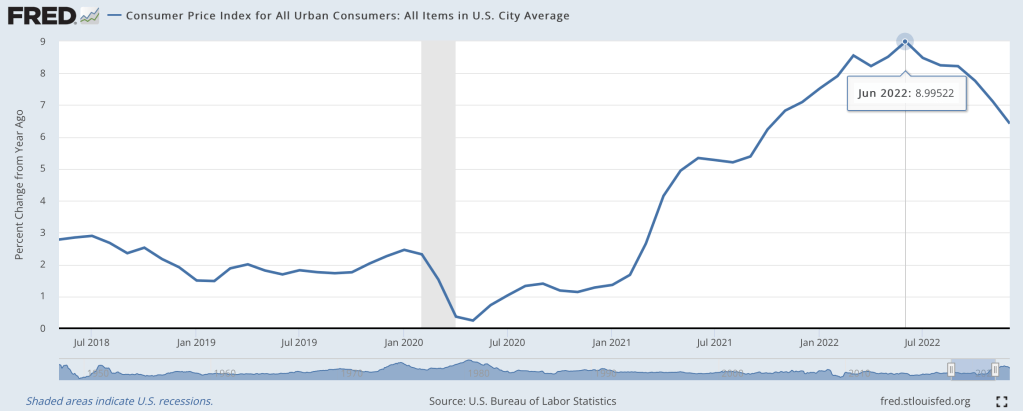
Last June I wondered if we were seeing the peak of inflation, and by at least one major measure I called the peak exactly:
At the moment, though, I’m feeling more confused than prophetic. The big question a year ago was how long it would take the Fed to get inflation down to reasonable levels, and how much collateral damage they would do to the real economy in that effort. Today most current indicators make it look like they pulled off the miraculous “soft landing”. Inflation over the last 12 months is still high, but over the last 6 months we’re nailing the Fed’s 2% annualized target. This has hit a few sectors of the real economy hard, with housing slowing dramatically and tech doing mass layoffs, but the overall picture is great: GDP growth was around 3% the last 2 quarters, and the 3.4% unemployment is the lowest since 1969.
What’s confusing about this is that we have a hard time believing we really got this lucky. Its like your plane lost power, you diverted course for an emergency crash landing, and once you touch down and find yourself seemingly unharmed you look around and wonder if the plane is about to explode. Consumer sentiment is worse than it was in the depths of Covid; business sentiment has been falling for over a year and is almost down to March 2020 levels. Betting markets forecast a 50% chance of a recession in 2023, and the yield curve is strongly inverted (one of the best predictors of a recession, though the guy who first noticed this says it might not work this time):
Finally, M2 money supply is shrinking for the first time since at least 1960, and I believe the first time since the Great Depression. This bodes well for inflation continuing to moderate, but its also one more indicator of a potential recession.
To sum up, most of the indicators of the current state of the economy look great, while most indicators of its near-term future look awful. So which do we trust?
My guess is that we avoid recession in 2023, but honestly this is mostly the gut feeling of an optimist. There’s no one knock-down piece of data I’d point to in support; its more that things are currently going well, and usually the best prediction is that tomorrow will be like today unless you have a good reason to think otherwise. The main reason people expect a slowdown is because of the Fed’s actions to fight inflation. The Fed itself predicts that they will cause a slowdown, but not a recession. Their most recent summary of economic projections from December predicts GDP growth slowing to 0.5% in 2023 and unemployment rising to 4.6%.
I think the “so what” outlook is also murky. Stocks have already fallen a lot from their highs and a recession already seems somewhat ‘priced in’, so even if I thought one was coming I wouldn’t necessarily sell stocks. On the flip side US stocks are still quite expensive by historical standards, so I don’t want to buy more on the assumption that they’ll rise more on good economic news this year. You might want to lock in decent rates on long-term bonds if you think the Fed will cut rates in response to a recession, but the inverted yield curve shows this is already somewhat priced in. 1-year bonds yielding almost 5% seems decent in either scenario, I have some and I’ll probably buy more, but 5% returns are nothing to get excited about. I’d like to hear suggestions but to me the small direct betting market on a potential recession is the clearest “so what” for anyone who does have a confident view about this year’s macro picture.
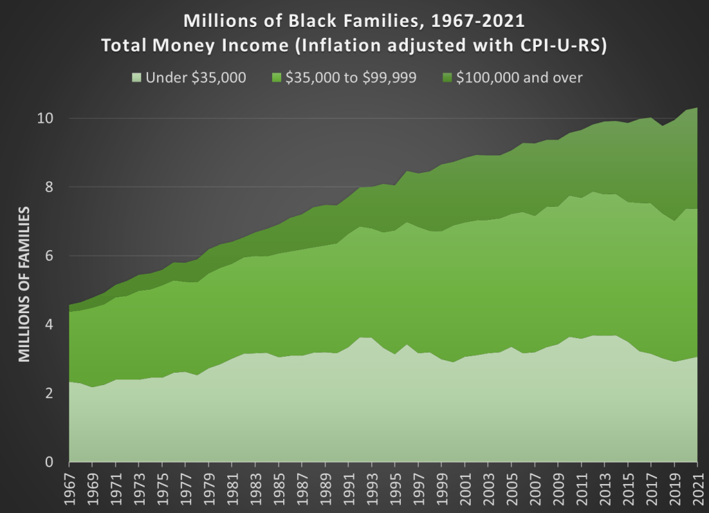
Black families are the poorest major racial or ethnic group in the US. With a median income of $59,541, a Black family only has about 59 percent of the income of a White, Non-Hispanic family. That’s the same proportion, 59 percent, as was true in 1972, the earliest date that we have comparable data. (For most of the data in this post, I will be using Table F-23 from the Census Bureau’s Historical Income Tables.) That’s almost 50 years with no closing of the racial gap in total money income for families.
Of course, what this also means is that family incomes of both Black and Whites grew at the same rate from 1972 to 2021. They both are about 50 percent larger than in 1972, and that’s after accounting for inflation (using the CPI-U-RS). As a first point of optimism, this very much goes against the typical narrative of income stagnation since the early 1970s.
To be sure, some of this growth is because families have more earners today, but even so: they have a lot more income. Having two earners does mean that you must spend more on some consumption categories, such as daycare when kids are young, possibly more on dining out or prepared meals. But even with those additional expenses, these families will have significantly more disposable income than their 1970s counterparts.
There is an ever more optimistic fact that we need to point out for Black families today: there are many, many more rich Black families today than in 1972. There are more rich families in absolute terms and as a proportion of the total. Here is the basic data from the Census Bureau (it goes back to 1967, the earliest date available for Blacks).
I just ran across the 1Q2023 “Guide to Markets” issued by J. P. Morgan Asset Management. This compendium of financial data is issued by a large team of their Global Market Insights Strategy Team. It consists of some seventy pages of data-packed charts, covering through December 2022. This information is selected to be of use to investors, both individual and institutional.
I was like a kid in a candy store, scrolling from one page of eye candy to the next. Without further ado, I will paste in some charts with minimal commentary.
One thing that caught my attention here was the persistence overestimation of earnings by Wall Street analysts. “Why do they keep doing that?” I wondered. A brief search led me to a 2017 article on Seeking Alpha by Lance Roberts titled “The Truth About Wall Street Analysis”.
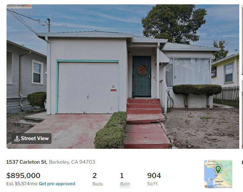
Policies can create their own entrenched consituencies, bad policies doubly so. Restrictions have long strangled the supply of housing in California, much to the detriment of the states inhabitants. This cost, of course, was spread across the entire population, while the resulting dramatic increase in housing prices proved to be a windfall for incumbent property owners. The immediate constituency of beneficiaries, however, has probably been less important than the capital committed property owners that followed, taking on larger and larger debt obligations, each generation of new homebuyers more terrified than the last that the rug might be pulled out from under them, more committed to maintaining an obiviously terrible status quo that they nonetheless found themselves bought into.
Economists refer to this as a transitional gains trap. Once the effects of the policy are internalized into the market, no one subsequent to the first generation of incumbent beneficiaries ever benefits. But, and this is most important, if the policy is *undone*, those who bought into the market after the policy was in place stand to lose. In the case of California housing, the potential losses could be significant.
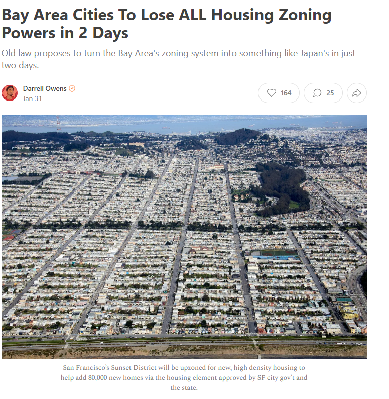
Now imagine you just bought this house today, only to read this headline tomorrow:
Darrell Owens gives all the necessary details. The point isn’t whether this or other policy eventswill the be the final blow to the California housing blockade. Or this legal case. Or this political agenda. The point is that the walls are closing in. Transitional gains traps depend on sufficiently concentrated benefits and diffuse costs. It may be the simple case that the costs of the California housing are so enormous that they are economic crippling for the majority of the population. The costs are too big to politically diffuse.
Transitional gains traps are impossible to costly get out of. Someone always loses. All you can really do is try not to fall in them yourselves. Even if the house actually does have good bones.
I’m reading The Property Species by Bart Wilson. I like chapter 4 “What is Right is Not Taken Out of the Rule, but Let the Rule Arise Out of What Is Right,” partly because I got to play a small part in this line of research.
Along with several coauthors, Bart Wilson has run experiments in which players have the ability to make and consume goods. According to the instructions that all players read at the beginning of the experiment, “when the clock expires… you earn cash based upon the number of red and blue items that have been moved to your house.”
Property norms can emerge in these environments, and sometimes subjects take goods from each other in an action that could be called “stealing.” The experimental instructions do not contain any morally loaded words like “stealing,” but subjects use that word to describe the activities of their counterparts.
Here is a conversation from the transcript of the chat room players can use to communicate while they produce and trade digital goods:
E: do you want to do this right way?
F: wht is the right way
E: the right way is I produce red you make blue then we split it nobody gets 100 percent profit but we both win
Why does the average drinker consume alcohol? There are plenty of reasons, one of which is social. Alcohol, while inhibiting clarity, precision, and discretion, is a social lubricant. If you’re one of those drinking, then it’s enjoyable to be around other drinkers. Also, people build the habit of drinking *something* while socializing. We all know that prohibition resulted in bootlegging and tainted cocktails. But what were the legal alternatives? One was that you could purchase grape juice and make your own wine (that’s a story for another time). Another is to switch to another drug.
Alcohol is a depressant and arguably the most popular one in the US. It’s not a clear substitute for alcohol in terms of its direct effects on the body. However, it’s a liquid, safe, and tasty. That make is a good candidate for satisfying the physical urge to imbibe. But, importantly, it is also a social drug. People would get so hopped up on coffee and feed off of one another’s high that Charles the II of England banned coffee houses in order to prevent seditious fomentation. This brings us to an important characteristic of coffee. It’s a stimulant. You’d think that a stimulant would not be a substitute for alcohol. If anything, one might think that they are complements. Coffee helps to provide that kick in the pants after having an enjoyable night. But, the social feature makes coffee a good candidate to substitute alcohol, should the times be dire.
Illegal activity aside, people wanted an outlet for their physical and social proclivities. They wanted intoxication. Coffee provided exactly that. Conveniently, the continental US didn’t grow any of its own coffee. That means that imports and domestic consumption have a tight relationship.
How well have countries recovered from the declines in the pandemic? It’s actually a bit difficult to answer that question, because it depends on how you measure it. Even if we agree that GDP is the best measure, how do we measure recovery? One possibility is to simply ask whether the country has exceeded its pre-pandemic GDP level. Exactly which quarter to use as the baseline is debatable, but here is a chart that Joseph Politano made for G7 countries using the 3rd quarter of 2019 as the baseline.
But we know that absent the pandemic, most countries would have continued growing (absent a recession for some other reason), so just getting back to pre-pandemic levels isn’t necessarily a full recovery. But how much growth should we have expected? It’s a hard question, but here’s a chart along those lines from the Washington Post, using the CBO’s measure of “potential GDP” as what growth might have looked like.
Using either of these approaches, it appears that the US has recovered pretty well, although it would be nice to have a comparison across countries using the same approach as the Washington Post chart does. While there is no consistent measure similar to CBO’s potential GDP figure for all countries, a simple approach is to project growth forward using the average pre-pandemic growth rate. I have done so for a number of countries, using the average growth rate from 2017-2019. In the following charts, the blue line is actual GDP levels, and the orange line is projecting the 2017-2019 growth rate forward. Sorry that I can’t easily fit all these into one chart, so here come the charts!