I keep reading and hearing people who are waiting for the shoe to drop on the next recession. They see high interest rates and… well, that’s what they see. Employment is ok and NGDP is chugging along.
One indicator of economic trouble is the delinquency rate on debt. That’s exactly what we would expect if people lose their job or discover that they are financially overextended. They’d fail to meet their debt obligations. But the broad measure of commercial bank loans is quiet. Not only is it quiet, it’s near historic lows in the data at only 1.25% in 2023Q2. Banks can lend with a confidence like never before.
But maybe that overall delinquency rate is obscuring some compositional items. After all, we know that many recessions begin with real-estate slowdowns. Below are the rates for commercial non-farmland loans, farmland loans, and residential mortgages. All are near historical lows, though there are hints that they’re might be on the rise. But one quarter doesn’t a recession make. I won’t show the graph for the sake of space, but all business loan delinquency rates have also been practically flat for the past five years.
Well, the great “Recession Starting Next Quarter” that has been predicted for nearly two years is nowhere in sight. In fact, the Bureau of Labor Statistics just last week posted an absolute blowout jobs number:
The U.S. economy churned out a blockbuster 336,000 jobs in September, smashing economists’ expectations and heightening the risk that policymakers will have to push even harder to slow down the economy. The data released Friday by the Bureau of Labor Statistics offered yet another snapshot of the job market’s remarkable strength, with the unemployment rate holding at 3.8 percent and wage growth outpacing inflation in a boost to workers. But it was also the latest example of an economy that simply refuses to slow down, despite the Federal Reserve’s aggressive attempts to get prices and hiring closer to normal levels…The September report, which showed the largest number of gains since January, had been expected to indicate continued moderation in the labor market, with forecasts of around 170,000 jobs created. Instead, it came in at nearly twice that amount. (Lauren Kaori Gurley and Rachel Siegel , Washington Post)
Before we get too excited, let’s note that the BLS numbers have a strong component of BS: nearly every jobs number they put out is quickly, quietly revised downward by 20% or so. Also, much of the jobs creation this year has been in the part-time category (so employers don’t have to pay health benefits). That said, it is indisputable that despite ferocious interest rate hikes, the economy continues to hum along, much more robustly that nearly anyone predicted six or twelve months ago. Why?
I suggest that we follow the time-tested approach of investigative reporters, which is to follow the money. We have noted earlier that since 2020 a key factor in consumer spending, which constitutes about 70% of the economy, has been the ginormous windfall of free money, over $4 trillion, that was put into the economy via various pandemic-related programs (enhanced unemployment benefits, direct stimmie payments, etc.). The story of the recent strong jobs market is largely the story of spending down that windfall.
When we were locked down in late 2020-early 2021, we consoled ourselves with ordering tons of goods on Amazon. While this generated some jobs for longshoremen and UPS and Amazon drivers, it was mainly Chinese workers who benefited from this phase. But for the past year and a half, we are out there in planes, trains, automobiles, and cruise ships, spending for services and restaurant food at a brisk pace. This has buoyed up the domestic economy, which in turn is keeping inflation far above the Fed’s 2% target.
Part of the incoming-recession story has been that the COVID windfall money is about to run out. For instance, here is a June, 2023 chart from Fed authors de Soyres, et al. showing that in the U.S. (black curve below) this money has already been exhausted:
A different set of Fed authors (Abdelrahman and Oliveira of the San Francisco Fed) wrote, also in June, that there remained a smidge of excess savings, but that “would likely be depleted in the third quarter of 2023.”
However, the Bureau of Economic Analysis (BEA) recently completed an update of national economic data that lowered the savings rate prior to the pandemic and increased it in 2020 and 2021. This basically reflected a change in the way the BEA accounts for income from mutual funds and REITS. The bottom line is that it has forced Wall Street economists to increase their excess savings projections to date by as much as $600 billion to $1 trillion, depending on the economics team. This in turn leads them to delay forecasts of recession by yet another 6-12 months.
For instance, James Knightley of ING Global Markets Research writes that there are still plenty of excess savings around; recent revisions in their numbers show the remaining hoard is even larger than they originally thought:
They did not break down this excess saving by income group, so it is possible that much of it remains with the upper 10-20% who may hoard/invest it, versus the bottom quartiles who have been spending it all into economy and now may be tapped out. We shall see how this continues to play out.
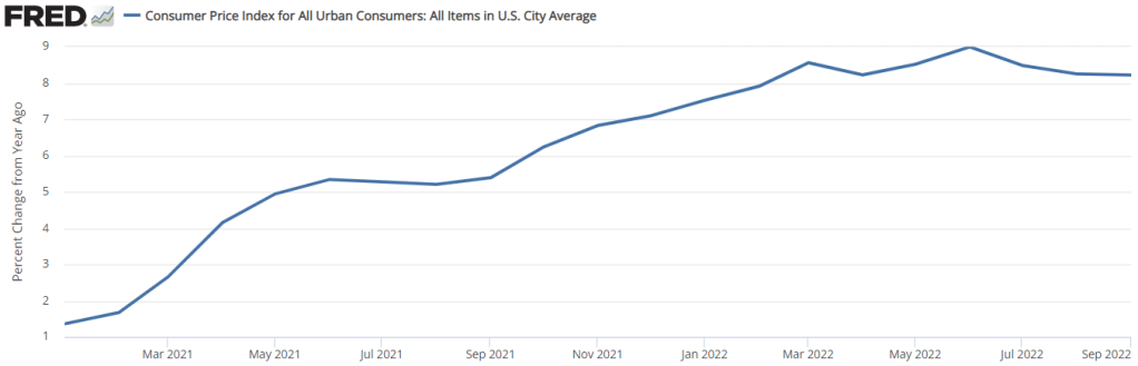
People were all excited last week when the CPI numbers were released because… the year-over-year rate of inflation did a whole lot of nothing. See below. The 12-month rate of inflation was practically constant. The 8.2% number was all over the headlines and twitter. We already know that news outlets don’t always report on the most relevant numbers. And I say that this is one of those times.
First of all, there is a problem with the year-over-year indicator. Well, not so much problem in the measure itself, but more a problem of interpretation. The problem is that the 12-month rate of inflation is the cumulative compound rate for 12 individual months. Each month that we update the 12-month inflation rate, we drop a month from the back of the 12-month window and we add a month to the front of the 12-month window. Below are both a graph and a table indicating the monthly rate of inflation and the 12-month periods ending in August 2022 (pink) and in September 2022 (green).
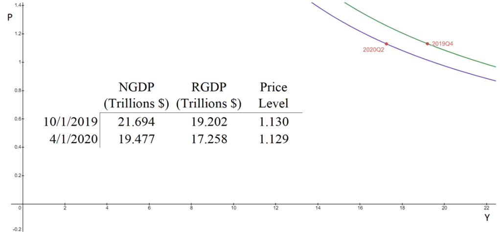
The aggregate supply & aggregate demand model (AS-AD) is nice because it’s flexible and clear. Often professors will teach it in levels. That is, they teach it with the level of output on one axis, and the price level on the other axis. This presentation is convenient for the equation of exchange, which can be arranged to reflect that aggregate demand (AD) is a hyperbola in (Y, P) space. Graphed below is the AD curve in 2019Q4 and in 2020Q2 using real GDP, NGDP, and the GDP price deflator.
The textbook that I use for Principles of Macroeconomics, instead places inflation (π) on the vertical axis while keeping the level of output on the horizontal axis. The authors motivate the downward slope by asserting that there is a policy reaction function for the Federal Reserve. When people observe high rates of inflation, state the authors, they know that the Fed will increase interest rates and reduce output. Personally, I find this reasoning to be inadequate because it makes a fundamental feature of the AS-AD model – downward sloping demand – contingent on policy context.
At the same time, I do think that it can be useful to put inflation on the vertical axis. Afterall, individuals are forward looking. We expect positive inflation because that’s what has happened previously, and we tend to be correct. So, I tell my students that “for our purposes”, placing inflation on the vertical axis is fine. I tell them that, when they take intermediate macro, they’ll want to express both axes as rates of change. I usually say this, and then go about my business of teaching principles.
But, what does it look like when we do graph in percent-change space?
Way back in the late 1970s and early 80s, Kydland and Prescott proposed rational expectations theory. This line of research arose, in part, because the Phillips curve ceased to describe reality well. Amid increasing inflation, people began to anticipate higher prices to a relatively correct degree when making labor, supply chain, and pricing decisions. Kydland and Prescott argued that individuals understand the rules of the game or how the world works – at least on average.
An increase in the money supply would increase total national spending, and increase demand for goods. However, firms also experienced increasing revenues and demanded more inputs such as commodities, capital, and intermediate goods. Because there were no greater productivity earlier in the supply chain, price roses. Firms began to understand that greater demand would eventually find its way to causing greater costs. Therefore, firms began raising prices before the cost of resources rose, increasing their willingness to pay for inputs and, ironically, hastening the increase in input prices. As a result, increases in the money supply began having substantial short-run price effects and negligible output effects.
However, assuming that people understand the rules of our economic system and ‘how the world works’ is hard to swallow. It is not at all clear that the typical economist understands monetary theory, much less clear that the typical person has a good understanding. Fortunately, another theory of expectations can help carry some of the load and achieve similar results.