Macroeconomic Policy In a Nutshell

What I’m telling my Intro Macro students on the last day of class, since we weren’t able to get through every chapter in the textbook:

A few of you might end up working in economic policy, or in highly macro-sensitive businesses like finance. For you, I recommend taking followup classes like Intermediate Macroeconomics or Money and Banking so you can understand the details. For everyone else, here are the very basics:

  1. In the long run, economic growth is what matters most. The difference between 2% and 3% real GDP growth per capita sounds small in a given year, but over your lifetime it is the difference between your country becoming 5 times better off vs 10 times better off.
  2. How to increase long-run economic growth? This is complicated and mostly not driven by traditional macroeconomic policy, but rather by having good culture, institutions, microeconomic policy, and luck.
  3. In the shorter run, you want to avoid recessions and bursts of inflation.
  4. High inflation means too many dollars chasing too few goods. To fix it, the federal government and the central bank need to stop printing so much money (the details can get very complicated here, but if we’re talking moderately high inflation like 5% the solution is probably the central bank raising interest rates, and if we’re talking very high inflation like 50% the solution is probably a big cut to government spending).
  5. If there is a recession (which will look to you like a big sudden increase in layoffs and bankruptcies), the solution is probably to reverse everything in the previous point. The government should make money ‘easier’ via the central bank lowering interest rates while the federal government spends more and taxes less.
  6. If you don’t take more economics classes, you will likely hear about macro issues mainly through the news media and social media. You should be aware of their two main biases: negativity bias and political bias.
    • Negativity Bias: If It Bleeds, It Leads on the news. Partly this is because bad news tends to happen suddenly while good news happens slowly, so it doesn’t seem like news; partly it just seems to be what people want from the news and from social media.
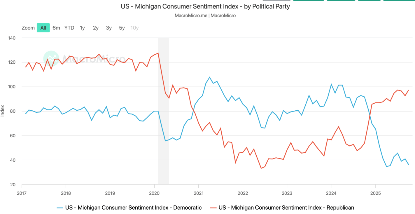
    • Political Bias: People tend to seek out news and social media sources that match their current preferences. These sources can be misleading in consistent ways for ideological reasons, or in varying ways based on whether the political party they like is currently in power.
  7. There are different ways to measure each key macroeconomic variable. Think through them now and make a principled decision about which ones you think are the best measures, and track those. Otherwise, your media ecosystem will cherry-pick for you whichever measures currently make the economy look either the best or the worst, depending on what their biases or incentives dictate.
  8. There are good ways to keep learning about economics outside of formal courses and textbooks, I list a few here.

Podcast on the Major Macro Events Since Y2K

The latest Macro Musings is an episode I could recommend to students in a macroeconomics class.

Jim Clouse on the Last 4 Decades at the Most Powerful Central Bank in the World

Since the great depression is over, what are the big events of the 21st century for macroeconomics?

9/11 and shoring up bank confidence subsequently

The Great Recession and preceding mortgage crisis

Covid and subsequent stimulus

This conversation is a tour of the trade offs under consideration at the Central Bank at these pivotal moments in the 21st century.

Beckworth: I think this is where it’s important to do the right counterfactual. What could have been could have been far worse, right? If there hadn’t been these interventions, so it’s easy to criticize from the outside, and there’s a lot of criticisms the Fed received at this time. Not to say we would have gone all the way to the Great Depression, but the fact that it was possible, right, this financial system was crashing. 

RGDP Underestimates Welfare

Like many Principles of Macroeconomics courses, mine begins with an introduction to GDP. We motivate RGDP as a measure of economic activity and NGDP as an indicator of income or total expenditures. But how does more RGDP imply that we are better off, even materially? One entirely appropriate answer is that the quantities of output are greater. Given some population, greater output means more final goods and services per person. So, our real income increases.  But what else can we say?

First, after adjusting for price changes, we can say that GDP underestimates the value that people place on goods and services that are transacted in markets. Given that 1) demand slopes down and 2) transactions are consensual, it stands to reason that everyone pays no more than their maximum value for things. This implies that people’s willingness to pay for goods surpasses their actual expenditures. Therefore, RGDP is a lower bound to the economic benefits that people enjoy. Without knowing the marginal value that people place on all quantities less than those that they actually buy, we have no idea how much more value is actually provided in our economy.

Continue reading

Videos for Teaching Inflation in 2024

I’m teaching principles of macro this semester. Making macroeconomics sound important to students is partly about explaining that recessions are painful and significant.

As Alex Tabarrok says, “The Great Depression is Over!”  Maybe Gen Z can appreciate the significance of the Great Depression, but it is history. Gen Z has heard of the Great Recession, but keep in mind that a student who is 20-y-o in 2024 was 4 in 2008. It’s a weird one, but there has been a recession more recently. The Covid Recession is what I like to link to, when possible, in class.

To teach the inflation chapter this week, I’m using video clips that I’ll put up here as resources for others.

To start off the inflation chapter and bring in a more global perspective, I show: “Zimbabwe’s inflation rate hits triple digits”  This 2-minute news clip was produced by Al Jazeera. They talk about lending and policy in addition to retail price increases.

After we have gone through some definitions, I show two clips of an economic forecast that was recorded in 2021. I don’t usually show such long clips in class, but I’m relying on dramatic irony to make it interesting. The students know the path that inflation took from 2020 to 2024, but Dr. Doti in the video does not. I stop the video occasionally to point out connections to our textbook.

Chapman University’s 2021 Economic Forecast Update was presented virtually on Wednesday, June 16, 2021.

Dr. Jim Doti predicts that an unprecedented increase in the money supply after Covid will lead to inflation. He’s not right about everything, but that’s what makes it so interesting. Right after showing students the quantity theory of money equation, I can show them someone trying to apply it from about minute 25 to about minute 35. (don’t start the video from minute 1)

Then, I go back to my lecture and introduce the Fisher effect. Next, we watch about minute 38 to minute 43 of the 2021 forecast because of the direct connection of inflation to interest rates. Partly this just helps illustrate how messy the real world is.

Also, I pull from one of Jeremy’s 2023 posts to illustrate the long run neutrality of money. “The Rate of Inflation is Falling, But Prices are Still Rising (And So are Wages)

More Or Less Money

Money and interest rates have been in the news because the Fed wants to slow the rate of inflation, maintain financial stability, and avoid a recession. Let’s break it down. First, some broad context. The M1 and M2 were all chugging along prior to 2020. M2 was growing along with NGDP and, after raising interest rates, the Fed had begun lowering them again. Then Covid, the stimuli, and the redefinition of M1 happened. Now, we’re trying to get back to something that looks like normal. See the graphs below.

https://fred.stlouisfed.org/graph/?g=1aFgM
https://fred.stlouisfed.org/graph/?g=1aFgO

But these aggregates gloss over some relevant compositional changes. Let’s go one-by-one.

The monetary base includes both bank reserves and currency in circulation. We could break it down further, but I’ll save that for another time. What we see is that while currency in circulation did grow faster post-covid, it was nothing compared to the growing reserve balances. From January to May of 2020, currency grew by 7.5% while reserves almost doubled. That means a few things. 1) People weren’t running on banks. Covid was not a financial crises in the sense that people were withdrawing huge sums of cash. 2) Banks were well capitalized, safe, and stable. Further, uncertainty aside, banks were ready to lend. And they did. Not long after the recession, everyone and their brother was re-financing or taking on new debt. More recently, we can see that currency has stabilized and, again, most of the action has been in reserve balances. As of September 2023, reserve balances are down 23% from the high in September 2021.

https://fred.stlouisfed.org/graph/?g=1aF06

The thing about the monetary base, however, is that reserves don’t translate into more spending unless the reserves are loaned out. The money supply that people can most easily spend, M1, is composed of currency held outside of banks, deposit balances, and “other liquid deposits” (green line below).*  See the graph below. Again, most of the action wasn’t in the physical printing of hard, physical cash. People’s checking account balances ballooned thanks to less spending on in-person services and thanks to the stimulus checks and other relief programs. Deposit balances more than doubled from January to December of 2020. Ultimately, deposit balances were 3.3 *times* higher by August of 2022. Since then, the balances have been on a slow, steady decline of about 5.8% over the course of the year. But even then, it’s those “other” deposits, previously categorized as M2, where most of the action is. The value of those balances have fallen by a whopping 2.5 *trillion* and 19% dollars in the past 18 months. People are drawing down their savings.

https://fred.stlouisfed.org/graph/?g=1aFgV

Finally, we get to M2, the less liquid measure of the money supply. Besides the M1 components, it also includes small time deposits, such as CD’s, and money market funds (not including those held in IRA and Keogh accounts). Money market funds and small time deposits have *increased* in value since the post stimulus tightening as people chase the allure of higher interest rates on offer. Measured by volume, the declines in the broad money supply have darn near all come from declines in M1 (again, the jump is redefinition). And of that, it’s almost entirely coming out of “other” liquid deposits, as illustrated above. That’s savings balances. It’s true that there is some other-other balances, but it’s mostly savings accounts.

https://fred.stlouisfed.org/graph/?g=1aFgY

Zooming in on just those “other” balances (below left), people still have higher balances than they did prior to the pandemic. But by now, they’re below the pre-pandemic trend.  Savings accounts are depleted. However, since many people don’t use savings account anymore due to the decade plus of low interest rates, it’s appropriate to consider both “other” accounts and demand deposits (below right). By that measure, we still have plenty of post-Covid liquidity at our disposal.

https://fred.stlouisfed.org/graph/?g=1aFLj
https://fred.stlouisfed.org/graph/?g=1aFLo


*Other liquid deposits consist of negotiable order of withdrawal (NOW) and automatic transfer service (ATS) balances at depository institutions, share draft accounts at credit unions, demand deposits at thrift institutions, and savings deposits, including money market deposit accounts.

PS. So where is all this above-trend NGDP coming from, if not the money supply? Hmmmm.

Easy FRED Stata Data

Lot’s of economists use FRED – that’s Federal Reserve Economic Data for the uninitiated. It’s super easy to use for basic queries, data transformations, graphs, and even maps. Downloading a single data series or even the same series for multiple geographic locations is also easy. But downloading distinct data series can be a hassle.

I’ve written previously about how the Excel add-on makes getting data more convenient. One of the problems with the Excel add-on is that locating the appropriate series can be difficult – I recommend using the FRED website to query data and then use the Excel add-on to obtain it. One major flaw is how the data is formatted in excel. A separate column of dates is downloaded for each series and the same dates aren’t aligned with one another. Further, re-downloading the data with small changes is almost impossible.

Only recently have I realized that there is an alternative that is better still! Stata has access to the FRED API and can import data sets directly in to its memory. There are no redundant date variables and the observations are all aligned by date.

Continue reading

Whiteboard Macroeconomics

There’s nothing that economists love more than a good blackboard (or in modern times, a whiteboard) to work out some basic models of how we think the world works. Supply and demand rules in microeconomics, but macroeconomics has a few good blackboard models too.

So I was excited to see when a member of Congress was using a whiteboard to work through some basic economic logic, as Rep. Katie Porter did in this video she tweeted using the textbook macroeconomics aggregate demand and aggregate supply model:

However, while I haven’t taught macroeconomics in about a decade, it seems there are a few flaws in her analysis. Flaws enough that this probably wouldn’t get a passing grade on an oral exam. I could detail them myself, but… I will leave this to the readers as an exercise! For fun, even if you don’t think this is the best model in the world, just assume it’s a good model. What did Rep. Porter miss? Leave a comment.

In Praise of the FRED Excel Add-in

Sometimes, large entities have enough money to throw at a problem that by sheer magnitude they produce something great (albeit at too high a cost). The iPhone app from the FRED is not that thing. But the Excel add-in is something that every macroeconomics professor should consider adding to their toolkit.

Personally, I include links to FRED content in the lecture notes that I provide to students. But FRED makes it easy to do so much more. They now have an add-in that makes accessing data *much* faster. With it, professors can demonstrate in excel their transformations that students can easily replicate. The advantage is that students can learn to access and transform their own data rather than relying on links that I provide them.

The tool is easy enough to find – FRED wants you to use it. After that, the installation is largely automatic.

Installed in excel you will see the below new ribbon option. It’s very user friendly.

Continue reading

Dressed for Recess(ion)

In my previous post, I decomposed consumer expenditures to figure out which service sectors experienced the largest supply-side disruptions due to Covid-19. I illustrated that transportation & recreation services were the only consumer service to experience substantial and persistent supply shocks. Health, food, and accommodation services also experienced supply shocks, but quickly rebounded. Housing, utility, and financial services experienced no supply disruptions whatsoever.

What about non-durables?

Total consumption spending is the largest category of spending in our economy and is composed of services, durable goods, and non-durables. Services are the largest portion and durable goods compose the smallest portion. So, while there were plenty of stories during the Covid-19 pandemic about months-long delivery times for durables, they did not constitute the typical experience for most consumption.

Even though it’s not the largest category, many people think of non-durables when they think of consumption. Below is the break-down of non-durable spending in 2019. The largest singular category of non-durable spending was for food and beverages, followed by pharmaceuticals & medical products, clothing & shoes, and gasoline and other energy goods. Clearly, the larger the proportion that each of these items composes of an individual household budget, the more significant the welfare implications of price changes.

Continue reading

It’s Still Hard to Find Good Help These Days

Consumption is the largest component of GDP. In 2019, it composed 67.5% of all spending in the US. During the Covid-19 recession, real consumption fell about 18% and took just over a year to recover. But consumption of services, composing 69% of consumption spending, hadn’t recovered almost two years after the 2020 pre-recession peak.  For those keeping up with the math, service consumption composed 46.5% of the economic spending in 2019.

We can decompose service consumption even further. The table below illustrates the breakdown of service consumption expenditures in 2019.

I argued in my previous post that the Covid-19 pandemic was primarily a demand shock insofar as consumption was concerned, though potential output for services may have fallen somewhat. When something is 67.5% of the economy, ‘somewhat’ can be a big deal. So, below I breakdown services into its components to identify which experienced supply or demand shocks. Macroeconomists often get accused of over-reliance on aggregates and I’ll be a monkey’s uncle if I succumb to the trope (I might, in fact be a monkey’s uncle).

Before I start again with the graphs, what should we expect? Let’s consider that the recession was a pandemic recession. We should expect that services which could be provided remotely to experience an initial negative demand shock and to have recovered quickly. We should expect close-proximity services to experience a negative demand and supply shock due to the symmetrical risk of contagion. Finally, we should expect that services with elastic demand to experience the largest demand shocks (If you want additional details for what the above service categories describe, then you can find out more here, pg. 18).

Continue reading