I have previously wrote about living standards in Ireland, and how GDP per capita overstates typical incomes because of a lot of foreign investment.
This is not to say that foreign investment is bad — to the contrary! But standard income statistics, such as GDP, aren’t particularly useful for a country like Ireland.
Norway has a similar challenge with national income statistics, but a different reason: Oil. Norway has a very large supply of oil revenues relative to the size of the rest of its economy, and oil revenues are counted in GDP. But those oil revenues don’t necessarily translate into higher household income or consumption.
Using World Bank data, Norway appears to be very rich: GDP per capita in nominal terms was about $90,000 in 2021. Compare that with $70,000 in the US, which is a very rich country itself. Sounds extremely wealthy!
Of course, by that same statistic, average income in Ireland is $100,000. But after making all the proper adjustments, as we saw in my prior post, Ireland is right around the EU average in terms of what individuals and households actually consume.
Last week I wrote about wealth growth during the pandemic, but my favorite way to look at wealth data is comparing different generations. Last September I wrote a post comparing Boomers, Gen Xers, and Millennials in wealth per capita at roughly the same age. At the time, Millennials were basically equal to Gen X at the same age, and we were a year short of having comparable data with Boomers.
What does it look like if we update the chart through the second quarter of this year?
I won’t explain all of the data in detail — for that see my post from last September. I’ll just note a few changes. We now have single-year population estimates for 2020 and 2021, so I’ve updated those to the most recent Census estimates for each cohort. Inflation adjustments are to June 2022, to match the end of the most recent quarter of data from the Fed DFA. We still have to use average wealth rather than median wealth for now, but the Fed SCF is currently in progress so at some point we’ll have 2022 median data (most recent currently is 2019, and there’s been a lot of wealth growth since then).
What do we notice in the chart? First, we now have one year of overlap between Boomers and Millennials. And it turns out… they are pretty much at the same level per capita! Millennials have also now fallen slightly behind Gen X at the same time, since they’ve had no wealth growth (in real, per capita terms) since the end of 2021 to the present.
But Millennials have fared much better in 2022 with the massive drop in wealth: about $6.6 trillion in total wealth in the US was lost (in nominal terms) from the first to the second quarter of 2022. None of that wealth loss was among Millennials, instead it was roughly evenly shared among the three older generations (Boomers hid hardest). This difference is largely because Millennials hold more assets in real estate (which went up) than in equities (which went way down). The other generations have much more exposure to the stock market at this point in their life.
You can clearly see that affect of the 2022 wealth decline if you look at the end of the line for Gen X. You can’t see the effect on Boomers, since I cut off the chart after the last Gen X comparable data, but they saw a big decline since 2021 as well: about 6% per capita, along with 7% for Gen X. Even so, Gen X is still about 18% wealthier on average than Boomers were at the same age.
Of course, even since the end of the second quarter of 2022, we’ve seen further declines in the stock market, with the S&P 500 down about 4%. And who knows what the next few months and quarters will bring. But as of right now, Millennials don’t seem to be doing much worse than their counterparts in other generations at the same age.
In the US wealth distribution, which group has seen the largest increase in wealth during the pandemic? A recent working paper by Blanchet, Saez, and Zucman attempts to answer that question with very up-to-date data, which they also regularly update at RealTimeInequality.org. As they say on TV, the answer may shock you: it’s the bottom 50%. At least if we are looking at the change in percentage terms, the bottom 50% are clearly the winners of the wealth race during the pandemic.
Average wealth of the bottom 50% increased by over 200 percent since January 2020, while for the entire distribution it was only 20 percent, with all the other groups somewhere between 15% and 20%. That result is jaw-dropping on its own. Of course, it needs some context.
Part of what’s going on here is that average wealth at the bottom was only about $4,000 pre-pandemic (inflation adjusted), while today it’s somewhere around $12,000. In percentage terms, that’s a huge increase. In dollar terms? Not so much. Contrast this with the Top 0.01%. In percentage terms, their growth was the lowest among these slices of the distribution: only 15.8%. But that amounts to an additional $64 million of wealth per adult in the Top 0.01%. Keeping percentage changes and level changes separate in your mind is always useful.
Still, I think it’s useful to drill down into the wealth gains of the bottom 50% to see where all this new wealth is coming from. In total, there was about $2 trillion of nominal wealth gains for the bottom 50% from the first quarter of 2020 to the first quarter of 2022. Where did it come from?
From the recent CPI inflation report, one of the biggest challenges for most households is the continuing increase in the price of food, especially “food at home” or what we usually call groceries. Prices of Groceries are up 13.5% in the past 12 months, an eye-popping number that we haven’t seen since briefly in 1979 was only clearly worse in 1973-74. Grocery prices are now over 20% greater than at the beginning of the pandemic in 2020. Any relief consumers feel at the pump from lower gas prices is being offset in other areas, notably grocery inflation.
The very steep recent increase in grocery prices is especially challenging for consumers because, not only are they basic necessities, if we look over the past 10 years we clearly see that consumer had gotten used to stable grocery prices.
The chart above shows the CPI component for groceries. Notice that from January 2015 to January 2020, there was no increase in grocery prices on average. Even going back to January 2012, the increase over the following 8 years was minimal. Keep in mind these nominal prices. I haven’t made any adjustment for wages or income! (If you know me, you know that’s coming next.) Almost a decade of flat grocery prices, and then boom!, double digit inflation.
But what if we compare grocery prices to wages? That trend becomes even more stark. I use the average wage for non-supervisory workers, as well as an annual grocery cost from the Consumer Expenditure Survey (for the middle quintile of income), to estimate how many hours a typical worker would need to work to purchase a family’s annual groceries. (I’ve truncated the y-axis to show more detail, not to trick you: it doesn’t start at zero.)
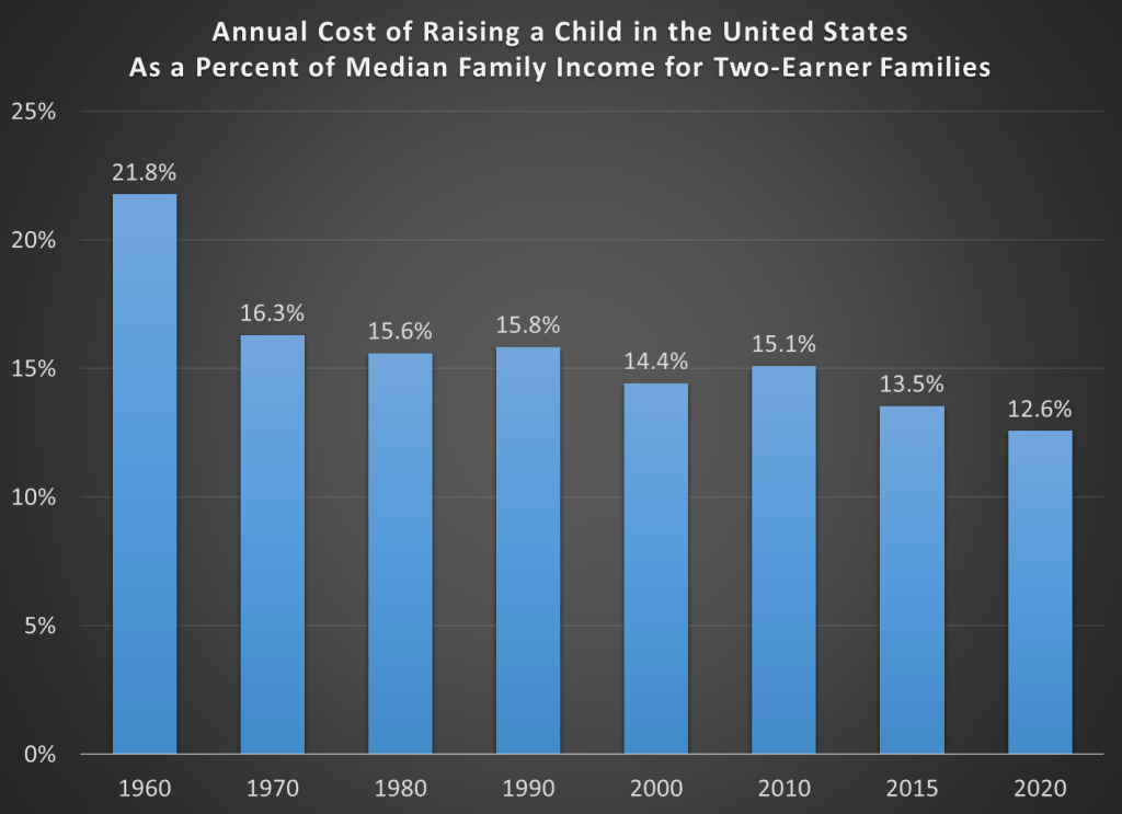
Raising kids is expensive. As an economist, we’re used to thinking about cost very broadly, including the opportunity cost of your time. Indeed, a post I wrote a few weeks ago focused on the fact that parents are spending more time with their kids than in decades past. But I want to focus on one aspect of the cost, which is what most “normal” people mean by “cost”: the financial cost.
Conveniently, the USDA has periodically put out reports that estimate the cost of raising a child. Their headline measure is for a middle-income, married couple with two children. Unfortunately the last report was issued in 2017, for a child born in 2015. And in the past 2 years, we know that the inflation picture has changed dramatically, so those old estimates may not necessarily reflect reality anymore. In fact, researchers at the Brookings Institution recently tried to update that 2015 data with the higher inflation we’ve experienced since 2020. In short, they assumed that from 2021 forward inflation will average 4% per year for the next decade (USDA assumed just over 2%).
Doing so, of course, will raise the nominal cost of raising a child. And that’s what their report shows: in nominal terms, the cost of raising a child born in 2015 will now be $310,605 through age 17, rather than $284,594 as the original report estimated. The original report also has a lower figure: $233,610. That’s the cost of raising that child in 2015 inflation-adjusted dollars.
As I’ve written several times before on this blog, adjusting for inflation can be tricky. In fact, sometimes we don’t actually need to do it! To see if it is more or less expensive to raise a child than in the past, what we can do instead is compare to the cost to some measure of income. I will look at several measures of income and wages in this post, but let me start with the one I think is the best: median family income for a family with two earners. Why do I think this is best? Because the USDA and Brookings cost estimates are for married couples who are also paying for childcare. To me, this suggests a two-earner family is ideal (you may disagree, but please read on).
Here’s the data. Income figures come from Census. Child costs are from USDA reports in 1960-2015, and the Brookings update in 2020.
Are resources becoming scarcer as world population increases and per capita consumption increases? Are basic goods becoming more expensive relative to wages in the face of potential resource shortages? These are some of the main questions that are addressed in the just released book Superabundanceby Marian Tupy and Gale Pooley. The authors were kind enough to provide me with an advance copy, which is why I’m already able to review this book on its release date (I’m not really that fast of a reader).
The author take a very optimistic view of the issues surrounding those opening questions. Properly measured (one of the key tasks of their work), resources are becoming more abundant, not more scarce. And properly measured, almost all consumer goods are becoming cheaper relative to wages.
The authors use the approach of “time prices” throughout the book. They are not the first to use this approach. Julian Simon (their inspiration for this project) used it in various places in his work. William Nordhaus famously used it is in paper on the history of the price of lighting. And Michael Cox and Richard Alm have used the time-price approach in many of their writings, from the 1997 Dallas Fed annual report, to a full-length book a few years later, as well as updates to the original 1997 report. And if you follow me on Twitter, I like to use this approach too.
In short, “time prices” tell us how many hours of work it takes to purchase a given good or service at different points in time. How many hours would you have to work to buy a pound of ground beef? A square foot of housing? An hour of college tuition? It’s the superior method when you are looking at the price of a particular good or service over time, compared with a naïve inflation adjustment, which only tells you if the price of that good/service rose faster or slower than goods or services in general, not if it’s become more affordable. Inflation adjustments are really only useful when you are trying to compare income or wages to all prices, to see if and how much incomes have increased over time. Of course, which wage series you choose is important (and you need to have a consistent series over time, or at least the end points), but as the authors point out (which they learned from me!), if you looking at wages after 1973, the wage series you use doesn’t matter much. Median wages, average wages, wages of the “unskilled” — these all give you the same trend since 1973. We don’t have all of these back earlier (especially median wages), but there’s not much reason to believe they’ve diverged that much. And the authors also present their data using multiple wage series in many of the charts and tables.
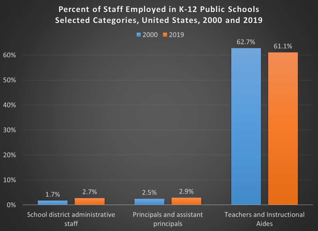
In the past 20 years in the US, per pupil spending in K-12 schools has increased by about 20%. That’s in CPI-U inflation-adjusted dollars. What’s the cause of this increase? Higher teacher salaries? Administrative bloat? Something else?
Here’s a chart you may have seen floating around the internet. It shows the growth in the number of employees at K-12 public schools.
But hold on, here’s another chart, showing the percent of employees in each of these same categories.
The numbers don’t add up to 100% because I’ve left off a few categories (the biggest one is “support staff,” which was 30-31% of the total throughout the time period). But overall, this chart appears to show much less bloat. Instructional staff (including aides) were by far the biggest category of employees in both categories in both time periods. Administrative staff at the district level did grow, but only by 1 percentage point of the total.
What’s the source of this data? Well, it’s a little trick I played. The source is the National Center for Education Statistic’s Digest of Education Statistics, Table 213.10. It’s the exact same data.
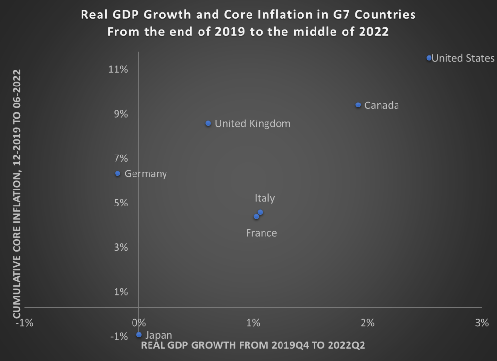
Back in April I wrote about GDP growth rates and inflation rates in G7 countries and the OECD broadly. James also wrote about a broader set of countries (182!) using these two measures. Since the economic scene is evolving so quickly, and we now have 6 more months of data, I wanted to provide an update on the US and our other large peer nations.
Here’s the data, showing cumulative real GDP growth and cumulative core inflation since the right before the pandemic (please note that I flipped the x- and y-axis from the previous post — sorry for the confusion, but this way makes more sense).
The picture looks roughly the same, but here are a few notable changes:
Despite the slight slowdown in GDP growth in the first half of 2022, the US still clearly has the highest rate of economic growth
UK, Italy, and Canada have now moved into positive territory for cumulative economic growth (yes, it’s all inflation adjusted)
But Japan and Germany still have had no net economic growth during the pandemic — and even worse for Germany, they have had a healthy dose of inflation too
The US once again stands out as having both the best economic performance and the worst inflation performance in the G7. Are these two things connected? That’s a question that is unanswerable from a simple scatterplot, and may be unanswerable completely. But I think it’s fair to say that the US hasn’t taken an obviously inferior economic path relative to other countries, even if our path has been inferior compared to some ideal policy. But don’t commit the Nirvana Fallacy!
Finally, we should recognize that the GDP is not the only important measure of how an economic is performing. For example, the US labor market has not recovered as well as some other peer nations have. Still, GDP is one of the important broad measures to look at, even if it is not ideal for diagnosing recessions.
Three weeks I wrote a blog post about how economists define a recession. I pretty quickly brushed aside the “two consecutive quarters of declining GDP,” since this is not the definition that NBER uses. But since that post (and thanks to a similar blog post from the White House the day after mine), there has been an ongoing debate among economists on social media about how we define recessions. And some economists and others in the media have insisted that the “two quarters” rule is a useful rule of thumb that is often used in textbooks.
It is absolutely true that you can find this “two quarters” rule mentioned in some economics textbooks. Occasionally, it is even part of the definition of a recession. But to try and move this debate forward, I collected as many examples as I could find from recent introductory economics textbooks. I tried to stick with the most recent editions to see what current thinking on the topic is among textbook authors, though I will also say a little bit about a few older editions after showing the results of my search.
Undoubtedly, I have missed a few principles textbooks (there are a lot of them!) so if you have a recent edition that I didn’t include, please share it and I’ll update the post accordingly. I also tried to stick with textbooks published in the last decade, though I made an exception for Samuelson and Nordhaus (2010) since Samuelson is so important to the history of principles textbooks (and his definition has changed, which I’ll discuss below).
But here’s my data on the 17 recent principles textbooks that I’ve found so far (send me more if you have them!). Thanks to Ninos Malek for gathering many of these textbooks and to my Twitter followers for some pointers too.
Earlier this week my co-blogger Mike had a really great post on work-from-home, and how we might turn former workspaces into new home spaces. It’s a really great idea, and an excellent example of a “second best” solution to the housing shortage.
I’d like to talk about a related but very different topic, which is the things we do in our homes. And for many working couples, that thing is raising children (and generally, keeping up the house).
If you spend much time on Twitter or Instagram, you’ve probably run across the account “Mom Life Comics.” It’s a very popular Instagram account, and lately some of the comics have been shared widely on Twitter (sometimes sympathetically, sometimes mockingly). The running theme of the topic, in short, is that moms carry much more of the “load” than dads do, both the physical load of doing stuff, and what’s sometimes called the “mental load” as well.
There’s a reason the comic is striking a chord with women: just ask any young mom today, especially a young mom that is also working. They have all felt this way at some point, and some of them probably feel this way all the time.
The idea is nothing new, of course. Sociologists have been using the term “invisible work” since at least the 1980s to describe the unseen, unpaid work that women do around the home. But the concept has, of course, been around for much longer. But how has the balance of work changed over time?