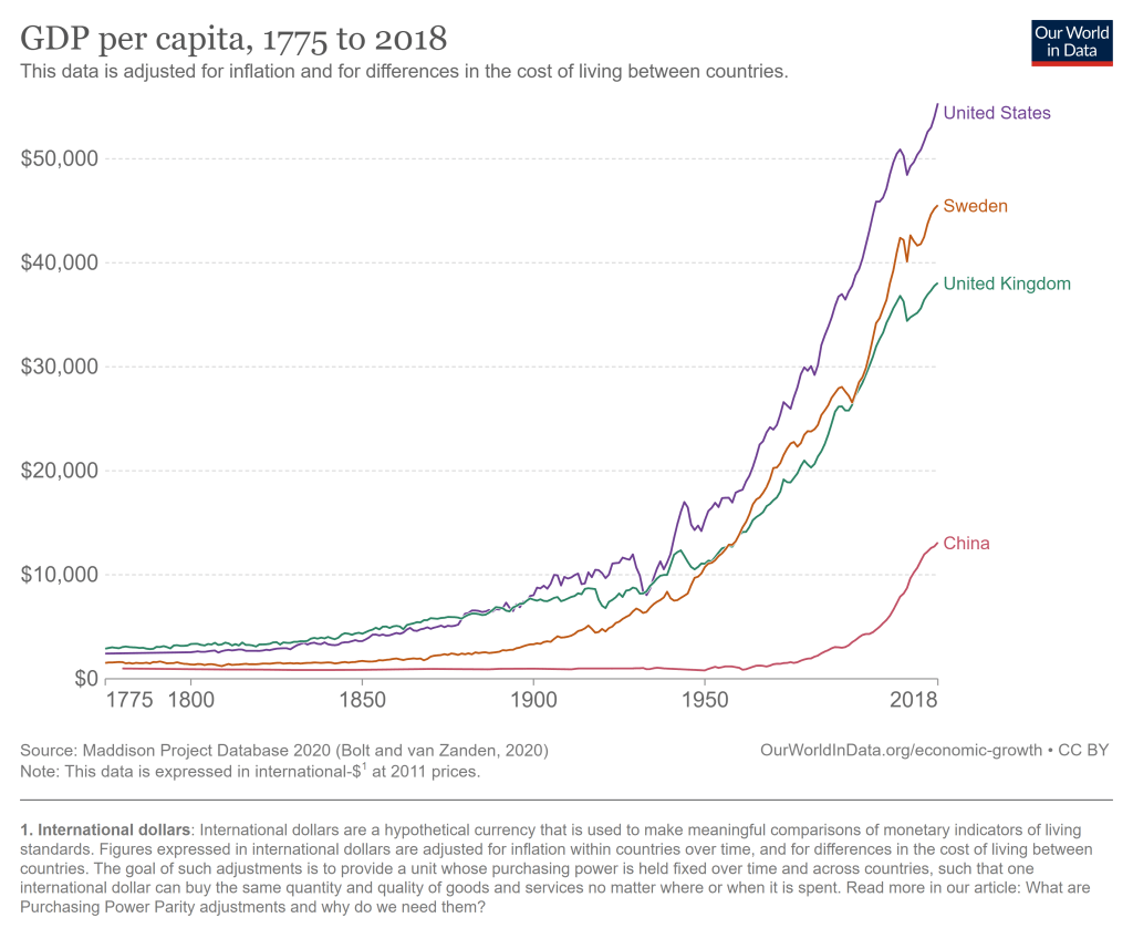
The United States has problems and always had. But the historical record of the United States as an economic powerhouse is unrivaled. The US had a bit of a head start on economic growth, being a direct descendant of the country that really kicked of the Industrial Revolution. But we took that head start and really ran with it, now being by far the highest income large country, and the highest income country that does not derive a significant part of its GDP from fossil fuels or being a tax haven.
The average American has, as best as we are able to measure it, a standard of living that is at least 20 times greater than Americans when this country began.
Last week my post was about a new article I have with Scott Winship on the “cost of thriving” today versus 1985. That paper has gotten quite a bit of coverage, including in the Wall Street Journal, which is great but also means you are going to get some pushback. Much of it comes in the form of “it just doesn’t feel like the numbers are right” (see Alex Tabarrok on this point), and that was the conclusion to the WSJ piece too.
Here’s a response of that nature from Mish Talk: “There’s no way a single person is better off today, especially a single parent with two kids based on child tax credits that will not come close to meeting daycare needs.”
He mentions daycare costs, but never comes back to it in the post (it’s mostly about housing costs). Daycare costs are undoubtedly an important cost for families with young children (though since Cass’ COTI is about married couples with one earner, they may not be as relevant). And in the CPI-U, daycare and preschool costs only getting a weight of 0.5%. Surely that’s not reality for the families that actually do pay daycare costs! If only there was an index that applied to the costs of raising children.
In fact, there already is. Since 1960, the USDA has been keeping track of the cost of raising a child. Daycare costs are definitely given much more weight: 16% of the expenditures on children got to child care and education. And much of that USDA index (recently updated by Brookings) looks similar to what COTI includes: housing, food, transportation, health care, education, but also clothing and daycare. I wrote about it in a post last year and compared that cost to various measures of income (including single-earner families and median weekly earnings). But what if we compared it to Oren Cass’ preferred measure of income, males 25 and older working full-time? Here’s the chart.
62 weeks. That’s how long the median male worker would need to work in a year to support a family in 2022, according to the calculations of Oren Cass for the American Compass Cost-of-Thriving Index released this year. Not only is 62 weeks longer than the baseline year of 1985 (when it took about 40 weeks, according to COTI), but there is a big problem: there aren’t 62 weeks in year. It is, by this calculation, impossible for a single male earner to support a family.
Is this true? In our new AEI paper, Scott Winship and I strongly disagree. First, we challenge the 62-week figure. With a few reasonable corrections to Cass’ COTI, we show that it is indeed possible for a median male earner to support a family. It takes 42 weeks, not 62 as reported in COTI.
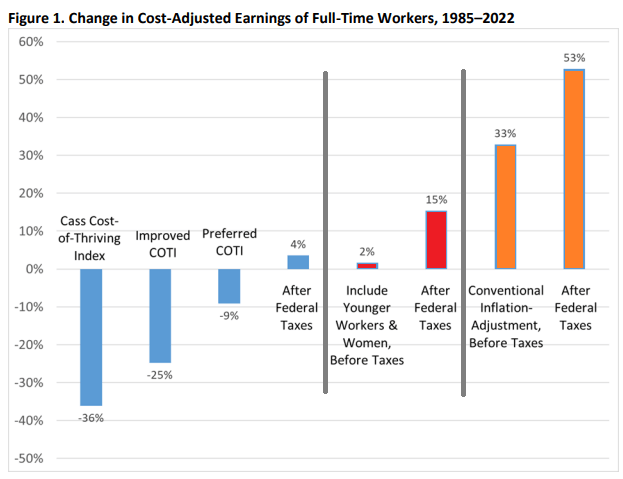
But wait, there’s more. Much more. In our paper, we provide a range of reasonable estimates for how the cost of thriving has changed since 1985. In the COTI calculation, the standard of living for a single-earner family has fallen by 36 percent since 1985. In our most optimistic estimate, the standard of living has risen by 53 percent. The chart below summarizes our various alternative versions of COTI. How do we get such radically different results? Is this all a numbers game?
On summer vacation, I recently visited Mount Rushmore. It’s amazing structure, and the story of its construction is as impressive as the monument itself. Much of the story you learn when visiting is the story of its creation. As an economist, of course seeing the following display with wage data got me very excited:
While the sign says that laborers made 30 cents per hour, searching online it appears that 50 cents was more common. More skilled workers, such as assistant sculptors, made $1.50 per hour. These were, as the sign says, “good wages” for that time. In the economy generally, production workers made around 50 cents per hour our as well around that time period, and most of the construction of Rushmore was during the Depression (some of the workers were WPA funded), so having any job, much less one that paid pre-Depression wages, was certainly a good one.
How does this compare to wages today? This is always a tricky question, as I have documented on this blog several times before, but the most straight forward approach (and good first approximation) is a simple CPI inflation adjustment. Using 1929 as the baseline year, when construction was in full swing, 30 cents an hour is roughly $5 today, 50 cents per hour is close to $9, and $1.50 would be about $26.50. That doesn’t sound too bad!
The best comparison I like to use is BLS’s average hourly earnings for private production and non-supervisory workers. Averages aren’t perfect, but this measure excludes management occupations that will be distorting the average. In May 2023, that wage was $28.75 per hour. So the average worker today earns 3-6 times as much per hour as these “good paying jobs” in the late 1920s and the Depression. And, as the Rushmore signage notes, these jobs were seasonal. Their off-season jobs probably paid even less.
The wage of the assistant sculptor does compare well with average wages today, but that pay was unusual for the time and was likely a highly skilled worker. The only record I can find of anyone making that much at Rushmore was Lincoln Borglum, the son of the main sculptor Gutzon Borglum. Lincoln oversaw the completion of the project after Gutzon’s death, and it was only in later years on the project that his pay was increased to $1.50 per hour.
For the typical laborer on Rushmore, having a good job was indeed good to have, but the wages pale in comparison to a typical worker today.
Two recent essays push back against the concept of “disinformation” in thoughtful but, I believe, ultimately incorrect ways.
Martin Gurri is primarily concerned with government trying to stamp out what it views as disinformation. I am concerned about that too, but there are ways for private actors to correct bad information too.
Dan Klein (my friend and professor in grad school) argues that most labeling of “disinformation” or “misinformation” is not really about information, but instead about knowledge. I agree that sometimes this is true. But sometimes it is not true. Sometimes we really are talking about information. And sometimes the information is about extremely important topics.
As I search through my own Twitter history for these terms, I see that there is overwhelmingly one period of time and one piece of information that I used them for: the total number of deaths in the United States in 2020. If you can think way back to the fall and winter of 2020/early 2021, you might recall that we were just finishing up the first year of the pandemic, and we were also going through one of the worst periods in the pandemic. Vaccines were now starting to become widely available as we got into 2021, and people were starting to make person decisions about whether to “get the jab.”
The number of total deaths in 2020 was an important number. There was still a lot of uncertainty about exactly how bad the pandemic was, or (to a small but vocal minority) whether the pandemic was even “real.” The data was crucial to this debate. Of course, once we have the data, we must interpret it. This is one of Klein’s main points, and a good one. But if we aren’t starting from a common baseline of true information, there is really no point in discussions based on interpretations of those different apparent realities. We will, by definition, be “talking past each other.”
So what were people saying about total deaths in 2020 during this moment of importance in late 2020/early 2021?
A recent Wall Street Journal declares “More High-School Grads Forgo College in Hot Labor Market.” An accompanying chart and data show the apparent plunge, with just 62% of recent high school grads enrolled in college, down from 66.2% before the pandemic, and well down from the high in 2009 of 70.1%.
The article recites the usual reasons. The high and increasing financial cost of attending college. The increasing opportunity cost due to the “hot labor market” mentioned in the headline. Large numbers of young people getting apprenticeships: apparently a 50% increase over some unstated timeframe!
They give anecdotes. A 21-year-old male in Maryland was put off by the high cost of a four-year degree. He likes working on cars, so instead got a job as a service technician at a Toyota dealership.
We’ve heard this all before. In fact, we know we’ve heard it before, because the WSJ article links to other WSJ articles saying the same thing over the past few years.
But are young people really skipping traditional four-year colleges for other opportunities? The answer is a big fat No. And we can even use the same data the WSJ used (from the CPS) to prove it, but slice it more finely. The percent of recent high school graduates enrolled in 4-year colleges and universities in 2022 was 45.1%. That’s slightly higher than 2019 (44.4%) and is, in fact, the second highest level ever in this data, with only 2016 being higher at 46%.
So what gives? The decline that the WSJ is reporting is entirely driven by a decline in enrollment at 2-year colleges, though you would never get a hint of that in the article. You might even think it was the opposite: perhaps young people are forgoing 4-year colleges in favor of trade schools! Nope. Here’s the data.
Most recent annual rates, compiled by Trading Economics. The US is right in the middle:
Argentina 109% Turkey 43.7% United Kingdom 8.7% Italy 8.2% Germany 7.2% Australia 7% Euro Area 7% South Africa 6.8% Mexico 6.3% France 5.9% Singapore 5.7% Netherlands 5.2% United States 4.9% India 4.7% Canada 4.4% Indonesia 4.3% Brazil 4.2% Spain 4.1% South Korea 3.7% Japan 3.5% Saudi Arabia 2.7% Switzerland 2.6% Russia 2.3% China 0.1%
In his NY Times column today, Ross Douthat argues that legalizing marijuana is a big mistake. Douthat makes a number of arguments, but let me focus on one point he makes in the column: that recent research suggests legalizing marijuana increases opioid deaths. This point is made in just one sentence of the essay, so let me quote it in full:
There was hope, and some early evidence, that legal pot might substitute for opioid use, but some of the more recent data cuts the other way: A new paper published in the Journal of Health Economics finds that “legal medical marijuana, particularly when available through retail dispensaries, is associated with higher opioid mortality.”
Kudos to Mr. Douthat for actually linking to the paper. That’s what the internet is for! Yet so many writers in traditional news sources fail to do this.
Now, on to the paper itself. There is nothing untrue in what Douthat writes. First, there was plenty of “early evidence” that legalizing marijuana reduced opioid deaths. More on this in a moment. And the study he cites by Mathur and Ruhm is particularly well done. It is published in the top health economics journal. But the main point of the paper is to say “we think the rest of the literature is wrong, and we’re going to try really hard to convince you that we are right.”
What does the rest of this literature say? Here’s a brief tour (all of these are cited in Mathur and Ruhm). The variable in question is opioid deaths.
70,000: that’s the number of adults (age 25 and older) in the US that earned the federal minimum wage of $7.25 per hour in 2021.
Another 538,000 adults reported earning below the minimum wage, but these are likely to be workers that earn tips, which aren’t reported in their hourly wages. Legally, they must make at least $7.25 including their tips, though many of them earn more. The data comes from a 2022 report by BLS using CPS data (hopefully the 2023 report is coming out soon).
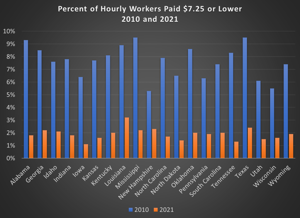
If we include all workers 16 and older, there are about 1.1 million people earning the federal minimum wage or less. That’s just 1.4% of hourly wage earners, and only 0.8% of all workers (including salaried workers). Crucially, this number has declined dramatically over time from a high of 15.1% of hourly wage earners (8.9% of all workers) in 1981. It has even declined significantly since 2010, the first full year that the $7.25 federal minimum was in effect, when 6% of hourly wage earners (3.5% of all workers) earned $7.25 or lower.
Perhaps, though, a big part of this decline is because most states (and even some cities and counties) now have minimum wages that are above the federal level, in some cases significantly above. Today, only 20 states use the federal minimum wage. No doubt this is important!
However, even if we focus just on those 20 states that use $7.25 per hour as the minimum, there were also large declines in the percent of hourly wage earners that earned $7.25 or less. Some states declined by 7 percentage points or more from 2010 to 2021, though all declined by at least 3 percentage points.
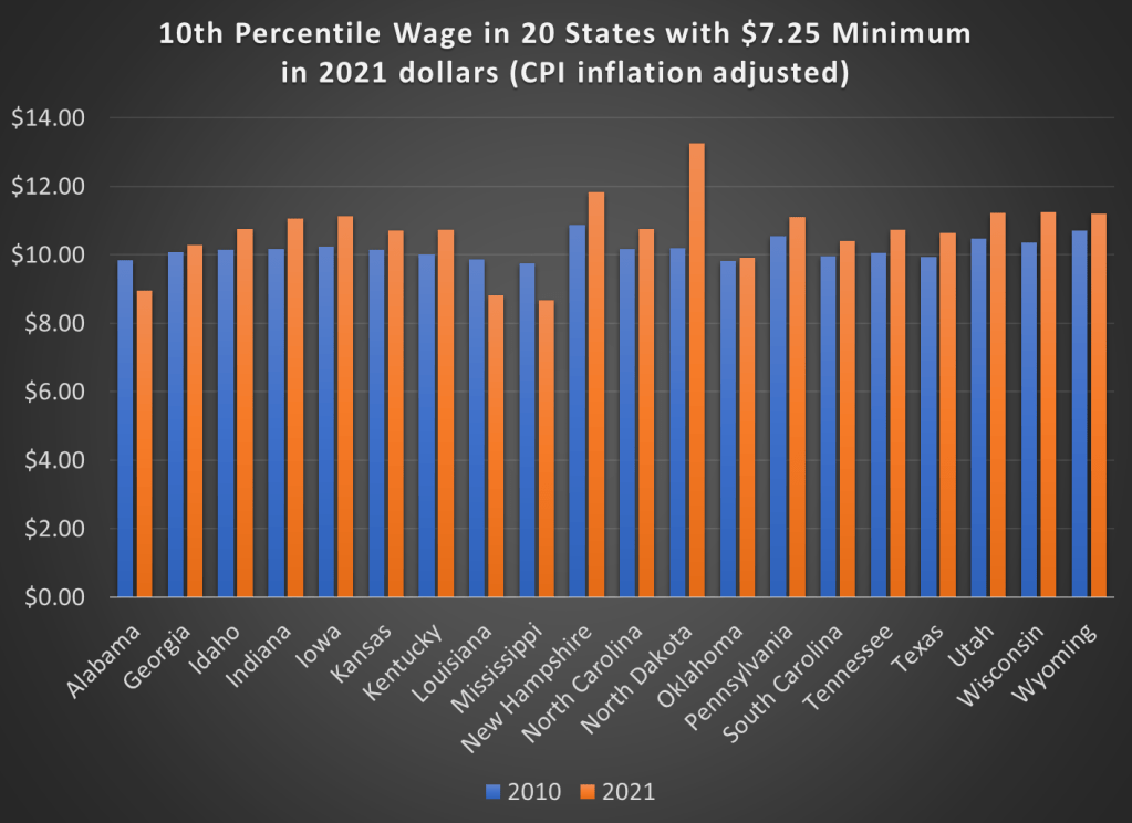
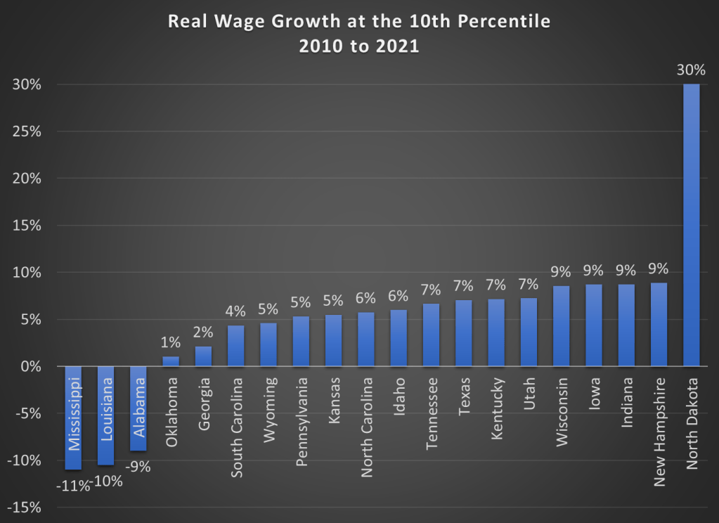
But maybe what’s going on is that employers are just providing wage increases that keep up with price inflation. So while fewer workers are earning the federal minimum wage, maybe they are no better off. We can address that possibility using BLS’s occupational wage data, which allows us to look at wages at the 10th percentile (these aren’t exactly minimum wage earners, but they are close). Real wage declines did happen in a few states (Alabama, Louisiana, and Mississippi), but most of these states experienced clear real wage growth from 2010 to 2021 at the 10th percentile of earners.
Here are the changes in percentage terms (once again, adjusted for CPI inflation).
Some might look at this growing irrelevance of the minimum wage as a reason to increase the federal minimum wage. But as the data from most states suggests, there are clear increases in wages happening already, suggesting that these are competitive labor markets. The case for raising the legal minimum wage in a competitive labor market is weak (it is stronger in a monopsony labor market).
Kevin Erdmann has written a detailed and thoughtful response to my post from last week on housing spending as a percent of income. My goal in that post was to look at consumer spending as a percent of income for a variety of different sub-groups (my primary interest was by age group, but I tried to get into more detail for other sub-groups).
As Erdmann emphasizes in his post, I left out one set of sub-groups that the CEX data allows us to use: renters vs. homeowners. And these are very important groups to look at, since for homeowners (as he points out) many of the costs are implicit (such as the opportunity cost of those that don’t have a mortgage). Lumping all of these households together may obscure some of the different trends.
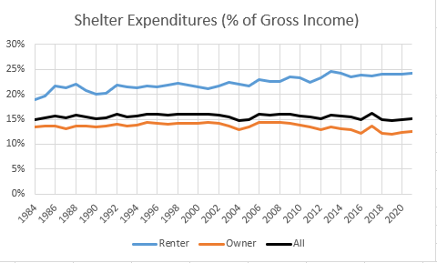
Be sure to read Erdmann’s post in full (he says many smart and correct things), but the key result is in his Figure 2 (reproduced here). Renters have seen the share of their income spent on shelter rise from 19% in 1984 to 24% in 2021. This is not a trivial increase. Owners, by contrast, have seen their share of spending fall, which is how it all gets washed out in the average.
I will concede that Erdmann is probably right on many of his many points. Still, I wanted to see this at a much finer level of detail, since national aggregates might be giving us confusing results. The micro-data in the CEX is probably not detailed enough to give us good breakdowns by MSA.