Have you heard about Human Capital?

While writing a paper recently, I was reminded of the importance of economic modelling.

Macroeconomic models are fun to rag on – everybody does it. But all economic models help us to express our understanding of the world clearly and help us to be specific when the temptation to hand-wave is strong. After all, a model is just a fancy way of saying “a system of logic”.

The paper linked above is several revisions in. What you don’t see are the mistakes that my co-author and I made along the way and the vagueness that we had to resolve. An earlier version of the paper simply stated that deaf people were endowed with less human capital than people who could hear. So far so good. But then we said that it was ambiguous who, the deaf or the hearing, would ultimately have more human capital after making additional human capital investments.

But this is not the case!

Continue reading

Penny-Pinchers Gonna Pinch

Text books say that there are two major problems with the Consumer Price Index (CPI). First, accounting for changes in quality is difficult. Second, the CPI is calculated by assuming a fixed basket of goods is consumed over time. For both of these reasons, the rate of inflation that is implied by CPI is typically considered to be about 1% overestimated.

Imperfectly accounting for quality improvements causes higher measured inflation because the stream of services that a product creates for the consumer has increased – even though the product is nominally the same product. For example, the camera on my smart-phone is now good enough to record a high-quality Youtube video, whereas it was of mediocre quality on my previous phone.  My life is better-off with the better camera. But the increase in my quality of life isn’t measured by the CPI. The CPI does, however, make note that I paid a higher price for a phone.

Further, people don’t consume a fixed basket of goods over time. Even if we stopped the introduction of all new products and maintained the quality of all current products, people would still change the composition of their consumption due to price changes among related goods.

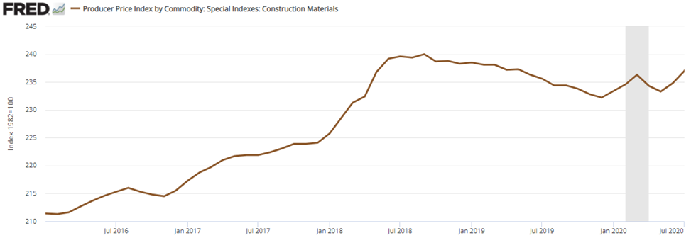
When people get hot and bothered by inflation, they often appeal to people who are of less means and who would find higher prices more burdensome. For that reason, below is a graph of some calorically dense and roughly comparable food staple prices (from the PPI).  You can put a protein on top of any one of these and call it a meal: pasta, flour, potatoes, & rice.

Let’s say that a consumer consumed equal parts of these in January of 2020. The CPI assumes that the consumption basket remains constant and plots a weighted average. In such a case, price rose 2.3% through July 2021. But in real life, penny-pinchers gonna pinch. If our consumer is particularly Spartan, then he will always consume the cheapest option – he treats the different foods as perfect substitutes. The Spartan price of consuming *fell* 22.3%. To be clear, the CPI assumes that the consumption composition remains unchanged, while the consumer’s actual basket is responsive to price changes.  Even if a consumer considers these goods to be imperfect substitutes and is willing to cut any particular type of consumption in half in favor of the cheapest alternative, then the price fell by 10%. In fact, a consumer who is at all responsive to prices will always have a cheaper basket than the headline CPI, all else constant.

In conclusion, be careful with your money. Spend it well and seek out alternatives. Your flexibility determines how much money you’ll have at the end of the month. The headline CPI number impacts only the most passive consumer – and even then, budget constraints gonna constrain.

A Canned-Beer Kind of Guy

An  ex-co-worker was once complaining to me that the prices of things that he liked kept going up.

He was an economics major. Of course he knew that wages also increase. He wasn’t simply cantankerous about inflation. He knew all about improving productivity, income, and price level changes. He was being more specific. The *particular* items that *he* liked were getting more expensive. He was complaining about what, to everyone else, were relative price changes.

Unrelatedly, I was floating around the bls.gov website and examining their Producer Price Index (PPI) FAQs (I learned a bunch). The content is extensive. CPI is broken up into some subcategories. But PPI, being used by multiple industries and trade groups for real-life costs and benefits, is excitingly granular.

You want to know what happened to the price of red, white, rose, and carbonated wines each in particular?  They’ve got you covered. It really is amazing.

Back to my co-worker. I tried to explain that relative price changes reflected underlying economic value and scarcities. We wasn’t having any of it. He just didn’t want his prices to go up. We economists are known for being kind of dispassionate. We see relative prices change and we shrug. Man-on-the-street sees a relative price change and, boy, does he care about it – if it’s the purchasing price that *he* faces.

See the below graph. What kind of consumer are you? Since the start of the pandemic, canned, bottled, and kegged beer have all changed in price. Or maybe you’re a teetotaler and you’ve noticed the increasing price of bottled water.  For interpretability, let’s consider what had cost $10 at the start of the year 2020. Bottled water has gone up to $10.50 and bottled beer has gone up to almost $10.30.  You may not blink at a 3% price increase – unless it’s for 6 bottles of your favorite craft beer.

The price of canned beer, on the other hand, hardly increased at all. And in the last couple of months, the price *fell*. I sure hope that my co-worker is a canned-beer kind of guy. Otherwise, someone is sure to hear a lot of belly-aching.

Hyperinflationary Efficiency?

I’m advising a senior thesis for a student who is examining the strength of Purchasing Power Parity in hyper-inflationary countries. Beautifully, the results are consistent with another author* who uses a more sophisticated method.

For those who don’t know, absolute purchasing power parity (PPP) depends on arbitrage among traders to cause a unit of currency to have the same ability to acquire goods in two different countries. If after converting your currency you can afford more stuff in foreign country, then there is a profit opportunity to purchase there and even to re-sell it in your home country.

Essentially, when you make that decision, you are reducing demand for the good in your home country and increasing demand in the foreign country (re-selling affects the domestic supply too). Eventually, the changes in demand cause the prices to converge and the arbitrage opportunities disappear. At this point the two currencies are said to have purchasing power parity – it doesn’t matter where you purchase the good.

So does PPP hold? One way that economists measure the strength of PPP is by measuring the time that it takes for a typical purchasing power difference to be arbitraged away by 50% – its ‘half-life’.  The more time that is required, the less efficient the markets are said to be.

The ex-ante question is: Is PPP be stronger or weaker during hyperinflationary periods?

Continue reading

Singing IPUMS Praises

This is a late post, but I just want to sing the praises of IPUMS.

I first encountered IPUMs data in Sacerdote’s paper on intergenerational human capital transfers in which he showed literacy rates by birth cohort throughout the 19th century (figure 4 is downright beautiful). I’ve since dug-in myself concerning school attendance and human capital.

In the papers that students write in our econ elective classes, it’s not unusual for them to contain FRED data. Given that we don’t teach time-series, the papers are usually empirically weak. But this semester in my Wester Economic History course, I’ve encouraged student to utilize IPUMS. There are 4 students who are using it whose ideas I will surely publicize in the future:

  • Historical patterns of deaf employment, education, human capital, & income
  • The economic impact of the Brooklyn bridge
  • The composition of US interstate migrants relative to their host state
  • Patterns compulsory schooling

IPUMS is so darn rich. I strongly recommend it if you haven’t yet taken advantage of it.

The Tall and Short of Student Experience

Every semester in my intro STAT course I have my students create a variety of survey questions. After I combine their questions into a single survey, they collect responses from the student body at Ave Maria University. Most of the questions are vanilla. Other are not. They typically get in excess of 100 responses from the ~1,100 person student body.

While exploring the data, I found a really beautiful example for the week that we spend on multiple regression and dummy variables.  The survey results illustrate a clear, linear association between student height (inches) and their student experience at AMU (scored 1-10).

So strange! Why might this be? Except for that solitary 7 ft+ student on the basketball team, how in the world might height matter for student experience?

As it turns out a separate relationship holds the key.

Confirmed with a simple unpaired t-test (unequal variances), women rank their student experience much more highly. For this, students have multiple explanations at the ready.

  • Our school is in a rural location and women are more socially satisfied.
  • Men are less happy generally.
  • Men are less studious or have lower grades.
  • Men get less sleep and stay up later

The list goes on and I don’t know what the reasoning is or which ones actually play a role. But what I do know, is how to make fun scatterplots in Stata. As it turns out, if you control for sex, height loses all of its effects on student experience. Men are taller on average and they aren’t happy students relative to women (apparently). We can see in the figure below that all of the action in the two fitted lines occurs in the intercept. The slopes are practically flat for both men and women. In other words, height neither adds nor subtracts from a student’s experience rating.

What’s going on is that neither men’s nor women’s experience is affected by being taller. But, what’s actually going on here – you know – statistically? The simple version is that the bar chart above dominates the scatter plot. If we subtract the mean male experience score from the male values and do the same for the females, then we’re left with what is practically white-noise. How do all those other students of a different height experience the world? Well, as students, not so differently from you.

Compulsory Schooling by Sex

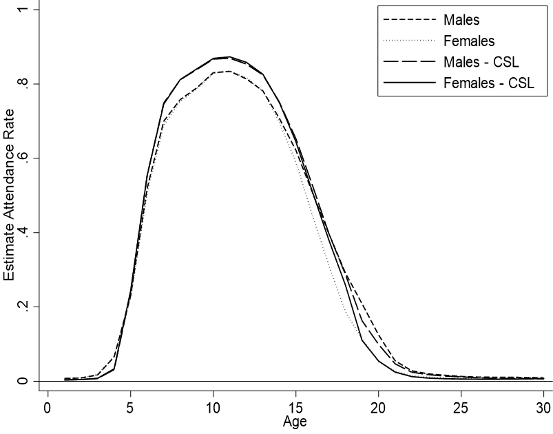
My previous posts focused on the aggregate school attendance and literacy rates for whites before and after state century compulsory schooling laws were enacted. When aggregates fail to deviate from trend after a law is passed, the natural next step is to examine the sub groups.

How did attendance rates differ by sex before and after compulsory school attendance? I’ll illustrate a plausible story. Prior to law enactments, boys attended more school because girls were needed to perform domestic duties and the expectations for female education was lower. As a result, boys had higher literacy rates due to higher school attendance. After law enactments, both girls and boys attended school more and the difference between their attendance rates is eliminated. Similarly, literacy rates converge and differences are eliminated. In short, the story is consistent with an oppressed – or at least disadvantaged – position for girls that was corrected by compulsory schooling.

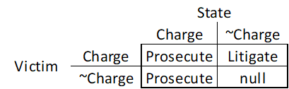
Formally, the hypotheses are:

Continue reading

Wait for the Lower Cost Version of Policy

I’ve written previously about initial US state compulsory schooling laws in regard to literacy and in school attendance rates. I ended with a political economy hypothesis. Here’s the logic:

  1. Legislators like lower costs, all else constant (more funding is available for other priorities).
  2. Enforcing truancy and educating an illiterate populous is costly.
  3. Therefore, state legislatures that passed compulsory attendance legislation will already have had relatively high rates of school attendance and literacy.

That’s it. Standard political economy incentives. But is it true? Well, we can’t tell what’s going on in politician heads today, much less 150 years ago. Though, we can observe evidence that might corroborate the story. In plain terms, consistent evidence for the hypothesis would be that school attendance and literacy rates were rising prior to compulsory schooling legislation. The figures below show attendance and literacy rates for children ages 10 to 18.

Continue reading

School Attendance as State Capacity

Who knows what state capacity was 150 years ago? After all, DMV jokes are only a little out of date. There is a lot of richness and specificity to state capacity. That’s why we can’t look at an identical law in two different places or times and assume that their enforcement and evasion are the same.

Interested readers can see my previous post for a figure that illustrates the timing of compulsory education legislation across US states. The effects on literacy were a bit ambiguous. The explanation might be that effective enforcement by the various states might have differed (substantially). The figure below illustrates the average rates of attendance by age and census year.

Just as an increasing number of states began to enact compulsory school attendance, we can see that school attendance rates rose over time. But we can’t tell from the figure whether attendance laws caused or were merely coincident with increasing attendance.

One hint is to group the people by whether their state had compulsory attendance laws on the books. See the figure below.

Continue reading

Reading Literacy Data

The story that I’ve heard is this:

            In the US, we care about education. We believe that all people should receive one, regardless of their family status. Therefore, states provide education directly.

There you have it. We provide education in the US so that everyone gets a more fair shake at education. We might disagree about the purpose of an education. Maybe it’s for improved job prospects, for a more informed citizenry, or for more unified values and experiences. One socially awkward answer is that state schools are, in part, a childcare service that permit parents to work. Except for these couple of reasons, school provision and compulsory education should, at the very least, increase literacy. That’s a low bar.

Given the above reasoning states began to pass compulsory school legislation. Massachusetts was first in 1852. Followed by DC and Vermont in the 1860s. Thirteen more adopted compulsory education legislation by 1880. By the year 1900, most states had compulsory schooling legislation on the books that was applicable to at least some age groups. See the figure. Thus, did the US achieve more equality, so goes the story.

The reasoning behind the story is sound. Without education of some sort, people will surely have less human capital. The vulnerability of the reasoning is that formal schooling is not the only form of education. A person who doesn’t attend school may help a parent at work or have a private tutor – or simply grow in a milieu of thoughtful exposure. Therefore, requiring that a child attend school may not improve human capital by a degree greater than what the child would have been doing otherwise. That’s an empirical matter.

The figure below illustrate the data for ‘white’ people and illustrates literacy between the ages of 20 and 30. Why that interval? At the lower end, we don’t have literacy data for people under the age of 20 in 1850 & 1860. On the higher end, any effects of compulsory schooling will only affect those who were children and subject to the law – older people are immune to compulsory schooling legislation.

The graph illustrates that state literacy rates were rising throughout the period. The main exception is 1870. Maybe the demands of the civil war caused children to work at home or otherwise and forego schooling. So the increase from 1870 to 1880 is more of a catch-up to a previous trend than anything else. While it’s true that several states passed compulsory schooling laws in the 1870s, that doesn’t explain the widespread literacy improvements across most states.

After 1860, we can examine the younger people who were subject to the schooling laws. The figure below for people ages 10-20 tells a similar story to the one above.

My biased reading of the data is that initial compulsory schooling laws had at least an ambiguous effect on the overall trend of improving literacy. I’ll delve deeper in future posts.

PS – The literacy data is from IPUMS.

PPS – The compulsory schooling law dates are allegedly from “Department of Education, National Center for Educational Statistics, Digest of Education Statistics, 2004.” But I couldn’t find the original source. Kudos to anyone in the comments who can find it.