Public utilities are funny things. The industry is highly capital intensive and many argue that it makes for natural monopolies. At the same time, access to electricity and water (and internet) are assumed as given in any modern building. Further, utility providers are highly, highly regulated at both the state and federal levels of government. Many utilities must ask permission prior to changing anything about their prices, capital, or even which services they offer.
Don’t get me wrong. Utility companies have a sweet deal. They are protected from competition, face relatively inelastic demand for their goods, and they have a very dependable rate of return. I just can’t help feeling like state governments are keeping hostage a large firm with immobile fixed business capital. For that matter, given what we know about the political desire for opaque taxation, I also have a suspicion that many states might tax their populations by using the utility companies as an ingenious foil. “Those utility companies are greedy, don’t you know. It’s a good thing that they are so highly regulated by the state.”
There are two types of utility taxation. 1) Gross receipts taxes are like an income tax. From the end-user’s perspective, the tax increases with each unit consumed. 2) A utility license tax is like a fee that the utility must pay in order to operate in the state. From the user’s perspective, well… This tax may not even appear on the monthly bill. But if it does, then the tax per household falls with each additional household that the utility serves. Either way, state governments can get their share of the economic profits that protection affords. Below is map which shows the 2021 cumulative utility tax per resident in each state.
How many people died in the US from heart diseases in 2019? The answer is harder than it might seem to pin down. Using a broad definition, such as “major cardiovascular diseases,” and including any deaths where this was listed on the death certificate, the number for 2019 is an astonishing 1.56 million deaths, according to the CDC. That number is astonishing because there were 2.85 million deaths in total in the US, so over half of deaths involved the heart or circulatory system, at least in some way that was important enough for a doctor to list it on the death certificate.
However, if you Google “heart disease deaths US 2019,” you get only 659,041 deaths. The source? Once again, the CDC! So, what’s going on here? To get to the smaller number, the CDC narrows the definition in two ways. First, instead of all “major cardiovascular diseases,” they limit it to diseases that are specifically about the heart. For example, cerebrovascular deaths (deaths involving blood flow in the brain) are not including in the lower CDC total. This first limitation gets us down to 1.28 million.
But the bigger reduction is when they limit the count to the underlying cause of death, “the disease or injury that initiated the train of morbid events leading directly to death, or the circumstances of the accident or violence which produced the fatal injury,” as opposed to other contributing causes. That’s how we cut the total in half from 1.28 million to 659,041 deaths.
We could further limit this to “Atherosclerotic heart disease,” a subset of heart disease deaths, but the largest single cause of deaths in the coding system that the CDC uses. There were 163,502 deaths of this kind in 2019, if you use the underlying cause of death only. But if we expand it to any listing of this disease on the death certificate, it doubles to 321,812 deaths. And now three categories of death are slightly larger in this “multiple cause of death” query, including a catch-all “Cardiac arrest, unspecified” category with 352,010 deaths in 2019.
So, what’s the right number? What’s the point of all this discussion? Here’s my question to you: did you ever hear of a debate about whether we were “overcounting” heart disease deaths in 2019? I don’t think I’ve ever heard of it. Probably there were occasional debates among the experts in this area, but never among the general public.
COVID-19 is different. The allegation of “overcounting” COVID deaths began almost right away in 2020, with prominent people claiming that the numbers being reported are basically useless because, for example, a fatal motorcycle death was briefly included in COVID death totals in Florida (people are still using this example!).
A more serious critique of COVID death counting was in a recent op-ed in the Washington Post. The argument here is serious and sober, and not trying to push a particular viewpoint as far as I can tell (contrast this with people pushing the motorcycle death story). Yet still the op-ed is almost totally lacking in data, especially on COVID deaths (there is some data on COVID hospitalizations).
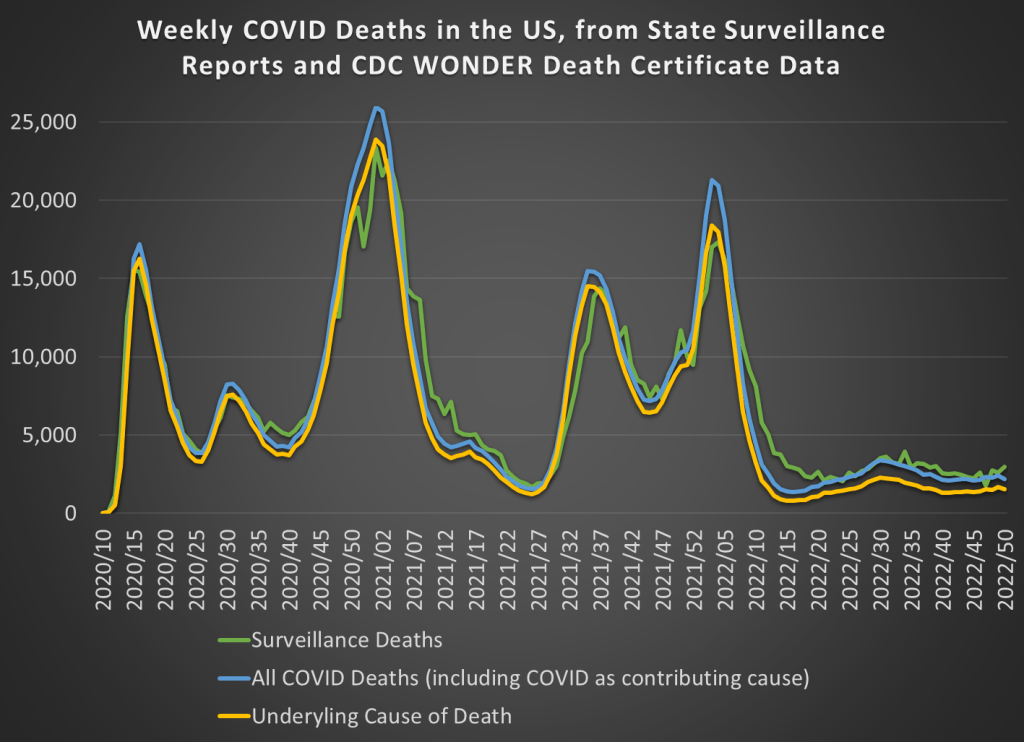
But most of the data she is asking for in the op-ed is readily available. While we don’t have death totals for all individuals that tested positive for COVID-19 at some point, we do have the following data available on a weekly basis. First, we have the “surveillance data” on deaths that was released by states and aggregated by the CDC. These were “the numbers” that you probably saw constantly discussed, sometimes daily, in the media during the height of the pandemic waves. The second and third sources of COVID death data are similar to the heart disease data I discussed above, from the CDC WONDER database, separated by whether COVID was the underlying cause or whether it was one among several contributing causes (whether it was underlying or not).
Those three measures of COVID deaths are displayed in this chart:
Last week I presented a graphic that illustrates the changing average price of homes by state. This week, I want to illustrate something that is more relevant to affordability. FRED provides data on both median salary and average home prices by state. That means that we can create an affordability index. Consider the equation for nominal growth where i is the percent change in median salary (s), π is the percent change in home price (p), and r is the real percent change in the amount of the average home that the median salary can purchase (h).
(1+i)=(1+π)(1+r)
Indexing the home price and salary to 1 and substituting each the percent change equation (New/Old – 1) into each percent change variable allows us to solve for the current quantity of average housing that can be afforded with the median salary relative to the base period:
h=s/p-1
If h>0, then more of the average house can be purchased by the median salary – let’s vaguely call this housing affordability. Both series are available annually since 1984 through 2021 for all 50 states and the District of Columbia. The map below illustrates affordability across states. Blue reflects less affordable housing and green reflects more affordable housing since 1984.
If you look at the long-run trends in labor markets, one of the most obvious changes is the decline in working hours. The chart from Our World in Data shows the long-run trend for some countries going back to 1870.
Hours of work declined in the US by 43% since 1870. In some countries like Germany, they fell a lot more (59%). But the decline was substantial across the board. One thing to notice in the chart above is that for the very recent years, the US is somewhat of an outlier in two ways. First, there hasn’t been much further decline after about the mid-20th century. Second, average hours of work in the US are quite a bit higher than many of developed countries (though similar to Australia).
But the labor market in the US (and in other countries) is in a very unusual spot at the present moment after the pandemic. So what has happened really recently. Many economists are looking into this question of hours and other questions about the labor market, and a new working paper titled “Where Are the Workers? From Great Resignation to Quiet Quitting” presents a lot of fascinating data about the current state of work in the US. The paper is short (just 14 pages) and readable for non-experts, so I encourage you to read it all yourself.
Here is one table and one chart from the paper that I will highlight, which shows that hours of work have been falling, but in a very specific set of workers: those who work lots of hours, and those with high incomes. For workers at the high end of hours worked, the 90th percentile, they have dropped from 50 hours to 45 hours of work per week just from 2019 to 2022. But workers at the median? Unchanged at 40 hours per week. (The data comes from the CPS.)
The figure below is only for male workers, and it shows a similar decline in hours worked for those at the high end of the earnings distribution. For those at the bottom, hours of work at mostly unchanged.
Housing has become more expensive. Below is a figure that illustrates the change in housing prices since 1975 by state. By far the leaders in housing price appreciation are the District of Columbia, California, and Washington. The price of housing in those states has increased about 2,000% – about double the national average. That’s an annualized rate of about 6.7% per year. That’s pretty rapid seeing as the PCE rate of inflation was 3.3% over the same period. It’s more like an investment grade return considering that the S&P has yielded about 10% over the same time period.
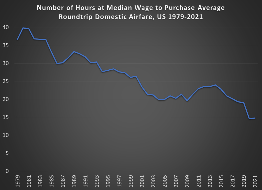
Winter holiday travel is notoriously frustrating. This year was especially bad if you were flying on Southwest. But that frustration about delayed and cancelled flights seems to have caused a big increase in pundits criticizing the airline industry generally. Here’s one claim I’ve seen a few times lately, that airline prices have “soared” as airlines consolidated.
Is it possible that airline passengers are experiencing soaring prices and bad service because the number of domestic carriers has shrunk from 12 in 1980 to 4 today — with many cities served by only 1 or 2?
Reich’s claim that there are 4 airlines today is strange — yes, there are the “Big Four” (AA, United, Delta, and Southwest), but today there are 14 mainline carriers in the US. There have been many mergers, but there has also been growth in the industry (Allegiant, Frontier, JetBlue, and Spirit are all large, low-cost airlines founded since 1980).
But is he right that prices have increased since 1980? Using data from the Department of Transportation (older data archived here), we can look at average fare data going back to 1979 (the data includes any baggage or change fees). In the chart below, I compare that average fare data (for round-trip, domestic flights) to median wages. The chart shows the number of hours you would have to work at the median wage to purchase the average ticket.
The dip at the end is due to weird pandemic effects in 2020 and 2021, so we can ignore that for the moment (early analysis of the same data for 2022 indicates prices are roughly back to pre-pandemic levels, consistent with the CPI data for airfare).
The main thing we see in the chart is that between 1980 and 2019, the wage-adjusted cost of airfare was cut in half. Almost all of that effect happened between 1980 and 2000, after which it’s become flat. That might be a reason to worry, but it’s certainly not “soaring.”
Of course, my chart doesn’t show the counterfactual. Perhaps without several major mergers in the past 20 years, price would be evenlower. Perhaps. But research which tries to establish a counterfactual isn’t promising for that theory. Here’s a paper on the Delta/Northwest merger, suggesting prices rose perhaps 2% on connecting routes (and not at all on non-stop routes). Here’s another paper on the USAir/Piedmont merger, which shows prices being 5-6% higher.
There are probably other papers on other mergers that I’m not aware of. And maybe all of these small effects from particular mergers add up to a large effect in the aggregate. But, as my chart indicates, even if the consolidation has led to some price increases, they weren’t enough to overcome the trend of wages rising faster than airline prices.
One last note: the average flight today is longer than in 1979. I couldn’t find perfectly comparable data for the entire time period, but between 1979 and 2013, the average length of a domestic flight increased by 20%. So, if I measured the cost per mile flown, the decline would be even more dramatic.
The census data in particular is vast and relatively comprehensive. But, it’s not all perfect.
Consider three variables:
Labforce, which categorizes whether someone is employed
Occ1950, which categorizes occupation types
Edscor50, which imputes a relative education score based on occupation
These all seem like appropriate variables that a labor economist might want to control for when explaining any number of phenomena. There is a problem. Edscor50, and the several measures like it, are occupation based. Specifically, the scores use details about 1950 occupations to impute educational details. There are similar indices used for earnings, income, status, socioeconomic status, and prestige.
The US government is great at collecting data, but not so good at sharing it in easy-to-use ways. When people try to access these datasets they either get discouraged and give up, or spend hours getting the data into a usable form. One of the crazy things about this is all the duplicated effort- hundreds of people might end up spending hours cleaning the data in mostly the same way. Ideally the government would just post a better version of the data on their official page. But barring that, researchers and other “data heroes” can provide a huge public service by publicly posting datasets that they have already cleaned up- and some have done so.
I just added a data page to my website that highlights some of these “most improved datasets”:
the IPUMS versions of the American Community Survey, Current Population Survey, and Medical Expenditure Panel Survey
I hope to keep adding to this page as I find other good sources of unofficial/improved data, and as I create them (one of my post-tenure goals). See the page for more detail on these datasets, and comment here if you know of existing improved datasets worth adding, or if you know of needlessly terrible datasets you think someone should clean up.
On Twitter, folks have been supporting and piling on to a guy whose bottom line was that we are able to afford much less now than we could in 1990 (I won’t link to it because he’s not a public figure). The piling on has been by economist-like people and the support has been from… others?
Regardless, the claim can be analyzed in a variety of ways. I’m more intimate with the macro statistics, so here’s one of many valid stabs at addressing the claim. I’ll be using aggregates and averages from the BEA consumer spending accounts.
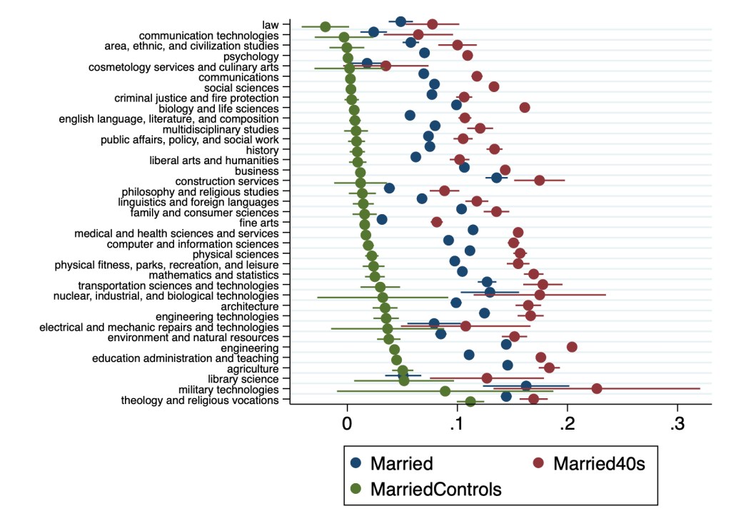
In a May post I described a paper my student my student had written on how college majors predict the likelihood of being married and having children later in life.
Since then I joined the paper as a coauthor and rewrote it to send to academic journals. I’m now revising it to resubmit to a journal after referee comments. The best referee suggestion was to move our huge tables to an appendix and replace them with figures. I just figured out how to do this in Stata using coefplot, and wanted to share some of the results:
Points represent marginal effects of coefficient estimates from Logit regressions estimating the effect of college major on marriage rates relative to non-college-graduates. All regressions control for sex, race, ethnicity, age, and state of residence. MarriedControls additionally controls for personal income, family income, employment status, and number of children. Married (blue points) includes all adults, others include only 40-49 year-olds. Lines through points represent 95% confidence intervals.Points represent coefficient estimates from Poisson regressions estimating the effect of college major on the number of children in the household relative to non-college-graduates. All regressions control for sex, race, ethnicity, age, and state of residence. ChildrenControls additionally controls for personal income, family income, employment status, and number of children. Children (blue points) includes all adults, others include only 40-49 year-olds. Lines through points represent 95% confidence intervals.
Many details have changed since Hannah’s original version, and a lot depends on the exact specification used. But 3 big points from the original paper still stand:
Almost all majors are more likely to be married than non-college-graduates
The association of college education with childbearing is more mixed than its almost-uniformly-positive association with marriage
College education is far from uniform; differences between some majors are larger than the average difference between college graduates and non-graduates