Housing has become more expensive. Below is a figure that illustrates the change in housing prices since 1975 by state. By far the leaders in housing price appreciation are the District of Columbia, California, and Washington. The price of housing in those states has increased about 2,000% – about double the national average. That’s an annualized rate of about 6.7% per year. That’s pretty rapid seeing as the PCE rate of inflation was 3.3% over the same period. It’s more like an investment grade return considering that the S&P has yielded about 10% over the same time period.
Continue readingData
Air Travel Prices Have Not “Soared” Since 1980 — They’ve Been Cut in Half
Winter holiday travel is notoriously frustrating. This year was especially bad if you were flying on Southwest. But that frustration about delayed and cancelled flights seems to have caused a big increase in pundits criticizing the airline industry generally. Here’s one claim I’ve seen a few times lately, that airline prices have “soared” as airlines consolidated.
Reich’s claim that there are 4 airlines today is strange — yes, there are the “Big Four” (AA, United, Delta, and Southwest), but today there are 14 mainline carriers in the US. There have been many mergers, but there has also been growth in the industry (Allegiant, Frontier, JetBlue, and Spirit are all large, low-cost airlines founded since 1980).
But is he right that prices have increased since 1980? Using data from the Department of Transportation (older data archived here), we can look at average fare data going back to 1979 (the data includes any baggage or change fees). In the chart below, I compare that average fare data (for round-trip, domestic flights) to median wages. The chart shows the number of hours you would have to work at the median wage to purchase the average ticket.
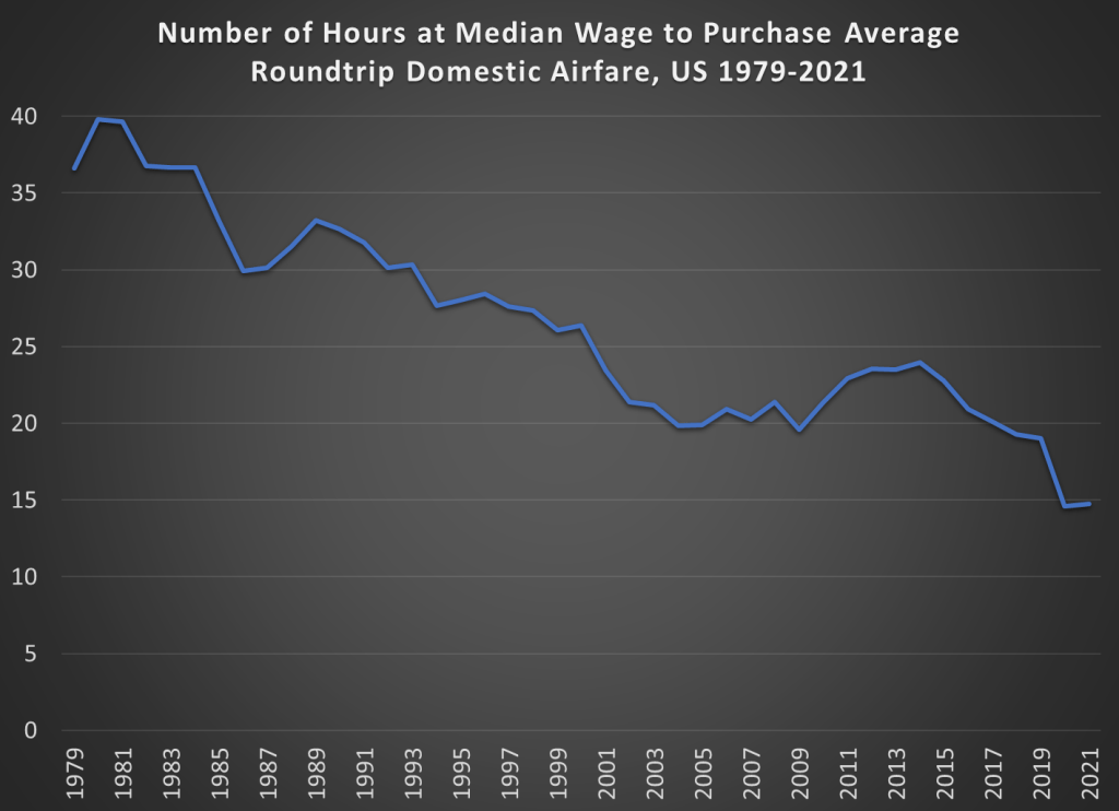
The dip at the end is due to weird pandemic effects in 2020 and 2021, so we can ignore that for the moment (early analysis of the same data for 2022 indicates prices are roughly back to pre-pandemic levels, consistent with the CPI data for airfare).
The main thing we see in the chart is that between 1980 and 2019, the wage-adjusted cost of airfare was cut in half. Almost all of that effect happened between 1980 and 2000, after which it’s become flat. That might be a reason to worry, but it’s certainly not “soaring.”
Of course, my chart doesn’t show the counterfactual. Perhaps without several major mergers in the past 20 years, price would be even lower. Perhaps. But research which tries to establish a counterfactual isn’t promising for that theory. Here’s a paper on the Delta/Northwest merger, suggesting prices rose perhaps 2% on connecting routes (and not at all on non-stop routes). Here’s another paper on the USAir/Piedmont merger, which shows prices being 5-6% higher.
There are probably other papers on other mergers that I’m not aware of. And maybe all of these small effects from particular mergers add up to a large effect in the aggregate. But, as my chart indicates, even if the consolidation has led to some price increases, they weren’t enough to overcome the trend of wages rising faster than airline prices.
One last note: the average flight today is longer than in 1979. I couldn’t find perfectly comparable data for the entire time period, but between 1979 and 2013, the average length of a domestic flight increased by 20%. So, if I measured the cost per mile flown, the decline would be even more dramatic.
Cleaning Data and Muddying Water
I’ve praised IPUMS before. It’s great.
The census data in particular is vast and relatively comprehensive. But, it’s not all perfect.
Consider three variables:
- Labforce, which categorizes whether someone is employed
- Occ1950, which categorizes occupation types
- Edscor50, which imputes a relative education score based on occupation
These all seem like appropriate variables that a labor economist might want to control for when explaining any number of phenomena. There is a problem. Edscor50, and the several measures like it, are occupation based. Specifically, the scores use details about 1950 occupations to impute educational details. There are similar indices used for earnings, income, status, socioeconomic status, and prestige.
Cool.
Continue readingMost Improved Data
The US government is great at collecting data, but not so good at sharing it in easy-to-use ways. When people try to access these datasets they either get discouraged and give up, or spend hours getting the data into a usable form. One of the crazy things about this is all the duplicated effort- hundreds of people might end up spending hours cleaning the data in mostly the same way. Ideally the government would just post a better version of the data on their official page. But barring that, researchers and other “data heroes” can provide a huge public service by publicly posting datasets that they have already cleaned up- and some have done so.
I just added a data page to my website that highlights some of these “most improved datasets”:
- the IPUMS versions of the American Community Survey, Current Population Survey, and Medical Expenditure Panel Survey
- The County Business Patterns Database, harmonized by Fabian Eckert, Teresa C. Fort, Peter K. Schott, and Natalie J. Yang
- Code for accessing the Quarterly Census of Employment and Wages by Gabriel Chodorow-Reich
- The merged Statistics of US Business, my own attempt to contribute
I hope to keep adding to this page as I find other good sources of unofficial/improved data, and as I create them (one of my post-tenure goals). See the page for more detail on these datasets, and comment here if you know of existing improved datasets worth adding, or if you know of needlessly terrible datasets you think someone should clean up.
Average US Consumption: 1990 Vs 2021
On Twitter, folks have been supporting and piling on to a guy whose bottom line was that we are able to afford much less now than we could in 1990 (I won’t link to it because he’s not a public figure). The piling on has been by economist-like people and the support has been from… others?
Regardless, the claim can be analyzed in a variety of ways. I’m more intimate with the macro statistics, so here’s one of many valid stabs at addressing the claim. I’ll be using aggregates and averages from the BEA consumer spending accounts.
Continue readingCollege Major, Marriage, and Children Update
In a May post I described a paper my student my student had written on how college majors predict the likelihood of being married and having children later in life.
Since then I joined the paper as a coauthor and rewrote it to send to academic journals. I’m now revising it to resubmit to a journal after referee comments. The best referee suggestion was to move our huge tables to an appendix and replace them with figures. I just figured out how to do this in Stata using coefplot, and wanted to share some of the results:
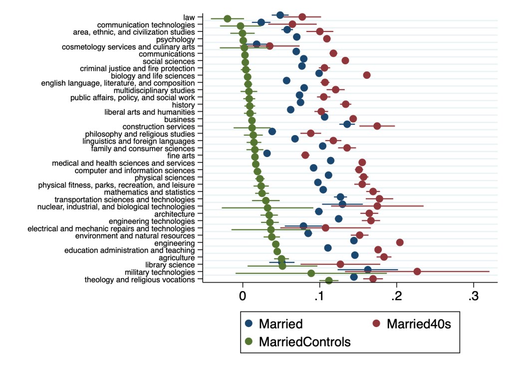

Many details have changed since Hannah’s original version, and a lot depends on the exact specification used. But 3 big points from the original paper still stand:
- Almost all majors are more likely to be married than non-college-graduates
- The association of college education with childbearing is more mixed than its almost-uniformly-positive association with marriage
- College education is far from uniform; differences between some majors are larger than the average difference between college graduates and non-graduates
The Wealth of Generations: Latest Update
I’ve covered the topic of generational wealth before, and here’s the latest data on how each generation was doing at roughly the same age. The data is updated through the 3rd quarter of 2022.
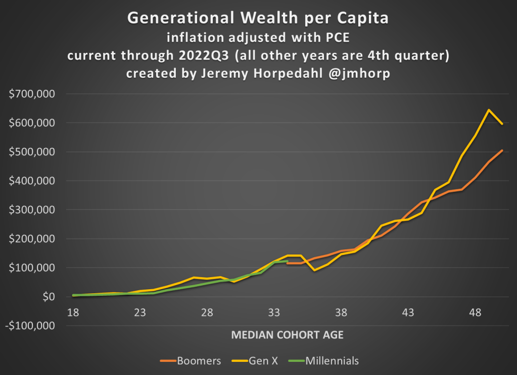
The main takeaways:
- Millennials are roughly equal in wealth per capita to Baby Boomers and Gen X at the same age.
- Gen X is currently much wealthier than Boomers were at the same age: about $100,000 per capita or 18% greater
- Wealth has declined significantly in 2022, but the hasn’t affected Millennials very much since they have very little wealth in the stock market (real estate is by far their largest wealth category)
Empirical Papers for Undergraduate Statistics Students
Once undergraduates have learned the basics of interpreting regression results, we would like to introduce them to the world of economics research papers. Reading these papers will help reinforce the statistical concepts, and also we want them to get access to the insights in the literature.
Many empirical papers in economics are too long or too difficult to assign to undergraduates, especially if the course is focused more on analytics than economics specifically. Here I provide materials and instructions for teaching two published econ articles to undergraduates. Assume the students have learned the basics of interpreting a regression model (perhaps from a course textbook) but have had few opportunities to apply theses skills or engage in scientific literature.
“The Effects of Attendance on Student Learning in Principles of Economics” is only 4 pages long! Students do not need to read past page 7 of “My Reference Point, Not Yours” to answer the reading guide questions. So, these readings can be assigned outside of class, but I did some of the reading during our class period.
Handing out printed copies of at least one of the papers and my guided questions can make a good classroom activity. If students do not have experience reading tables of regression results, it can be useful to do it together in person.
The questions in the reading guide help students to identify the main variables and hypotheses. Then, students are asked to pull specific results from the tables in the papers. You can customize this list of questions by deleting lines if you do not want to discuss issues like non-linear effects or the null hypothesis.
I provide links below. First is the reading guide with about 30 short-answer questions about the two articles.
- Link to download the reading guide that goes with both papers, starting with the shorter one.
2. This is a web link to download the Effects of Attendance paper. (4 pages long and the topic is relatable to undergraduates)
3. Two web sources for “My Reference Point, Not Yours” (15 pages in total in the JEBO manuscript, but students do not need to read past page 7 for this exercise, and they can skip the Literature Review section)
JEBO link: https://www.sciencedirect.com/science/article/abs/pii/S0167268120300299
SSRN working paper link: https://papers.ssrn.com/sol3/papers.cfm?abstract_id=3434182
AI Can’t Cure a Flaccid Mind
Many of my classes consist of a large writing component. I’ve designed the courses so that most students write the best paper that they’ll ever write in their life. Recently, I had reason to believe that a student was using AI or a paid service to write their paper. I couldn’t find conclusive evidence that they didn’t write it, but it ended up not mattering much in the end.
Continue readingInflation-Adjusted Wages Have Been Rising Since June 2022
Back in May 2022, I wrote about the very bad picture for inflation-adjusted wages in the US. While they were still slightly above pre-pandemic levels, wages had been falling consistently since the beginning of 2021.
But since then, we’ve got some better news. The chart below shows the data (note: I’m using wages for private production and non-supervisory workers here, rather than for all private workers in the May post).

While the overall inflation picture still looks bad, with 7.1% annual inflation in the latest report, we also see that in the past 5 months wage growth has exceeded CPI growth. It’s also been true compared with the PCE price index for the past 4 available months (November PCE data won’t be available until next Friday). Inflation has cooled slightly in the past few months, while wages have continued to grow.
This all means that real (inflation-adjusted) average wages in the US have been rising consistently since June 2022. Finally, some good news!
