The Fed is Still Under-Reacting to Inflation

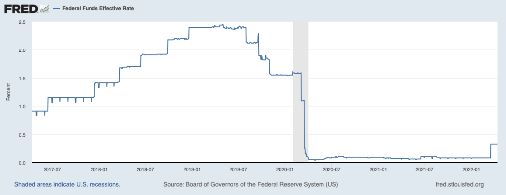
In March the Federal Reserve raised rates for the first time since Covid began:

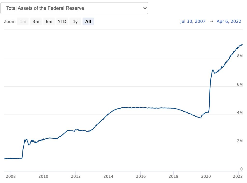
They also began to shrink their balance sheet:

Hard to see but its already down $25 billion from a peak of $8.962 trillion

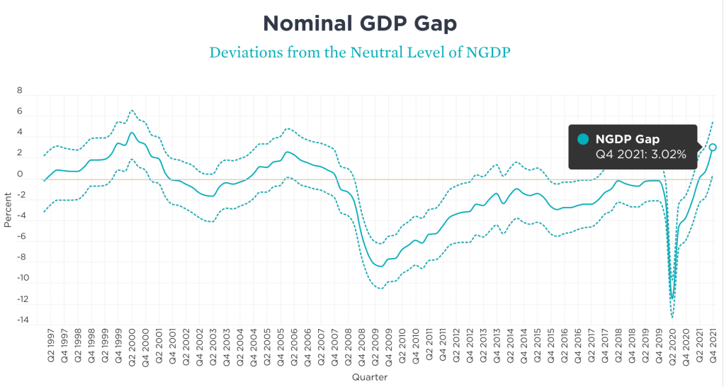
These moves are in the right direction, but represent a slow start to tackling inflation that is the highest of my lifetime, with the CPI up 8.5% over the last year. While temporary supply constraints are contributing to this, it seems clear to me that excessive aggregate demand is a major driver of this inflation. The labor market has already recovered, with unemployment at 3.6% like it was in late 2019. The Covid-induced output gap is fully eliminated by one standard measure:

But market-based measures of inflation expectations remain high. The TIPS spread predicts that inflation rates over the next 10 years will be much closer to 3% than to the Fed’s target of 2%:

My preferred measure, the NGDP gap, is at 3% (i.e., 3% over the ideal level of 0)

Source: https://www.mercatus.org/publications/monetary-policy/measuring-monetary-policy-ngdp-gap

Overall, its seams clear that Fed policy is currently too loose. The harder question is, what exactly to do about it? How much should they raise rates? The simplest way to answer this is to use the Taylor Rule. Using the version of the rule that Bernanke describes here and using core PCE as the inflation measure (currently just 5.4% yoy, vs 8.5% for headline CPI) implies that the Fed Funds rate should be:

5.4% + 0.5*0% + 0.5*(5.4%-2) + 2 = 9.1%

As Bernanke and many others have explained, you don’t want to take the Taylor rule literally, and the Fed raising rates to 9.1% Volcker-style at their next meeting would be a terrible idea. But keeping the Fed Funds rate under 0.5% would also be a terrible idea. Markets do expect the Fed to keep raising rates this year, but slowly, so that they would be around 2.25% by December. I’ll go on record as worrying that this is too slow, and recommending that they raise rates by at least 0.5% at their next meeting, and continue doing so until market-based measures of medium-run inflation are down to 2%.

Disclaimer: I’m a microeconomist whose last post on inflation was at best only directionally right. Consider this the view of one “insider-outsider” and then go read smarter people like Scott Sumner.

Inflation During the Pandemic in the OECD

Inflation is definitely here. The latest CPI release puts the annual inflation rate in the US at 8.5% over the past 12 months, the highest 12-month period since May 1981. That’s bad, especially because wages for many workers aren’t keeping up with the price increases (and that’s true in other countries too).

But what about other countries? Many countries are experiencing record inflation too. The same day the US announced the latest CPI data, Germany announced that they also had the highest annual inflation since 1981.

Using data from the OECD, we can make some comparisons across countries during the pandemic. I’ll use data through February 2022, which excludes the most recent (very high!) months for places like the US and Germany, but most countries haven’t released March 2022 data quite yet.

Let’s compare inflation rates and GDP growth (in real terms, also from the OECD), using the end of 2019 as a baseline. We’ll compare the US, the other G-7 countries, and several broad groups of countries (OECD, OECD European countries, and the Euro area). The chart below uses “core inflation,” which excludes food and energy (below I will use total inflation — the basic picture doesn’t change much).

Continue reading

It’s Still Hard to Find Good Help These Days

Consumption is the largest component of GDP. In 2019, it composed 67.5% of all spending in the US. During the Covid-19 recession, real consumption fell about 18% and took just over a year to recover. But consumption of services, composing 69% of consumption spending, hadn’t recovered almost two years after the 2020 pre-recession peak.  For those keeping up with the math, service consumption composed 46.5% of the economic spending in 2019.

We can decompose service consumption even further. The table below illustrates the breakdown of service consumption expenditures in 2019.

I argued in my previous post that the Covid-19 pandemic was primarily a demand shock insofar as consumption was concerned, though potential output for services may have fallen somewhat. When something is 67.5% of the economy, ‘somewhat’ can be a big deal. So, below I breakdown services into its components to identify which experienced supply or demand shocks. Macroeconomists often get accused of over-reliance on aggregates and I’ll be a monkey’s uncle if I succumb to the trope (I might, in fact be a monkey’s uncle).

Before I start again with the graphs, what should we expect? Let’s consider that the recession was a pandemic recession. We should expect that services which could be provided remotely to experience an initial negative demand shock and to have recovered quickly. We should expect close-proximity services to experience a negative demand and supply shock due to the symmetrical risk of contagion. Finally, we should expect that services with elastic demand to experience the largest demand shocks (If you want additional details for what the above service categories describe, then you can find out more here, pg. 18).

Continue reading

Deficits Are Here to Stay

Last week President Biden released his Fiscal Year 2023 budget proposal. The annual release of the budget proposal is always exciting for economists that study public finance. The president’s proposal is the first step in the federal budgeting process, which in some cases leads to the full passage of a federal budget by the start of the fiscal year in October (though perhaps surprisingly, the process rarely works as intended).

This year’s budget is especially interesting to look at because it gives us our first look at what post-pandemic federal budgeting might look like. And while the budget has a lot of detail on the administration’s priorities, I like to go right to the bottom line: does the budget balance? What are total spending and revenue levels?

The bottom line in the Biden budget this year is that permanently large deficits are here to stay. Keep in mind that a budget proposal is just a proposal, but it’s reasonable to interpret it as what the president wants to see happen with the budget over the next 10 years (even if Congress might want something different). Over the next 10 years, Biden has proposed that budget deficits remain consistently right around 4.5% of GDP, with no plan to balance the budget in the near future.

How does this compare to past budget proposals? For comparison, I looked at the final budget proposals of Biden plus his two predecessors. I start Obama’s in 2021 to match Trump’s first year, and all three overlap for 2023-2026. I put these as a percent of GDP so we don’t have to worry about inflation adjustments (though we might worry about optimistic GDP forecasts, see below).

Continue reading

Tradle

The success of Wordle has inspired a host of similar games. My personal favorite is Worldle, where you guess a country based on its shape. But the one that’s most econ-relevant and the one that I learn the most from is Tradle. You have to guess the country based on its exports:

This one would be a lot easier if I knew what Kaolin is

Its powered by data from the Observatory of Economic Complexity. I recommend checking that out after you try the game.

$5,000 Worth of Vaccines Saves One Life

I’ve written about the social benefits (in terms of the value of lives saved) of COVID mitigation measures, such as wearing face masks, before. But at this juncture in the pandemic (and really for the past 12 months), the key mitigation measure has been vaccines. How much does it cost to save one life through increased vaccination?

Robert Barro has a new rough estimate: about $5,000. In other words, he finds that it takes about 250 additionally vaccinated people in a state to save one life, and the vaccines cost about $20 to produce (marginal cost). So, about $5,000.

Barro gets this number (specifically, that 250 new vaccinated people saves one life) by using cross-state regressions on COVID vaccination rates and COVID death rates. Of course, there are plenty of potential issues with cross-state regressions. It’s not a randomized control trial! But Barro does a reasonable job of trying to control for most of these problems.

Another way to restate these numbers: if we assume that the VSL of an elderly life is somewhere around $5 million, then the social benefit from each person getting vaccinated is around $20,000. In other words from a public policy perspective, it would have made sense to pay each person up to $20,000 to get vaccinated!

Or thought of one more way: each $20 vaccine is worth about $20,000 to society. That’s an astonishing rate of return. And we’re not even including the value of opening up the economy earlier (from both a political and behavioral perspective) than an alternative world without the vaccines.

Covid Evidence: Supply Vs Demand Shock

By the time most students exit undergrad, they get acquainted with the Aggregate Supply – Aggregate Demand model. I think that this model is so important that my Principles of Macro class spends twice the amount of time on it as on any other topic. The model is nice because it uses the familiar tools of Supply & Demand and throws a macro twist on them. Below is a graph of the short-run AS-AD model.

Quick primer: The AD curve increases to the right and decreases to the left. The Federal Reserve and Federal government can both affect AD by increasing or decreasing total spending in the economy. Economists differ on the circumstances in which one authority is more relevant than another.

The AS curve reflects inflation expectations, short-run productivity (intercept), and nominal rigidity (slope). If inflation expectations rise, then the AS curve shifts up vertically. If there is transitory decline in productivity, then it shifts up vertically and left horizontally.

Nominal rigidity refers to the total spending elasticity of the quantity produced. In laymen’s terms, nominal rigidity describes how production changes when there is a short-run increase in total spending. The figure above displays 3 possible SR-AS’s. AS0 reflects that firms will simply produce more when there is greater spending and they will not raise their prices. AS2 reflects that producers mostly raise prices and increase output only somewhat. AS1 is an intermediate case. One of the things that determines nominal rigidity is how accurate the inflation expectations are. The more accurate the inflation expectations, the more vertical the SR-AS curve appears.*

The AS-AD model has many of the typical S&D features. The initial equilibrium is the intersection between the original AS and AD curves. There is a price and quantity implication when one of the curves move. An increase in AD results in some combination of higher prices and greater output – depending on nominal rigidities. An increase in the SR-AS curve results in some combination of lower prices and higher output – depending on the slope of aggregate demand.

Of course, the real world is complicated – sometimes multiple shocks occur and multiple curves move simultaneously. If that is the case, then we can simply say which curve ‘moved more’. We should also expect that the long-run productive capacity of the economy increased over the past two years, say due to technological improvements, such that the new equilibrium output is several percentage points to the right. We can’t observe the AD and AS curves directly, but we can observe their results.

The big questions are:

  1. What happened during and after the 2020 recession?
  2. Was there more than one shock?
  3. When did any shocks occur?

Below is a graph of real consumption and consumption prices as a percent of the business cycle peak in February prior to the recession (See this post that I did last week exploring the real side only). What can we tell from this figure?

Continue reading

What Was a “Normal Person” 50 Years Ago?

If you spend much time on Twitter, you may have seen the following cartoon or something like it:

The implication here is that many of the social beliefs we hold today are very different from what people held 50 years ago, and (possibly, therefore) it’s not radical to still hold those beliefs today. The Tweet above doesn’t specify exactly what those beliefs are, but we can use survey data to dig into what those might be. Thankfully, one of the greatest social surveys out there was first conducted in 1972, exactly 50 years ago: the General Social Survey.

What exactly did a normal person believe around 1972, according to the GSS?

Continue reading

This Time was Way Different

The financial crisis recession that started in late 2007 was very different from the 2020 pandemic recession. Even now, 15 years later, we don’t all agree on the causes of the 2007 recession. Maybe it was due to the housing crisis, maybe due to the policy of allowing NGDP to fall, or maybe due to financial contagion. I watched Vernon Smith give a lecture in 2012 in which he explained that it was a housing crisis. Scott Sumner believes that a housing sectoral decline would have occurred, and that the economy-wide deep recession and subsequent slow recovery was caused by poor monetary policy.

Everyone agrees, however, that the 2007 recession was fundamentally different from the 2020 recession. The latter, many believe, reflected a supply shock or a technology shock. Performing social activities, including work, in close proximity to others became much less safe. As a result, we traded off productivity for safety.

The policy responses to each of the two were also different. In 2020, monetary policy was far more targeted in its interventions and the fiscal stimulus was much bigger. I’ll save the policy response differences for another post. In this post, I want to display a few graphs that broadly reflect the speed and magnitude of the recoveries. Because the recessions had different causes, I use broad measures that are applicable to both.

Continue reading

Main Street Entrepreneurship is Back

Silicon Valley venture-backed tech startups have had a wildly successful twenty years, coming to dominate the markets. But tech remains a relatively small sector in terms of the total number of businesses and employees, and by many measures entrepreneurship and small business have been in relative decline in the US during the 2000’s.

Source: Business Employment Dynamics data compiled by Kauffman Foundation https://indicators.kauffman.org/reports/2021-early-stage-entrepreneurship-national

Covid accelerated many pre-existing trends, like the shift to remote work. But it reversed other trends, and seems to have led to a revival in entrepreneurship broadly.

Source: Current Population Survey Data complied by Kauffman Foundation https://indicators.kauffman.org/reports/2021-early-stage-entrepreneurship-national

A new report from the Kauffman Foundation, “2021 NATIONAL REPORT ON EARLY-STAGE ENTREPRENEURSHIP IN THE UNITED STATES“, illustrates this reversal, showing that the rate of new entrepreneurs is the highest its been since at least 1996.

This wasn’t all good at first- in 2020, the share of “necessity entrepreneurs” also reached record highs. These are people who start a business because they can’t get the job they want, not because they expect their business to be wildly successful. But in 2021, the rate of new entrepreneurs remained high while the share of “necessity entrepreneurs” and “opportunity entrepreneurs” returned to their normal balance.

Another good sign is that the share of businesses surviving at least a year is also at record levels:

More cracks in the Great Stagnation.