Credit Card Limits for Men and Women

Yesterday Federal Reserve researcher Nathan Blascak presented a paper at my Economics Seminar Series that was a surprise hit, with the audience staying over 40 minutes past the end to keep asking questions. So today I’ll share some highlights from the paper, “Decomposing Gender Differences in Bankcard Credit Limits”

The challenge here is that its hard to get data that includes both gender and credit card limits (its illegal to use gender as a basis for allocating credit, so credit card companies don’t keep data on it, as they don’t want to be suspected of using it). The paper is original for managing to do so, by merging three different datasets. But even this merged data only lets them do this for a fairly specific subgroup- Americans who hold a mortgage solely in their name (not jointly with a spouse). Even this limited data, though, is quite illuminating.

Their headline result is that men have 4.5% higher credit limits than women. Women actually have slightly more credit cards (3.38 vs 3.22), but have lower limits on each card; summing up their total credit limit across all cards yields an average of $28,544 for women vs $30,079 for men.

Source: Table 1 of this paper

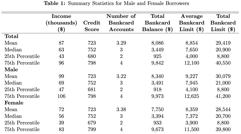
Two of the big factors that determine limits, and so could cause this difference, are credit scores and income. The table above shows that men and women have remarkably similar credit scores, while men have higher incomes. Still, when the paper tries to predict credit limits, controlling for credit scores, incomes, and other observables explains only about 13% of the gender gap.

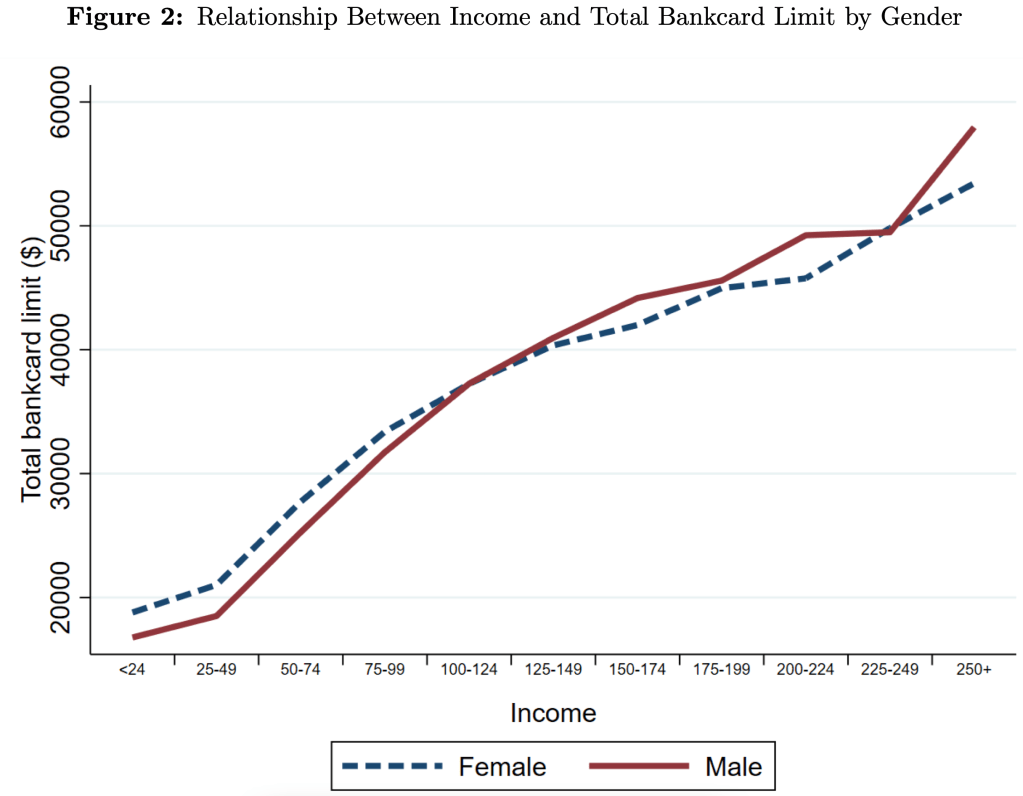
Men have 4.5% higher credit limits on average, but this difference varies a lot across the distribution. For credit scores, the gap is narrow in the middle but bigger at the extremes. For income, we see that men get higher limits at higher incomes, but women actually get higher limits at lower incomes- and not just “low incomes”, women do better all the way up to $100,000/yr:

The papers data covers 2006-2018, so they also show all sorts of interesting trends. The average number of credit cards held by men and women plunged after the 2008 recession and remains well below the peak. Total credit limits plunged too, though they were almost totally recovered by 2018.

There’s lots more in the paper, which is a great example of the value of descriptive work with new data. If anything I’d like to see the authors push even harder on the distribution angle. Its nice to see how limits vary across all incomes and credit scores, but why not show the full distribution of credit card limits by gender? My guess is that the 1st and 99th percentiles are very interesting places, because there’s all sorts of crazy behavior at the extremes. Finally, I wonder if higher limits are actually a good thing once you get beyond a relatively low amount- do you know of anyone who ever had a good reason to get their personal credit card balances over $20,000?

Wealth Growth During the Pandemic

In the US wealth distribution, which group has seen the largest increase in wealth during the pandemic? A recent working paper by Blanchet, Saez, and Zucman attempts to answer that question with very up-to-date data, which they also regularly update at RealTimeInequality.org. As they say on TV, the answer may shock you: it’s the bottom 50%. At least if we are looking at the change in percentage terms, the bottom 50% are clearly the winners of the wealth race during the pandemic.

chart created at https://realtimeinequality.org/

Average wealth of the bottom 50% increased by over 200 percent since January 2020, while for the entire distribution it was only 20 percent, with all the other groups somewhere between 15% and 20%. That result is jaw-dropping on its own. Of course, it needs some context.

Part of what’s going on here is that average wealth at the bottom was only about $4,000 pre-pandemic (inflation adjusted), while today it’s somewhere around $12,000. In percentage terms, that’s a huge increase. In dollar terms? Not so much. Contrast this with the Top 0.01%. In percentage terms, their growth was the lowest among these slices of the distribution: only 15.8%. But that amounts to an additional $64 million of wealth per adult in the Top 0.01%. Keeping percentage changes and level changes separate in your mind is always useful.

Still, I think it’s useful to drill down into the wealth gains of the bottom 50% to see where all this new wealth is coming from. In total, there was about $2 trillion of nominal wealth gains for the bottom 50% from the first quarter of 2020 to the first quarter of 2022. Where did it come from?

Continue reading

Recent Podcasts about Data Analytics

My students recently assembled a list of podcasts about data analytics that are a click away if this is a topic of interest.

The show they pulled from the most was In Machines We Trust produced by the MIT Technology Review.

Attention Shoppers, You’re Being Tracked

Hired by an Algorithm” (“I would recommend this podcast to anyone who will be applying for a job in the near future.”)

Encore: When an Algorithm Gets It Wrong

Can AI Keep Guns out of Schools

How retail is using AI to prevent fraud

Other episodes, not from In Machines We Trust:

More or Less Behind the Statistics: Can we use maths to beat the robots?  (Might be of interest to the folks who like to debate “new math” in schools.)

How Data Science Enables Better Decisions at Merck

Data Science at Home: State of Artificial Intelligence 2022

Emoji as a Predictor – Data skeptic

Data Skeptic: Data Science Hiring Process 

True Machine Intelligence just like the human brain” (Ep. 155)

How to Thrive as an Early-Career Data Scientist” – Super Data Science

No matter how you feel about intelligent machines, you’ll be talking to them soon.

They are delivering food already.

Grocery Prices and Wages, in the Short Run and the Long Run

From the recent CPI inflation report, one of the biggest challenges for most households is the continuing increase in the price of food, especially “food at home” or what we usually call groceries. Prices of Groceries are up 13.5% in the past 12 months, an eye-popping number that we haven’t seen since briefly in 1979 was only clearly worse in 1973-74. Grocery prices are now over 20% greater than at the beginning of the pandemic in 2020. Any relief consumers feel at the pump from lower gas prices is being offset in other areas, notably grocery inflation.

The very steep recent increase in grocery prices is especially challenging for consumers because, not only are they basic necessities, if we look over the past 10 years we clearly see that consumer had gotten used to stable grocery prices.

The chart above shows the CPI component for groceries. Notice that from January 2015 to January 2020, there was no increase in grocery prices on average. Even going back to January 2012, the increase over the following 8 years was minimal. Keep in mind these nominal prices. I haven’t made any adjustment for wages or income! (If you know me, you know that’s coming next.) Almost a decade of flat grocery prices, and then boom!, double digit inflation.

But what if we compare grocery prices to wages? That trend becomes even more stark. I use the average wage for non-supervisory workers, as well as an annual grocery cost from the Consumer Expenditure Survey (for the middle quintile of income), to estimate how many hours a typical worker would need to work to purchase a family’s annual groceries. (I’ve truncated the y-axis to show more detail, not to trick you: it doesn’t start at zero.)

Continue reading

The Cost of Raising a Child

Raising kids is expensive. As an economist, we’re used to thinking about cost very broadly, including the opportunity cost of your time. Indeed, a post I wrote a few weeks ago focused on the fact that parents are spending more time with their kids than in decades past. But I want to focus on one aspect of the cost, which is what most “normal” people mean by “cost”: the financial cost.

Conveniently, the USDA has periodically put out reports that estimate the cost of raising a child. Their headline measure is for a middle-income, married couple with two children. Unfortunately the last report was issued in 2017, for a child born in 2015. And in the past 2 years, we know that the inflation picture has changed dramatically, so those old estimates may not necessarily reflect reality anymore. In fact, researchers at the Brookings Institution recently tried to update that 2015 data with the higher inflation we’ve experienced since 2020. In short, they assumed that from 2021 forward inflation will average 4% per year for the next decade (USDA assumed just over 2%).

Doing so, of course, will raise the nominal cost of raising a child. And that’s what their report shows: in nominal terms, the cost of raising a child born in 2015 will now be $310,605 through age 17, rather than $284,594 as the original report estimated. The original report also has a lower figure: $233,610. That’s the cost of raising that child in 2015 inflation-adjusted dollars.

As I’ve written several times before on this blog, adjusting for inflation can be tricky. In fact, sometimes we don’t actually need to do it! To see if it is more or less expensive to raise a child than in the past, what we can do instead is compare to the cost to some measure of income. I will look at several measures of income and wages in this post, but let me start with the one I think is the best: median family income for a family with two earners. Why do I think this is best? Because the USDA and Brookings cost estimates are for married couples who are also paying for childcare. To me, this suggests a two-earner family is ideal (you may disagree, but please read on).

Here’s the data. Income figures come from Census. Child costs are from USDA reports in 1960-2015, and the Brookings update in 2020.

Continue reading

The Future of Student Debt

Yesterday the Biden administration announced that is forgiving up to $20k per person in student debt. So far we’ve seen lots of debate over whether this was a good/fair idea; as an economist who paid back his own debt early, you can probably guess what I have to say about that, so I’ll move on to the more interesting question of what happens now.

…after sharing one tweet
OK one more, but I promise its relevant

The above is a quote from Thomas Sowell as a political commentator, but he was also a great economist. His book Applied Economics says that the essence of the economic approach to policy analysis is to not just consider the immediate effect, but instead to keep asking “and then what?” So let’s try that here.

We’ll start with the immediate effects. Those whose debt just fell will be happy, and will have more money to spend or save in other ways. The federal government is on the other side of this, they’ll receive less in debt payments and so will have to fund themselves in other ways like borrowing money or raising taxes. People are still trying to estimate how big this transfer from the government to student debtors is, but let’s take the Penn Wharton Budget Model estimate of $330 billion (the actual cost is likely higher, since that estimate is for $10k of loan forgiveness, but the actual program forgives up to $20k for those who had Pell grants). Dividing by US population tells you the cost is roughly $1000 per American; dividing by $10,000 tells you that roughly 33 million debtors benefit.

OK, what happens next? The big question is: is this a one-time thing, or does it make future loan forgiveness more or less likely? Later I’ll make the argument for why the answer could be “less”. But right now most people seem to think the answer is “more”, and that belief is what will be driving decisions.

If current and future students think loan forgiveness is likely, they have an incentive to take out more loans than they otherwise would, and to pay them off more slowly (particularly since income-based repayment was just cut from 10% to 5% of income). This higher willingness to pay from students gives colleges an incentive to raise tuition; historically about 60% of subsidized loans to students end up captured by colleges in the form of higher prices:

We find a pass-through effect on tuition of changes in subsidized loan maximums of about 60 cents on the dollar, and smaller but positive effects for unsubsidized federal loans. The subsidized loan effect is most pronounced for more expensive degrees, those offered by private institutions, and for two-year or vocational programs.

Source: https://www.newyorkfed.org/research/staff_reports/sr733.html

To the extent that you think student debt is a national problem, this action didn’t solve the problem so much as push it back 6 years; wiping out roughly 20% of all student debt brings us back to 2016 levels. So we could end up right back here in 2028, possibly faster to the extent that students borrow more as a result.

Source: https://fred.stlouisfed.org/series/SLOAS#

That, together with the “normalization” of student loan forgiveness, is why people think a similar action in the future is likely. But I’ll give two reasons it might not happen.

First, this action may have only reduced student debt by about 20%, but it reduced the number of student debtors much more (at least 36%), because most debtors owed relatively small amounts. It will take more than 6 years for the number of voters who’d benefit from loan forgiveness to get back to what it was in 2022, reducing support for forgiveness in the mean time.

Source: https://www.valuepenguin.com/average-student-loan-debt

That also gives Congress plenty of time to do something, even by their lethargic standards. Part of what bothers many people about this loan forgiveness is that it not only doesn’t solve the underlying issue of the Department of Education signing kids up for decades of debt, it will likely worsen the underlying issue through the moral hazard effect I describe above. Forgiveness would be much more popular if it were paired with reforms to solve the underlying issue. While we aren’t getting real reform now, I do think forgiveness makes it more likely that we’ll see reform in the next few years. What could that look like?

Let’s start with the libertarian solution, which of course won’t happen:

More realistic will be limits on where Federal loan money can be spent, and shared responsibility for colleges. Colleges and the government have spent decades pushing 18 year olds to sign up for huge amounts of debt. While I’d certainly like to see 18-year-olds act more responsibly and “just say no” to the pushers, the institutions bear most of the blame here. The Department of Education should raise its standards and stop offering loans to programs with high default rates or bad student outcomes. This should include not just fly-by-night colleges, but sketchy masters degree programs at prestigious schools.

Colleges should also share responsibility when they consistently saddle students with debt but don’t actually improve students’ prospects enough to be able to pay it back. Economists have put a lot of thought into how to do this in a manner that doesn’t penalize colleges simply for trying to teach less-prepared students.

I’d bet that some reform along these lines happens in the 2020’s, just like the bank bailouts of 2008 led to the Dodd-Frank reform of 2010 to try to prevent future bailouts. The big question is, will this be a pragmatic bipartisan reform to curb the worst offenders, or a Republican effort to substantially reduce the amount of money flowing to a higher ed sector they increasingly dislike?

Are Teacher Salaries Held Back by “Bloat” in K-12 Schools?

In the past 20 years in the US, per pupil spending in K-12 schools has increased by about 20%. That’s in CPI-U inflation-adjusted dollars. What’s the cause of this increase? Higher teacher salaries? Administrative bloat? Something else?

Here’s a chart you may have seen floating around the internet. It shows the growth in the number of employees at K-12 public schools.

This looks like a lot of administrative bloat! The source of the data is the National Center for Education Statistic’s Digest of Education Statistics, Table 213.10.

But hold on, here’s another chart, showing the percent of employees in each of these same categories.

The numbers don’t add up to 100% because I’ve left off a few categories (the biggest one is “support staff,” which was 30-31% of the total throughout the time period). But overall, this chart appears to show much less bloat. Instructional staff (including aides) were by far the biggest category of employees in both categories in both time periods. Administrative staff at the district level did grow, but only by 1 percentage point of the total.

What’s the source of this data? Well, it’s a little trick I played. The source is the National Center for Education Statistic’s Digest of Education Statistics, Table 213.10. It’s the exact same data.

How is this possible?

Continue reading

A Theory of Certificate of Need Laws and Health Care Spending

I just published a paper on CON laws and spending in Contemporary Economic Policy. As frequent readers of this blog will know, CON laws in 34 states require healthcare providers in 34 US states to get permission from a state board before opening or expanding, and one goal of the laws is to reduce health care spending. The contribution we aim for in this paper is to lay out a theoretical framework for how these laws affect spending.

There have been many empirical papers on this, typically finding that CON laws increase spending, but the only theory explaining why has been simple supply and demand. Health care markets are hard to model for a few reasons, but one big one is that most spending is done through insurers, so the price consumers pay is typically quite a bit lower than the price producers receive. This leads to “moral hazard”- i.e. overuse and overspending by consumers. Normally economists hate monopolies because they lead to underproduction, so in a market with overuse its fair to ask (as Hotelling did about nonrenewable resources)- could two market failures (moral hazard overuse and monopoly underuse) cancel each other out?

Continue reading

GDP Growth and Inflation in G7 Countries

Back in April I wrote about GDP growth rates and inflation rates in G7 countries and the OECD broadly. James also wrote about a broader set of countries (182!) using these two measures. Since the economic scene is evolving so quickly, and we now have 6 more months of data, I wanted to provide an update on the US and our other large peer nations.

Here’s the data, showing cumulative real GDP growth and cumulative core inflation since the right before the pandemic (please note that I flipped the x- and y-axis from the previous post — sorry for the confusion, but this way makes more sense).

The picture looks roughly the same, but here are a few notable changes:

  • Despite the slight slowdown in GDP growth in the first half of 2022, the US still clearly has the highest rate of economic growth
  • UK, Italy, and Canada have now moved into positive territory for cumulative economic growth (yes, it’s all inflation adjusted)
  • But Japan and Germany still have had no net economic growth during the pandemic — and even worse for Germany, they have had a healthy dose of inflation too

The US once again stands out as having both the best economic performance and the worst inflation performance in the G7. Are these two things connected? That’s a question that is unanswerable from a simple scatterplot, and may be unanswerable completely. But I think it’s fair to say that the US hasn’t taken an obviously inferior economic path relative to other countries, even if our path has been inferior compared to some ideal policy. But don’t commit the Nirvana Fallacy!

Finally, we should recognize that the GDP is not the only important measure of how an economic is performing. For example, the US labor market has not recovered as well as some other peer nations have. Still, GDP is one of the important broad measures to look at, even if it is not ideal for diagnosing recessions.

The “Textbook Definition” of a Recession

Three weeks I wrote a blog post about how economists define a recession. I pretty quickly brushed aside the “two consecutive quarters of declining GDP,” since this is not the definition that NBER uses. But since that post (and thanks to a similar blog post from the White House the day after mine), there has been an ongoing debate among economists on social media about how we define recessions. And some economists and others in the media have insisted that the “two quarters” rule is a useful rule of thumb that is often used in textbooks.

It is absolutely true that you can find this “two quarters” rule mentioned in some economics textbooks. Occasionally, it is even part of the definition of a recession. But to try and move this debate forward, I collected as many examples as I could find from recent introductory economics textbooks. I tried to stick with the most recent editions to see what current thinking on the topic is among textbook authors, though I will also say a little bit about a few older editions after showing the results of my search.

Undoubtedly, I have missed a few principles textbooks (there are a lot of them!) so if you have a recent edition that I didn’t include, please share it and I’ll update the post accordingly. I also tried to stick with textbooks published in the last decade, though I made an exception for Samuelson and Nordhaus (2010) since Samuelson is so important to the history of principles textbooks (and his definition has changed, which I’ll discuss below).

But here’s my data on the 17 recent principles textbooks that I’ve found so far (send me more if you have them!). Thanks to Ninos Malek for gathering many of these textbooks and to my Twitter followers for some pointers too.

Continue reading