The Mont Pelerin Society was founded 75 years ago. The title of this post was the opening sentence of the Statement of Aims the new Society agreed upon. They had many concerns about what they considered “central values,” but primary among those concerns were the dangers related to market economies: “a decline of belief in private property and the competitive market” and “the growth of theories which question the desirability of the rule of law.”
How has the world done since 1947? It’s easy to point to the decline of communism and socialism, both in practice and as a dominant theory, as a victory for the goals of the Mont Pelerin Society. However, we might be concerned that in the non-communist world, economic freedom has declined even as communism has failed. Let’s dig a little deeper.
One source we can use is an extension of the Fraser Institute’s Economic Freedom of the World index. The primary index only extends back to 1970, but recently Lawson and Murphy have constructed a version of the index which goes all the way back to 1950 for some countries. As far as I’m aware, they haven’t yet perfectly mapped the pre-1970 index with the primary index that extends to the present, but I’ll make a quick comparison using the available data. The 1950 data brings us very close to the date of the first MPS meeting.
Here’s a list of countries relevant to the discussion at MPS in 1947. The list includes countries where attendees came from, as well as other countries of interest to the discussion, such as China and Russia (I’m using the list from Caldwell’s recent edited transcripts of the 1947 meeting). Caveat: this isn’t a chain-linked index, so the 1950 and 2020 numbers are perfectly comparable. Also, the 2020 number only includes Areas 1-4 of the index, since that’s what the pre-1970 data contains.
The table above should give us some optimism about the state of market economies in the world from the perspective of 1947. Not only have China and Russia, clearly improved their economic freedom scores, but all of the Western market economies have as well. Again, exercise caution in interpreting these, since it’s not a chain-linked index, and it excludes one area of economic freedom (regulation, which surely has grown substantially since 1947). Despite those cautions, the picture in 2020 looks pretty good compared with 1950.
But what of other liberal institutions? While the MPS statement of aims doesn’t specifically mention democratic institutions, the threat to democracy seems to clearly be a concern in 1947 (“extensions of arbitrary power” and “freedom of thought and expression”).
Although fracking technology has enabled renewed oil production in the U.S., the West remains heavily dependent on oil imports, especially from the Middle East. Even in the U.S., the current refining capacity is not well-matched to the type of light oil produced by fracking, so we still import oil (of types that our refineries can handle), although we also export fracked oil. Since oil remains the basis of so much economic activity, and since many oil exporting countries are unstable or even hostile to the U.S and our allies, the U.S. in 1975 established a large Strategic Petroleum Reserve (SPR) to store up crude oil. The storage is mainly in caverns in Texas and Louisiana, dissolved out of underground salt deposits. It was mainly filled in the Reagan/Bush administrations in the late 1970’s, and topped up under Bush II around 2003-2004.
The statutory purpose of this stockpile is to protect us and our allies against a “a significant reduction in supply which is of significant scope and duration,” per the Department of Energy. If such an event occurs, leading to high prices and associated economic impact, the President is authorized to release oil from the SPR. However,
In no case may the Reserve be drawn down…
(A) in excess of an aggregate of 30,000,000 barrels with respect to each such shortage;
(B) for more than 60 days with respect to each such shortage;
Somehow various administrations and also Congress have circumvented these restrictions on draining the SPR, and over the years have sold off bits and pieces to raise money for government spending. However, the current administration has decimated the SPR, selling off a third of it (some 200 million barrels), mostly in the past six months:
The administration projects this gusher to stop after November. Essentially all objective observers recognize this as primarily a political move, to reduce gasoline prices in order to curry favor with voters for the mid-term elections this November. It’s one thing to knock the price of gasoline down from $5.00/gallon back in the spring, when the world was panicked about Russia’s invasion of Ukraine, but to keep on selling into a moderated market is irresponsible. We haven’t had an actual shortfall in supply these past few months. Among other things, Russia keeps happily pumping and selling, out into the global grey market.
I won’t belabor the point here (stay tuned for more posts on this subject), but the world is structurally short of oil. With this administration having spent its first year demonizing oil and oil companies, the petroleum industry is understandably cautious about making expensive investments in future oil production. They know they will be stabbed in the back as soon as the current party in power no longer needs them.
By dumping this oil now, the administration is making the U.S. and the West more vulnerable later, if there is an actual global oil supply crisis (think: Iran vs. Saudi Arabia in the Persian Gulf…). Irritated by the lowish oil prices engendered by the SPR release, OPEC just announced production cuts which will drive prices right back up. They can cut production far longer than we can drain the SPR. If this all motivates further investment in low CO2 energy (including nuclear), that is perhaps a good thing. But between now, and attaining a carbon-free utopia in the future, we need to keep the crude flowing. Let us hope for the best here.
Ultimately, drawing down the SPR was a political decision. Think about it. An administration that has frequently emphasized the importance of reducing carbon emissions is trying to increase oil supplies to bring down rising oil prices — which will in turn help keep demand (and carbon emissions) high.
But even though the Biden Administration wants to address rising carbon emissions, high gasoline prices cause incumbents to lose elections. So, they try to tame gasoline prices even though it contradicts one of their key objectives of reducing carbon emissions.
The SPR has now been depleted since President Biden took office from 640 million barrels to 450 million barrels…
President Biden’s gamble to deplete the SPR in order to fight high oil prices may not hurt him at all. Of course, if for some reason we had a true supply emergency and found ourselves needing that oil, it would be looked upon as a terrible decision.
I have previously wrote about living standards in Ireland, and how GDP per capita overstates typical incomes because of a lot of foreign investment.
This is not to say that foreign investment is bad — to the contrary! But standard income statistics, such as GDP, aren’t particularly useful for a country like Ireland.
Norway has a similar challenge with national income statistics, but a different reason: Oil. Norway has a very large supply of oil revenues relative to the size of the rest of its economy, and oil revenues are counted in GDP. But those oil revenues don’t necessarily translate into higher household income or consumption.
Using World Bank data, Norway appears to be very rich: GDP per capita in nominal terms was about $90,000 in 2021. Compare that with $70,000 in the US, which is a very rich country itself. Sounds extremely wealthy!
Of course, by that same statistic, average income in Ireland is $100,000. But after making all the proper adjustments, as we saw in my prior post, Ireland is right around the EU average in terms of what individuals and households actually consume.
The ups and downs of the U.S. stock market are largely driven by the degree to which the Federal Reserve makes easy money available. After (ridiculously) insisting for most of 2021 that inflation was merely “transitory”, chairman Powell has finally put on his big boy pants and started to attack the problem by raising short term interest rates, and (only now) starting to reduce the Fed’s holdings of bonds. Massive buying of bonds is termed “Quantitative Easing” (QE), and its opposite is known as “quantitative tightening” or QT. QT can be accomplished by outright sales of bonds into the open market, or (as the Fed is doing) simply letting bonds mature and not replacing them with purchases of new bonds.
The specter of Fed tightening drove stock prices down all year, to a low in June. Then a new mantra began to circulate on Wall Street, that the Fed would relent at the first sign of economic slowdown, and hence would “pivot” back to easy money (low interest rate) policies. Stocks enjoyed 15% rise until stern speeches from the Fed in August convinced the Street that the Fed was going to stay the course until inflation is broken, and so stocks slumped back down to their June lows. Other major central banks like the European Central Bank and the Bank of England have likewise pledged tighter money policies in order to curb inflation.
However, stocks had a short-lived rally last Wednesday, when the Bank of England intervened in the markets by buying up long-term bonds. Aha, the central banks are caving at last! QE is back!!
It turns out that the reason the BOE intervened was not because of tight money conditions affecting general employment and income. Rather, there was a specific, technical reason. Many pension funds in the UK had entered into so-called “liability-driven investments” (LDIs), which involve interest rate swap agreements. I won’t try to explain the mechanical details of these beyond showing one figure:
In a stable world, these instruments allow pension funds to take money that they would have invested in boring, stable, low-interest bonds, and allocate it to (hopefully) higher-yielding investments such as stocks. But there is a huge catch, involving posting collateral, which in turn involves margin calls if the market price of long term bonds declines (as always happens when long-term interest rates go up).
The world has become less stable in the past six months, particularly since the Russian invasion of Ukraine. UK finances are shaky in the base case, and a proposal by the new prime minister for an unfunded tax cut that would exacerbate the budget deficit pushed the markets over the edge. Yields on British government bonds (“gilts”) surged, which would have triggered forced disastrous selling of assets (margin calls) by the pension funds at ever-lower prices. This death spiral would have imperiled the solvency of these nationally-important funds. See here and here for more explanations.
…according to Cardano Investment’s Kerrin Rosenberg, most UK pension funds “would have been wiped out” were it not for the bond buying.
“If there was no intervention today, gilt yields could have gone up to 7% to 8% from 4.5% this morning and in that situation around 90% of UK pension funds would have run out of collateral,” Rosenberg told The Financial Times.
Will other central banks be forced to abandon money-tightening because of imperiled pension funds? The consensus seems to be probably not. The UK funds had a relatively high exposure to these derivatives, and British finances are in worse shape than most other major economies. That said, this is a cautionary example of the vulnerabilities of cleverly engineered financial instruments. In the end, there is no free lunch.
I am pleased to announce that my paper “Willingness to be Paid: Who Trains for Tech Jobs?” has been accepted at Labour Economics.
Having a larger high-skill workforce increases productivity, so it is useful to understand how workers self-select into high-paying technology (tech) jobs. This study examines how workers decide whether or not to pursue tech, through an experiment in which subjects are offered a short programming job. I will highlight some results on gender and preferences in this post.
Most of the subjects in the experiment are college students. They started by filling out a survey that took less than 15 minutes. They could indicate whether or not they would like an invitation for returning again to do computer programming.
Subjects indicate whether they would like an invitation to return to do a one-hour computer programming job for $15, $25, $35, …, or $85.[1]This is presented as 9 discrete options, such as:
“I would like an invitation to do the programming task if I will be paid $15, $25, $35, $45, $55, $65, $75 or $85.”,
or,
“I would like an invitation to do the programming task if I will be paid $85. If I draw a $15, $25, $35, $45, $55, $65 or $75 then I will not receive an invitation.”,
and the last choice is
“I would not like to receive an invitation for the programming task.”
Ex-ante, would you expect a gender gap in the results? In 2021, there was only 1 female employee working in a tech role at Google for every 3 male tech employees. Many technical or IT roles exhibit a gender gap.
To find a gender gap in this experiment would mean female subjects reject the programming follow-up job or at least they would have a different reservation wage. In economics, the reservation wage is the lowest wage an employee would accept to continue doing their job. I might have observed that women were willing to program but would reject the low wage levels. If that had occurred, then the implication would be that there are more men available to do the programming job for any given wage level.
However, the male and female participants behaved in very similar ways. There was no significant difference in reservation wages or in the choice to reject the follow-up invitation to program. The average reservation wage for the initial experiment was very close to $25 for both males and females. A small number of male subjects said they did not want to be invited back at even the highest wage level. In the initial experiment, 5% of males and 6% of females refused the programming job.
The experiment was run in 3 different ways, partly to test the robustness of this (lack of) gender effect. About 100 more subjects were recruited online through Prolific to observe a non-traditional subject pool. Details are in the paper.
Ex-ante, given the obvious gender gap in tech companies, there were several reasons to expect a gender gap in the experiment, even on a college campus. Ex-post, readers might decide that I left something out of the design that would have generated a gender gap. This experiment involves a short-term individual task. Maybe the team culture or the length of the commitment is what deters women from tech jobs. I hope that my experiment is a template that researchers can build on. Maybe even a small change in the format would cause us to observe a gender gap. If that can be established, then that would be a major contribution to an important puzzle.
For the decisions that involved financial incentives, I observed no significant gender gaps in the study. However, subjects answered other questions and there are gender gaps for some of the self-reported answers. It was much more likely that women would answer “Yes” to the question
If you were to take a job in a tech field, do you expect that you would face discrimination or harassment?
I observed that women said they were less confident if you just asked them if they are “confident”. However, when I did an incentivized belief elicitation about performance on a programming quiz, women appear quite similar to men.
Since wages are high for tech jobs, why aren’t more people pursing them? The answer to that question is complex. It does not all boil down to subjective preferences for technical tasks, however in my results enjoyment is one of the few variables that was significant.
People who say they enjoy programming are significantly more likely to do it at any given wage level, in this experiment.
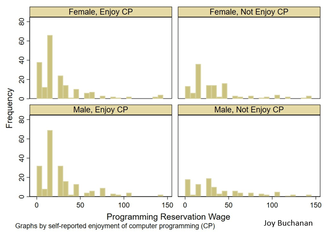
Fig. 3 Histogram of reservation wage for programming job, by reported enjoyment of computer programming (CP) and gender, pooling all treatments and samples
Figure 3 from the paper shows the reservation wage of participates from all three waves. Subjects who say that they enjoy programming usually pick a reservation wage at or near the lowest possible level. This pattern is quite similar whether you are considering males or females.
Interestingly, enjoyment mattered more than some of the other factors that I though would predict willingness to participate. About half of subjects said they had taken a class that taught them some coding, but that factor did not predict their behavior in the experiment. Enjoyment or subjective preferences seemed to matter more than training. To my knowledge, policy makers talk a lot about training and very little about these subjective factors. I hope my experiment helps us understand what is happening when people self-select into tech. Later, I will write another blog about the treatment manipulation and results, and perhaps I will have the official link to the article by then.
Buchanan, Joy. “Willingness to be Paid: Who Trains for Tech Jobs.” Labour Economics.
[1] We use a quasi-BDM to obtain a view of the labor supply curve at many different wages. The data is not as granulated as that which a traditional Becker-DeGroot-Marschak (BDM) mechanism obtains, but it is easy for subjects to understand. The BDM, while being theoretically appropriate for this purpose, has come under suspicion for being difficult for inexperienced subjects to understand (Cason and Plott, 2014). We follow Bartling et al. (2015) and use a discrete version.
I was in DC last weekend for the Effective Altruism Global conference. I met a lot of smart people who are going to have a huge impact on the world, and some who already are. I’ll share a few of my favorite highlights here, with the disclaimer that most quotes won’t be exact:
The mistake every do-gooder makes is coming to a country and thinking ‘I’m just here to help people, I’m not a political actor.’ Guess what? You are. What you do changes the balance of power, often toward the center
I’m funding the Yale spit test? The world doesn’t make sense [Yale, NIH, et c should be on it]… its like, if I won an academy award or NBA MVP, how screwed up would the world be?
You should all be political independents, both parties are terrible. You should be voluntary social conservatives, behave like Mormons…. we need a marginal revolution toward the better parts of the Mormon / social conservative package
Tyler Cowen
“Keep right” indeed
Tyler later specified that the main things he meant by this were to marry young and not drink, though I don’t think he realized how common the latter already is:
As he often does, Tyler recommend that people travel more:
If I meet someone who’s been to 40 countries I tell them they should travel more, and to weirder places
Tyler Cowen
But when someone asked “How much travel is too much”, he came up with this limiting principle:
How much travel is too much travel? 10% after your significant other gets mad at you
Tyler Cowen
I asked Matt Yglesias how much of his policy influence comes just from writing things online, and how much from personal connections and being in DC. He said something like:
Personal connections matter a lot given how real people change their minds, but there’s also less of a dichotomy than you’d think. For instance, a WaPo column of mine was getting passed around the White House, but I wrote it because someone in the WH suggested the topic. Politicians often communicate with each other via the media, though I wish they wouldn’t. Just talk to each other, you work in the same building!
My tweets are more influential than my columns & substack, because they are read so much more & I’m followed by many journalists. Overall though now is a great time for specialists, obsessives and weirdos. Construction Physics is a great blog now but if he’d written it in 2003 people would just be like, WTF. On the other hand my [generalist] college blog did well in 2003 but if a college student wrote the same kind of things today people would say, who cares?
Matt Yglesias
Journalists are suspicious haters, that’s our function in society
Can’t remember if this was Matt Yglesias or Kelsey Piper
Tyler and Matt were both telling people that you can accomplish your goals more effectively by being more “normie” in some ways. This can be a bit of a sacrifice, but:
If you can give a kidney, you can learn to tie a tie, give a firm handshake, and look people in the eye
Matt Yglesias
I’m some combination of smart enough and arrogant enough that its normally rare for me to meet someone and think “oh, you’re smarter than I am”. But at EAG it was common; not just because of the ridiculous numbers of top-university degrees and real-world accomplishments, but the breadth and depth of the conversations, everything from mental math to number theory, AI to finance, to a surprisingly convincing pitch for the relevance of metaphysics for political theory.
The othermain place I think this is SSC / ACX meetups
It wasn’t a step up for everyone though; I talked to someone at a top hedge fund who said the people he worked with were “are the smartest, most dedicated people I’ve been around…. smarter than EAs, more able to execute than mathematicians at [top PhD program he was at]”. They work 12 hour days, actually working the whole time (no long lunch break, small talk with colleagues, reading social media on their computers)… but all in a ruthless, selfish, impressively successful quest to outsmart the market and make more money.
Overall it was a great time and helped me narrow down my plans for what to do with my time and brainpower post-tenure. If you’re interested there are more conferences ahead.
Last week I wrote about wealth growth during the pandemic, but my favorite way to look at wealth data is comparing different generations. Last September I wrote a post comparing Boomers, Gen Xers, and Millennials in wealth per capita at roughly the same age. At the time, Millennials were basically equal to Gen X at the same age, and we were a year short of having comparable data with Boomers.
What does it look like if we update the chart through the second quarter of this year?
I won’t explain all of the data in detail — for that see my post from last September. I’ll just note a few changes. We now have single-year population estimates for 2020 and 2021, so I’ve updated those to the most recent Census estimates for each cohort. Inflation adjustments are to June 2022, to match the end of the most recent quarter of data from the Fed DFA. We still have to use average wealth rather than median wealth for now, but the Fed SCF is currently in progress so at some point we’ll have 2022 median data (most recent currently is 2019, and there’s been a lot of wealth growth since then).
What do we notice in the chart? First, we now have one year of overlap between Boomers and Millennials. And it turns out… they are pretty much at the same level per capita! Millennials have also now fallen slightly behind Gen X at the same time, since they’ve had no wealth growth (in real, per capita terms) since the end of 2021 to the present.
But Millennials have fared much better in 2022 with the massive drop in wealth: about $6.6 trillion in total wealth in the US was lost (in nominal terms) from the first to the second quarter of 2022. None of that wealth loss was among Millennials, instead it was roughly evenly shared among the three older generations (Boomers hid hardest). This difference is largely because Millennials hold more assets in real estate (which went up) than in equities (which went way down). The other generations have much more exposure to the stock market at this point in their life.
You can clearly see that affect of the 2022 wealth decline if you look at the end of the line for Gen X. You can’t see the effect on Boomers, since I cut off the chart after the last Gen X comparable data, but they saw a big decline since 2021 as well: about 6% per capita, along with 7% for Gen X. Even so, Gen X is still about 18% wealthier on average than Boomers were at the same age.
Of course, even since the end of the second quarter of 2022, we’ve seen further declines in the stock market, with the S&P 500 down about 4%. And who knows what the next few months and quarters will bring. But as of right now, Millennials don’t seem to be doing much worse than their counterparts in other generations at the same age.
The interest paid on most bank checking and savings account is still very low. Bank of America is paying 0.01-0.04% (i.e., practically zero) on savings accounts, and 0.05% (still nearly zero) on a 10-month CD. You can get over 2%, but mainly by opening an account with some little outfit you have never heard of. Money market funds are offering a little over 2%.
Courtesy of the Fed and its rate-raising, the interest on 6-12 month Treasury bills is now around 4%. Here is a graph of all Treasury bill/bonds (interest rate versus how long till bonds mature). So: Instead of leaving money in a bank account or in your broker’s money market fund, I suggest you take that money, transfer it to a brokerage account (e.g. at Vanguard or Schwab or Fidelity for low fees); then use that money to buy T-bills. Most brokerages have a simple, automated process for doing that. Below I will list the complete steps for doing this at Vanguard. (Buying other types of bonds might be more involved).
Example: I bought $10,000 worth of six-month T-bills a couple of days ago. I paid $9,824 for them now (in September, 2022). I can redeem them for their face value of $10,000 in March, 2023. That works out to an annualized interest rate of about 3.8%. (It would have been 4.0 % if I went for a 12-month T-bill). These short-term T-bills do not pay monthly or quarterly interest. You get your interest benefit by buying them at a discount to the face value.
No matter what interest rates or the economy does between now and March, Uncle Sam guarantees that I will get my $10,000. If I want to cash out before then, I can just sell some or all of my T-bill holdings back into the market. Again, no matter what happens, I can pretty well count on getting my full money back.
This is obviously a bit more trouble than just buying share in a bond mutual fund or exchange traded fund (ETF). Why go to this extra trouble? My big reason is that with a bond fund, its value can slosh up or (these days mainly) down by a significant percentage. So you might put $10,000 in today, and have it worth only $9,500 in a couple of months. I don’t mind stock prices flopping up and down, but not with bonds that I might want to cash in at any time.
If you buy say a longer-term bond, say a five-year Treasury bond, yes, you are guaranteed to collect the full face value in five years, but if you want to sell it into the market a year from now, you may find that its market value has gone down (or up) compared to what you paid for it, if interest rates have changed in the meantime. This adds a layer of uncertainty in managing your money. That is why I am recommending shorter-term (typically 1-year) T-bills.
One other comment on money management: for money you don’t think you will need for at least a year, one of the best places to put it is in U.S. government I-series savings bonds. These I-bonds pay whatever is the prevailing inflation rate, e.g., are paying now 9.6% (!!!). That is an astonishingly high yield for a government guaranteed bond. Bonus: the interest on I-bonds, like the interest on T-bills and other federal obligations, is typically exempt from state and municipal income taxes.
After holding an I-bond for at least a year, you can cash out at any time for the face value. (There is a modest interest rate penalty for redeeming in less than five years). There are two minor hitches with I-bonds. One is that you have to open a “Treasury Direct” account with the Treasury to purchase (and redeem) I-bonds. No big deal, just another account to monitor and make up a password for. The other hitch is that you can only buy up to $10,000 per year of I-bonds. That said, you should go make the extra effort and put the first $10,000 of your bond-type savings into I-bonds.
APPENDIX: HOW TO BUY TREASURY BILLS IN VANGUARD
Once you know how things flow, it only takes a few minutes to complete a purchase. Presumably other brokerages have similar procedures. ( There is a Treasury web site here which with a huge table of all T-bill maturities and current prices, but it’s probably easier to find what you are looking for in the Vanguard system).
( 1 ) On your main (“Holdings”) display page for your account, choose Transact:
( 2 ) Select the “Trade Bonds or CDs” option
( 3 ) This will bring up a “Check rates and trade bonds” page. Choose your account you want to transact in, and click Continue.
( 4 ) Which brings you to the “Find brokered CDs and bonds” page. For 6-month T-Bills, click as marked in red below:
( 5 ) This brings you to the “Now, select which Treasury you want” page. For approximately six-month T-Bill , probably select the first one on the list (red arrow, below). As of trading day 9/23/2022, that one maturing 3/16/2023 was the closest to 6-months. Note that I paid $98.25 (per $100 face value) for this T-bill. It does not pay monthly interest, but it is guaranteed to be redeemed at $100 when it matures in six months. The effective annual interest rate on this transaction is 3.8%. After selecting which T-Bill, click Continue.
( 5 ) This brings you to the “Next, provide the amount you want to invest” page. Here you input how much money you put into this transaction. Since T-Bills come in denominations of $1000 or more, so you have to input thousand dollar amounts here. (e.g. $3000 or $12000, but not $4500).
Yesterday Federal Reserve researcher Nathan Blascak presented a paper at my Economics Seminar Series that was a surprise hit, with the audience staying over 40 minutes past the end to keep asking questions. So today I’ll share some highlights from the paper, “Decomposing Gender Differences in Bankcard Credit Limits”.
The challenge here is that its hard to get data that includes both gender and credit card limits (its illegal to use gender as a basis for allocating credit, so credit card companies don’t keep data on it, as they don’t want to be suspected of using it). The paper is original for managing to do so, by merging three different datasets. But even this merged data only lets them do this for a fairly specific subgroup- Americans who hold a mortgage solely in their name (not jointly with a spouse). Even this limited data, though, is quite illuminating.
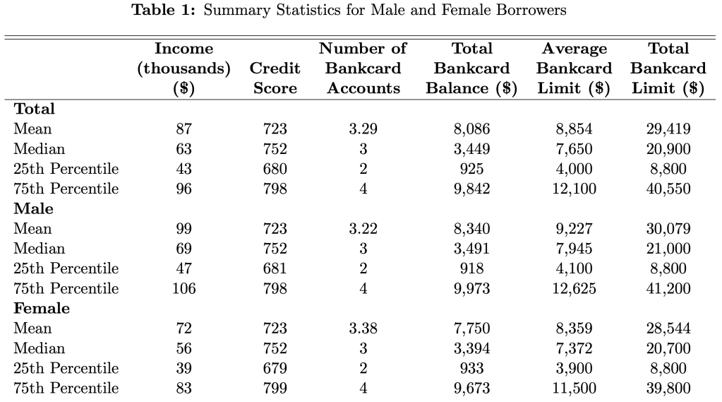
Their headline result is that men have 4.5% higher credit limits than women. Women actually have slightly more credit cards (3.38 vs 3.22), but have lower limits on each card; summing up their total credit limit across all cards yields an average of $28,544 for women vs $30,079 for men.
Two of the big factors that determine limits, and so could cause this difference, are credit scores and income. The table above shows that men and women have remarkably similar credit scores, while men have higher incomes. Still, when the paper tries to predict credit limits, controlling for credit scores, incomes, and other observables explains only about 13% of the gender gap.
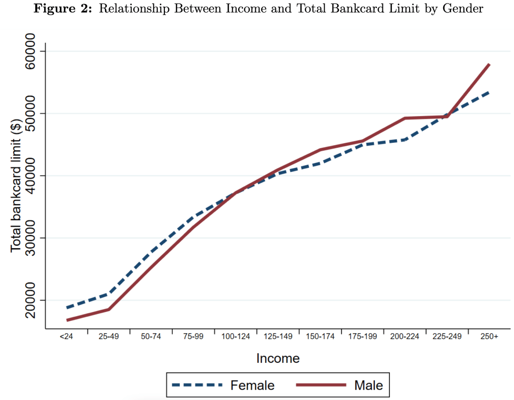
Men have 4.5% higher credit limits on average, but this difference varies a lot across the distribution. For credit scores, the gap is narrow in the middle but bigger at the extremes. For income, we see that men get higher limits at higher incomes, but women actually get higher limits at lower incomes- and not just “low incomes”, women do better all the way up to $100,000/yr:
The papers data covers 2006-2018, so they also show all sorts of interesting trends. The average number of credit cards held by men and women plunged after the 2008 recession and remains well below the peak. Total credit limits plunged too, though they were almost totally recovered by 2018.
There’s lots more in the paper, which is a great example of the value of descriptive work with new data. If anything I’d like to see the authors push even harder on the distribution angle. Its nice to see how limits vary across all incomes and credit scores, but why not show the full distribution of credit card limits by gender? My guess is that the 1st and 99th percentiles are very interesting places, because there’s all sorts of crazy behavior at the extremes. Finally, I wonder if higher limits are actually a good thing once you get beyond a relatively low amount- do you know of anyone who ever had a good reason to get their personal credit card balances over $20,000?
In the US wealth distribution, which group has seen the largest increase in wealth during the pandemic? A recent working paper by Blanchet, Saez, and Zucman attempts to answer that question with very up-to-date data, which they also regularly update at RealTimeInequality.org. As they say on TV, the answer may shock you: it’s the bottom 50%. At least if we are looking at the change in percentage terms, the bottom 50% are clearly the winners of the wealth race during the pandemic.
Average wealth of the bottom 50% increased by over 200 percent since January 2020, while for the entire distribution it was only 20 percent, with all the other groups somewhere between 15% and 20%. That result is jaw-dropping on its own. Of course, it needs some context.
Part of what’s going on here is that average wealth at the bottom was only about $4,000 pre-pandemic (inflation adjusted), while today it’s somewhere around $12,000. In percentage terms, that’s a huge increase. In dollar terms? Not so much. Contrast this with the Top 0.01%. In percentage terms, their growth was the lowest among these slices of the distribution: only 15.8%. But that amounts to an additional $64 million of wealth per adult in the Top 0.01%. Keeping percentage changes and level changes separate in your mind is always useful.
Still, I think it’s useful to drill down into the wealth gains of the bottom 50% to see where all this new wealth is coming from. In total, there was about $2 trillion of nominal wealth gains for the bottom 50% from the first quarter of 2020 to the first quarter of 2022. Where did it come from?