I’ve written about coffee consumption during US alcohol prohibition in the past. I’ve also written about visualizing supply and demand. Many. Times. Today, I want to illustrate how to use supply and demand to reveal clues about the cause of a market’s volume and price changes. I’ll illustrate with an example of coffee consumption during prohibition.
The hypothesis is that alcohol prohibition would have caused consumers to substitute toward more easily accessible goods that were somewhat similar, such as coffee. To help analyze the problem, we have the competitive market model in our theoretical toolkit, which is often used for commodities. Together, the hypothesis and theory tell a story.
Substitution toward coffee would be modeled as greater demand, placing upward pressure on both US coffee imports and coffee prices. However, we know that the price in the long-run competitive market is driven back down to the minimum average cost by firm entry and exit. So, we should observe any changes in demand to be followed by a return to the baseline price. In the current case, increased demand and subsequent expansions of supply should also result in increasing trade volumes rather than decreasing.
Now that we have our hypothesis, theory, and model predictions sorted, we can look at the graph below which compares the price and volume data to the 1918 values. While prohibition’s enforcement by the Volstead act didn’t begin until 1920, “wartime prohibition” and eager congressmen effectively banned most alcohol in 1919. Consequently, the increase in both price and quantity reflects the increased demand for coffee. Suppliers responded by expanding production and bringing more supplies to market such that there were greater volumes by 1921 and the price was almost back down to its 1918 level. Demand again leaps in 1924-1926, increasing the price, until additional supplies put downward pressure on the price and further expanded the quantity transacted.
We see exactly what the hypothesis and theory predicted. There are punctuated jumps in demand, followed by supply-side adjustments that lower the price. Any volume declines are minor, and the overall trend is toward greater output. The supply & demand framework allows us to image the superimposed supply and demand curves that intersect and move along the observed price & quantity data. Increases toward the upper-right reflect demand increases. Changes plotted to the lower-right reflect supply increases. Of course, inflation and deflation account for some of the observed changes, but similar demand patterns aren’t present in the other commodity markets, such as for sugar or wheat. Therefore, we have good reason to believe that the coffee market dynamics were unique in the time period illustrated above.
*BTW, if you’re thinking that the interpretation is thrown off by WWI, then think again. Unlike most industries, US regulation of coffee transport and consumption was relatively light during the war, and US-Brazilian trade routes remained largely intact.
I’m not using all of it, but it’s very helpful to see what other instructors have come up with to make teaching monetary policy more fun and more effective. You have to sign up to access it, using your official instructor email address.
It can feel relatively easy to talk to students about their role in the economy as consumers. It is relatively hard to lecture about central banking, because it is less relatable to everyday life. These exercises help us get into the “mind” of a bank.
Thank you to Econiful and Marginal Revolution University for making these resources available. There will probably be an equivalent for fiscal policy produced in the future.
I teach one hour-forty minute classes on Tuesdays and Thursdays. And I allot only sixty minutes for exams. While student enjoy having the unexpected spare time after an exam, that’s a lot of learning time to miss. Therefore, after my midterms, we do an in-class activity that is a low-stakes, competitive game (and, entirely voluntary).
I call this game “The Extent of the Market” and it has three lessons. Here’s how the game works:
I have a paper handout, a big bag of variety candy, and a URL. The handout is pictured below-left and lists the types of candy. Each student rates their preference with zero being the least preferred candy. Whether they keep their preferences a secret is up to them. Next, I distribute two pieces of candy to each of them. Importantly, their candy endowment is random and they don’t get to choose or trade (yet). Finally, the URL takes them to a Google sheet pictured below-right where they can choose an id and enter there ‘value score’ under Round 0 by summing the candy ratings of their endowment.
Round 1 is where they get to make choices. I tell students that their goal is to maximize their score and that there is a prize at the end. They are now permitted to trade with anyone at their table or in their row. It doesn’t take long since their candy preferences compose of only the short list, their endowments are small, and the group of potential trade partners is small. When trading is finished, they enter there new scores under round 1.
Lesson #1: Voluntary trade makes people better off.
For each transaction that occurred, someone’s score increased. And in most cases two people’s scores increased. Not everyone will have traded and not everyone will have a higher score. But no one will have a lower score, given the rules and objective of the game. Importantly, the total amount and variety of candy in the little classroom economy hasn’t changed. But the sum of the values in Round 1 increased from Round 0. Trade helps allocate resources where they provide the most value, even if the total amount of physical stuff remains fixed. If it’s a microeconomics class, then this is where you mention Pareto improvements.
Round 2 follows the same process, but this time they may trade with anyone in their quadrant or section of the room. After trading concludes, they enter their scores at the URL under round 2.
Lesson #2: More potential trade partners increases the potential gains from trade.
Again, the variety and total amount of candy in the room remains constant. The only thing that increased was the size of the group of people with whom students could trade. And, they again earn higher scores or, at least, scores that are no lower. People have diverse resources and diverse preferences, and the more of them that you can trade with, the more opportunities to find complementary gains. Clearly, this means that increasing the size of the pool of trading partners is beneficial. One among the many reasons that the USA has had great economic success is that we are a large country geographically with diverse resources and a population of diverse preferences. This means that we have a large common market with many opportunities for mutually beneficial trade. The bigger that we make that common market, the better. Clearly, the implications run afoul of buy-local and protectionist inclinations.
Round 3 proceeds identically with students able to trade with anyone in the room and they enter their scores. At this time the game is finished. It’s important to identify the cumulative class scores across time and to reemphasize lessons #1 & #2. Often, the cumulative value-score will have doubled from Round 0, despite the fixed recourses, making no one worse off. If trading with a row, and then a section, and then the whole class results in gains, then there is an analogy to be drawn to a state, country, and the globe.
Lesson #3: Trade changes the distribution of resources.
Despite an initial distribution of resources, voluntary trade changed that distribution. While no one is worse off and plenty of students are better off, measured inequality may have been affected. Regardless, once a voluntary trade occurs, the distribution of candy and of scores changes. This has implications for redistributive policies. If income or wealth is redistributed in order to achieve some ideal distribution, then the ability to freely trade alters that distribution. The only way to achieve it again would be for another intervention to change the candy distribution by force or threat thereof. Consider that sports superstar Lebron James became rich by playing basketball for people who like to watch him. If we redistribute his income, and then permit him the freedom to voluntarily play basketball again, then the income distribution will change as he again trades and increases his income. Similarly, giving money to a low marginal product worker can provide some short-term relief. But, if the worker resumes their prior behavior and productivity, then the same determinants and resulting income persist.
It’s a fund game and students enjoy it. There are some important limitations. #1: There is no production in this game nor incentives for production. This is a feature for the fixed resources aspect of the game. But this is a bug insofar as students think about US jobs vs international jobs. I can assert that the supply side works similarly to the demand side, but students see it less clearly (it helps to draw these parallels throughout the semester). #2: While there is a maximum possible score in the game, the value created in reality is unbounded. There is no highest possible score IRL. #3: There are no feedback dynamics. Taxes associated with income redistribution cause workers to require higher pay, worsening pre-tax inequality. People respond to incentives, and the tax/subsidy component that determined the initial distribution of candy is absent.
It’s a fun game. If you try it, then please let me know how it goes or leave suggestions in the comments.
*By default, Google Sheets anonymizes users. You could have them sign in or use an institutional cloud drive to remove problems that might be associated anonymity.
**If your student can’t handle choosing their own id, then you can just list your students.
***Ideally, each increased trade-group is a superset of the prior round’s potential trading partners.
****You can do more than 3 rounds, but the principle doesn’t change
*****More trade will occur with more students, a greater variety of possible candies, and with more candies endowed per person. You can alter these as needed depending on the classroom limitations.
I found a new time series and panel data tool that I want to share. What does it do? It’s called xtbreak and it finds what are known as ‘structural breaks’ in the data. What does that mean? It means that the determinants of a dependent variable matter differently at different periods of time. In statistics we’d say that the regression coefficients are different during different periods of time. To elaborate, I’ll walk through the same example that the authors of the command use.
The data contains weekly US covid cases and deaths for 2020-2021. Here’s what it looks like:
So, what’s the data generating process? It stands to reason that the number of deaths is related to the number of cases one week prior. So, we can adopt the following model:
That seems reasonable. However, we suspect that δ is not the same across the entire sample period. Why not? Medical professionals learned how to better treat covid, and the public changed their behavior so that different types of people contracted covid. Further, once they contracted it, the public’s criteria for visiting the doctor changed. So, while the lagged number of cases is a reasonable determinant of deaths across the entire sample, we would expect it to predict a different number deaths at different times. In the model above, we are saying that δ changes over time and maybe at discrete points.
First, xtbreak allows us to test whether there are any structural breaks. Specifically, it can test whether there are S breaks rather than S-1 breaks. If the test statistic is greater than the critical statistics, then we can conclude that there are some number of breaks. Note that there being 5 breaks given that there are 4 depends on there also be at least 4 breaks. And since we can’t say that there are certainly 4 breaks rather than 3, it would be inappropriate to say that there are 4 or 5 breaks.
Great, so if there are three structural breaks, then when do they occur? xbtreak can answer that too (below). The three structural breaks are noted as the 20th week of 2020, the 51st week of 2020, and the 11th week of 2021. Conveniently, there is also a confidence interval. Note that the confidence intervals for 2020w11 and 2021w11 breaks are nice and precise with a 1-week confidence interval. The 2nd break, however, has a big 30-week confidence interval (nearly 7 months). So, while we suspect that there is a 3rdstructural break, we don’t know as precisely where it is.
Regardless, if there are three structural breaks, then that means that there are four time periods with different relationships between lagged covid cases and covid deaths. We can create a scatter plot of the raw data and run a regression to see the different slopes. Below we can see the different slopes that describe the impact of lagged covid cases on deaths. Sensibly, covid cases resulted in more deaths earlier during the pandemic. As time passed, the proportion of cases which resulted in death declined (as seen in the falling slope of the dots). It’s no wonder that people were freaking out at the start of the pandemic.
What’s nice about this method for finding breaks is that it is statistically determined. Of course, it’s important to have a theoretical motivation for why any breaks would occur in the first place. This method is more rigorous than eye-balling the data and provides opportunities to hypothesis test the number of breaks and their location. If you read the documentation, then there are other tests, such as breaks in the constant, that are also possible.
I recently learned about an interesting statistic for social scientists. It’s called the “Dissimilarity Index”. It allows you to compare the categorical distribution of two sets.
Many of us already know how to compare two distributions that have only 2 possible values. It’s easy because if you know the proportion of a group who are in category 1, then you know that 1-p will be in category 2. We can conveniently denote these with values of zero and one, and then conduct standard t-tests or z-tests to discover whether they are statistically different. But what about distributions across more than two possible categories?
By now, everyone should consider using ChatGPT and be familiar with how it works. I’m going to highlight resources for that.
My paper about how ChatGPT generates academic citations should be useful to academics as a way to quickly grasp the strengths and weakness of ChatGPT. ChatGPT often works well, but sometimes fails. It’s important to anticipate how it fails. Our paper is so short and simple that your undergraduates could read it before using ChatGPT for their writing assignments.
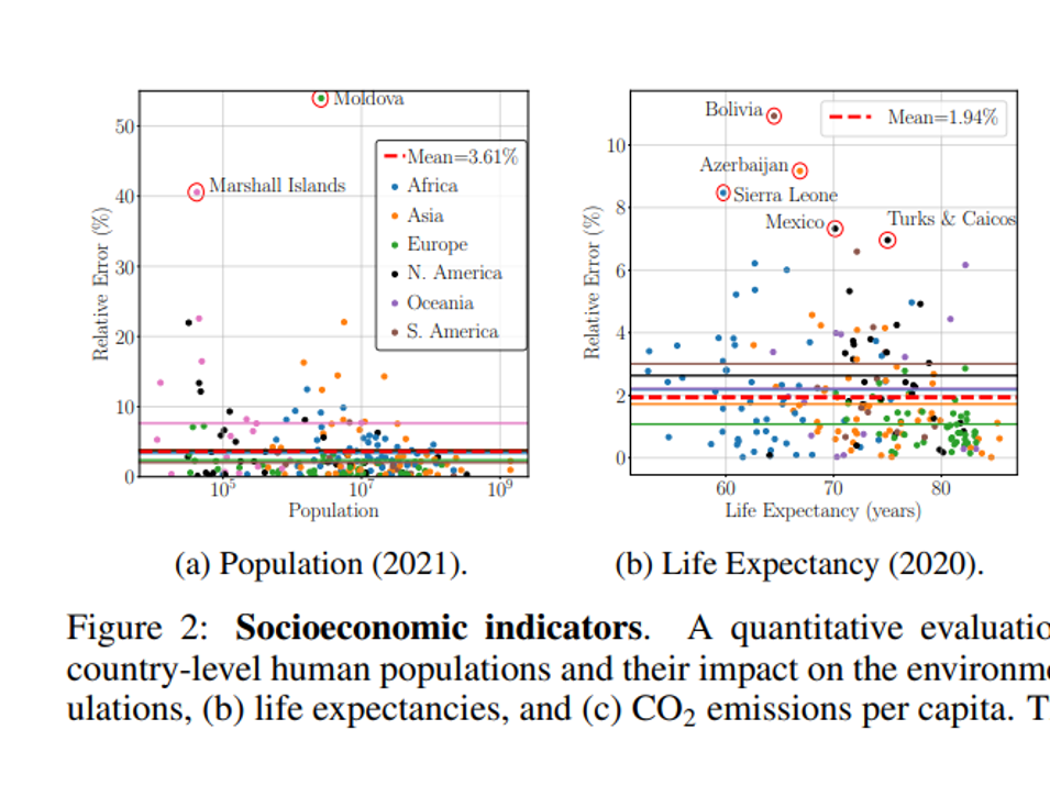
A paper that does this in a different domain is “GPT4GEO: How a Language Model Sees the World’s Geography” (Again, consider showing it to your undergrads because of the neat pictures, but probably walk through it together in class instead of assigning it as reading.) They describe their project: “To characterise what GPT-4 knows about the world, we devise a set of progressively more challenging experiments… “
For example, they asked ChatGPT about the populations of countries and found that: “For populations, GPT-4 performs relatively well with a mean relative error (MRE) of 3.61%. However, significantly higher errors [occur] … for less populated countries.”
ChatGPT will often say SOMETHING, if prompted correctly. It is often, at least slightly, wrong. This graph shows that most estimates of national populations were not correct and the performance was worse on countries that are less well-known. That’s exactly what we found in our paper on citations. We found that very famous books are often cited correctly, because ChatGPT is mimicking other documents that correctly cite those books. However, if there are not many documents to train on, then ChatGPT will make things up.
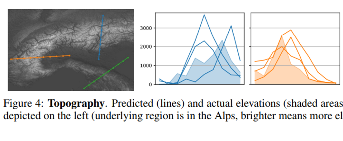
I love this figure from the geography paper showing how ChatGPT estimates the elevations of mountains. This visual should be all over Twitter.
There are 3 lines because they did the prompt three times. ChatGPT threw out three different wrong mountains. Is that kind of work good enough for your tasks? Often it is. The shaded area in the graph is the actual topography of the earth in those places. ChatGPT “knows” that this area of the world is a mountain. But it will just put out incorrect estimates of the exact elevation, instead of stating that it does not know the exact elevation of those areas of the world.
The first thing to explain is that what ChatGPT is always fundamentally trying to do is to produce a “reasonable continuation” of whatever text it’s got so far, where by “reasonable” we mean “what one might expect someone to write after seeing what people have written on billions of webpages, etc.
If you feel like you already are proficient with using ChatGPT, then I would recommend Wolfram’s blog because you will learn a lot about math and computers.
Scott wrote “Generative AI Nano-Tutorial” here, which has the advantage of being much shorter than Wolfram’s blog.
The government is unique among economic institutions insofar as it can use coercion legally. But not all activities are coercive. Clearly, taxation is overwhelmingly coercive. Some people say that they are happy to pay taxes, but the voluntary gifts to the US Treasury are itsy-bitsy (just over $1m for FY 2023). Most regulations also include the threat of fines or jail time for non-compliance.
But once the government has the money in their coffers, there is plenty that they can do consensually. Once they have the resources, they are often just another potential transactor in the markets for goods and services. While the government can transact as well as anyone else, there is a fundamental theoretical difference for how we should interpret those transactions. Specifically, there is a principal-agent problem such that we can’t quite identify the welfare that is enjoyed by consumers when the government makes purchases. We really have very little idea.
Garett Jones uses the analogy of the government confiscating potatoes. The worst use would be for the government to throw the valuable resources into the river. Those resources help no one. Improved welfare would be yielded if the government just transferred those potatoes back to people. Sure, there’s the transaction cost of administration, but people get their potatoes back. Finally, the great hope is that the government takes the potatoes and makes tasty potato fritas such that they return to the public something more valuable than they took. These might be things that fall into the public goods category or solving collective action problems generally.
The above examples illustrates that how the government spends matters a lot for the welfare implications of the newly purchased government resources. But, we need to recall that there is an entire private segment of the market that is affected by the government transactions.
Short-Run Analysis
In a competitive market, firms face increasing marginal costs and make decisions about their levels of output. When the government makes purchases, it’s simply acting as another demander. How does the entry of a larger demander affect everyone else in the market? See the below GIF.
Last time the gifs were simply about price & quantity and welfare. I’m sharing some more GIFs, this time in regard to welfare and taxes.
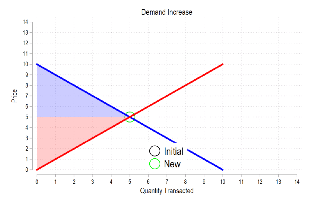
First, see the below gif. It shows us that both consumer surplus (blue area) and producer surplus (red area) always rise if there is a demand increase (assuming the law of supply and law of demand).
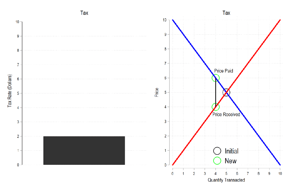
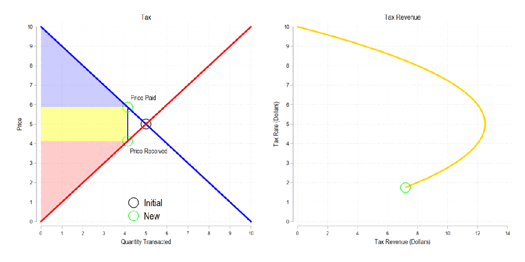
Next, let’s consider a basic tax. We can represent it as the difference between what the demander pays and what the supplier receives. The bigger the tax, the bigger the difference between the two.
Now let’s combine the tow ideas: If taxes rise, then the quantity transacted falls, price paid rises, price received falls, and both consumer and producer surplus fall. Not only that, since there is an inverse relationship between the tax rate and the quantity transacted, it may be that increasing the tax rate more *reduces* revenue. The idea that there is a tax revenue maximizing tax rate is illustrated below right and is known as the Laffer curve.
In addition to all the usual items for a principles of macroeconomics class, I’m asking my students to listen to one podcast episode this semester. They have to write a short summary on a discussion board for credit.
It took me a bit of time to collect this list of links. I also give them some discretion to find their own episode, but I’m not posting my rules on that point here. This list is something you can copy, paste, and modify. The point is to have all the web links in one place so that students can just click around. There have been many great podcasts over past 2 decades, but I list relatively new content so that we get a bit of “current events” thrown in. So, even if you’ve assigned podcasts before, this new list might be helpful.
I’ve discussed the ways to teach supply and demand in the past. Regardless, almost all principles of economics classes require a book. But even digital books are often just intangible versions of the hard copy. Supply and demand are illustrated as static pictures, using arrows and labels to do the leg-work of introducing exogenous changes. There’s often a text block with further explanation, but it lacks the kind of multi-sensory explanation that one gets while in a class.
In a class, the instructor can gesticulate and vary their speech explain the model, all while drawing a graph. That’s fundamentally different from reading a book. Studying a book requires the student to repeatedly glance between the words and the graph and to identify the appropriate part of the graph that is relevant to the explanation. For new or confused students, connected the words to one of many parts of a graph is the point of failure.
This is part of why the Marginal Revolution University videos do well. They’re well produced, with context and audio-overlaid video of graphs. It’s pretty close to the in-person experience sans the ability to ask questions, but includes the additional ability to rewind, repeat, adjust the speed, display captions, and share.