Inflation Update: With and Without the Outliers

Inflation has been constantly in the news over the past 2 years, but it has especially been in the news lately with regards to one country: Argentina. That country has been experiencing triple-digit annual inflation lately, and it has become one of the key issues in the current presidential race.

How bad is inflation in Argentina? Here’s a comparison to some other G20 countries from September 2019 through September 2023 (data from the OECD).
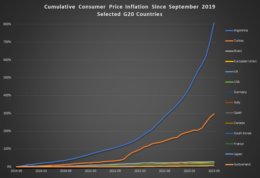
Cumulative consumer price inflation in Argentina over the past 4 years is over 800 percent. That means goods which cost 100 pesos in September 2019 now costs 900 pesos, on average. Well, they did in September. It’s almost November now, so if the recent inflation rates persisted, those goods are around 1,000 pesos now.

Turkey also stands out as a country with very rapid inflation the past 4 years — without Argentina on the chart, Turkey would clearly stand out from the rest. But other than Turkey, all the other countries are bunched at the bottom. Has there not been much difference among them? Not quite.

This next chart removes Argentina and Turkey:
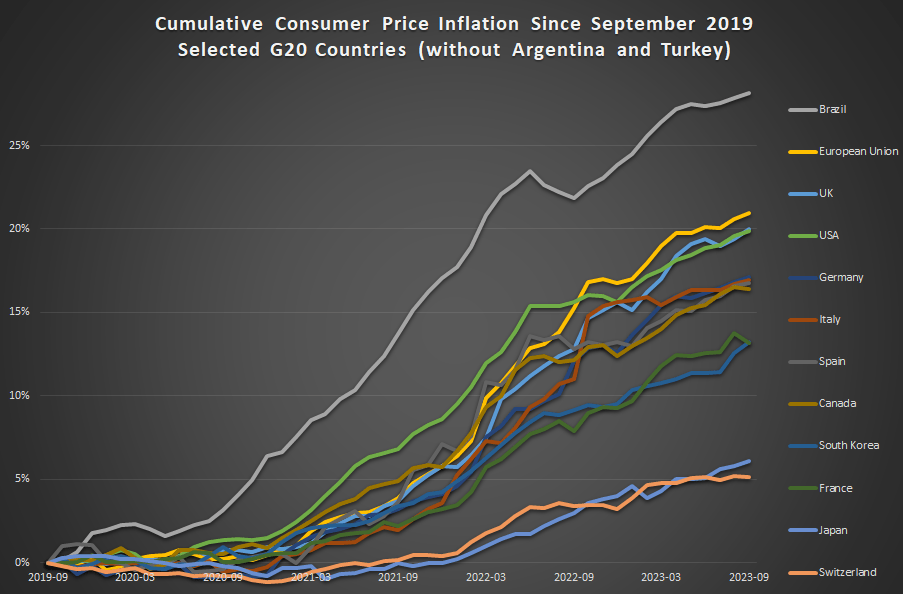
In this second chart we see two standouts on the opposite end of the spectrum: Japan and Switzerland have had extremely low inflation, just 6 and 5 percent cumulatively since late 2019 (and this is not unusual for these two countries in recent history).

For us here in the USA, things don’t look so good. Only Brazil and the EU are higher (and the EU is mostly due to energy price inflation in Eastern Europe), so other than that we are basically tied with the UK for the worst inflation performance among very high income countries during the pandemic. That’s bad news! But perhaps one silver lining is that average wages in the US have outpaced inflation slightly: 23 percent vs 20 percent growth over this time period. That’s not much to celebrate — except relative to most of the rest of the world.

Pinball Prices (Not Adjusted for Inflation)

Last weekend I had the opportunity to visit an arcade, but not one of those modern fancy arcades with virtual reality, laser tag, etc. This arcade specializes in having old-school games, primarily pinball, but also early video arcade games. You pay a cover charge ($5 for kids, $10 for adults), and then you use quarters to play the games. But here’s the cool part: the price of the games is the same as it was when the games were first released.

As an economist, of course, I was very interested in the prices.

They had pinball machines that dated back the 1960s, and video games from the late 1970s. Most video arcade games were around 50 cents for the early games (late 1970s and early 1980s). But the pinball machines started out at 25 cents, with the earliest game they had being a Bally Blue Ribbon machine, manufactured in 1965 (interestingly, some of the earlier machines had slots for both dimes and quarters — I assume the price was adjustable mechanically). Notably, you also got to play 5 balls for this price (3 balls seems to be standard later on).

How should we think about that 25 cents? A standard reaction is to adjust the number for inflation. Using the CPI-U as the inflation index, that means the 25 cents from 1965 is “worth” about $2.40 now. That’s interesting, but I don’t think it really provides the relevance that we want today.

An alternative is to calculate the “time price” of playing the game. Using the average hourly wage of $2.67 in December 1965, we can calculate that it would take about 5.5 minutes of work to pay for that game — a game which probably only lasts about 5.5 minutes, unless you are really good at it!

Another comparison we could do is with the cost of video games today compared with wages today. But that’s not really a fair comparison — video games are much more advanced today. We would need to do some sort of quality adjustment, which is overly complicated.

But, at least in my case, there is no need to do the quality adjustment — I can play the exact same game as 1965. In fact, I did (several times). There was also that $10 cover charge that I mentioned, and if I spread that fixed cost over 40 games, it cost me about 50 cents per play (including the 25 cents to start the machine) to play the 1965 Bally’s Blue Ribbon Pinball machine. At the average wage today of $29 per hour, it takes about 1 minute to afford a play of that same game. In other words, my Blue-Ribbon-Pinball standard of living is about 5.5 times greater than in 1965.

Now this isn’t to say we are 5.5 times better off overall than 1965. Prices don’t stay constant for most goods! But hopefully it is a useful way to think about that 25 cent price tag from the past, and how to compare it to today.

Manufacturing Compensation in the Long Run

You may have heard that there is a new viral song which deals with a few economic issues. Noah Smith has a good analysis of “Rich Men North of Richmond,” which he mostly finds to be incorrect in its analysis (for example, of welfare policy). But Smith does say that the song has a point: manufacturing wages haven’t performed well in recent years. Not only has pay for factory workers “[lagged] the national average in recent years,” for those workers in Virginia, it’s lower in real terms than in 2010.

Well that all doesn’t sound good! Smith is only going back to about 2000 with the data he shows. What if we took a longer run perspective? What if we took a really long-run perspecitive?

Here’s wages for blue-collar factor workers that goes back to 1939 in the US:

The wage data (for manufacturing production workers) is from BLS and the PCE price index is from the BEA. What do you notice as you look at the data?

First, it is true that the last 20 years or so hasn’t been great. Only about 8% cumulative growth since 2002. That’s not great!

But as you look back further, you’ll notice that gains are substantial. Compared to what some might consider the “golden age” of manufacturing wages, the early 1950s, real wages have roughly doubled. It’s true, the growth rate from 1939-1973 is much, much better than the following 50 years. Wouldn’t it be nice if that growth rate had continued! But no doubt you’ve seen many memes saying something like “in the 1950s you could support a family on one high-school graduate income, but not today!” This data suggests that view of the 1950s is a little distorted by nostalgia.

One final thing to note: we might think that one big change in recent decades is that a lot more compensation goes to benefits, rather than wages. There’s actually a total compensation series for blue-collar workers going all the way back to 1790:

The total compensation data, as well as the CPI data that I used to inflation-adjust the figures (to 2022 dollars), comes from the fantastic resource Measuring Worth. This is a total compensation measurement, so it includes benefits, but the source data tells us that up until the late 1930s, it’s really just a wage measure. So potentially we could splice this together with the above chart, to get a “wage only” series covering the entire history of the US.

However, when we look at total compensation, we still see the post-1970s stagnation. Real compensation is roughly the same as about 1977. Yikes! Note here that we’re using the CPI, since the PCE index only goes back to 1929, and the CPI tends to overstate inflation (yes, that’s right, sorry CPI truthers). Still, it’s not the most optimistic picture.

Or isn’t it? With all of the automation and global competition in manufacturing coming on board in the past 50 years, perhaps our baseline is that things could have been much worse. In any case, if we look at total compensation, it’s currently about double what it was in the post-WW2 era. That’s even with the dip in 2022 due to high CPI inflation.

Wages and compensation of blue-collar productions workers have indeed been growing slowly for the past few decades. That much is true. On the other hand, they are still among the highest they have ever been in history, over 50 times (not 50%, 50 times!) higher than at the birth of this nation. This ranks them as probably the highest wages anywhere in world history for an occupation that doesn’t require an advanced degree. That history is worth knowing.

The Rate of Inflation is Falling, But Prices are Still Rising (And So are Wages)

The latest CPI-U price data shows that the rate of inflation in the US has slowed significantly to just 3% in the past 12 months. That’s a huge improvement from the peak last June, when the annual rate of inflation was over 9%. Still, prices as a whole aren’t falling, and they clearly aren’t anywhere near where they were before the pandemic: using the CPI-U, prices are up over 17% since January 2020.

Lately I’ve heard many people asking a good question: will prices ever get back down to where they were? Usually they mean pre-pandemic prices, though sometimes they refer to a particular point-in-time (such as the start of Biden’s presidency). The only correct answer is “we don’t know,” but I think a likely answer for many goods and services is “no.” For many reasons, the nominal prices of most goods and services rise over time. Though this is not true for everything, of course (newer technologies are one example we often see).

But what about specific goods that we buy frequently? Will we ever see gasoline consistently below $3 per gallon again? Will we ever see milk consistently below $4 per gallon again? What about eggs and bread? And indeed, these prices are well above January 2020 levels: 23% higher for milk, 43% for bread, 45% for gasoline, and a whopping 52% for eggs. For the price data, I am using this convenient data on common food and energy goods from BLS.

For some of these items, I do think you might someday see prices fall back to levels consumers were used to from the recent past, since food and energy prices tend to be volatile. For others, though maybe not. But I think we as consumers can become overly focused on staples that we buy frequently and can easily recall the price in our heads. For example, while eggs, bread, and milk are items that we buy frequently (including being the staples of stocking up before a storm), in total these constitute just 0.6% of average consumer spending.

If instead of those 3 staples, your mind naturally anchors on produce prices, the trends look different: oranges are up 23%, but bananas are only up 10%, and tomatoes are, in fact, down 14% since January 2020. But again, these items are less than 0.5% of total consumer spending. Ideally, we shouldn’t anchor on any one subset of goods when doing a good analysis, even if it is natural for us to do so in our lives as consumers.

This is where the benefit of a price index, like the CPI-U, comes in.

Continue reading

“Good Money at the Time”

On summer vacation, I recently visited Mount Rushmore. It’s amazing structure, and the story of its construction is as impressive as the monument itself. Much of the story you learn when visiting is the story of its creation. As an economist, of course seeing the following display with wage data got me very excited:

While the sign says that laborers made 30 cents per hour, searching online it appears that 50 cents was more common. More skilled workers, such as assistant sculptors, made $1.50 per hour. These were, as the sign says, “good wages” for that time. In the economy generally, production workers made around 50 cents per hour our as well around that time period, and most of the construction of Rushmore was during the Depression (some of the workers were WPA funded), so having any job, much less one that paid pre-Depression wages, was certainly a good one.

How does this compare to wages today? This is always a tricky question, as I have documented on this blog several times before, but the most straight forward approach (and good first approximation) is a simple CPI inflation adjustment. Using 1929 as the baseline year, when construction was in full swing, 30 cents an hour is roughly $5 today, 50 cents per hour is close to $9, and $1.50 would be about $26.50. That doesn’t sound too bad!

The best comparison I like to use is BLS’s average hourly earnings for private production and non-supervisory workers. Averages aren’t perfect, but this measure excludes management occupations that will be distorting the average. In May 2023, that wage was $28.75 per hour. So the average worker today earns 3-6 times as much per hour as these “good paying jobs” in the late 1920s and the Depression. And, as the Rushmore signage notes, these jobs were seasonal. Their off-season jobs probably paid even less.

The wage of the assistant sculptor does compare well with average wages today, but that pay was unusual for the time and was likely a highly skilled worker. The only record I can find of anyone making that much at Rushmore was Lincoln Borglum, the son of the main sculptor Gutzon Borglum. Lincoln oversaw the completion of the project after Gutzon’s death, and it was only in later years on the project that his pay was increased to $1.50 per hour.

For the typical laborer on Rushmore, having a good job was indeed good to have, but the wages pale in comparison to a typical worker today.

Why No Recession (Yet)

Where is that recession that pundits have been predicting for over a year now? The suspense is killing me. Despite savage hikes in interest rates that have led to a collapse in regional banks and in home buying, the economy just keeps chugging along, and inflation continues to run way above the targeted 2% level. What’s going on?

An article I just read on the Seeking Alpha applied finance website points to three interrelated factors. I will cite and credit the author (whose moniker is “Long-Short Manager”; he runs a couple of investment funds) for the content here, while noting that I agree with his points based on other reading. These points all relate to ongoing strong financial position of the (average) American consumer, who mainly drives the spending in our economy.

( 1 )  Reduced Debt Service

The article notes:

The graph above shows household debt payments as a percent of disposable personal income going back to 2000. Since peaking at 13% right before the financial crisis, it steadily improved to 2020, with a subsequent large drop due primarily to lowered mortgage rates (usually the largest debt obligation of a household). It is the lowest it has been this century.

(Although mortgage rates have jumped in the past year, most existing mortgages were taken out pre-2023, when interest rates had been pushed to near zero by the Fed.)

( 2 )  Robust Wage Growth

The next graph from the Atlanta Fed’s wage tracker (note that the methodology used by this tracker is fundamentally different from the Fed’s employment cost index …) shows that job hoppers on average are making about 3% more than core inflation (call that 5%) whereas the average stayer is making a half percent over core inflation. This is allowing people to catch up for the year that they got behind on inflation.

Likewise, the author notes that although job quits have come down in the past year, they remain well above re-COVID levels.

( 3 ) We Are Still Spending Down Gigantic Pandemic Stimulus Windfall

As we have noted earlier, the government/Fed combination dumped some $4 trillion into our collective pockets in 2020-2021. This includes enhanced unemployment benefits as well as direct stimulus payments, at a time when much of our normal spending (e.g., on travel, sports, commuting, etc.) was curtailed. We are still spending down these excess savings at a good clip, which seems to be a fundamental driver of the currently robust economy:

The last figure on the consumer shows how excess savings (defined as the extra savings consumers accumulated during the pandemic due to fiscal transfers and reduced spending due to lockdowns) has evolved – it should now be around 700 billion and ought to be fully depleted by the end of the year – leaving the consumer still with the lowest debt service ratios of the century and wages caught up with inflation. If you are wondering why we haven’t had a recession despite economists saying we will have it within 6 months for about 12 months now, these charts should tell you why. The tailwind from consumers has exceeded any headwinds from reduced investment due to higher rates. 

And there you have it.

Workers Finally Get a Real Annual Raise

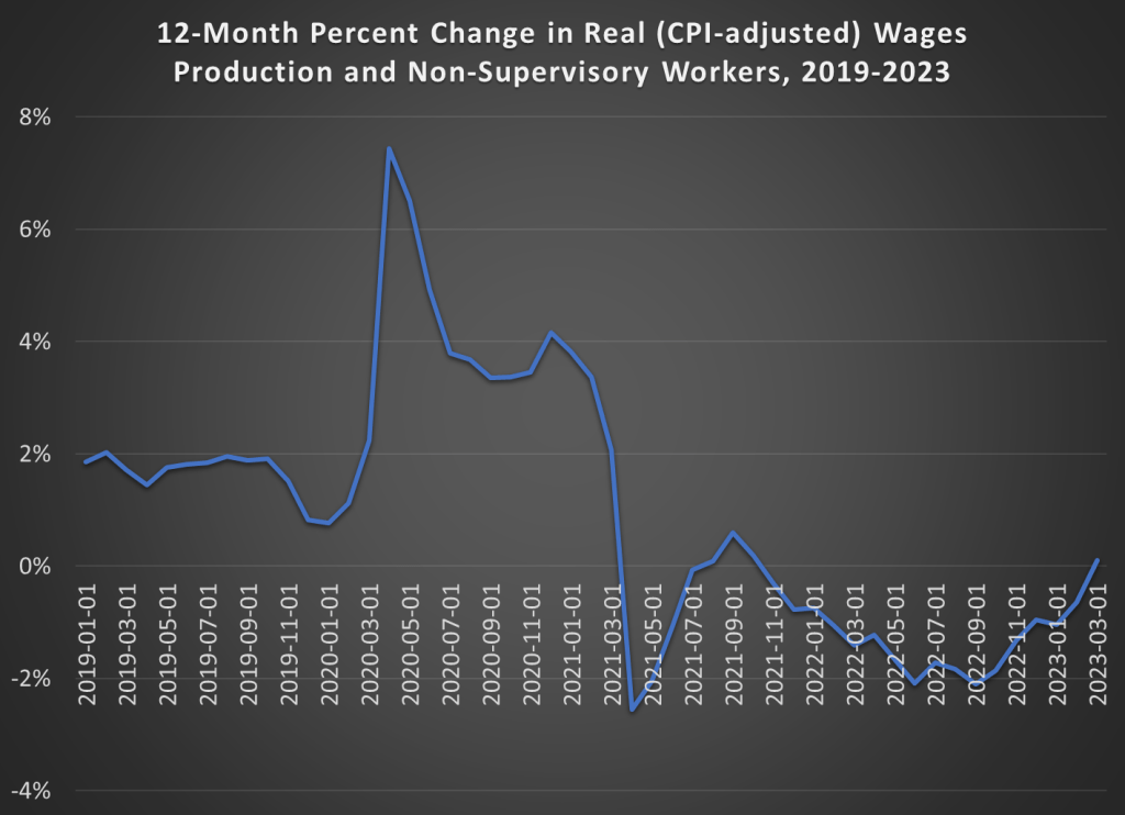
Back in December I pointed out that, thanks to slowing inflation, real wages had been rising since June 2022 (using either the CPI or the PCEPI for inflation adjustments).

With the latest monthly data, we can now report more good news for wage earners: CPI-adjusted wages have increased over the past 12 months. That had happened since 2021. In the past 12 months, wages of production and non-supervisory workers are up 5.1%, just a hair more than the annual increase in the CPI of 5.0%. It’s not much, and we’re not back to our pre-pandemic norm of 2% real wage growth. But it is more good news that we may finally getting past our post-COVID inflationary hangover.

What is $100 from the Late Nineteenth Century Worth Today?

Recently I was watching a lecture by historian Marcus Witcher which addressed the treatment of African Americans in the Jim Crow era. Witcher mentioned the “pig laws,” which were severe legal punishments given to Blacks in the South for what used to be petty crimes. Such as stealing a pig. He mentioned that the fines could be anywhere from $100 to $500, and then he asked me directly: how much is $100 adjusted for inflation today?

My initial, immediate answer was about $3,000. That turns out to be almost exactly correct for around 1880. But the more I thought about it, the more I realized that this wasn’t a satisfactory answer. We were trying to put $100 from a distant past year in context to understand how much of a burden this was for African Americans at the time. Does knowing that adjusted for inflation it’s about $3,000 give us much context?

Continue reading

Inflation-Adjusted Wages Have Been Rising Since June 2022

Back in May 2022, I wrote about the very bad picture for inflation-adjusted wages in the US. While they were still slightly above pre-pandemic levels, wages had been falling consistently since the beginning of 2021.

But since then, we’ve got some better news. The chart below shows the data (note: I’m using wages for private production and non-supervisory workers here, rather than for all private workers in the May post).

While the overall inflation picture still looks bad, with 7.1% annual inflation in the latest report, we also see that in the past 5 months wage growth has exceeded CPI growth. It’s also been true compared with the PCE price index for the past 4 available months (November PCE data won’t be available until next Friday). Inflation has cooled slightly in the past few months, while wages have continued to grow.

This all means that real (inflation-adjusted) average wages in the US have been rising consistently since June 2022. Finally, some good news!

Thanksgiving Dinner is Once Again More Expensive (But Not the Most Expensive Ever)

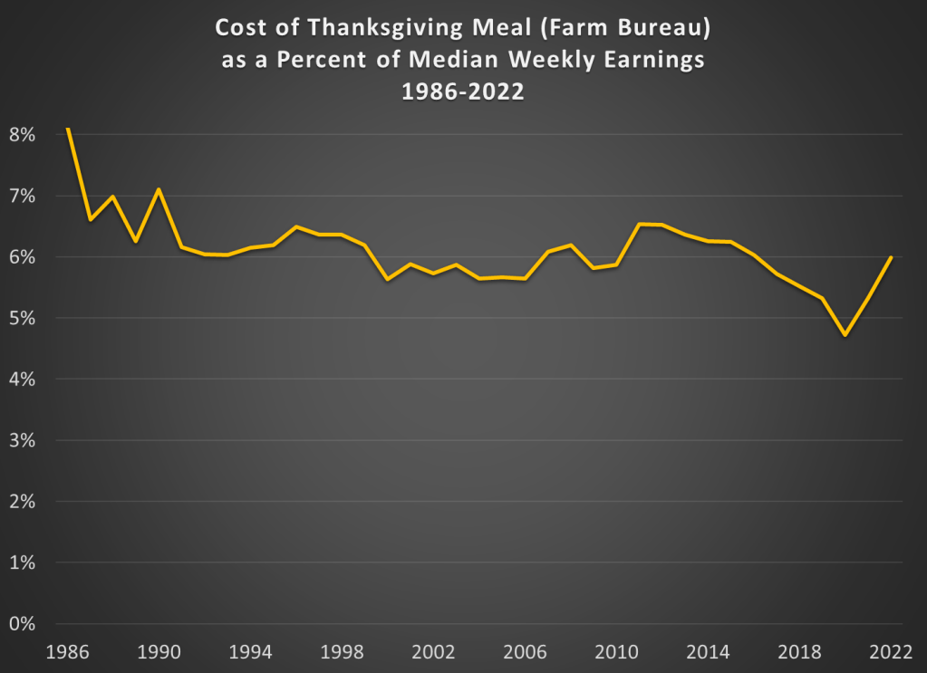
Last year inflation hadn’t quite hit the levels we would see in 2022, but they were already rising. When Thanksgiving rolled around, many media sources were reporting that it was the “most expensive Thanksgiving ever.” In nominal terms that was true, though in nominal terms it isn’t that surprising. In a post last year, I compared the prices of Thanksgiving dinners (using the same data from Farm Bureau) to median earnings going back to 1986. While 2021 was more expensive the 2020, it turned out it was still the second lowest it had been since 1986.

As you might expect, this year’s Thanksgiving dinner is even more expensive than last year in nominal terms. It’s up about 20% since last year or over $10 more, according to Farm Bureau. That’s certainly more than the overall rate of inflation (7.7% in the past 12 months) and more than inflation for groceries (12.4% in the past 12 months). But how does that compare with median wages? Comparing the 3rd quarter of this year with the same quarter in 2021, median wages are only up about 7%, certainly not enough to keep up with those rising turkey prices.

When we add 2022 to the historical chart, here’s what it looks like.

The spike in the last 2 years is clear in the chart but notice that at about 6% of median weekly earnings, we have essentially returned to the average level of the entire series. From 2017-2021, we could be thankful that the price of your Thanksgiving dinner had dropped below that 6% level. We’ll have to find something else to be thankful for this year.