If you’re like me, then you are very fond of food. What determines the price of food? Supply and demand of course!
We can consider food as a commodity because just about anyone can buy and sell it. Almost all foods have partial substitutes. Therefore, the long-run price in the competitive market for food is largely dictated by the marginal cost. Demand has an impact on the price only in the short run.
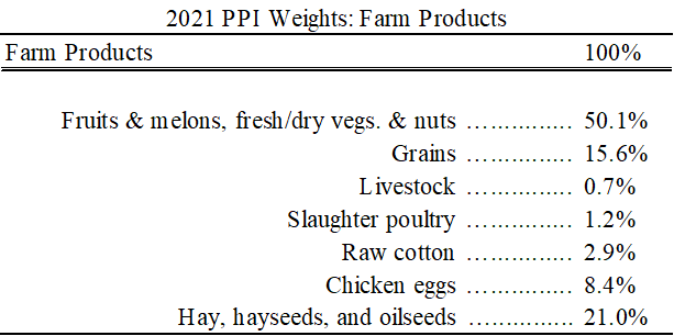
A long-run driver of food prices are the costs that food producers face. The US Bureau of Labor Statistics divides the Producer Price Index into multiple categories that are relevant for a variety of sectors and points within the production process. Below is a table of the most fundamental, relatively unprocessed farm products and their weight among all farm products in December 2021. Cotton is a relatively large component for farm products even though it’s not a food and I include it for completeness. Fruits, veggies, and nuts makeup the overwhelming proportion of the cost of farm products. I was at first surprised that grains composed such a small proportion. But, being dirt cheap, it makes sense.
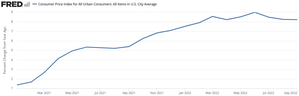
We all know that inflation has been in the news. It’s been elevated since the second quarter of 2021. Consumer prices tend to lag producer prices. One indicator of where food prices will be in the near future is where the producer prices are now. Below is a graph that displays the above seasonally adjusted farm product prices since the start of 2021*.
My wife and I have different preferences for the kind of gifts that we like to receive. She likes earrings, flowers, massages, and electronics. I like hand tools, power tools, and any other item that makes domestic life more efficient. I can really appreciate a nice new pair of dockers or a button-down.
If you have a dad, husband, or anyone else in your life who appreciates practical gifts, then this list is for you. Below are four gift ideas that are sure to make the practical person in your life very happy – even if they may not be what you would want to receive. I’ve personally vetted all of the below items, so I can attest to the satisfaction that they are sure to provide that hard-to-shop-for person.
Is your life in disarray? Are your cords and chargers in disarray? Then look no further. Nothing compares to the knowledge that the nest of cords behind your wall unit is no more. Use Velcro to bind and truncate your computer cords and your kitchen appliance cords. Do you have a drawer or box full of tangled extras? Velcro is nice because you can cut it to your custom length and reuse it with minimal loss of life. You can also use it in electrical applications or in the cabin of your vehicle. Do you have a phone charger beside your bed that keeps falling on the ground? Just Velcro it to the nightstand lamp and it will stay exactly where you want it. AND, because it’s reusable, you can easily remove it and keep the cords in your luggage nice and compact.
Growing stuff is hard. But flowers, greenery, or even vegetables are nice. Yes, I’m basically recommending that you give someone dirt. But it’s awesome dirt. There’s this stuff called coconut coir. It’s coconut fiber that’s been compressed into a small disc or brick that’s ideal for shipping and delivery. Just add water and you’ve got some fancy dirt just waiting for an application. Coconut coir is all plant-based material, drains well, and it’s easy to store. You may not think of dirt as something that has a shelf life, but regular potting soil can definitely grow some unsavory things if you let it sit for long enough. Coconut coir is the solution to all of your spur of the moment small-scale horticultural endeavors.
Shipping items to our homes has been a game changer for shopping. But home delivery is not sensible for low priced heavy items like some liquids. My family was frequently running out of windshield wiper fluid and we’d end up stopping at a grocery store and overpaying. But no more! Qwix Mix is a windshield wiper fluid concentrate. Just an ounce in addition to a gallon of water saves us unplanned trips, high prices, and the storage cost of purchasing gallons of fluid ahead of time. I can’t vouch for the de-icing formulation, but the southern climate formula does exactly what it’s supposed to do.
Since the Covid recession, many of us have taken up our hand at cutting hair at home. For a while, we were borrowing a neighbor’s clippers. They were loud and had a short cord. But I’ve since purchased Ufree clippers and they are so much more convenient. They’re quiet, cordless, charge with a USB cord, and have a battery level display. But the battery lasts so long that you don’t even need to think about it. This kit comes with a beard trimmer, several guards, and a cape (throw the cape away, it’s bad). The clippers are metal and have some heft to them. Several colors are available – they come in black, silver, and gold finishes. But how can one not choose the gold ones?
That’s my list of great gifts for practical people. IDK your gift limit, but if you buy all 4 of these gifts you’ll spend about $100. That might leave room left over for stocking stuffers and chocolate.
(We’re not paid for any of these recommendations. But using our links is always helpful.)
I teach macroeconomics, finance, and other things.
Often, I use Excel to complete repetitive calculations for my students. The version that I show them is different from the version that I use. They see a lot more mathematical steps displayed in different cells, usually with a label describing what it is. But when I create an answer calculator or work on my own, I usually try to be as concise as possible, squeezing what I can into a single cell or many fewer cells. That’s what brings me to to the sumproduct excel function that I recently learned. It’s super useful I’ll illustrate it with two examples.
Example 1) NGDP
One way to calculate NGDP is to sum all of the expenditures on the different products during a time period. The expenditures on a good is simply the price of the good times the quantity that was purchased during the time period. The below image illustrates an example with the values on the left, and the equations that I used on the right. That’s the student version. There is an equation for each good which calculates the total expenditure on the individual goods. Then, there is a final equation which sums the spending to get total expenditures, or NGDP.
People were all excited last week when the CPI numbers were released because… the year-over-year rate of inflation did a whole lot of nothing. See below. The 12-month rate of inflation was practically constant. The 8.2% number was all over the headlines and twitter. We already know that news outlets don’t always report on the most relevant numbers. And I say that this is one of those times.
First of all, there is a problem with the year-over-year indicator. Well, not so much problem in the measure itself, but more a problem of interpretation. The problem is that the 12-month rate of inflation is the cumulative compound rate for 12 individual months. Each month that we update the 12-month inflation rate, we drop a month from the back of the 12-month window and we add a month to the front of the 12-month window. Below are both a graph and a table indicating the monthly rate of inflation and the 12-month periods ending in August 2022 (pink) and in September 2022 (green).
The younger, high school and undergrad version of me was not the best person. My sense of humor was too dark and I didn’t much care about the experience of other people. When I went to grad school, I was so excited. I would finally be around other economists and I would be able to drop all of the niceties, empty social signals, and fuzziness that I thought non-economists employed. And I was oh so very wrong.
It turned out that economists are also human beings and that no amount of self-congratulatory Spock-praising would stop that from being the case. Indeed, with some candid feedback, I became convinced that I was in desperate need of the kind of prosocial norms that could help me to better produce social capital. In other words, I needed to figure out how to get along. Below is some advice that I’ve found pivotal. Maybe you can share it with another person who might be well-served by reading it too.
Below are six norms that are good to employ in order to improve social cohesion, agreeableness, and, frankly, better mental health. And these aren’t just for economists. I suspect that there are plenty of people (maybe young men) who can benefit from what took me too long to learn. So here we go!
Michael Maynard and I wrote about giving a good gift. A good gift is one in which the giver has an information advantage. Gifting an object or a service can provide a consumption bundle to the recipient that they didn’t know was even possible or that they didn’t know that they would prefer. They would have chosen the items themselves, if only they had known about them. Giving a gift card can be similar if the recipient did not know about the vendor previously. Cash is a good gift when the giver does not have an information advantage over the recipient.
In our previous post, we showed diagrammatically that ‘better off’ was indicated by the higher utility. But this spurs an important question:
We are living in volatile times. With covid-19, big federal legislation packages, and the Ruso-Ukrainian conflict disruptions to grain, seed oils, and crude oil, relative prices are reflecting sudden drastic ebbs of supply and demand. I want to make a small but enlightening point that I’ve made in my classes, though I’m not sure that I’ve made it here.
Economists often get a bad rap for being heartless or unempathetic. Sometimes, they are painted as ideologues who just disguise their pre-existing opinions in painfully specific terminology and statistics. Let’s do a litmus test.
Consider two alternative markets. One is a perfect monopoly, the other has perfect competition. All details concerning marginal costs to firms and marginal benefits to consumers are the same. In an erratic world, which market structure will result in greater price volatility for consumers? Try to answer for yourself before you read below. More importantly, what’s your reasoning?
Extreme Market Power
A distinguishing difference between a competitive market and a monopoly concerns prices. While firms maximize profits in both cases, the price that consumers face in a competitive market is equal to the marginal cost that the firms face. There is no profit earned on that last unit produced. In the case of monopoly, the price is above the marginal cost. Profits can be positive or negative, but the consumer will pay a price that is greater than the cost of producing the last unit.
Below are two graphs. Given identical marginal costs of production and benefits that the consumers enjoy, we can see that:
The monopoly price is higher.
The monopoly quantity produced is lower.
But static models only go so far. What about when there is volatility in the world?
Volatile Costs
Oil and gasoline are important inputs for producing many (most?) physical goods. Not only that, they are short-lived, meaning that they disappear once they are used, making them intermediate goods. Therefore, changes in the price of oil constitutes a change in the marginal cost for many firms. If the price of oil rises, or is volatile otherwise, then which type of market will experience greater price and quantity volatility?
Below are two figures that illustrate the same change in the marginal cost. We can see that:
Monopoly price volatility is lower (in absolute terms and percent).
Monopoly quantity produced volatility is lower (in absolute terms, though no different as a percent).
The take-away: While monopoly does constrict supply and elevate prices, Monopoly also reduces price and output volatility when there are changes in the marginal cost.
Volatile Demand
That covers the costs. But what about volatile demand? A large part of the Covid-19 recession was the huge reallocation of demand away from in-person services and to remote services and goods. What is the effect of market power when people suddenly increase or decrease their demand for goods?
Below are two figures that illustrate the same change in demand. We can see that:
Monopoly price volatility is higher (in absolute terms, though no different as a percent).
Monopoly quantity produced volatility is lower (in absolute terms, though no different as a percent).
Monopolies Don’t Cause Inflation
Economists know that inflation can’t very well be blamed on greed (does less greed beget deflation?). Another problematic story is that market concentration contributes to inflation. But the above illustrations demonstrate that this narrative is also a bit silly. Monopolistic markets cause the price level to be higher, it’s true. But inflation is the change in prices. Changing market concentration might be a long term phenomenon, but can’t explain acute price growth. If demand suddenly rises, monopolies result in no more price growth than perfectly competitive markets. If the marginal cost of production suddenly rises, monopolies result in less price growth.
All of this analysis entirely ignores welfare. Also, no market is perfectly competitive or perfectly monopolistic. They are the extreme cases and particular markets lie somewhere in between.
Did you guess or reason correctly? Many econ students have a bias that monopolies are bad. So, in any side-by-side comparison, students think that “monopolies-bad, competition-good” is a safe mantra. But the above illustrations (which can be demonstrated mathematically) reveal that economic reasoning helps to reveal truths about the world. Economists are not simply a hearty band of kool-aid drinking academics.
Last year, our economics department launched a data analytics minor program. The first class is a simple 2 credit course called Foundations of Data Analytics. Originally, the idea was that liberal arts majors would take it and that this class would be a soft, non-technical intro of terminology and history.
However, it turned out that liberal arts majors didn’t take the class and that the most popular feedback was that the class lacked technical challenge. I’m prepping to teach the class and it will have two components. A Python training component where students simply learn Python. We won’t do super complicated things, but they will use Python extensively in future classes. The 2nd component is still in the vein of the old version of the course.
I’ll have the students read and discuss “Big DataDemystified” by David Stephenson. He spends 12 brief chapters introducing the reader to the importance of modern big data management, analytics, and how it fits into an organization’s key performance indicators. It reads like it’s for business majors, but any type of medium-to-large organization would find it useful.
Davidson starts with some flashy stories that illustrate the potential of data-driven business strategies. For example, Target corporation used predictive analytics to advertise baby and pregnancy products to mothers who didn’t even know that they were pregnant yet. He wets the appetite of the reader by noting that the supercomputers that could play Chess or Go relied on fundamentally different technologies.
The first several chapters of the book excite the reader with thoughts of unexploited potentialities. This is what I want to impress upon the students. I want them to know the difference between artificial intelligence (AI) and machine learning (ML). I want them to recognize which tool is better for the challenges that they might face and to see clear applications (and limitations).
AI uses brute force, iterating through possible next steps. There are multiple online tic-tac-toe AI that keep track records. If a student can play the optimal set of strategies 8 games in a row, then they can get the general idea behind testing a large variety of statistical models and explanatory variables, then choosing the best.
But ML is responsive to new data, according to what worked best on previous training data. There are multiple YouTubers out there who have used ML to beat Super Mario Brothers. Programmers identify an objective function and the ML program is off to the races. It tries a few things on a level, and then uses the training rounds to perform quite well on new levels that it has never encountered before.
There are a couple of chapters in the middle of the book that didn’t appeal to me. They discuss the question of how big data should inform a firm’s strategy and how data projects should be implemented. These chapters read like they are written for MBAs or for management. They were boring for me. But that’s ok, given that Stephenson is trying to appeal to a broad audience.
The final chapters are great. They describe the limitations of big data endeavors. Big data is not a panacea and projects can fail for a variety of what are very human reasons.
Stephenson emphasizes the importance of transaction costs (though he doesn’t say it that way). Medium sized companies should outsource to experts who can achieve (or fail) quickly such that big capital investments or labor costs can be avoided. Or, if internals will be hired instead, he discusses the trade-offs between using open source software, getting locked in, and reinventing the wheel. These are a great few chapters that remind the reader that data scientists and analysts are not magicians. They are people who specialize and can waste their time just as well as anyone else.
Overall, I strongly recommend this book. I kinda sorta knew what machine learning and artificial intelligence were prior to reading, but this book provides a very accessible introduction to big data environments, their possible uses, and organizational features that matter for success. Mid and upper level managers should read this book so that they can interact with these ideas prudentially. Those with a passing interest in programming should read it for greater clarity and to get a better handle on the various sub-fields. Hopefully, my students will read it and feel inspired to be on one side or the other of the manager- data analyst divide with greater confidence, understanding, and a little less hubris.
I love data, I love maps, and I love data visualizations.
While we tend not to remember entire data sets, we often remember some patterns related to rank. Speaking for myself anyway, I usually remember a handful of values that are pertinent to me. If I have a list of data by state, then I might take special note of the relative ranking of Florida (where I live), the populous states, Kentucky (where my parents’ families live), and Virginia (where my wife’s family lives). I might also take special note of the top rank and the bottom rank. See the below table of liquor taxes by State. You can easily find any state that you care about because the states are listed alphabetically.
A ranking is useful. It helps the reader to organize the data in their mind. But rankings are ordinal. It’s cool that Florida has a lower liquor tax than Virginia and Kentucky, but I really care about the actual tax rates. Is the difference big or small? Like, should I be buying my liquor in one of the other states in the southeast instead of Florida? Without knowing the tax rates, I can’t make the economic calculation of whether the extra stop in Georgia is worth the time and hassle. So, the most useful small data sets will have both the ranking and the raw data. Maybe we’re more interested in the rankings, such as in the below table.
But, tables take time to consume. A reader might immediately take note of the bottom and top values. And given that the data is not in alphabetical order, they might be able to quickly pick out the state that they’re accustomed to seeing in print. But otherwise, it will be difficult to scan the list for particular values of interest.
On May 6, 2022, the governor of Florida, Ron DeSantis, signed House Bill 7071. The bill was touted as a tax-relief package for Floridians in order to ease the pains caused by inflation. In total, the bill includes $1.2 billion in forgone tax revenues by temporarily suspending sales taxes that are levied on a variety of items that pull at one’s heartstrings. Below is the list of affected products.
A minor political point that I want to make first is that the children’s items are getting a lot of press, but they are only about 18.4% of the tax expenditures. The tax break on hurricane windows and doors received 37% of the funds and gasoline is receiving another 16.7%. There are ~$150 million in additional sales, corporate, and ad valorem tax exemptions. Looking at the table, it seems that producers of hurricane windows and doors might be the biggest beneficiary and that that the children’s items are there to make the bill politically palatable. Regardless, this is probably not the best use of $1.2 billion.
There are at least three economic points worth making.