Protests Erupt Across China Over COVID Policy But Lockdowns Continue: Why?

Headlines in today’s financial news include items like “Clashes in Shanghai as COVID protests flare across China“ from Yahoo Finance. There have been widespread protests this week, which are normally a rarity under the authoritarian regime, and are being suppressed by any means necessary. Apple stock is down about 4% in the past two trading days on fears that iPhone shortages will get worse due to worker unrest in the giant Foxconn factory in Zhengzhou. Wall Street keeps hoping the China will loosen up, since the lockdowns on the world’s second-largest economy are a drag on global markets.

China has pursued a “zero-COVID” policy, of strict mass lockdowns to halt any spread of the virus. Residents have been confined to their apartments for over 3 months in some cases. Whole cities with tens of millions of people have been locked down for months at a time whenever a number of cases are spotted. China’s economic growth has stagnated, and unemployment among young people has risen to 20%, which has helped fuel unrest.  Chinese people are aware that the rest of the world has moved on from mass lockdowns, and may be realizing the futility of thinking that lockdowns can stave off the virus indefinitely.

Given its discomfort with widespread discontent and protests, why does the Chinese government persist in this policy? An article in the Atlantic by Michael Shuman answers that question: “Zero COVID Has Outlived Its Usefulness. Here’s Why China Is Still Enforcing It. “  Back in 2020 when COVID first swept through the world, the strict lockdowns (readily enforced in an authoritarian regime) seemed like a big win for the Chinese leadership:

When the outbreak began in Wuhan in early 2020, the virus was unknown, vaccines were unavailable, and China’s poorly equipped health system could have quickly become overwhelmed by a sweeping pandemic. Yet the policy had a political element from the very beginning as well. The Communist Party is adept at sniffing out threats to its rule, and it quickly identified COVID as one of them. A major public-health crisis, with millions dying, would have raised serious doubts about the regime’s competence, which is, in effect, its sole claim to legitimacy.

Worse, the party could have faced a populace that directly blamed it for the outbreak—with good reason. The Chinese authorities at both the national and local levels botched their initial response to the novel coronavirus, suppressing information about its discovery by a Wuhan doctor and acting far too slowly to contain the initial spread. Sensing its potential vulnerability, the party shifted into anti-COVID overdrive, shutting down large swaths of the country, with the result that it did succeed in snuffing out an epidemic in a matter of weeks, even as it spread to the rest of the world.

That success allowed the Communist Party to transform a potential tragedy into a public-relations triumph. Within weeks of the Wuhan outbreak, China’s propaganda machine was touting the wonders of its virus-busting methods. And as the U.S. and other Western countries struggled to contain the disease, Beijing’s big win became even more valuable as evidence that its authoritarian system was more capable and caring than any democratic one. Beijing and its advocates pointed to rising case and death counts in the U.S. as proof of China’s superiority and American decline.

A number of other countries including Australia and New Zealand also implemented strict (stricter than in the U.S.) lockdown measures in 2020, and, like China, experienced far less impact from the virus in that timeframe than seen in the U.S. However, most of these measures were lifted in 2021. The widespread application of mRNA vaccines like those from Pfizer and Moderna in the West has served to mitigate the severity of the viral infection. Also, some measure of herd immunity has been achieved by the widespread exposure to COVID in the population; antibodies persist for at least eight months after contracting the disease. So, what’s up with China?

China has resisted using Western vaccines, relying instead on homegrown vaccines which are less effective, though they do give some measure of protection.  Also, “The additional layers of high-tech surveillance adopted in the name of pandemic prevention can be used to enhance the tracking and monitoring of the populace more generally,” which is another win for the government. However, the major factor is that the Party, and especially President Xi, cannot afford to loosen up now and risk an embarrassing explosion of cases that would overburden the healthcare system and probably lead to millions of deaths:

The victory of zero COVID was claimed not just as the party’s but as Xi Jinping’s in particular. The State Council, China’s highest governing body, declared in a 2020 white paper that Xi had “taken personal command, planned the response, overseen the general situation and acted decisively, pointing the way forward in the fight against the epidemic.”

This narrative became entrenched. If Beijing loosened up and allowed COVID to run amok, the Chinese system would appear no better than those of loser democracies, and Xi would seem like another failing politician, a mere mortal, not the virus-fighting superhero he was painted as. Zero COVID’s failure would be a disaster for the Communist Party’s veneer of infallibility.

So the leadership insists on zero COVID and damn the consequences.
Can You Use an Expired Home COVID Test?

Using a COVID test is a fairly serious matter – the results of such tests drive decisions on staying home and isolating or not, which in turn affect the spread of the virus in the population. I am known to use medicines that maybe expired six months earlier, figuring that the med will still be say 80% effective, but for a COVID test I want it to be as accurate as possible.

We all have on our shelves boxes of rapid COVID tests which were send out by the government in the first half of 2022. Most of these tests had nominal six-month lives, so according to what is stamped on the box, they are expiring right about now.

But wait – – that six-month life was just a (conservative) estimate from back when the tests were manufactured. For about a dozen out of the original 22 approved tests, subsequent data has shown that the tests remain accurate for longer than six months. Typically, the approved life is extended an additional six months or more. So before using or throwing out a box whose stamped expiration date has passed, go to this FDA link. You can quickly find your brand of test. The instructions for using this site are:

To see if the expiration date for your at-home OTC COVID-19 test has been extended, first find the row in the below table that matches the manufacturer and test name shown on the box label of your test.   

  • If the Expiration Date column says that the shelf-life is “extended,” there is a link to “updated expiration dates” where you can find a list of the original expiration dates and the new expiration dates.  Find the original expiration date on the box label of your test and then look for the new expiration date in the “updated expiration dates” table for your test.   
  • If the Expiration Date column does not say the shelf-life is extended, that means the expiration date on the box label of your test is still correct.  The table will say “See box label” instead of having a link to updated expiration dates.  

A couple more notes re COVID Tests:

( 1 ) The tests do detect the omicron BA.5 subvariant, which has driven much of the infections lately. However, if you have been exposed to COVID, the new recommendation is to take three (instead of just two) tests, at least 48 hours apart. (If you take the test too early, not enough antigen has built up to detect, so you might get a false negative).

( 2 ) Although the initial federal program for free tests has expired, there are several ways to still get free tests. Any health insurer will pay for them, as will Medicare. And there are other venues for uninsured or low-income people. See this article.

Is the Bottom Quartile Already in Recession?

I heard on a radio interview that spending by the bottom quartile is way down in 2022, while it is holding up merrily for the upper two quartiles. My mind jumped to the thesis:

“Hmm, the bottom quartile probably (proportionately) felt the benefit of the three COVID stimulus packages more, plus they would have benefited more, proportionately, from the enhanced 2020-2021 unemployment benefits, which (I gathered from anecdotal observations) often paid them more for staying home than they used to receive for working. But…by 2022, all that extra money may be running out.”

I spent some time poking around the internet, trying to find some pre-made figures or tables to support or disprove this thesis. What I found tended to support it, but this is not rigorous data-mining. So, for what it is worth, here are some  charts.

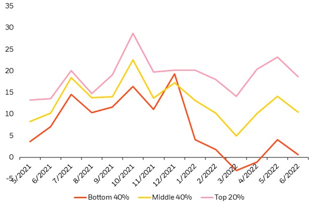
First, about the spending in 2022. This chart indicates that discretionary service spending by the bottom 40% income cohort is indeed down sharply in  2022, and now sits a little lower than a  year ago, while the upper 20% cohort is spending actually more than a year ago.  Spending by the middle 40% trended up in 2H 2021, then back down in 1H 2022, to end about even over the past 12 months:

Discretionary service consumption by income cohort. (I don’t what the units are for the y-axis, but presumably they show the trends). Source: Earnest Research, as of June 30, 2022, as reproduced by Blackrock.

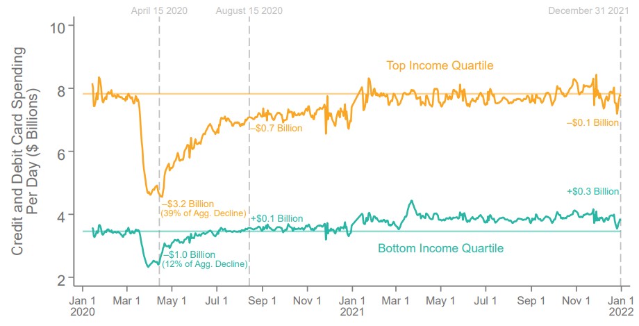
And what about 2020-2021? The next two charts indicate (a) that consumer spending was HIGHER in 2021 that it was pre-COVID for the bottom income quartile, even though (b) their employment in 2021 remained some 20% LOWER than pre-COVID. Looks to me like a lot of spending of stimmie checks was going on in 2021, but (see above) that money has run out in 2022.

Some reader here may have access to a more consistent data set, so I am happy to see this thesis tested further.

Consumer Spending by Income Quartile (Showing higher spending by bottom quartile following stimulus checks and enhanced unemployment payments in 2020-2021)  Source: The Economic Impacts of COVID-19: Evidence from a New Public Database Built Using Private Sector Data, Stepner et al. (2022).

Employment Changes by Wage Quartile ( Showing employment for the bottom quartile in most of 2021 was some 20% lower that pre-COVID)  Source: The Economic Impacts of COVID-19: Evidence from a New Public Database Built Using Private Sector Data, Stepner et al. (2022)   

Market Concentration & Inflation

We are living in volatile times. With covid-19, big federal legislation packages, and the Ruso-Ukrainian conflict disruptions to grain, seed oils, and crude oil, relative prices are reflecting sudden drastic ebbs of supply and demand. I want to make a small but enlightening point that I’ve made in my classes, though I’m not sure that I’ve made it here.

Economists often get a bad rap for being heartless or unempathetic. Sometimes, they are painted as ideologues who just disguise their pre-existing opinions in painfully specific terminology and statistics. Let’s do a litmus test.

Consider two alternative markets. One is a perfect monopoly, the other has perfect competition. All details concerning marginal costs to firms and marginal benefits to consumers are the same. In an erratic world, which market structure will result in greater price volatility for consumers? Try to answer for yourself before you read below. More importantly, what’s your reasoning?

Extreme Market Power

A distinguishing difference between a competitive market and a monopoly concerns prices. While firms maximize profits in both cases, the price that consumers face in a competitive market is equal to the marginal cost that the firms face. There is no profit earned on that last unit produced. In the case of monopoly, the price is above the marginal cost. Profits can be positive or negative, but the consumer will pay a price that is greater than the cost of producing the last unit.

Below are two graphs. Given identical marginal costs of production and benefits that the consumers enjoy, we can see that:

  1. The monopoly price is higher.
  2. The monopoly quantity produced is lower.

But static models only go so far. What about when there is volatility in the world?

Volatile Costs

Oil and gasoline are important inputs for producing many (most?) physical goods. Not only that, they are short-lived, meaning that they disappear once they are used, making them intermediate goods. Therefore, changes in the price of oil constitutes a change in the marginal cost for many firms. If the price of oil rises, or is volatile otherwise, then which type of market will experience greater price and quantity volatility?

Below are two figures that illustrate the same change in the marginal cost. We can see that:

  1. Monopoly price volatility is lower (in absolute terms and percent).
  2. Monopoly quantity produced volatility is lower (in absolute terms, though no different as a percent).

The take-away: While monopoly does constrict supply and elevate prices, Monopoly also reduces price and output volatility when there are changes in the marginal cost.  

Volatile Demand

That covers the costs. But what about volatile demand? A large part of the Covid-19 recession was the huge reallocation of demand away from in-person services and to remote services and goods. What is the effect of market power when people suddenly increase or decrease their demand for goods?

Below are two figures that illustrate the same change in demand. We can see that:

  1. Monopoly price volatility is higher (in absolute terms, though no different as a percent).
  2. Monopoly quantity produced volatility is lower (in absolute terms, though no different as a percent).

Monopolies Don’t Cause Inflation

Economists know that inflation can’t very well be blamed on greed (does less greed beget deflation?). Another problematic story is that market concentration contributes to inflation. But the above illustrations demonstrate that this narrative is also a bit silly. Monopolistic markets cause the price level to be higher, it’s true. But inflation is the change in prices. Changing market concentration might be a long term phenomenon, but can’t explain acute price growth. If demand suddenly rises, monopolies result in no more price growth than perfectly competitive markets. If the marginal cost of production suddenly rises, monopolies result in less price growth.

All of this analysis entirely ignores welfare. Also, no market is perfectly competitive or perfectly monopolistic. They are the extreme cases and particular markets lie somewhere in between.

Did you guess or reason correctly? Many econ students have a bias that monopolies are bad. So, in any side-by-side comparison, students think that “monopolies-bad, competition-good” is a safe mantra. But the above illustrations (which can be demonstrated mathematically) reveal that economic reasoning helps to reveal truths about the world. Economists are not simply a hearty band of kool-aid drinking academics.

Covid-19 Didn’t Break the Supply Chains. You Did.

This is my last post in a series that uses the AS-AD model to describe US consumption during and after the Covid-19 recession. I wrote about US consumption’s broad categories, services, and non-durables. This last one addresses durable consumption.

During the week of thanksgiving in 2020, our thirteen-year-old microwave bit the dust. NBD, I thought. Microwaves are cheap, and I’m willing to spend a little more in order to get one that I think will be of better quality (GE, *cough*-*cough*). So, I filtered through the models on multiple websites and found the right size, brand, and wattage. No matter the retailer, at checkout I learned that regardless of price, I’d be waiting a good two months before my new, entirely standard, and unexceptional microwave oven would arrive. I’d have to wait until the end of January of 2021.

¡Que Ridiculo!

Continue reading

AS-AD: From Levels to Percent

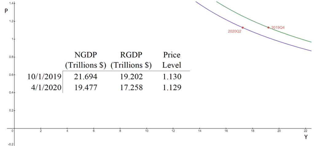
The aggregate supply & aggregate demand model (AS-AD) is nice because it’s flexible and clear. Often professors will teach it in levels. That is, they teach it with the level of output on one axis, and the price level on the other axis. This presentation is convenient for the equation of exchange, which can be arranged to reflect that aggregate demand (AD) is a hyperbola in (Y, P) space. Graphed below is the AD curve in 2019Q4 and in 2020Q2 using real GDP, NGDP, and the GDP price deflator.

The textbook that I use for Principles of Macroeconomics, instead places inflation (π) on the vertical axis while keeping the level of output on the horizontal axis. The authors motivate the downward slope by asserting that there is a policy reaction function for the Federal Reserve. When people observe high rates of inflation, state the authors, they know that the Fed will increase interest rates and reduce output. Personally, I find this reasoning to be inadequate because it makes a fundamental feature of the AS-AD model – downward sloping demand – contingent on policy context.

At the same time, I do think that it can be useful to put inflation on the vertical axis. Afterall, individuals are forward looking. We expect positive inflation because that’s what has happened previously, and we tend to be correct. So, I tell my students that “for our purposes”, placing inflation on the vertical axis is fine. I tell them that, when they take intermediate macro, they’ll want to express both axes as rates of change. I usually say this, and then go about my business of teaching principles.

But, what does it look like when we do graph in percent-change space?

Continue reading

Dressed for Recess(ion)

In my previous post, I decomposed consumer expenditures to figure out which service sectors experienced the largest supply-side disruptions due to Covid-19. I illustrated that transportation & recreation services were the only consumer service to experience substantial and persistent supply shocks. Health, food, and accommodation services also experienced supply shocks, but quickly rebounded. Housing, utility, and financial services experienced no supply disruptions whatsoever.

What about non-durables?

Total consumption spending is the largest category of spending in our economy and is composed of services, durable goods, and non-durables. Services are the largest portion and durable goods compose the smallest portion. So, while there were plenty of stories during the Covid-19 pandemic about months-long delivery times for durables, they did not constitute the typical experience for most consumption.

Even though it’s not the largest category, many people think of non-durables when they think of consumption. Below is the break-down of non-durable spending in 2019. The largest singular category of non-durable spending was for food and beverages, followed by pharmaceuticals & medical products, clothing & shoes, and gasoline and other energy goods. Clearly, the larger the proportion that each of these items composes of an individual household budget, the more significant the welfare implications of price changes.

Continue reading

It’s Still Hard to Find Good Help These Days

Consumption is the largest component of GDP. In 2019, it composed 67.5% of all spending in the US. During the Covid-19 recession, real consumption fell about 18% and took just over a year to recover. But consumption of services, composing 69% of consumption spending, hadn’t recovered almost two years after the 2020 pre-recession peak.  For those keeping up with the math, service consumption composed 46.5% of the economic spending in 2019.

We can decompose service consumption even further. The table below illustrates the breakdown of service consumption expenditures in 2019.

I argued in my previous post that the Covid-19 pandemic was primarily a demand shock insofar as consumption was concerned, though potential output for services may have fallen somewhat. When something is 67.5% of the economy, ‘somewhat’ can be a big deal. So, below I breakdown services into its components to identify which experienced supply or demand shocks. Macroeconomists often get accused of over-reliance on aggregates and I’ll be a monkey’s uncle if I succumb to the trope (I might, in fact be a monkey’s uncle).

Before I start again with the graphs, what should we expect? Let’s consider that the recession was a pandemic recession. We should expect that services which could be provided remotely to experience an initial negative demand shock and to have recovered quickly. We should expect close-proximity services to experience a negative demand and supply shock due to the symmetrical risk of contagion. Finally, we should expect that services with elastic demand to experience the largest demand shocks (If you want additional details for what the above service categories describe, then you can find out more here, pg. 18).

Continue reading

Covid Evidence: Supply Vs Demand Shock

By the time most students exit undergrad, they get acquainted with the Aggregate Supply – Aggregate Demand model. I think that this model is so important that my Principles of Macro class spends twice the amount of time on it as on any other topic. The model is nice because it uses the familiar tools of Supply & Demand and throws a macro twist on them. Below is a graph of the short-run AS-AD model.

Quick primer: The AD curve increases to the right and decreases to the left. The Federal Reserve and Federal government can both affect AD by increasing or decreasing total spending in the economy. Economists differ on the circumstances in which one authority is more relevant than another.

The AS curve reflects inflation expectations, short-run productivity (intercept), and nominal rigidity (slope). If inflation expectations rise, then the AS curve shifts up vertically. If there is transitory decline in productivity, then it shifts up vertically and left horizontally.

Nominal rigidity refers to the total spending elasticity of the quantity produced. In laymen’s terms, nominal rigidity describes how production changes when there is a short-run increase in total spending. The figure above displays 3 possible SR-AS’s. AS0 reflects that firms will simply produce more when there is greater spending and they will not raise their prices. AS2 reflects that producers mostly raise prices and increase output only somewhat. AS1 is an intermediate case. One of the things that determines nominal rigidity is how accurate the inflation expectations are. The more accurate the inflation expectations, the more vertical the SR-AS curve appears.*

The AS-AD model has many of the typical S&D features. The initial equilibrium is the intersection between the original AS and AD curves. There is a price and quantity implication when one of the curves move. An increase in AD results in some combination of higher prices and greater output – depending on nominal rigidities. An increase in the SR-AS curve results in some combination of lower prices and higher output – depending on the slope of aggregate demand.

Of course, the real world is complicated – sometimes multiple shocks occur and multiple curves move simultaneously. If that is the case, then we can simply say which curve ‘moved more’. We should also expect that the long-run productive capacity of the economy increased over the past two years, say due to technological improvements, such that the new equilibrium output is several percentage points to the right. We can’t observe the AD and AS curves directly, but we can observe their results.

The big questions are:

  1. What happened during and after the 2020 recession?
  2. Was there more than one shock?
  3. When did any shocks occur?

Below is a graph of real consumption and consumption prices as a percent of the business cycle peak in February prior to the recession (See this post that I did last week exploring the real side only). What can we tell from this figure?

Continue reading

Half of Deliberately Exposed Unvaccinated Volunteers in UK Study Did Not Get COVID; Why?

A British study by Ben Killingley and 31 co-authors recently appeared in pre-print form, where 36 (heroic) healthy young adult volunteers were deliberately exposed to the Covid virus by nasal drops. These volunteers then went into quarantine for 14 days, and logged their symptoms and were subjected to various tests for a total of 28 days.


Of the 36 subjects, only 18 (53%) became infected with the virus, as determined by PCR testing (the gold standard for Covid tests) and by direct counting of viral loads in mucus cells by FFA.

The study found that viral shedding (as estimated by mucus viral loads) begins within two days of exposure and rapidly reaches high levels, then declines. Viable virus is still detectible up to 12 days post-inoculation. This result supports the practice of people quarantining for at least 10 days after they first exhibit symptoms of infection. There were significant higher viral loads in the nose than in the throat,  which supports the practice of wearing masks that cover the nose as well as the mouth.


The cheap, fast, LFA rapid antigen test method (used in home tests) performed fairly well. Because it is less sensitive, it did not it did not yield positive results for infected individuals until an average of four days after infection, or about two days after viral shedding may have begun. But from four days onward, the LFA method was sensitive and reasonably accurate which supports the ongoing use of these quick, cheap tests.

These direct inclusions from the paper are helpful, but not earthshaking. The elephant in the room, which the paper did not seem to directly address, is why nearly half of the people who were exposed did NOT become infected. This raises all kinds of issues about what mechanisms the human body may have to naturally fight off COVID or similar viral infections. Gaining insight on this could lead to breakthroughs in preventing or mitigating this pernicious virus.

An article by Eileen O’Reilly at Axios probes these questions. There is nothing conclusive out there, but four ideas that are under investigation are:

1. Cross-immunity from the four endemic human coronaviruses is one hypothesis. Those other coronaviruses cause many of the colds people catch and could prime B-cell and T-cell response to this new coronavirus in some people.

2. Multiple genetic variations may make someone’s immune system more or less susceptible to the virus.  Some 20 different genes have been identified which affect the likelihood of severe infection, and a genetic predisposition to not getting infected is seen in other diseases where people have one or multiple factors that interfere with the virus binding to cells or being transported within.

3. Mucosal immunity may play an underrecognized role in mounting a defense.

This suggests nasal vaccines might have a chance at stopping a virus before it invades the whole body.

4. Where the virus settled on the human body, how large the particle was, the amount and length of exposure, how good the ventilation was and other environmental circumstances may also play a role.

These considerations support continuing with the usual recommendations of social distancing, wearing facemasks, and ventilating buildings, especially when caseloads are peaking. Also, the doses administered to the volunteers in the study were considered quite small by clinical standards. It was surprising that such a low dose was effective as it was in causing full-blown infections; and the particular strain used in the experiment was not necessarily one of the more recent highly virulent variants. After reading these results,  it is more understandable to me why so many reasonably careful friends and family members of mine (nearly all vaccinated, fortunately) have come down with (presumably) omicron COVID in the past two months. Just a little dab will do ya.