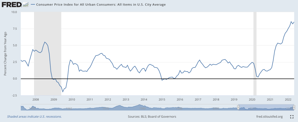
I think so, though the path back to 2% is a long one. Two months ago I wrote that “the Fed is still under-reacting to inflation“. We’ve had an eventful two months since; last Friday the BLS announced CPI prices rose 1% just in May, and that:
The all items index increased 8.6 percent for the 12 months ending May, the largest 12-month increase since the period ending December 1981
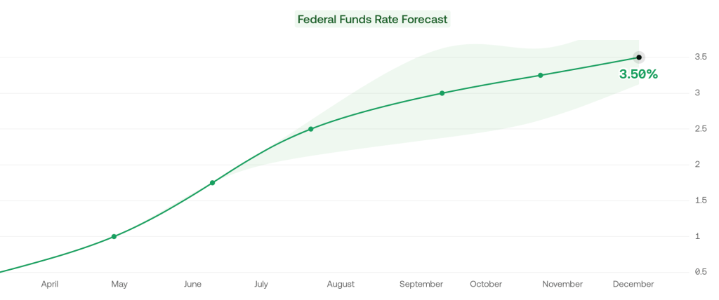
Then this Wednesday the Fed announced they were raising interest rates by 0.75%, the biggest increase since 1994, despite having said after their last meeting that they weren’t considering increases above 0.5%. I don’t like their communications strategy, but I do like their actions this month. This change in the Fed’s stance is one reason I think we’re at or near the peak.
Its not just what the Fed did this week, its the change in their plans going forward. As of April, the Fed said the Fed Funds rate would be 1.75% in December, and markets thought it would be 2.5%. But now the Fed and markets both project 3.5% rates in December.
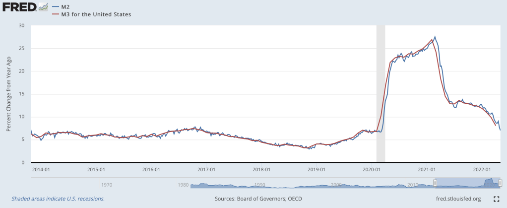
The other reason I’m optimistic is that the days of rapid money supply growth continue to get further behind us. From March to May 2020, the M2 and M3 supply exploded, growing at the fastest pace in at least 40 years:
Rapid inflation began about 12 months later. But the rate of money supply growth peaked in February 2021, then began a rapid decline. Based on the latest data from April 2022, money supply growth is down to 8%, a bit high but finally back to a normal range. Money supply changes famously influence prices with “long and variable lags”, so its hard to call the top precisely. But the fact that we’re now 15 months past the peak of money supply growth (and have stable monetary velocity) is encouraging. Old-fashioned money supply is the same indicator that led Lars Christiansen to predict this high inflation in April 2021 after successfully predicting low inflation post-2009 (many people got one of those calls right, but very few got both).
Stocks also entered an official bear market this week (down 20% from highs), which is both a sign of excess money no longer pumping up markets, and a cause of lower demand going forward.
Markets seem to agree with my update: 5-year breakevens have fallen from a high of 3.6% back in March down to 2.9% today, implying 2.9% average inflation over the next 5 years. Much improved, though as I said at the top the path to 2% will be a long one- think years, not months. Even the Fed expects inflation to be over 5% at the end of this year, and for it to fall only to 2.6% next year.
What am I still worried about? The Producer Price Index is still growing at 20%. The Fed is raising rates quickly now but their balance sheet is still over twice its pre-Covid level and is shrinking very slowly. The Russia-Ukraine war drags on, keeping oil and gas prices high, and we likely still have yet to see its full impact on food prices. Making good predictions is hard.
While I’m sticking my neck out, I’ll make one more prediction, though this one is easier- Dems are in for a bad time in November. A new president’s party generally does badly at his first midterm, as in 2018 and 2010. But this time the economy will be a huge drag on top of that. November is late enough that the real economy will be notably slowed by the Fed’s inflation-fighting effects, but not so late that inflation will be under control (I expect it to be lower than today but still above 5%). Markets currently predict a 75% chance that Republicans take the House and Senate in November, and if anything that seems low to me.
People have expectations about the world. When those expectations are violated, they usually change their behavior in order to account for the new information (on the margin at least). Does unexpected inflation affect people’s behavior? Of course. William Phillips thought so (the famous version of the Phillips Curve assumes constant inflation expectations).
Macroeconomists often separate the world into reals and nominals. Sometimes we produce more and other times we produce less. Those are the reals. The prices that we pay and the money that we spend are the nominals. There is what’s sometimes called a ‘loose joint’ between reals and nominals. That is, they do not move in tandem, nor are they entirely independent. If the Fed suddenly slows the growth of the money supply, then economic activity growth might also slow – but not by the same amount. In the long run, reals and nominals are largely independent. Whether we have 2% vs 3% annual inflation over the course of some decade is probably not important for our real output at the end of that decade.
It Takes Two to Tango.
It is often said that the Fed can achieve any amount of total spending in the economy that it prefers. It can achieve any NGDP. But, the Fed doesn’t control NGDP as a matter of fiat. The Fed changes interest rates and the money supply in order to change the total spending in our economy. Importantly, the effect of Fed policy changes is contingent on how the public reacts. After all, the Fed can increase the money supply. But it is us who decides how much to spend.
The United States is a uniquely violent country among high-income democracies. And by the best available data on homicides, the US has always been more violent. Homicides are useful to look at because we generally have the best data on these (murders are the most likely crime to be reported) and it’s the most serious of all violent crimes.
Just how much more violent is the US than other high-income democracies? As measured by the homicide rate, about 6-7 times as violent. We can see this first by comparing the US to several European countries (and a few groupings of similar countries).
Let me make a few things clear about this chart. First, this is data for homicides, which are typically defined as interpersonal violence. Thus, it excludes deaths on the battlefield, genocides, acts of terrorism (generally speaking), and other deaths of this nature. That’s how it is defined. If we plotted a chart of battlefield deaths, it would look quite different, but there’s not much good reason to combine these different forms of violent death.
On the specifics of the chart, prior to 1990 these data are averages from multiple observations over multi-year timespans (generally 25 or 50 years). The data on European countries comes from a paper by Eisner on long-term crime trends (Table 1). The countries chosen are from this paper, as are the years chosen. Remember that historical data is always imperfect, but these are some of the best estimates available. For the US, I used Figure 5 from this paper by Tcherni-Buzzeo, and did my best to make the timeframes comparable to the Eisner data. The data are not perfect, but I think they are about as close as we can get to long-run comparisons. For the data from 1990 forward, I use the IHME Global Burden of Disease study, and the death rates from interpersonal violence (to match Eisner, I average across grouped countries).
When we average across all the European countries in the first chart and compare the US to Europe, we can see that the US has always been more violent, though the 20th century onwards does seem to show even more violence in the US relative to Europe. (These charts are slightly different from some that I posted on Twitter recently, especially the pre-1990 data as I tried to more carefully use the same periods for the averages — still only take this a rough guide).
And what is the main form by which this violence is carried out? In the US, it is undeniably clear: firearms. Between 1999 and 2020, there were almost 400,000 homicides in the US (using CDC data). Over 275,000 of these, or about 70%, were carried out with firearms. The next largest category is murder with a knife or other sharp object, with about 10% of murders. And homicides have become even more gun-focused in recent years: about 80% of murders in 2020-21 were committed with guns.
So, there’s the data. But the important social scientific question is: Can we do anything about it? Are there any public policies, either about guns or other things, that will reduce gun violence? Could restrictions on gun use actually increase homicides, since no doubt guns are also used defensively?
In July of 1992, the Barenaked Ladies released their debut studio album Gordon, which included one of their most popular songs: “If I Had $1000000.” Considering all the inflation we’ve had recently, you know that $1 million doesn’t buy as much as it did in 1992, but how much less? As measured by the Consumer Price Index in the US, prices have roughly doubled since 1992, meaning you would need about $2 million to buy the same amount of stuff as in 1992.
(Note: the Barenaked Ladies are Canadian, and prices in Canada haven’t quite doubled since 1992, but this song was included on early demo tapes in 1988 and 1989 released in Canada, and prices have roughly doubled there since then.)
So the value of a dollar that you held since 1992 has lost roughly half of its purchasing power. That’s bad. But how bad is it? What’s the normal US experience for how long it takes for prices to double?
It turns out that even with the recent huge run-up in inflation, we just lived through the lowest period of inflation for anyone alive today.
In previous blog posts, I’ve used the Simpsons as an example of a typical family to use for historical comparisons. In a post on mortgage payments, I found that it’s slightly easier to make a mortgage payment on Homer’s salary than in the early 1990s. In a post on taxes, I showed that the Simpsons now pay a much lower average tax rate than they did in the 1990s (guess all those tax cuts didn’t just go to the rich!).
Now, the Simpsons and economics are back at the front of the discourse about standards of living. The 33rd season finale of the show is all about whether the middle class can get by economically these days. And Planet Money’s “The Indicator” podcast (great program!) has a podcast about the show, which is a follow-up to a similar podcast last year called “Are The Simpsons Still Middle Class?” (apparently part of the influence for the recent Simpsons episode).
In that podcast from last year, they say “Tuition has more than doubled. Health care costs have more than doubled. I believe housing costs have more than doubled.” And they follow-up, for good measure with “Even after adjusting for inflation, college tuition has more than doubled since ‘The Simpsons’ started.”
Since we’ve already looked at housing costs for Homer, let’s look at the potential college costs for Bart. I’m going to assume Lisa will be fine, probably getting a free-ride (and a hot plate!) to one of the Seven Sisters or maybe even Harvard. But if Bart wants to go to college, the Simpsons will probably be paying out of pocket.
An important factor to consider when looking at college prices is not just the “sticker price,” or the published price, but to also look at what is known as the “net price.” The net price takes into account the average amount of aid that a student receives. This is important to consider at any time, but especially for data in more recent years since discounting has become a major part of the college pricing landscape. For example, at private colleges the average discount is now over 50%, with some colleges essentially giving some discount to 100% of students (in other words, at some colleges no one actually pays the sticker price). Discounting at public colleges isn’t quite as out-of-control as private colleges, but it’s still a major part of college pricing.
And no doubt Bart Simpson would be going to a traditional public, four-year college. Probably Springfield University, just like his old man (though Homer attended as an adult), located right in their town of Springfield. So what has happened to tuition prices since the early 1990s.
One of the best publications on college prices is the College Board’s annual report “Trends in College Pricing.” The report is broken down by type of college, it shows what factors (tuition, housing, etc.) make up the typical cost of college, and even shows differences across US states. Importantly, they include that “net tuition and fees” number, and they’ve been doing so since their 2003 report. That 2003 report even calculated the net figures back to the 1992-93 school year, perfect for an example of the early Simpsons (“Homer Goes to College” aired in 1993).
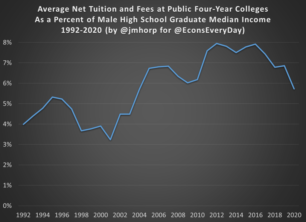
In the 1992-93 academic year, the average net tuition and fees, plus room and board for public four-year colleges in the US was $4,620 (from Figure 7, adjusted back to nominal dollars). In the 2020-21 academic year, the same figure was $15,050 (from Figure CP-9). Adjusted for inflation, that’s roughly a doubling (slightly less, but in the ballpark) since the early 1990s, just as Planet Money stated.
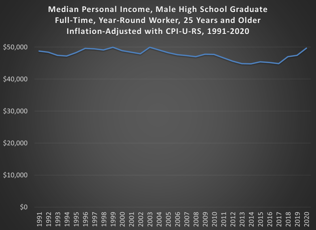
But let’s compare the cost of college to Homer’s income. In 1992, the median male with a high school education, working full-time earned $26,699, meaning that the cost of college would be 17.3% of his income that year. In 2020, the median male with a high school education, working full-time earned $49,661, meaning that the cost of college would be 30.3% of his income.
By this measure, college clearly has become much more expensive when compared to a Homer Simpson-type salary, and 30% of your income is a very hard pill to swallow (though the 17% in 1992 wasn’t a picnic either). But here’s one other factor to consider. The College Board data also allows us to look only at net tuition and fees, rather than also including the cost of room and board. Remember, Springfield University is located in Springfield, and Bart has a perfectly fine room at the house on Evergreen Terrace. While living on campus is certainly a big part of the college experience, and no one would probably love that experience more than Bart Simpson, many students today do choose to live with their parents while attending college (or at least live off-campus, where housing is often cheaper).
If we just look at net tuition and fees (not room and board), in 1992-93 the average cost at public four-year colleges was about $1,065 (in nominal dollars). That’s about 4% of Homer’s annual income. Much more reasonable! In 2020-21, that same figure was $2,880 (once again, in nominal dollars), or just under 6% of annual income. That’s certainly more than 4%, but not exactly the kind of expense that would break the budget if planned for.
I want to repeat that number again: $2,880. That was the average cost of tuition and fees at an in-state, four-year, public college in the US in 2020-21, after accounting for grants and aid. I suspect this number is much, much lower than most would guess.
The chart below does the same calculation for all the years I could find (1992-2020) using archived versions of the College Board’s report. I’ll admit the data isn’t perfect, as later reports sometimes have different numbers than earlier reports, but it’s probably the best we can do if we want a consistent time series. There does seem to be a break happening in the early 2000s, when college suddenly did get more expensive relative to a high school graduate’s income, though in the past 15 years it’s been pretty flat.
We should keep in mind that if Bart were to take out the maximum federal student loan amount of $9,000 as a dependent student in his first year at Springfield University, he is primarily borrowing money to pay for his housing and food, not his education.
In 1993, the premium for getting a college degree was about 54%, with the median male college grad earning about $41,400 and the equivalent high school grad earning about $26,800 (data from Table P-24). In 2021, that premium had risen to about 64%, with the median male college grad earning $81,300 compared with his high school counterpart earning about $49,700.
I’m ignoring all sorts of important questions here about what is causing the difference in pay. Is it signaling, human capital, something else, or some combination of all these? Yes. But regardless of your preferred explanation for the college wage premium, there’s pretty solid evidence of a sheepskin effect.
Putting It All Together
I’ve now explored taxes, housing, and college education prices using a family like the Simpsons. But what if we put it all together? How are high school graduates doing?
The best way to do this is probably the simple chart you’ve been thinking of all along: median income adjusted for inflation. Some things have gotten cheaper (housing, TVs), some more expensive (college, probably healthcare), but to get a sense of the total effect, we need to adjust for all prices. The chart below is that calculation, using Census data on median earnings for full-time, year-round workers, male high school graduates aged 25 and older. The data starts in 1991. You can get some earlier estimates from different data series, but if we want a consistent series 1991 is the best we can do.
And from the chart we see that real incomes of male high school graduates are… pretty flat. That’s not good, but let’s contextualize. First, claims that it’s harder for these workers to make ends meet aren’t true. It’s roughly no easier, but also no harder. Definitely wage stagnation, but also not “falling behind.”
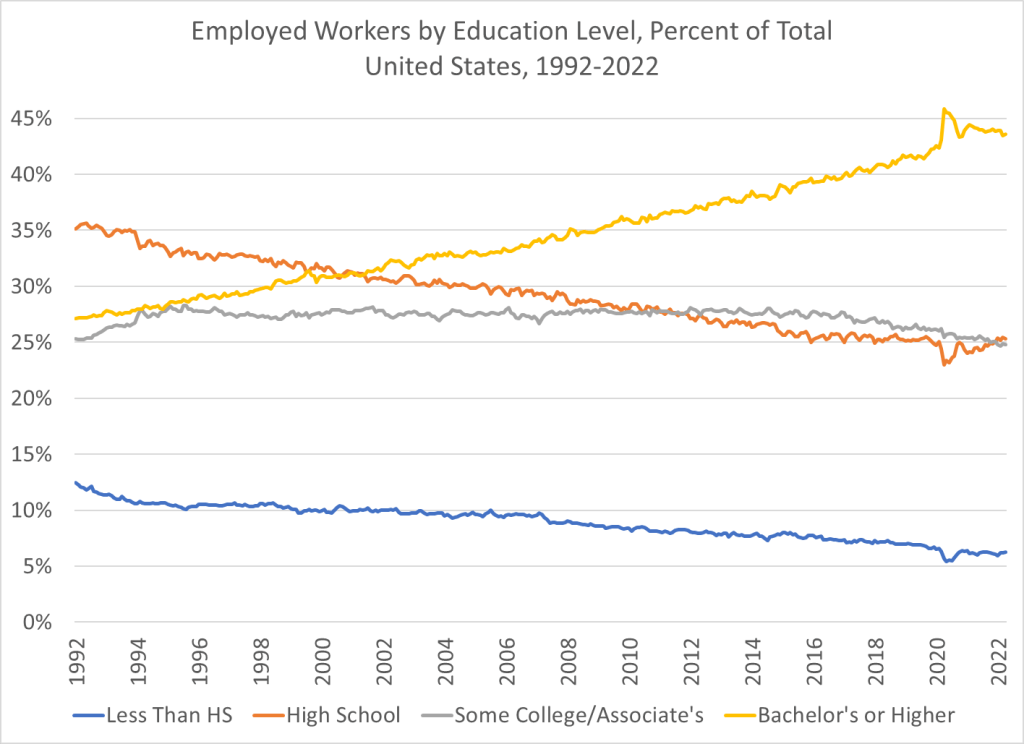
And also, high school graduates are a shrinking part of the workforce in the United States. You probably already knew this. But it wasn’t until after the year 2000 that college grads became the largest category of workers in the US. In the early 1990s, high school graduates (folks like Homer) were by far the largest single category of workers. Now, it’s by far college graduates, and those with some college or a 2-year degree are roughly equal in size to high school graudates. So, while the income stagnation we see for high school grads is not good, it’s affecting a shrinking portion of workers in the US.
According to the latest data, about one in four facilities doesn’t accept private insurance or Medicaid, and more than half don’t accept Medicare. This makes substance use treatment something of an outlier, since 91% of all US health spending is paid for through insurance. Still, there are many reasons to prefer being paid in cash: insurance might reimburse at low rates, impose administrative hassles, and generally try to tell you how to run things.
Providers generally put up with the hassles of insurance because they see the alternative as not getting paid. But if demand for their services gets high enough that they can stay busy with patients paying cash, they will often try going cash-only. Some try to generate high demand by providing excellent service. Sometimes high demand comes from a growing health crisis, as with opioids.
Demand can also be high relative to supply because supply is restricted. US health care is full of supply restrictions, but in this case I wondered if Certificate of Need laws were playing a role. As we’ve written about previously, CON laws require health care providers in 34 states to get the permission of a government board to certify their “economic necessity” before they can open or expand. But there’s a lot of variation from state to state in what types of services are covered by this requirement; acute hospital beds and long-term care beds are most common. 23 states require substance use treatment facilities to obtain a CON before opening or expanding.
States with Substance Use–Treatment CON Laws in 2020. Created using data from Mitchell, Philpot, and McBirney
How do these laws affect substance use treatment? We didn’t really know- only one academic article had studied substance use CON, finding it led to fewer facilities in CON states. But I’ve studied other types of CON, so I joined forces with Cornell substance use researcher Thanh Lu and my student Patrick Vogt to investigate. The resulting article, “Certificate-of-need laws and substance use treatment“, was just published at Substance Abuse Treatment, Prevention, and Policy. Here’s the quick summary:
We find that CON laws have no statistically significant effect on the number of facilities, beds, or clients and no significant effect on the acceptance of Medicare. However, they reduce the acceptance of private insurance by a statistically significant 6.0%.
Overall I was surprised that CON didn’t significantly affect most of the outcomes we looked at, and appears to be far from the main reason that treatment facilities don’t take insurance. Still, repealing substance use CON would be a simple way to improve access to substance use treatment, particularly since CON doesn’t appear to bring much in the way of offsetting benefits.
Going forward I aim to investigate how these laws affect health outcomes like overdose rates, and to dig more into the text of state laws and regulations to determine exactly what is covered by substance use CON in different states. As the article explains, we identified several errors in the official data sources we were using. This makes me worry there are more errors we didn’t catch, and there are certainly things the sources just don’t specify, like in which states the laws apply to outpatient facilities. So I hope we (or someone else) will have even better work to share in the future, but for now this article is as good as it gets, and we share our data here.
While we know that COVID primarily affects the elderly, the mortality and other effects on the non-elderly aren’t trivial. I have explored this in several past posts, such as this November 2021 post on Americans in their 30s and 40s. But now we have more complete (though not fully complete) mortality data for 2021, so it’s worth revisiting the question of COVID and the non-elderly again.
For this post, I will primarily focus on the 12-month period from November 2020 through October 2021. While data is available past October 2021 on mortality for most causes, data classified by “intent” (suicides, homicides, traffic accidents, and importantly drug overdoses) is only fully current in the CDC WONDER data through October 2021. This timeframe also conveniently encompasses both the Winter 2020/21 wave and the Delta wave of COVID (though not yet the Omicron wave, which was quite deadly).
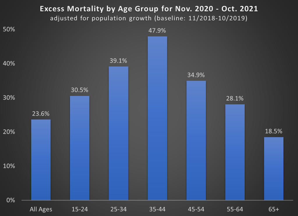
First, let’s look at excess mortality using standard age groups. For this calculation, I use the period November 2018 through October 2019 as the baseline. The chart shows the increase in all-cause deaths in percentage terms. It is also adjusted for population growth, though for most age groups this was +/- 1% (the 65+ group was 3% larger than 2 years prior).
A few things jump out here. First notice the massive increase in mortality for the 35-44 age group (much more on this later). Almost 50% more deaths! To put that in raw numbers, deaths increased from about 82,000 to 122,000 for the 35-44 age group, and population growth was only about 1%. And while that is the largest increase, there were huge increases for every age group that includes adults.
Also notice that the 65+ age group certainly saw an increase, but it is the smallest increase among adults! Of course, in raw numbers the 65+ age group had the most excess deaths: about 450,000 of the 680,000 excess deaths during this time period. But since the elderly die at such high rates in every year, the increase was as large in percentage terms.
One related fact that doesn’t show up in the chart: while there were about 680,000 excess deaths during this time frame in the US in total, there were only about 480,000 deaths where COVID-19 was listed as the underlying cause of death. That means we have about 200,000 additional deaths in this 12-month time period to account for, or a 24% increase (population growth overall was only 0.4%).
That’s a lot of other, non-COVID deaths! What were those deaths? Let’s dig into the data.
The American Community Survey began in 2000, and started asking about college majors in 2009, surveying over 3 million Americans per year. This has allowed all sorts of excellent research on how majors affect things like career prospects and income, like this chart from my PhD advisor Doug Webber:
See here for the interactive version of this image
But the ACS asks about all sorts of other outcomes, many of which have yet to be connected to college major. As far as I can tell this was true of marriage and children, though I haven’t searched exhaustively. I say “was true” because a student in my Economics Senior Capstone class at Providence College, Hannah Farrell, has now looked into it.
The overall answer is that those who finished college are much more likely to be married, and somewhat more likely to have children, than those with no college degree. But what if we regress the 39 broad major categories from the ACS (along with controls for age, sex, family income, and unemployment status) on marriage and children? Here’s what Hannah found:
Every major except “military technologies” is significantly more likely than non-college-grads to be married. The smallest effects are from pre-law, ethnic studies, and library science, which are about 7pp more likely to be married than non-grads. The largest effects are from agriculture, theology, and nuclear technology majors, each about 18pp more likely to be married.
For children the story is more mixed; library science majors have 0.18 fewer children on average than non-college-graduates, while many majors have no significant effect (communications, education, math, fine arts). Most majors have more significantly more children than non-college graduates, with the biggest effect coming from Theology and Construction (0.3 more children than non-grads).
In this categorization the ACS lumps lots of majors together, so that economics is classified as “Social Sciences”. When using the more detailed variable that separates it out, Hannah finds that economics majors are 9pp more likely than non-grads to be married, but don’t have significantly more children.
I love teaching the Capstone because I get to learn from the original empirical research the students do. In a typical class one or two students write a paper good enough that it could be published in an academic journal with a bit of polishing, and this was one of them. But its also amazing how many insights remain undiscovered even in heavily-used public datasets like the ACS. We’ve also just started to get good data on specific colleges, see this post on which schools’ graduates are the most and least likely to be married.
The latest CPI inflation report didn’t have a huge surprise in the headline number, with 8.3% being very similar to last month. But with the two most recent months of data, we can now see something very unfortunate in the data: cumulative inflation during the pandemic as measured by the CPI-U (11.6%) has now almost matched average wage growth (12.0%), as measured by the average wage for all private workers. I start in January 2020 for the pre-pandemic baseline.
What this means is that inflation-adjusted wages in the US are no greater than they were before the pandemic. They are almost identical to what they were in February 2020 (just 2 cents greater). But as regular readers will know, the CPI-U isn’t the only measure of inflation, and there’s good reason to believe it’s not the best. One alternative is the Personal Consumption Expenditures price index. Cumulative inflation for the PCE is slightly lower during the pandemic (9.0%, though we don’t have April 2022 data yet).
This chart shows average wage growth adjusted with both of these different measures of inflation, expressed as a percent of January 2020 wages. The CPI-U adjusted wages (blue line) have been falling steadily since the beginning of 2021, though the declines have accelerated in 2022. The PCE-adjusted wages (orange line) have also not performed superbly, but at least they are still 2-3% above January 2020. Still, the picture is not rosy: they’ve basically been flat since mid-2020 and have started to drop in early 2022.
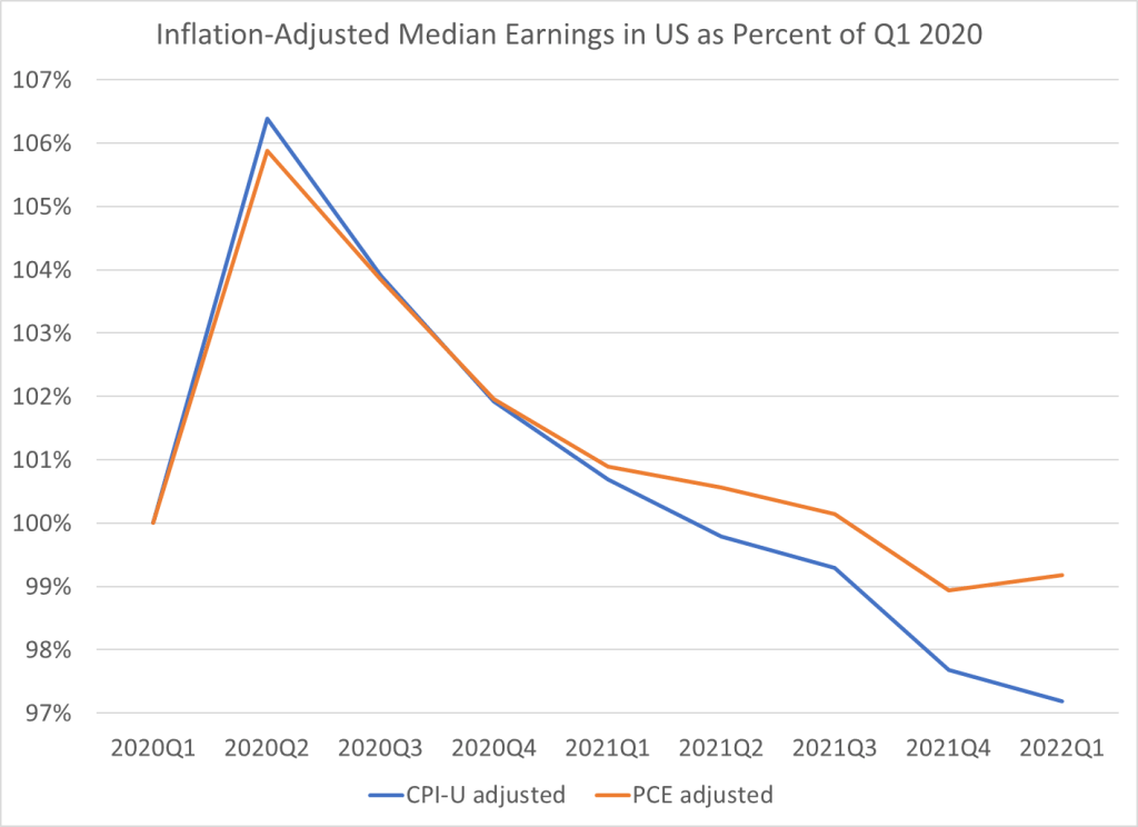
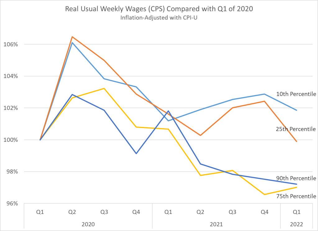
Of course, average (mean) numbers can be tricky and sometimes misleading. What if instead we used median wages? Unfortunately, there is no hourly median wage data that is updated every month. The closest data that I usually look at is median weekly earnings, which is available on a quarterly basis. Here’s what that data looks like, expressed as a percent of the first quarter of 2020. I limit the data to full-time workers, since that should give us a roughly comparable number to the hourly data (hours of work may have changed, but using full-time workers should make it roughly constant).
For median weekly earnings, we can see that the picture is even less rosy. Median earnings have been declining consistently since the second quarter of 2020, regardless of which inflation adjustment we use. The decline in the PCE-adjusted measure isn’t quite as steep since early 2021, but both figures are below the pre-pandemic level, and have been for the past two quarters.
One final note: if we look at weekly earnings across the distribution, and not just at the median, we see something very interesting. Earnings at the bottom of the distribution seem to be performing better than those at the top. In fact, the 10th percentile weekly wage is the only category that is still above pre-pandemic levels. I’m only adjusting using the CPI-U here, but the patterns for the PCE-adjusted earnings would be roughly similar.
We should be cautious about interpreting this data too: if workers dropping out of the labor force are primarily at the bottom of the distribution, it will artificially push up the 10th percentile earnings level. It would be good to know how much of that is going on here. Still, I think this is an important result in the current data.
This is my last post in a series that uses the AS-AD model to describe US consumption during and after the Covid-19 recession. I wrote about US consumption’s broad categories, services, and non-durables. This last one addresses durable consumption.
During the week of thanksgiving in 2020, our thirteen-year-old microwave bit the dust. NBD, I thought. Microwaves are cheap, and I’m willing to spend a little more in order to get one that I think will be of better quality (GE, *cough*-*cough*). So, I filtered through the models on multiple websites and found the right size, brand, and wattage. No matter the retailer, at checkout I learned that regardless of price, I’d be waiting a good two months before my new, entirely standard, and unexceptional microwave oven would arrive. I’d have to wait until the end of January of 2021.