Is it harder to buy a home today than in the past? Many seem to think so. Lately, some people have used the example of the fictional Simpsons family to make this claim. A recent Tweet with around 100,000 likes expressed the sentiment:
The Simpsons own this home on a single salary from a husband who didn't go to college
The unspoken implication is that today a “single salary from a husband who didn’t go to college” couldn’t buy a typical home in the US. Or at least, it would stretch your budget so thin that you would have to give up something else or need two incomes to support that lifestyle (famously dubbed “the two-income trap” by Elizabeth Warren).
But is this an accurate picture of the Simpsons family over time? And does that picture accurately represent a typical family in the US? Let’s investigate. And let’s start by pointing out that as measured by the availability of consumption goods, the Simpsons do see rising prosperity over time. They have flat screen TVs now, instead of consoles with rabbit ears, as the late Steve Horwitz and Stewart Dompe point out in their contribution to the edited volume Homer Economicus. But with all due respect to my friends Steve and Stewart, I don’t think many would deny that TVs, cell phones, and computers are cheaper today than in the 1990s. The familiar refrain is “but what about housing, education, and health care?”
In this post I want to take on the question of housing, partially by using the Simpsons as an example. My main result is this chart, which I will present first and then explain.
Economics involves human beings making decisions. Where there are humans, drama is never absent. Hence, somewhere in the broader financial sphere, there is always some drama. The chart below displays gyrations in the exchange rate of the Turkish lira which may be fairly characterized as “dramatic”. This chart shows the lira-per-dollar exchange rate over the past six months; a higher number here means lower lira valuation.
Foreign Exchange Market Prices, Turkish Lira per Dollar. Source: TradingView.com
What is going on here? Why the spike up in November/December, followed by an even more sudden drop?
As usual, loss of value in foreign exchange goes hand in hand with domestic inflation. Inflation within Turkey for the month of December was reported to 36% on an annualized basis. Now, an orthodox economic response to runaway inflation includes raising interest rates. Higher interest rates tend to make a currency more valuable. Higher interest rates encourage people to hold onto their currency, since they are rewarded by interest on their savings. Conversely, low interest rates, especially when coupled with inflation, motivates people to spend down their money before it loses more value. In the case of emerging market countries like Turkey, high inflation/low interest drives people to exchange their local currency for more stable foreign currencies, like dollars or euros (or crypto stablecoins like Tether).
But Turkey is Turkey, and Turkey is run by the authoritarian President Erdogan. He has economic views which might most charitably characterized as “heterodox”. Erdogan claims that high interest rates actually cause inflation. His views may be influenced by the prohibition on charging interest in classic Islamic practice. The Turkish president has stated, “My belief is that interest rates are the mother of all evils. Interest rates are the cause of inflation. Inflation is a result, not a cause. We need to push down interest rates.” President Erdogan has sacked numerous treasury officials who disagreed with him, and pressured the central bank to implement four interest rates cuts in the last four months of 2021.
It seems he hopes to stimulate enough internal growth to paper over any other problems. I think there could be some merit to that notion, but the current inflation level is toxically high. Lower- and middle-class Turks find it hard to purchase necessities.
Lowering the value of your currency to make your exports more attractive has been practiced successfully by various Asian nations, but Turkey is too exposed to foreign exchange to weather such a huge drop in the value of the lira. A large part of Turkey’s recent economic growth has been funded by foreign investors, and that may dry up because of the currency instability. Turkey is dependent on imports for many essentials, including all of its energy needs, so imports have become much more expensive for Turks as their currency depreciates. Furthermore, because of the fluctuating value of the local currency, many loans are denominated in dollars or euros. This makes it burdensome for borrowers to keep up payments of interest and principal, when these foreign currencies have become more expensive.
Modern currencies have essentially no intrinsic value. Money is a big confidence game. A shopkeeper will take my dollar bill in exchange for some candy, because he is confident that some other party will in turn accept that dollar bill in exchange for something else of value. If confidence in a currency collapses, so does its exchange value.
Foreign creditors and domestic Turkish consumers were becoming more and more nervous about the prospects for the lira in late 2021, as inflation was fueling further inflationary expectation. It crashed to a record high exchange rate of 13.44 against the dollar on November 23 after the Turkish leader insisted that rate cuts would continue.
Things really started getting out of control in mid-December. Turks frantically ditched their currency in exchange for euros and dollars, which led to further devaluation of the lira. On December 21st, however, the Turkish government unleashed an innovative initiative. They offered to backstop the value of the lira deposits of Turkish residents, as long as those deposits were held in lira for a certain period of time. Besides offering interest on the deposits, the offer was to compensate depositors for any loss in value against the dollar. The intent was to motivate residents to keep their lira as lira.
Turkey’s new Finance Minister Nureddin Nebati has no real finance background; his main qualification for office appears to be a willingness to do what his boss wants. When Nebati was asked to give details of this initiative, he reportedly answered thus: “”I won’t give a number now. Can you look into my eyes? What do you see?… The economy is the sparkle in the eyes.” Hmm.
President Erdogan has said he is protecting the country’s economy from attacks by “foreign financial tools that can disrupt the financial system.” Western economists are not impressed. Market strategist Timothy Ash commented, “ More complete and utter rubbish from Erdogan…Foreign institutional investors don’t want to invest in Turkey because of the absolutely crazy monetary policy settings imposed by Erdogan.”
At any rate, this unusual measure, combined with old-fashioned central bank intervention (the Turkish central bank is believed to have used some 10 billion dollars’ worth of its foreign reserves to buy lira), seemed to stem the immediate panic. Within a day, the exchange rate thudded down from about 18 to about 13, which is roughly the level today.
It has been pointed out that it simply is not feasible for the government to backstop all relevant bank deposits against a huge currency depreciation; the Turkish government and central bank would burn through all their foreign reserves, and have to resort to printing ever more worthless lira. However, sometimes the mere promise of such a guarantee (whether or not it is practical) is enough to restore some measure of confidence, which in turn means that the currency will not collapse and thus the resources of the central bank will not be put to the test. As we said, confidence is what it is all about. We will see how this plays out.
The latest CPI inflation data was released this morning. Mostly the new data just confirms what we’ve seen the past few months: consumer price inflation is at the highest levels in decades, and it is now very broad based.
To see how broad based the inflation is, we can look at any of the “special aggregates” that the BLS produces. CPI less food. CPI less shelter. CPI less food, shelter, energy, used cars and trucks (what a mouthful!). All of these are up substantially over the past year. The lowest number you can get is that last aggregate I listed, which excludes almost 60% of consumer spending, and even it is up 4.7% over the past year — the largest increase since 1991 for that particular special index.
Or, you can just look at food. We all have probably observed that meat prices are way up recently — about 15% over the past year. But it’s not just meat. It’s fruit, vegetables, grains, dairy… the whole darn food pyramid. In fact, there are only two food categories (hot dogs and cheese) and two drinks (tea and wine) that are actually down since December 2020.
The only categories of food and drinks in the CPI that are down since last year are hot dogs, cheese, tea, and wine
— Jeremy 'adjusted for inflation' Horpedahl 📈 (@jmhorp) January 12, 2022
I’ve covered the symbolic importance of hot dog prices before, but the fact that only four food or drink categories had price decreases are indications that food-price inflation is extremely broad-based.
Inflation is colloquially defined as, “Too much money chasing too few goods (and services)”. Supply chain constraints get talked about, and these are widely blamed for the inflation we are seeing. Of course, supply limitations play into inflation, but to focus on them is to miss the elephant in room. The primary driver of this inflation is not “too few goods”, but “too much money.”
While the headlines tend to focus on the micro elements of the supply shock (the LA port, coal in China, natural gas in Europe, semiconductors globally, truckers in the UK, etc.), this perspective largely misses the macro cause that is likely to persist and for which there is no idiosyncratic solution. This is not, by and large, a pandemic-related supply problem: as we’ll show, supply of almost everything is at all-time highs. Rather, this is mostly an MP3-driven upward demand shock. [emphases in the original]
In Bridgewater’s terminology, “MP3” is “Monetary Policy #3”, and refers to massive deficit spending combined with central bank quantitative easing. We saw this implemented in 2020-2021 when the federal government pumped out trillions of dollars of stimulus payments and enhanced unemployment benefits, and the Fed instantly soaked up the bonds that were issued to pay for these trillions. This fed/Fed combo amounts to simply printing money on an enormous scale.
Those trillions of dollars funded a huge surge in durable goods purchases. By late 2021 the supply of these goods was well above 2019 (pre-COVID) levels, and even above normal growth trendlines. However, the supply and transport systems simply could not grow fast enough to accommodate this insatiable demand. Charts below substantiate this. To focus on supply chain bottlenecks of themselves is misleading. The primary driver for this inflation has been the trillions of dollars of federal largesse. The Fed knows all this, obviously, but Jay Powell (the Chief Enabler of this deficit spending) would likely not have been reappointed if he spoke too directly about the cause of this inflation. Hence the endless prattle about supply chains.
Keeping a fixed price is a somewhat rare, but fascinating pricing strategy. It can even become part of the identity of the product. The most famous example was Coca-Cola, which sold a 6.5 ounce bottle for 5 cents from 1886 to 1959. It’s so famous that it has its own Wikipedia page! “Always 5 cents” became a marketing slogan for them. And while we may regard that time period as one of generally low inflation, consumer prices on average more than tripled from 1886 to 1959.
Probably the most famous recent example is Costco’s $1.50 hot dog and soda combo, which has been stable in price since 1985. Rumor has it that the founder of Costco once told the current CEO that he’d kill him if he raised the price of the hot dog. Since 1985, nominal median wages in the US have tripled, meaning that your Costco Hot Dog Standard of Living has also tripled.
The concept of nickel and dime stores and later dollar stores are similar concepts, but they aren’t necessarily selling the exact same products over time. Coca-Cola, Hot-N-Ready pizzas, and Costco hot dogs really are the same product from year-to-year, so these products stand out as amazing examples of price stability during periods of time when most prices were rising in nominal terms (other than new technologies).
What are some other examples of consistently stable prices?
I remember people talking about Covid-19 in January of 2020. There had been several epidemic scare-claims from major news outlets in the decade prior and those all turned out to be nothing. So, I was not excited about this one. By the end of the month, I saw people making substantiated claims and I started to suspect that my low-information heuristic might not perform well.
People are different. We have different degrees of excitability, different risk tolerances, and different biases. At the start of the pandemic, these differences were on full display between political figures and their parties, and among the state and municipal governments. There were a lot of divergent beliefs about the world. Depending on your news outlet of choice, you probably think that some politicians and bureaucrats acted with either malice or incompetence.
I think that the Federal Reserve did a fine job, however. What follows is an abridged timeline, graph by graph, of how and when the Fed managed monetary policy during the Covid-19 pandemic.
February, 2020: Financial Markets recognize a big problem
The S&P begins its rapid decent on February 20th and would ultimately lose a third of its value by March 23rd. Financial markets are often easily scared, however. The primary tool that the Fed has is adjusting the number of reserves and the available money supply by purchasing various assets. The Fed didn’t begin buying extra assets of any kind until mid-March. There is a clear response by the 18th, though they may have started making a change by the 11th. One might argue that they cut the federal funds rate as early as the 4th, but given that there was no change in their balance sheet, this was probably demand driven.
March, 2020: The Fed Accommodates quickly and substantially.
In the month following March 9th, the Fed increased M2 by 8.3%. By the week of March 21st, consumer sentiment and mobility was down and economic policy uncertainty began to rise substantially – people freaked out. Although the consumer sentiment weekly indicator was back within the range of normal by the end of April, EPU remained elevated through May of 2020. Additionally, although lending was only slightly down, bank reserves increased 71% from February to April. Much of that was due to Fed asset purchases. But there was also a healthy chunk that was due to consumer spending tanking by 20% over the same period.
In the 18 months prior to 2020, M2 had grown at rate of about 0.5% per month. For the almost 18 months following the sudden 8.3% increase, the new growth rate of M2 almost doubled to about 1% per month. The Fed accommodated quite quickly in March.
April, 2020: People are awash with money
Falling consumption caused bank deposit balances to rise by 5.6% between March 11th and April 8th. The first round of stimulus checks were deposited during the weekend of April 11th. That contributed to bank deposits rising by another 6.7% by May 13th.
By the end of March, three weeks after it began increasing M2, the Fed remembered that it really didn’t want another housing crisis. It didn’t want another round of fire sales, bank failures, disintermediation, collapsed lending, and debt deflation. It went from owning $0 in mortgage-backed securities (MBS) on March 25th to owning nearly $1.5 billion worth by the week of April 1st. Nobody’s talking about it, but the Fed kept buying MBS at a constant growth rate through 2021.
May, 2020 – December, 2021: The Fed Prevents Last-Time’s Crisis
Jerome Powell presided over the shortest US recession ever on record. The Fed helped to successfully avoid a housing collapse, disintermediation, and debt deflation – by 2008 standards. The monthly supply of housing collapsed, but it had bottomed out by the end of the summer. By August of 2021, the supply of housing had entirely recovered. The average price of new house sales never fell. Prices in April of 2020 were typical of the year prior, then rose thereafter. A broader measure of success was that total loans did not fall sharply and are nearly back to their pre-pandemic volumes. After 2008, it took six years to again reach the prior peak. A broader measure still, total spending in the US economy is back to the level predicted by the pre-pandemic trend.
The Fed can’t control long-run output. As I’ve written previously, insofar as aggregate demand management is concerned, we are perfectly on track. The problem in the US economy now is real output. The Fed avoided debt deflation, but it can’t control the real responses in production, supply chains, and labor markets that were disrupted by Covid-19 and the associated policy responses.
What was the cost of the Fed’s apparent success? Some have argued that the Fed has lost some of its political insulation and that it unnecessarily and imprudently over-reached into non-monetary areas. Maybe future Fed responses will depend on who is in office or will depend on which group of favored interests need help. Personally, I’m not so worried about political exposure. But I am quite worried about the Fed’s interventions in particular markets, such as MBS, and how/whether they will divest responsibly.
Of course, another cost of the Fed’s policies has been higher inflation. During the 17 months prior to the pandemic, inflation was 0.125% per month. During the pandemic recession, consumer prices dipped and inflation was moderate through November. But, in the 16 months since April of 2020, consumer prices have grown at a rate of 0.393% per month – more than three times the previous rate. Some of that is catch-up after the brief fall in prices.
Although people are genuinely worried about inflation, they were also worried about if after the 2008 recession and it never came. This time, inflation is actually elevated. But people were complaining about inflation before it was ever perceptible. The compound annual rate of inflation rose to 7% in March of 2021. But it had been almost zero as recent as November, 2020. That March 2021 number is misleading. The actual change in prices from February to March was 0.567%. Something that was priced at $10 in February was then priced at $10.06 in March. Hardly noticeable, were it not for headlines and news feeds.
Inflation is on everyone’s mind. Everybody freaks out. You cannot do anything about it. As such, lets talk about something mildly related: how price indexes (those that we use to talk about inflation) deal with quality changes.
One big problem when we try to measure the cost of living is that the price information we collect does not reflect the same thing we consume. I know that sentence seems weird. After all, 1$ for a pound of bread is 1$ for a pound a bread. And if prices go up 10%, then the price per pound of bread is 1.10$!
If you think that, you’re wrong. Think about the following example from my native province of Quebec. In the 1990s, Quebec deregulated opening hours for grocery stores. The result was … higher prices at large superstores. Why? Before the reform, stores had shorter hours especially on sundays. This meant that stores were competing with each other on a smaller quality dimension which meant more price-based competition. With deregulation, some consumers were willing to pay slightly higher prices to shop at ungodly hours. What were these consumers consuming? Were they consuming only the breadloafs they bought or were they consuming those loafs and the flexible schedule of the grocery stores? The answer is the latter! Ergo, the change from 1$ per pound to 1.10$ per pound does not meanthat the price of bread alone increased — it may have even fallen all else being equal!
So how do you adjust for that? There are many papers on how to do hedonic adjustments (hedonic is the fancy words we use to say “quality-adjusted”) and they are all a pain to read unless you are very familiar with real analysis, set theory and advanced calculus (and even there, its still a pain). Fortunately, I recently found a neat little application from an old econometrics graduate text from the 1960s (see image below) that allows me to teach this to my students (and now, you too!) in an easy-to-get format.
A neat book
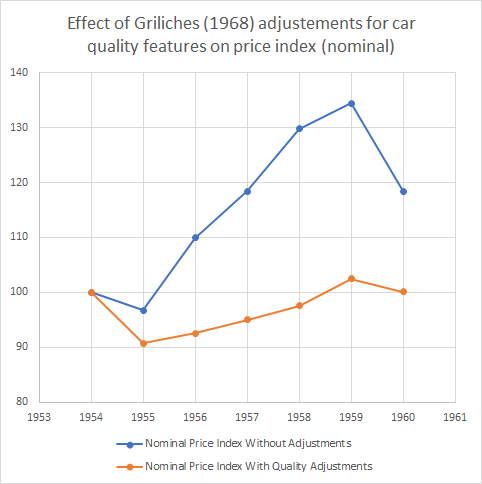
The book has a neat chapter by one of the most famous econometricians of the 20th century, Zvi Griliches, titled “Hedonic Price Indexes for Automobiles: An Econometric Analysis of Quality Change”. In the chapter, Griliches points out that from 1954 to 1960, car prices went up some 20% — well above the overall price index. From 1937 to 1950, prices for cars went up in line with inflation. Taken together, these two facts suggest that the real price of cars stayed constant from 1937 to 1950 and increased to 1960. But that suggestion is wrong Griliches points out because of our aforementioned quality issues. Up until 1960, there were considerable improvement in vehicle quality: better gears, better brakes, more horsepower, safer settings, automatic transmission, hardtops, switching to V-8 engines rather than 6 cylinders engines etc.
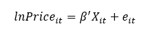
How do you account for these quality changes? Griliches simply went about consulting guide books for autobuyers. He collected price data for the cars as well the details regarding quality. And he used this very simple specification where the log of the nominal price is set as a dependent variable.
Griliches’ specification
The vector Xis all the quality dimensions he could find (horsepower, shipping weight, length, V-8 engine, hardtop, automatic transmission, power steering, power brakes, compact car). All of these dimensions were statistically significant determinants of the price of cars (with the exception of V-8 engines which was not significant). Then, Griliches assumed that all quality dimensions were “unchanged” from 1954 to 1960 in order to see how prices would have evolved without any changes in quality. The result is the figure below. The blue line depicts the actual prices he collected where you can see the 20% increase to 1960 (which is a 30%+ increase to 1959). The orange line depicts the price holding quality constant. That orange line is unambiguous: quality-constant car prices didn’t change much during the 1950s. Adjusting for inflation during the period suggests a drop in 10% in the real price of a quality-constant car.
Isn’t that a fascinating way to understand what we are actually measuring when we collect prices to talk about inflation? I find this to be an utterly fascinating example (and a useful teaching tool). Okay, I am done, you can go back to freaking out about inflation and how bad the Fed, Bank of Canada, ECB are.
But is it true? In short: no. I’ll explain why, but my larger goal is to get you to think more clearly about inflation.
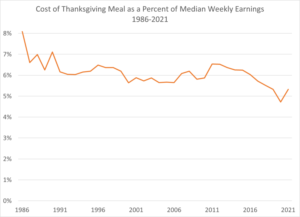
How should we measure the cost of a Thanksgiving meal? A widely used measure comes from the Farm Bureau, which shows that the cost of a traditional turkey-centric meal costs about 14% more than last year. In dollar terms it is $53.31 for a turkey, a pumpkin, cranberries, sweet potatoes, stuffing, etc. That’s more that it has ever been, in dollar terms. Farm Bureau has been tracking the cost of this same meal since 1986.
So in one sense, it seems like the headline claim is true. Most expensive Thanksgiving ever!
But we need to think deeper. A nominal price doesn’t actually tell us much. If a long-lost cousin from the Republic of Horpedahl told you it costs 1 million Jeremys to buy a Thanksgiving dinner, what would your reaction be? The first and best reaction is: how much do people earn in the Republic of Horpedahl?
We should ask the same question in the United States today: how do incomes today compare to incomes in the past? Which measure of income you use is important, but if we use median usual weekly earnings of full-time workers, we can make a simple comparison of how much of your weekly earnings would be needed to buy a traditional Thanksgiving meal. This chart shows exactly that. In 2021 that meal will be the second lowest it has ever been as a percent of median earnings — higher than last year, but tied with 2019 for the second lowest. And much less than in the late 1980s and early 1990s (I use third quarter data for each year, the most recent available).
Adjusting for income is the best way to look at this question. It’s not perfect — part of this depends on what income measure you use — but it’s much better than the alternative. The worst approach is to just look at nominal prices. This tells you virtually nothing.
The recent debate over US inflation seems to be full of mood affiliation on both sides, where people start with a mood (“panic” or “don’t worry”) and then look for facts to fit the mood.
My natural temperament is “don’t worry” and that is what I’ve generally thought about inflation, but the latest number of 6.2% inflation over the last year is a bit concerning, and makes me glad the the Fed has announced they plan to taper off of new asset purchases. But overall I think people are still talking past each other, and I wish more people would answer these questions:
What will CPI inflation be over the next 12 months?
What specifically should the Fed do differently, if anything? How quickly should they taper and raise rates?
If you are currently thinking “panic” or “don’t worry”, what data could come in that would change your mind?
I’ll start with my answers, informed more by my gut than by quantitative models: my guess for inflation over the next year is 4-5%, the Fed has things about right but I’d say “tighten faster” rather than “tighten slower” if I had to pick. I expect inflation to slow noticeably in the spring as the economy transitions from the unusual boom in demand for goods back to demand for services after Christmas and the Delta wave, as more people get back to work and supply bottlenecks have time to work themselves out. I would start to get more seriously concerned if we see no slowing by June, or if market-based measures of inflation or NGDP projections start to move substantially (2pp) higher.
To the extent that I’ve been on the wrong side of this, I blame the cognitive bias I seem to fall prey to most often- mistaking reversed stupidity for intelligence. Just because lots of people make obviously incorrect predictions of hyperinflation doesn’t mean that inflation will be low.
No, 6.2% inflation per year is not in the same universe as hyperinflation (50% inflation per month)
*The usual disclaimer applies- my affiliation with the Fed gives me zero insider information about or influence over monetary policy and I don’t speak for them.
The latest CPI release today shows that real inflation is here. Headline inflation for consumer prices is up 6.2% compared to a year ago and a almost full percentage point in just the past month (seasonally adjusted, so compared to the normal monthly increase).
Back in June, we could reasonably say that 45% of the increase that month (and 27% over the prior year) had been due to just the price of new and used cars, in the past month only 17% can be attributed to vehicle prices. That’s still a lot, considering cars are only about 8 percent of the overall CPI, but inflation is clearly showing up in other areas.
Gasoline prices (also car related!) are always volatile, but they are up sharply in the past year. The over 50% increase for regular unleaded gasoline translates to $1.22 more per gallon than a year ago (and $1.50 more gallon than Spring 2020), which is the largest nominal price increase consumers have seen in a 12-month period (the data stretches back to 1977).
But gasoline is only about 4 percent of consumer spending. What if we look more broadly? Even excluding energy prices, inflation is 4.7% over the past year, the highest increase since 1991.
The natural related questions are Why? And what can we do about it?
The Why question is tricky. The Federal Reserve is very interested in whether the increase in prices is caused by monetary policy. It very much guides their action. Consumers don’t really care that much. They just want the pain to stop. Unfortunately, though, part of the pain may be induced by consumers themselves: spending on goods is extremely high right now, with the year so far 18% above the comparable period in 2019. Higher spending will increase prices in any environment, but the strain it is putting on supply chains only exacerbates the problem. This is not to “blame the victim,” but rather to understand what is going on.
What can be done? That’s an even harder question. It’s convenient to blame the President for things like gas prices. And certainly many voters and pundits will blame him. This charge is not completely without basis, as there are certainly things at the margin a president could do to ease gas prices in the short run (allow more drilling, gas tax hiatus), but we shouldn’t oversell this. And in other areas too, perhaps there are changes that could be made at the margin. But given the massive increases in consumer spending (at least for now), any changes won’t put a dent in the overall inflation rate.
But what about at the individual level? Milton Friedman was asked this question in 1980. That year inflation was 13.5%, the highest since World War II. Friedman’s answer: high living. He said there is no asset which you can expect to protect you against inflation, so you should spend what you have now on something nice. Buy a nice house, a nice suit, a picture to hang on the wall. This is what economists sometimes call “the flight to real values,” or as Phil Donahue put it “convert your money into material things.” While this advice may make sense at the individual level, it doesn’t have great implications for the current supply chain issues.
Friedman did have clear advice for the nation: the Federal Reserve should stop increasing the money supply. Whether that advice will work in the current environment, or whether it will stall the economic recovery, is the hard question the Fed is wrestling with at this very moment.