My wife traveled to Ireland with a friend after she graduated with her bachelor’s degree. She had lived in Europe as a child and had travelled for mission trips. But travelling to the Irish Republic as a young adult, for the singular purpose of celebration and leisure, made a big impact on my eventual wife and she recounted it for years.
Remember pre-Covid when life was so easy? Many of us had planned trips, for business and leisure, that were interrupted. By now, the vast majority of people are back to ‘normal’ (I think?). Classes are in-person, masks are largely optional, and there is no more line stretching out down the sidewalk near the Trader Joe’s. With all this normalcy, one might ask:
In July of 1992, the Barenaked Ladies released their debut studio album Gordon, which included one of their most popular songs: “If I Had $1000000.” Considering all the inflation we’ve had recently, you know that $1 million doesn’t buy as much as it did in 1992, but how much less? As measured by the Consumer Price Index in the US, prices have roughly doubled since 1992, meaning you would need about $2 million to buy the same amount of stuff as in 1992.
(Note: the Barenaked Ladies are Canadian, and prices in Canada haven’t quite doubled since 1992, but this song was included on early demo tapes in 1988 and 1989 released in Canada, and prices have roughly doubled there since then.)
So the value of a dollar that you held since 1992 has lost roughly half of its purchasing power. That’s bad. But how bad is it? What’s the normal US experience for how long it takes for prices to double?
It turns out that even with the recent huge run-up in inflation, we just lived through the lowest period of inflation for anyone alive today.
The latest CPI inflation report didn’t have a huge surprise in the headline number, with 8.3% being very similar to last month. But with the two most recent months of data, we can now see something very unfortunate in the data: cumulative inflation during the pandemic as measured by the CPI-U (11.6%) has now almost matched average wage growth (12.0%), as measured by the average wage for all private workers. I start in January 2020 for the pre-pandemic baseline.
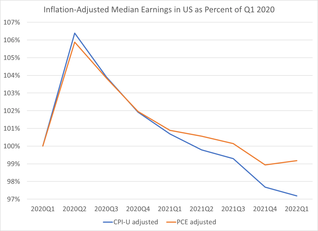
What this means is that inflation-adjusted wages in the US are no greater than they were before the pandemic. They are almost identical to what they were in February 2020 (just 2 cents greater). But as regular readers will know, the CPI-U isn’t the only measure of inflation, and there’s good reason to believe it’s not the best. One alternative is the Personal Consumption Expenditures price index. Cumulative inflation for the PCE is slightly lower during the pandemic (9.0%, though we don’t have April 2022 data yet).
This chart shows average wage growth adjusted with both of these different measures of inflation, expressed as a percent of January 2020 wages. The CPI-U adjusted wages (blue line) have been falling steadily since the beginning of 2021, though the declines have accelerated in 2022. The PCE-adjusted wages (orange line) have also not performed superbly, but at least they are still 2-3% above January 2020. Still, the picture is not rosy: they’ve basically been flat since mid-2020 and have started to drop in early 2022.
Of course, average (mean) numbers can be tricky and sometimes misleading. What if instead we used median wages? Unfortunately, there is no hourly median wage data that is updated every month. The closest data that I usually look at is median weekly earnings, which is available on a quarterly basis. Here’s what that data looks like, expressed as a percent of the first quarter of 2020. I limit the data to full-time workers, since that should give us a roughly comparable number to the hourly data (hours of work may have changed, but using full-time workers should make it roughly constant).
For median weekly earnings, we can see that the picture is even less rosy. Median earnings have been declining consistently since the second quarter of 2020, regardless of which inflation adjustment we use. The decline in the PCE-adjusted measure isn’t quite as steep since early 2021, but both figures are below the pre-pandemic level, and have been for the past two quarters.
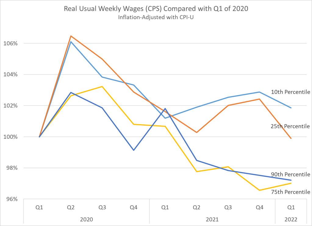
One final note: if we look at weekly earnings across the distribution, and not just at the median, we see something very interesting. Earnings at the bottom of the distribution seem to be performing better than those at the top. In fact, the 10th percentile weekly wage is the only category that is still above pre-pandemic levels. I’m only adjusting using the CPI-U here, but the patterns for the PCE-adjusted earnings would be roughly similar.
We should be cautious about interpreting this data too: if workers dropping out of the labor force are primarily at the bottom of the distribution, it will artificially push up the 10th percentile earnings level. It would be good to know how much of that is going on here. Still, I think this is an important result in the current data.
This is my last post in a series that uses the AS-AD model to describe US consumption during and after the Covid-19 recession. I wrote about US consumption’s broad categories, services, and non-durables. This last one addresses durable consumption.
During the week of thanksgiving in 2020, our thirteen-year-old microwave bit the dust. NBD, I thought. Microwaves are cheap, and I’m willing to spend a little more in order to get one that I think will be of better quality (GE, *cough*-*cough*). So, I filtered through the models on multiple websites and found the right size, brand, and wattage. No matter the retailer, at checkout I learned that regardless of price, I’d be waiting a good two months before my new, entirely standard, and unexceptional microwave oven would arrive. I’d have to wait until the end of January of 2021.
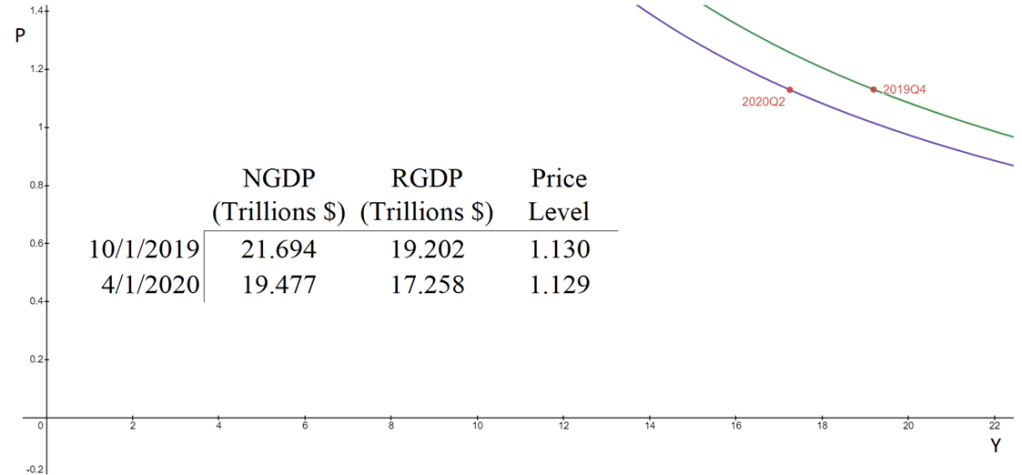
The aggregate supply & aggregate demand model (AS-AD) is nice because it’s flexible and clear. Often professors will teach it in levels. That is, they teach it with the level of output on one axis, and the price level on the other axis. This presentation is convenient for the equation of exchange, which can be arranged to reflect that aggregate demand (AD) is a hyperbola in (Y, P) space. Graphed below is the AD curve in 2019Q4 and in 2020Q2 using real GDP, NGDP, and the GDP price deflator.
The textbook that I use for Principles of Macroeconomics, instead places inflation (π) on the vertical axis while keeping the level of output on the horizontal axis. The authors motivate the downward slope by asserting that there is a policy reaction function for the Federal Reserve. When people observe high rates of inflation, state the authors, they know that the Fed will increase interest rates and reduce output. Personally, I find this reasoning to be inadequate because it makes a fundamental feature of the AS-AD model – downward sloping demand – contingent on policy context.
At the same time, I do think that it can be useful to put inflation on the vertical axis. Afterall, individuals are forward looking. We expect positive inflation because that’s what has happened previously, and we tend to be correct. So, I tell my students that “for our purposes”, placing inflation on the vertical axis is fine. I tell them that, when they take intermediate macro, they’ll want to express both axes as rates of change. I usually say this, and then go about my business of teaching principles.
But, what does it look like when we do graph in percent-change space?
In my previous post, I decomposed consumer expenditures to figure out which service sectors experienced the largest supply-side disruptions due to Covid-19. I illustrated that transportation & recreation services were the only consumer service to experience substantial and persistent supply shocks. Health, food, and accommodation services also experienced supply shocks, but quickly rebounded. Housing, utility, and financial services experienced no supply disruptions whatsoever.
What about non-durables?
Total consumption spending is the largest category of spending in our economy and is composed of services, durable goods, and non-durables. Services are the largest portion and durable goods compose the smallest portion. So, while there were plenty of stories during the Covid-19 pandemic about months-long delivery times for durables, they did not constitute the typical experience for most consumption.
Even though it’s not the largest category, many people think of non-durables when they think of consumption. Below is the break-down of non-durable spending in 2019. The largest singular category of non-durable spending was for food and beverages, followed by pharmaceuticals & medical products, clothing & shoes, and gasoline and other energy goods. Clearly, the larger the proportion that each of these items composes of an individual household budget, the more significant the welfare implications of price changes.
Inflation is definitely here. The latest CPI release puts the annual inflation rate in the US at 8.5% over the past 12 months, the highest 12-month period since May 1981. That’s bad, especially because wages for many workers aren’t keeping up with the price increases (and that’s true in other countries too).
But what about other countries? Many countries are experiencing record inflation too. The same day the US announced the latest CPI data, Germany announced that they also had the highest annual inflation since 1981.
Using data from the OECD, we can make some comparisons across countries during the pandemic. I’ll use data through February 2022, which excludes the most recent (very high!) months for places like the US and Germany, but most countries haven’t released March 2022 data quite yet.
Let’s compare inflation rates and GDP growth (in real terms, also from the OECD), using the end of 2019 as a baseline. We’ll compare the US, the other G-7 countries, and several broad groups of countries (OECD, OECD European countries, and the Euro area). The chart below uses “core inflation,” which excludes food and energy (below I will use total inflation — the basic picture doesn’t change much).
By the time most students exit undergrad, they get acquainted with the Aggregate Supply – Aggregate Demand model. I think that this model is so important that my Principles of Macro class spends twice the amount of time on it as on any other topic. The model is nice because it uses the familiar tools of Supply & Demand and throws a macro twist on them. Below is a graph of the short-run AS-AD model.
Quick primer: The AD curve increases to the right and decreases to the left. The Federal Reserve and Federal government can both affect AD by increasing or decreasing total spending in the economy. Economists differ on the circumstances in which one authority is more relevant than another.
The AS curve reflects inflation expectations, short-run productivity (intercept), and nominal rigidity (slope). If inflation expectations rise, then the AS curve shifts up vertically. If there is transitory decline in productivity, then it shifts up vertically and left horizontally.
Nominal rigidity refers to the total spending elasticity of the quantity produced. In laymen’s terms, nominal rigidity describes how production changes when there is a short-run increase in total spending. The figure above displays 3 possible SR-AS’s. AS0 reflects that firms will simply produce more when there is greater spending and they will not raise their prices. AS2 reflects that producers mostly raise prices and increase output only somewhat. AS1 is an intermediate case. One of the things that determines nominal rigidity is how accurate the inflation expectations are. The more accurate the inflation expectations, the more vertical the SR-AS curve appears.*
The AS-AD model has many of the typical S&D features. The initial equilibrium is the intersection between the original AS and AD curves. There is a price and quantity implication when one of the curves move. An increase in AD results in some combination of higher prices and greater output – depending on nominal rigidities. An increase in the SR-AS curve results in some combination of lower prices and higher output – depending on the slope of aggregate demand.
Of course, the real world is complicated – sometimes multiple shocks occur and multiple curves move simultaneously. If that is the case, then we can simply say which curve ‘moved more’. We should also expect that the long-run productive capacity of the economy increased over the past two years, say due to technological improvements, such that the new equilibrium output is several percentage points to the right. We can’t observe the AD and AS curves directly, but we can observe their results.
The big questions are:
What happened during and after the 2020 recession?
Gasoline prices are high and rising. Anecdotally, they seem to be increasing at the pump by the hour. And indeed, in nominal terms they are now the highest they have ever been in the US (this is true with both the AAA daily price level and the EIA weekly price level). At over $4.10 per gallon, the price now exceeds the peaks briefly hit in 2008, 2011, and 2012. And it’s looking like this peak might not be so brief.
But we all know you can’t compare nominal dollars over long periods of time. We need some context for this price! Plenty of news stories provide what they think is the right context: adjust it for inflation! For example, USA Today reports that today’s price “would come to around $5.25 today when adjusted for inflation.”
$5.25: that’s a pretty concrete number. But it’s not really useful. OK, so clearly that’s higher than the current price, about 20% higher in fact. Still, it doesn’t really give us the right context.
As I argued in a previous post on housing costs, inflation adjustments aren’t always the best way to contextualize a historical number. Yes, when you want to compare income or wages over time, it’s good to adjust for inflation. It’s necessary, in fact. And a good economist will always do that.
However, when comparing particular prices over time, it doesn’t really make sense to adjust for other prices. All you are really saying is “if the price of gasoline increased at the same rate as the average price level, here’s what it would be.” Perhaps slightly useful, but it doesn’t really get at the thing we’re really try to address: is gasoline more or less affordable than in the past?
The best approach is to adjust the prices for changes in wages or income. Which measure of wages or income you choose is important, but it’s the best adjustment to make. No need to make any inflation adjustments, are worrying about whether the index you choose is properly accounting for quality changes, substitution effects, etc. If you want to know how affordable something is, compare it to income.
Here’s what I think is the best simple comparison for gasoline, which I’ll explain it below. In short, it tells us how many minutes the average worker would need to work to purchase one gallon of gasoline.
Since the price of gasoline is rising sharply every day lately, my chart will surely be out of date very soon. But right now, it’s the most current data I could provide with a comparable historical series: EIA weekly data current through March 7th, 2022 (Monday). We can see that at current prices, it takes about 9 minutes of work at the average wage to purchase a gallon of gasoline. At the peak in 2008, it took over 13 minutes of work to purchase a gallon, and it fluctuated between 10 and 12 minutes of work for much of 2011-2014.
Way back in the late 1970s and early 80s, Kydland and Prescott proposed rational expectations theory. This line of research arose, in part, because the Phillips curve ceased to describe reality well. Amid increasing inflation, people began to anticipate higher prices to a relatively correct degree when making labor, supply chain, and pricing decisions. Kydland and Prescott argued that individuals understand the rules of the game or how the world works – at least on average.
An increase in the money supply would increase total national spending, and increase demand for goods. However, firms also experienced increasing revenues and demanded more inputs such as commodities, capital, and intermediate goods. Because there were no greater productivity earlier in the supply chain, price roses. Firms began to understand that greater demand would eventually find its way to causing greater costs. Therefore, firms began raising prices before the cost of resources rose, increasing their willingness to pay for inputs and, ironically, hastening the increase in input prices. As a result, increases in the money supply began having substantial short-run price effects and negligible output effects.
However, assuming that people understand the rules of our economic system and ‘how the world works’ is hard to swallow. It is not at all clear that the typical economist understands monetary theory, much less clear that the typical person has a good understanding. Fortunately, another theory of expectations can help carry some of the load and achieve similar results.