The latest CPI inflation data was released this morning. Mostly the new data just confirms what we’ve seen the past few months: consumer price inflation is at the highest levels in decades, and it is now very broad based.
To see how broad based the inflation is, we can look at any of the “special aggregates” that the BLS produces. CPI less food. CPI less shelter. CPI less food, shelter, energy, used cars and trucks (what a mouthful!). All of these are up substantially over the past year. The lowest number you can get is that last aggregate I listed, which excludes almost 60% of consumer spending, and even it is up 4.7% over the past year — the largest increase since 1991 for that particular special index.
Or, you can just look at food. We all have probably observed that meat prices are way up recently — about 15% over the past year. But it’s not just meat. It’s fruit, vegetables, grains, dairy… the whole darn food pyramid. In fact, there are only two food categories (hot dogs and cheese) and two drinks (tea and wine) that are actually down since December 2020.
The only categories of food and drinks in the CPI that are down since last year are hot dogs, cheese, tea, and wine
— Jeremy 'adjusted for inflation' Horpedahl 📈 (@jmhorp) January 12, 2022
I’ve covered the symbolic importance of hot dog prices before, but the fact that only four food or drink categories had price decreases are indications that food-price inflation is extremely broad-based.
According to the most recent TSA data, on December 21st of this year there were 1,979,089 people traveling by plane. That’s almost exactly equal to the number of people that flew in the US on the same date in 2019: 1,981,433 travelers. It’s also double the number of people that few on December 21, 2020 (about 992,000). These numbers are encouraging. Does that mean that we’re back to normal levels of travel?
Not quite. We shouldn’t read too much into one day of data, for a variety of reasons, but most importantly because while we’re looking at the same date, travel varies throughout the week and December 21st is a different day of the week every year (Tuesday this year, Saturday in 2019). It’s better to use a weekly average and compare it to 2019. Here’s what the data looks like for 2020 and 2021.
With this data, we can see that airline travel is back to about 85 percent of 2019 levels. That’s not bad, but airline travel was already back to 85 percent by early July 2021, with some variation since then, but generally staying in the 70-90 percent range for most of the second half of the year.
For those that are flying this year, there is good news in terms of prices (unusual to have good prices news right now): airfares are still about 20 percent cheaper than pre-pandemic levels. In fact, airline prices are the cheapest they have been since 1999. In nominal terms! If you are interested in even more historical price data, take a look at my May 2021 post on the “golden age” of flight.
And of course, flying is not the most common way that people travel for Christmas and the holiday season. According to estimates from AAA, only about 6 percent of holiday travelers choose to fly. This was true in 2019, and will be roughly true in 2021 (as usual, 2020 was the exception: around 3 percent). By far the most common mode of travel in the US is driving, accounting for over 90 percent of holiday travel.
If you are traveling by car, there isn’t much good news for prices. As you have no doubt heard constantly for the past few months, gasoline costs a lot more than it did last Christmas, on average about $1 per gallon more. But even compared to Christmas 2019, gasoline prices are almost 29 percent higher. The last time gasoline prices were this high (in nominal terms) around Christmas was in 2013.
I hope you all have safe holiday travels, and we’ll all look forward to better prices in the New Year!
I remember people talking about Covid-19 in January of 2020. There had been several epidemic scare-claims from major news outlets in the decade prior and those all turned out to be nothing. So, I was not excited about this one. By the end of the month, I saw people making substantiated claims and I started to suspect that my low-information heuristic might not perform well.
People are different. We have different degrees of excitability, different risk tolerances, and different biases. At the start of the pandemic, these differences were on full display between political figures and their parties, and among the state and municipal governments. There were a lot of divergent beliefs about the world. Depending on your news outlet of choice, you probably think that some politicians and bureaucrats acted with either malice or incompetence.
I think that the Federal Reserve did a fine job, however. What follows is an abridged timeline, graph by graph, of how and when the Fed managed monetary policy during the Covid-19 pandemic.
February, 2020: Financial Markets recognize a big problem
The S&P begins its rapid decent on February 20th and would ultimately lose a third of its value by March 23rd. Financial markets are often easily scared, however. The primary tool that the Fed has is adjusting the number of reserves and the available money supply by purchasing various assets. The Fed didn’t begin buying extra assets of any kind until mid-March. There is a clear response by the 18th, though they may have started making a change by the 11th. One might argue that they cut the federal funds rate as early as the 4th, but given that there was no change in their balance sheet, this was probably demand driven.
March, 2020: The Fed Accommodates quickly and substantially.
In the month following March 9th, the Fed increased M2 by 8.3%. By the week of March 21st, consumer sentiment and mobility was down and economic policy uncertainty began to rise substantially – people freaked out. Although the consumer sentiment weekly indicator was back within the range of normal by the end of April, EPU remained elevated through May of 2020. Additionally, although lending was only slightly down, bank reserves increased 71% from February to April. Much of that was due to Fed asset purchases. But there was also a healthy chunk that was due to consumer spending tanking by 20% over the same period.
In the 18 months prior to 2020, M2 had grown at rate of about 0.5% per month. For the almost 18 months following the sudden 8.3% increase, the new growth rate of M2 almost doubled to about 1% per month. The Fed accommodated quite quickly in March.
April, 2020: People are awash with money
Falling consumption caused bank deposit balances to rise by 5.6% between March 11th and April 8th. The first round of stimulus checks were deposited during the weekend of April 11th. That contributed to bank deposits rising by another 6.7% by May 13th.
By the end of March, three weeks after it began increasing M2, the Fed remembered that it really didn’t want another housing crisis. It didn’t want another round of fire sales, bank failures, disintermediation, collapsed lending, and debt deflation. It went from owning $0 in mortgage-backed securities (MBS) on March 25th to owning nearly $1.5 billion worth by the week of April 1st. Nobody’s talking about it, but the Fed kept buying MBS at a constant growth rate through 2021.
May, 2020 – December, 2021: The Fed Prevents Last-Time’s Crisis
Jerome Powell presided over the shortest US recession ever on record. The Fed helped to successfully avoid a housing collapse, disintermediation, and debt deflation – by 2008 standards. The monthly supply of housing collapsed, but it had bottomed out by the end of the summer. By August of 2021, the supply of housing had entirely recovered. The average price of new house sales never fell. Prices in April of 2020 were typical of the year prior, then rose thereafter. A broader measure of success was that total loans did not fall sharply and are nearly back to their pre-pandemic volumes. After 2008, it took six years to again reach the prior peak. A broader measure still, total spending in the US economy is back to the level predicted by the pre-pandemic trend.
The Fed can’t control long-run output. As I’ve written previously, insofar as aggregate demand management is concerned, we are perfectly on track. The problem in the US economy now is real output. The Fed avoided debt deflation, but it can’t control the real responses in production, supply chains, and labor markets that were disrupted by Covid-19 and the associated policy responses.
What was the cost of the Fed’s apparent success? Some have argued that the Fed has lost some of its political insulation and that it unnecessarily and imprudently over-reached into non-monetary areas. Maybe future Fed responses will depend on who is in office or will depend on which group of favored interests need help. Personally, I’m not so worried about political exposure. But I am quite worried about the Fed’s interventions in particular markets, such as MBS, and how/whether they will divest responsibly.
Of course, another cost of the Fed’s policies has been higher inflation. During the 17 months prior to the pandemic, inflation was 0.125% per month. During the pandemic recession, consumer prices dipped and inflation was moderate through November. But, in the 16 months since April of 2020, consumer prices have grown at a rate of 0.393% per month – more than three times the previous rate. Some of that is catch-up after the brief fall in prices.
Although people are genuinely worried about inflation, they were also worried about if after the 2008 recession and it never came. This time, inflation is actually elevated. But people were complaining about inflation before it was ever perceptible. The compound annual rate of inflation rose to 7% in March of 2021. But it had been almost zero as recent as November, 2020. That March 2021 number is misleading. The actual change in prices from February to March was 0.567%. Something that was priced at $10 in February was then priced at $10.06 in March. Hardly noticeable, were it not for headlines and news feeds.
Inflation is on everyone’s mind. Everybody freaks out. You cannot do anything about it. As such, lets talk about something mildly related: how price indexes (those that we use to talk about inflation) deal with quality changes.
One big problem when we try to measure the cost of living is that the price information we collect does not reflect the same thing we consume. I know that sentence seems weird. After all, 1$ for a pound of bread is 1$ for a pound a bread. And if prices go up 10%, then the price per pound of bread is 1.10$!
If you think that, you’re wrong. Think about the following example from my native province of Quebec. In the 1990s, Quebec deregulated opening hours for grocery stores. The result was … higher prices at large superstores. Why? Before the reform, stores had shorter hours especially on sundays. This meant that stores were competing with each other on a smaller quality dimension which meant more price-based competition. With deregulation, some consumers were willing to pay slightly higher prices to shop at ungodly hours. What were these consumers consuming? Were they consuming only the breadloafs they bought or were they consuming those loafs and the flexible schedule of the grocery stores? The answer is the latter! Ergo, the change from 1$ per pound to 1.10$ per pound does not meanthat the price of bread alone increased — it may have even fallen all else being equal!
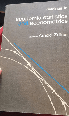
So how do you adjust for that? There are many papers on how to do hedonic adjustments (hedonic is the fancy words we use to say “quality-adjusted”) and they are all a pain to read unless you are very familiar with real analysis, set theory and advanced calculus (and even there, its still a pain). Fortunately, I recently found a neat little application from an old econometrics graduate text from the 1960s (see image below) that allows me to teach this to my students (and now, you too!) in an easy-to-get format.
A neat book
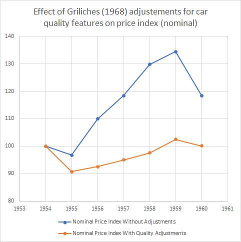
The book has a neat chapter by one of the most famous econometricians of the 20th century, Zvi Griliches, titled “Hedonic Price Indexes for Automobiles: An Econometric Analysis of Quality Change”. In the chapter, Griliches points out that from 1954 to 1960, car prices went up some 20% — well above the overall price index. From 1937 to 1950, prices for cars went up in line with inflation. Taken together, these two facts suggest that the real price of cars stayed constant from 1937 to 1950 and increased to 1960. But that suggestion is wrong Griliches points out because of our aforementioned quality issues. Up until 1960, there were considerable improvement in vehicle quality: better gears, better brakes, more horsepower, safer settings, automatic transmission, hardtops, switching to V-8 engines rather than 6 cylinders engines etc.
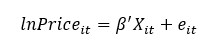
How do you account for these quality changes? Griliches simply went about consulting guide books for autobuyers. He collected price data for the cars as well the details regarding quality. And he used this very simple specification where the log of the nominal price is set as a dependent variable.
Griliches’ specification
The vector Xis all the quality dimensions he could find (horsepower, shipping weight, length, V-8 engine, hardtop, automatic transmission, power steering, power brakes, compact car). All of these dimensions were statistically significant determinants of the price of cars (with the exception of V-8 engines which was not significant). Then, Griliches assumed that all quality dimensions were “unchanged” from 1954 to 1960 in order to see how prices would have evolved without any changes in quality. The result is the figure below. The blue line depicts the actual prices he collected where you can see the 20% increase to 1960 (which is a 30%+ increase to 1959). The orange line depicts the price holding quality constant. That orange line is unambiguous: quality-constant car prices didn’t change much during the 1950s. Adjusting for inflation during the period suggests a drop in 10% in the real price of a quality-constant car.
Isn’t that a fascinating way to understand what we are actually measuring when we collect prices to talk about inflation? I find this to be an utterly fascinating example (and a useful teaching tool). Okay, I am done, you can go back to freaking out about inflation and how bad the Fed, Bank of Canada, ECB are.
It’s pumpkin spice season. That means that not only can you get pumpkin spice lattes, but also pumpkin spice Oreos, pumpkin spice Cheerios, and even pumpkin spice oil changes.
The most important thing to know about “pumpkin spice” things is that they don’t actually taste like pumpkin. They taste like the spices that you use to flavor pumpkin pie. (Notable exception: Peter Suderman’s excellent pumpkin spice cocktail syrup, which does contain pumpkin puree.)
Last week economic historian Anton Howes posted a picture of the spice shelf at his grocery store and guessed that this would have been worth millions of dollars in 1600.
Just thinking about how much this shelf would have been worth in England in the year 1600. Presumably at least tens of millions in today’s money. pic.twitter.com/Vc9HDBlQxL
Some of the comments pushed back a little. OK, probably not millions but certainly a lot. Howes was alluding to the well-known fact that spices used to be expensive. Very expensive. Spices, along with precious metals, were one of the primary reasons for the global exploration, trade, and colonialism for centuries. Finding and controlling spices was a huge source of wealth.
But how much more expensive were spices in the past? One comment on Howes’ tweet points to an excellent essay by the late economic historian John Munro on the history of spices. And importantly, Munro gives us a nice comparison of the prices of spices in 15th century Europe, including a comparison to typical wages.
As I looked at the list of spices in Munro’s essay, I noticed: these are the pumpkin spices! Cloves, cinnamon, ginger, and mace (from the nutmeg seed, though not exactly the same as nutmeg). He’s even included sugar. That’s all we need to make a pumpkin spice syrup!
Last week in my Thanksgiving prices post I cautioned against looking at any one price or set of prices in isolation. You can’t tell a lot about standards of living by looking at just a few prices, you need to look at all prices. So let me just reiterate here that the following comparison is not a broad claim about living standards, just a fun exercise.
That being said, let’s see how much the prices of spices have fallen.
The latest CPI release today shows that real inflation is here. Headline inflation for consumer prices is up 6.2% compared to a year ago and a almost full percentage point in just the past month (seasonally adjusted, so compared to the normal monthly increase).
Back in June, we could reasonably say that 45% of the increase that month (and 27% over the prior year) had been due to just the price of new and used cars, in the past month only 17% can be attributed to vehicle prices. That’s still a lot, considering cars are only about 8 percent of the overall CPI, but inflation is clearly showing up in other areas.
Gasoline prices (also car related!) are always volatile, but they are up sharply in the past year. The over 50% increase for regular unleaded gasoline translates to $1.22 more per gallon than a year ago (and $1.50 more gallon than Spring 2020), which is the largest nominal price increase consumers have seen in a 12-month period (the data stretches back to 1977).
But gasoline is only about 4 percent of consumer spending. What if we look more broadly? Even excluding energy prices, inflation is 4.7% over the past year, the highest increase since 1991.
The natural related questions are Why? And what can we do about it?
The Why question is tricky. The Federal Reserve is very interested in whether the increase in prices is caused by monetary policy. It very much guides their action. Consumers don’t really care that much. They just want the pain to stop. Unfortunately, though, part of the pain may be induced by consumers themselves: spending on goods is extremely high right now, with the year so far 18% above the comparable period in 2019. Higher spending will increase prices in any environment, but the strain it is putting on supply chains only exacerbates the problem. This is not to “blame the victim,” but rather to understand what is going on.
What can be done? That’s an even harder question. It’s convenient to blame the President for things like gas prices. And certainly many voters and pundits will blame him. This charge is not completely without basis, as there are certainly things at the margin a president could do to ease gas prices in the short run (allow more drilling, gas tax hiatus), but we shouldn’t oversell this. And in other areas too, perhaps there are changes that could be made at the margin. But given the massive increases in consumer spending (at least for now), any changes won’t put a dent in the overall inflation rate.
But what about at the individual level? Milton Friedman was asked this question in 1980. That year inflation was 13.5%, the highest since World War II. Friedman’s answer: high living. He said there is no asset which you can expect to protect you against inflation, so you should spend what you have now on something nice. Buy a nice house, a nice suit, a picture to hang on the wall. This is what economists sometimes call “the flight to real values,” or as Phil Donahue put it “convert your money into material things.” While this advice may make sense at the individual level, it doesn’t have great implications for the current supply chain issues.
Friedman did have clear advice for the nation: the Federal Reserve should stop increasing the money supply. Whether that advice will work in the current environment, or whether it will stall the economic recovery, is the hard question the Fed is wrestling with at this very moment.
I’m a big fan of Milton Friedman. I’m also a big fan of easy-to-remember phrases that impart great wisdom. It honestly made me wince the first time I said the following:
“Inflation is *not* everywhere and always a monetary phenomenon“.
The reasoning is as plain as day. Consider the quantity equation:
MV=PY
For the uninitiated, M is the money supply, V (velocity) is the average number of times dollars transacts during a period, P is the price level, and finally Y is real output during a period. This equation is often called the “equation of exchange” or “the quantity equation”. Strictly speaking, it is an identity. It is a truism that cannot be violated. All economists agree that the equation is true, though they may disagree on its usefulness.
Inflation is simply the percent change in price. We can rearrange the quantity equation, solving for price, in order to see the relationship between the price level and its determinants.
P= MV/Y
What does this mean? It means that more money results in more inflation, all else held constant. It means that higher velocity results in more inflation, all else held constant. It means that less output results in more inflation, all else held constant.
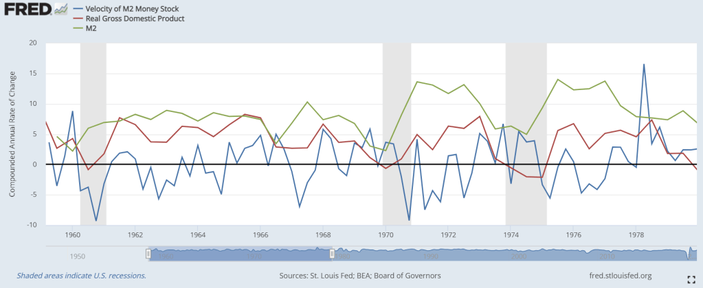
Why would Milton Friedman say that inflation is always caused by changes in the money supply if it is clear that there are two other causes of the price level? When Milton Friedman said his famous quote, output growth was relatively steady. Velocity growth was relatively steady. For his context, Milton Friedman was right. The majority of price and inflation volatility was found in changes in M. See below.
Strictly speaking however, Milton Friedman knew better and he knew that the statement was not strictly correct. Friedman was a public intellectual and he was a great simplifier. He taught many people many true things. At the time, people were blaming inflation on a great variety of things: taxes, fish catches, and unions, to name a few. Arguably, Friedman got them closer to the truth.
What does this mean? It means that higher NGDP results in more inflation, all else held constant. It means that less output results in more inflation, all else held constant.
But economists dismissing M in lieu of AD are committing the same oversimplification. Y can also change! Maybe economists figure that our recent history is full of relatively stable Y growth and that we ought not pay attention to it. And indeed, unsurprisingly, RGDP growth has been less than NGDP growth.
But what is driving the current bought of inflation?
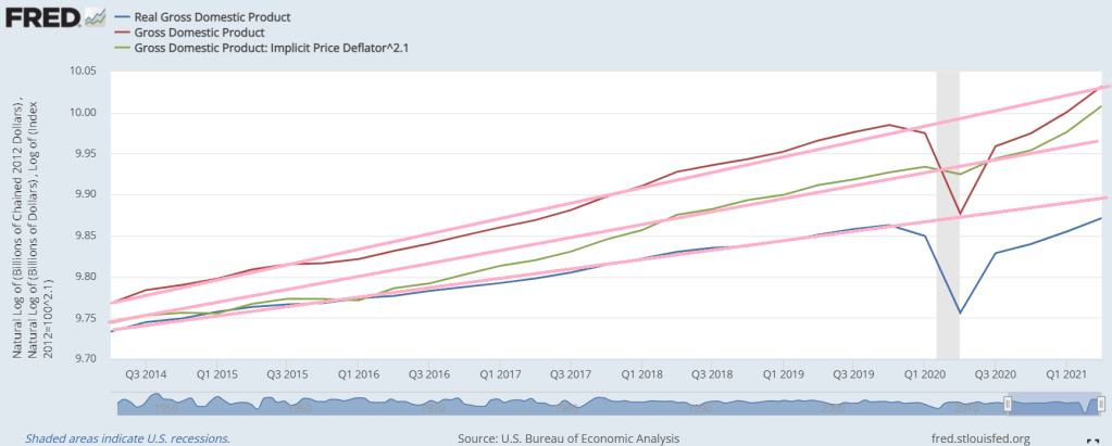
Pardon the crude image. The pink lines are eye-balled trend lines on natural logged data for AD, Y, and P. Prices are up. Is it because of exceptionally high NGDP? Nope. Total spending is back on pre-2020 trend. Does Y happen to be down? Yep, it sure is.
Right now, assuming the previous trend was anywhere close to potential output, inflation is not being driven by excess aggregate demand. It’s being driven by inadequate real output. The news tells the story. There have been supply-chain bottle-necks, difficulty employing, lockdowns, and fear of covid. Right now we have an output problem and higher prices are a symptom. We do not have an aggregate spending problem.
PS – In fact, it is my belief that the Fed successfully avoided a debt-deflation aggregate demand tumble that would have been catastrophic. Inflation is expected when supplies of goods decline.
The title question may seem obvious. “We” care about inflation because, ultimately, any dollars we have saved will purchase fewer real goods and services. Additionally, we might worry that our incomes are not keeping pace with the increase in the prices of good and services that we want to purchase.
But the answer to that question is a little more nuanced. “We” also care about why prices are increasing. I keep putting “we” in quotation marks because who the we is crucial for answering the question. For example, individuals and families primarily care about inflation for the reasons I stated in the first paragraph.
But central bankers care about inflation for different reasons. In broad terms, monetary policy is an attempt to smooth out the fluctuations in the economy, especially to make recessions shorter and less deep. But monetary officials want to know: is the policy they are putting in place leading to prices rising in general? If so, especially if inflation gets above certain target levels, it may mean that monetary has been “too loose.”
However, if particular prices are rising, say the price of cars (due to a lack of computer chips), central bankers don’t really care about this: it gives them no indication of whether they’ve done “too much” or “too little” with regards to stimulating the economy. Similarly, if gasoline prices rise, consumers really care about this. Central bankers, not so much: it doesn’t really tell them much about their goal (stimulating the economy with stimulating it too much).
And because some prices are so volatile, historical context is important for understanding what a recent increase or decrease means. For example, gasoline prices are up 45% in the past 12 months. That’s a lot! But it’s an increase from a very low base, and the historical reality is that gasoline prices today (around $3.00/gallon on average) are at similar levels to what they were way back in 2006, and are lower than they were for almost all of 2011-2014. And these are all in nominal terms, median household income has gone up a lot since 2006 (up 40% in nominal terms) and even since 2014 (up 25%).
All of this is important background for thinking about the latest release of the CPI-U data this week. The headline inflation number of 5.3% is indeed startling, similar to last month. We haven’t touched that level since mid-2008, and that was only for a few months. If consumer price inflation were to stay at around 5% for a sustained period of time, it would be a new, harsh reality for most consumers today: we haven’t had a year with 5% inflation since 1990, and for the past decade the average has hung around 2%.
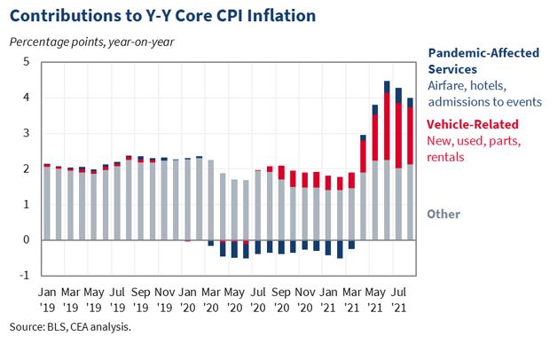
So will it stay this high? Sadly, I have no crystal ball and I will just reiterate what I said last month: the picture is just too muddled right now to say anything concrete. Perhaps by the end of the year we will have a better picture. But is there anything we can say right now even with the muddled picture? I continue to like this chart from the Council of Economic Advisors:
Bottom line: if we strip out the unusual supply chain disruptions to automobiles as well as airline/hotel prices making up for lost ground during the pandemic, inflation is at completely normal levels. It’s almost exactly 2%
But is this cheating? Can we really strip out the things that are increasing at rapid rates?
Text books say that there are two major problems with the Consumer Price Index (CPI). First, accounting for changes in quality is difficult. Second, the CPI is calculated by assuming a fixed basket of goods is consumed over time. For both of these reasons, the rate of inflation that is implied by CPI is typically considered to be about 1% overestimated.
Imperfectly accounting for quality improvements causes higher measured inflation because the stream of services that a product creates for the consumer has increased – even though the product is nominally the same product. For example, the camera on my smart-phone is now good enough to record a high-quality Youtube video, whereas it was of mediocre quality on my previous phone. My life is better-off with the better camera. But the increase in my quality of life isn’t measured by the CPI. The CPI does, however, make note that I paid a higher price for a phone.
Further, people don’t consume a fixed basket of goods over time. Even if we stopped the introduction of all new products and maintained the quality of all current products, people would still change the composition of their consumption due to price changes among related goods.
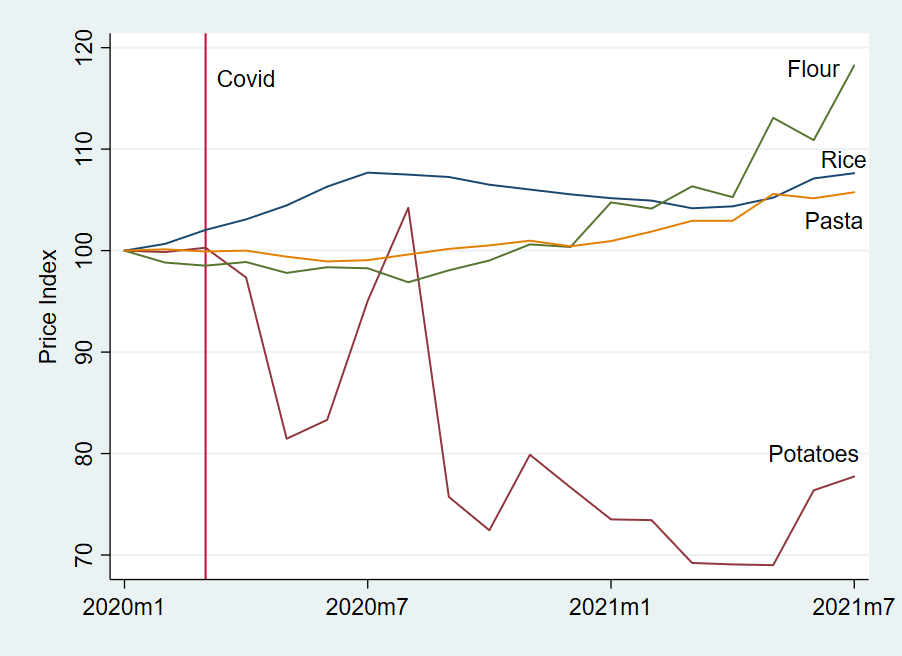
When people get hot and bothered by inflation, they often appeal to people who are of less means and who would find higher prices more burdensome. For that reason, below is a graph of some calorically dense and roughly comparable food staple prices (from the PPI). You can put a protein on top of any one of these and call it a meal: pasta, flour, potatoes, & rice.
Let’s say that a consumer consumed equal parts of these in January of 2020. The CPI assumes that the consumption basket remains constant and plots a weighted average. In such a case, price rose 2.3% through July 2021. But in real life, penny-pinchers gonna pinch. If our consumer is particularly Spartan, then he will always consume the cheapest option – he treats the different foods as perfect substitutes. The Spartan price of consuming *fell* 22.3%. To be clear, the CPI assumes that the consumption composition remains unchanged, while the consumer’s actual basket is responsive to price changes. Even if a consumer considers these goods to be imperfect substitutes and is willing to cut any particular type of consumption in half in favor of the cheapest alternative, then the price fell by 10%. In fact, a consumer who is at all responsive to prices will always have a cheaper basket than the headline CPI, all else constant.
In conclusion, be careful with your money. Spend it well and seek out alternatives. Your flexibility determines how much money you’ll have at the end of the month. The headline CPI number impacts only the most passive consumer – and even then, budget constraints gonna constrain.
The latest inflation data for the US has been released, and the headline CPI-U annual increase of 5.4% is once again raising worries that high inflation could be a permanent part of the landscape for the near future.
My personal opinion is that the picture is much too muddled now, between temporary supply issues and low bases for 2020 prices, to say much about the medium-term picture. I think we’ll have a better picture by the end of the year. Still, it’s worth drilling down into the data, as we have done in the past on this blog, to understand some things about economics, prices, and how price changes are impacting real people.
Certainly the prices of some goods are rising at alarming rates. Many of these are related to automobiles and transportation generally, but some categories of food have rose a lot in the past year too (though groceries overall are only up 2.6%).
But I want to talk about two categories of consumption: beer and hot dogs.
Actually, my co-blogger Zachary has already written about beer. And using the producer price index, he found that canned beer is actually cheaper than it was a year ago. If you like canned beer, rejoice! And for all beer at home, the CPI shows only a 1.8% increase since last year, after a similar small 1.6% increase last July (not much of a base effect… a clue for later!).
But not all Americans consumer alcohol. So let’s talk about that most American food product: the hot dog.