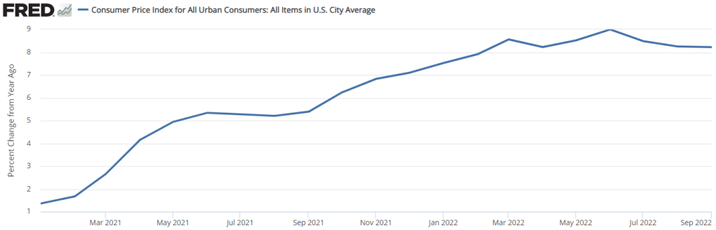
People were all excited last week when the CPI numbers were released because… the year-over-year rate of inflation did a whole lot of nothing. See below. The 12-month rate of inflation was practically constant. The 8.2% number was all over the headlines and twitter. We already know that news outlets don’t always report on the most relevant numbers. And I say that this is one of those times.
First of all, there is a problem with the year-over-year indicator. Well, not so much problem in the measure itself, but more a problem of interpretation. The problem is that the 12-month rate of inflation is the cumulative compound rate for 12 individual months. Each month that we update the 12-month inflation rate, we drop a month from the back of the 12-month window and we add a month to the front of the 12-month window. Below are both a graph and a table indicating the monthly rate of inflation and the 12-month periods ending in August 2022 (pink) and in September 2022 (green).
Are resources becoming scarcer as world population increases and per capita consumption increases? Are basic goods becoming more expensive relative to wages in the face of potential resource shortages? These are some of the main questions that are addressed in the just released book Superabundanceby Marian Tupy and Gale Pooley. The authors were kind enough to provide me with an advance copy, which is why I’m already able to review this book on its release date (I’m not really that fast of a reader).
The author take a very optimistic view of the issues surrounding those opening questions. Properly measured (one of the key tasks of their work), resources are becoming more abundant, not more scarce. And properly measured, almost all consumer goods are becoming cheaper relative to wages.
The authors use the approach of “time prices” throughout the book. They are not the first to use this approach. Julian Simon (their inspiration for this project) used it in various places in his work. William Nordhaus famously used it is in paper on the history of the price of lighting. And Michael Cox and Richard Alm have used the time-price approach in many of their writings, from the 1997 Dallas Fed annual report, to a full-length book a few years later, as well as updates to the original 1997 report. And if you follow me on Twitter, I like to use this approach too.
In short, “time prices” tell us how many hours of work it takes to purchase a given good or service at different points in time. How many hours would you have to work to buy a pound of ground beef? A square foot of housing? An hour of college tuition? It’s the superior method when you are looking at the price of a particular good or service over time, compared with a naïve inflation adjustment, which only tells you if the price of that good/service rose faster or slower than goods or services in general, not if it’s become more affordable. Inflation adjustments are really only useful when you are trying to compare income or wages to all prices, to see if and how much incomes have increased over time. Of course, which wage series you choose is important (and you need to have a consistent series over time, or at least the end points), but as the authors point out (which they learned from me!), if you looking at wages after 1973, the wage series you use doesn’t matter much. Median wages, average wages, wages of the “unskilled” — these all give you the same trend since 1973. We don’t have all of these back earlier (especially median wages), but there’s not much reason to believe they’ve diverged that much. And the authors also present their data using multiple wage series in many of the charts and tables.
We are living in volatile times. With covid-19, big federal legislation packages, and the Ruso-Ukrainian conflict disruptions to grain, seed oils, and crude oil, relative prices are reflecting sudden drastic ebbs of supply and demand. I want to make a small but enlightening point that I’ve made in my classes, though I’m not sure that I’ve made it here.
Economists often get a bad rap for being heartless or unempathetic. Sometimes, they are painted as ideologues who just disguise their pre-existing opinions in painfully specific terminology and statistics. Let’s do a litmus test.
Consider two alternative markets. One is a perfect monopoly, the other has perfect competition. All details concerning marginal costs to firms and marginal benefits to consumers are the same. In an erratic world, which market structure will result in greater price volatility for consumers? Try to answer for yourself before you read below. More importantly, what’s your reasoning?
Extreme Market Power
A distinguishing difference between a competitive market and a monopoly concerns prices. While firms maximize profits in both cases, the price that consumers face in a competitive market is equal to the marginal cost that the firms face. There is no profit earned on that last unit produced. In the case of monopoly, the price is above the marginal cost. Profits can be positive or negative, but the consumer will pay a price that is greater than the cost of producing the last unit.
Below are two graphs. Given identical marginal costs of production and benefits that the consumers enjoy, we can see that:
The monopoly price is higher.
The monopoly quantity produced is lower.
But static models only go so far. What about when there is volatility in the world?
Volatile Costs
Oil and gasoline are important inputs for producing many (most?) physical goods. Not only that, they are short-lived, meaning that they disappear once they are used, making them intermediate goods. Therefore, changes in the price of oil constitutes a change in the marginal cost for many firms. If the price of oil rises, or is volatile otherwise, then which type of market will experience greater price and quantity volatility?
Below are two figures that illustrate the same change in the marginal cost. We can see that:
Monopoly price volatility is lower (in absolute terms and percent).
Monopoly quantity produced volatility is lower (in absolute terms, though no different as a percent).
The take-away: While monopoly does constrict supply and elevate prices, Monopoly also reduces price and output volatility when there are changes in the marginal cost.
Volatile Demand
That covers the costs. But what about volatile demand? A large part of the Covid-19 recession was the huge reallocation of demand away from in-person services and to remote services and goods. What is the effect of market power when people suddenly increase or decrease their demand for goods?
Below are two figures that illustrate the same change in demand. We can see that:
Monopoly price volatility is higher (in absolute terms, though no different as a percent).
Monopoly quantity produced volatility is lower (in absolute terms, though no different as a percent).
Monopolies Don’t Cause Inflation
Economists know that inflation can’t very well be blamed on greed (does less greed beget deflation?). Another problematic story is that market concentration contributes to inflation. But the above illustrations demonstrate that this narrative is also a bit silly. Monopolistic markets cause the price level to be higher, it’s true. But inflation is the change in prices. Changing market concentration might be a long term phenomenon, but can’t explain acute price growth. If demand suddenly rises, monopolies result in no more price growth than perfectly competitive markets. If the marginal cost of production suddenly rises, monopolies result in less price growth.
All of this analysis entirely ignores welfare. Also, no market is perfectly competitive or perfectly monopolistic. They are the extreme cases and particular markets lie somewhere in between.
Did you guess or reason correctly? Many econ students have a bias that monopolies are bad. So, in any side-by-side comparison, students think that “monopolies-bad, competition-good” is a safe mantra. But the above illustrations (which can be demonstrated mathematically) reveal that economic reasoning helps to reveal truths about the world. Economists are not simply a hearty band of kool-aid drinking academics.
This is my last post in a series that uses the AS-AD model to describe US consumption during and after the Covid-19 recession. I wrote about US consumption’s broad categories, services, and non-durables. This last one addresses durable consumption.
During the week of thanksgiving in 2020, our thirteen-year-old microwave bit the dust. NBD, I thought. Microwaves are cheap, and I’m willing to spend a little more in order to get one that I think will be of better quality (GE, *cough*-*cough*). So, I filtered through the models on multiple websites and found the right size, brand, and wattage. No matter the retailer, at checkout I learned that regardless of price, I’d be waiting a good two months before my new, entirely standard, and unexceptional microwave oven would arrive. I’d have to wait until the end of January of 2021.
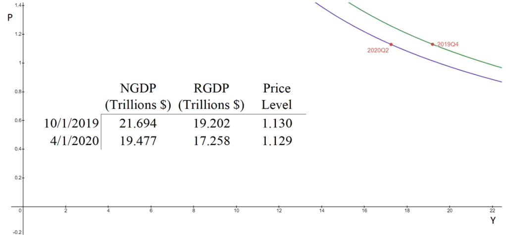
The aggregate supply & aggregate demand model (AS-AD) is nice because it’s flexible and clear. Often professors will teach it in levels. That is, they teach it with the level of output on one axis, and the price level on the other axis. This presentation is convenient for the equation of exchange, which can be arranged to reflect that aggregate demand (AD) is a hyperbola in (Y, P) space. Graphed below is the AD curve in 2019Q4 and in 2020Q2 using real GDP, NGDP, and the GDP price deflator.
The textbook that I use for Principles of Macroeconomics, instead places inflation (π) on the vertical axis while keeping the level of output on the horizontal axis. The authors motivate the downward slope by asserting that there is a policy reaction function for the Federal Reserve. When people observe high rates of inflation, state the authors, they know that the Fed will increase interest rates and reduce output. Personally, I find this reasoning to be inadequate because it makes a fundamental feature of the AS-AD model – downward sloping demand – contingent on policy context.
At the same time, I do think that it can be useful to put inflation on the vertical axis. Afterall, individuals are forward looking. We expect positive inflation because that’s what has happened previously, and we tend to be correct. So, I tell my students that “for our purposes”, placing inflation on the vertical axis is fine. I tell them that, when they take intermediate macro, they’ll want to express both axes as rates of change. I usually say this, and then go about my business of teaching principles.
But, what does it look like when we do graph in percent-change space?
In my previous post, I decomposed consumer expenditures to figure out which service sectors experienced the largest supply-side disruptions due to Covid-19. I illustrated that transportation & recreation services were the only consumer service to experience substantial and persistent supply shocks. Health, food, and accommodation services also experienced supply shocks, but quickly rebounded. Housing, utility, and financial services experienced no supply disruptions whatsoever.
What about non-durables?
Total consumption spending is the largest category of spending in our economy and is composed of services, durable goods, and non-durables. Services are the largest portion and durable goods compose the smallest portion. So, while there were plenty of stories during the Covid-19 pandemic about months-long delivery times for durables, they did not constitute the typical experience for most consumption.
Even though it’s not the largest category, many people think of non-durables when they think of consumption. Below is the break-down of non-durable spending in 2019. The largest singular category of non-durable spending was for food and beverages, followed by pharmaceuticals & medical products, clothing & shoes, and gasoline and other energy goods. Clearly, the larger the proportion that each of these items composes of an individual household budget, the more significant the welfare implications of price changes.
By the time most students exit undergrad, they get acquainted with the Aggregate Supply – Aggregate Demand model. I think that this model is so important that my Principles of Macro class spends twice the amount of time on it as on any other topic. The model is nice because it uses the familiar tools of Supply & Demand and throws a macro twist on them. Below is a graph of the short-run AS-AD model.
Quick primer: The AD curve increases to the right and decreases to the left. The Federal Reserve and Federal government can both affect AD by increasing or decreasing total spending in the economy. Economists differ on the circumstances in which one authority is more relevant than another.
The AS curve reflects inflation expectations, short-run productivity (intercept), and nominal rigidity (slope). If inflation expectations rise, then the AS curve shifts up vertically. If there is transitory decline in productivity, then it shifts up vertically and left horizontally.
Nominal rigidity refers to the total spending elasticity of the quantity produced. In laymen’s terms, nominal rigidity describes how production changes when there is a short-run increase in total spending. The figure above displays 3 possible SR-AS’s. AS0 reflects that firms will simply produce more when there is greater spending and they will not raise their prices. AS2 reflects that producers mostly raise prices and increase output only somewhat. AS1 is an intermediate case. One of the things that determines nominal rigidity is how accurate the inflation expectations are. The more accurate the inflation expectations, the more vertical the SR-AS curve appears.*
The AS-AD model has many of the typical S&D features. The initial equilibrium is the intersection between the original AS and AD curves. There is a price and quantity implication when one of the curves move. An increase in AD results in some combination of higher prices and greater output – depending on nominal rigidities. An increase in the SR-AS curve results in some combination of lower prices and higher output – depending on the slope of aggregate demand.
Of course, the real world is complicated – sometimes multiple shocks occur and multiple curves move simultaneously. If that is the case, then we can simply say which curve ‘moved more’. We should also expect that the long-run productive capacity of the economy increased over the past two years, say due to technological improvements, such that the new equilibrium output is several percentage points to the right. We can’t observe the AD and AS curves directly, but we can observe their results.
The big questions are:
What happened during and after the 2020 recession?
The latest CPI inflation data was released this morning. Mostly the new data just confirms what we’ve seen the past few months: consumer price inflation is at the highest levels in decades, and it is now very broad based.
To see how broad based the inflation is, we can look at any of the “special aggregates” that the BLS produces. CPI less food. CPI less shelter. CPI less food, shelter, energy, used cars and trucks (what a mouthful!). All of these are up substantially over the past year. The lowest number you can get is that last aggregate I listed, which excludes almost 60% of consumer spending, and even it is up 4.7% over the past year — the largest increase since 1991 for that particular special index.
Or, you can just look at food. We all have probably observed that meat prices are way up recently — about 15% over the past year. But it’s not just meat. It’s fruit, vegetables, grains, dairy… the whole darn food pyramid. In fact, there are only two food categories (hot dogs and cheese) and two drinks (tea and wine) that are actually down since December 2020.
The only categories of food and drinks in the CPI that are down since last year are hot dogs, cheese, tea, and wine
— Jeremy 'adjusted for inflation' Horpedahl 📈 (@jmhorp) January 12, 2022
I’ve covered the symbolic importance of hot dog prices before, but the fact that only four food or drink categories had price decreases are indications that food-price inflation is extremely broad-based.
According to the most recent TSA data, on December 21st of this year there were 1,979,089 people traveling by plane. That’s almost exactly equal to the number of people that flew in the US on the same date in 2019: 1,981,433 travelers. It’s also double the number of people that few on December 21, 2020 (about 992,000). These numbers are encouraging. Does that mean that we’re back to normal levels of travel?
Not quite. We shouldn’t read too much into one day of data, for a variety of reasons, but most importantly because while we’re looking at the same date, travel varies throughout the week and December 21st is a different day of the week every year (Tuesday this year, Saturday in 2019). It’s better to use a weekly average and compare it to 2019. Here’s what the data looks like for 2020 and 2021.
With this data, we can see that airline travel is back to about 85 percent of 2019 levels. That’s not bad, but airline travel was already back to 85 percent by early July 2021, with some variation since then, but generally staying in the 70-90 percent range for most of the second half of the year.
For those that are flying this year, there is good news in terms of prices (unusual to have good prices news right now): airfares are still about 20 percent cheaper than pre-pandemic levels. In fact, airline prices are the cheapest they have been since 1999. In nominal terms! If you are interested in even more historical price data, take a look at my May 2021 post on the “golden age” of flight.
And of course, flying is not the most common way that people travel for Christmas and the holiday season. According to estimates from AAA, only about 6 percent of holiday travelers choose to fly. This was true in 2019, and will be roughly true in 2021 (as usual, 2020 was the exception: around 3 percent). By far the most common mode of travel in the US is driving, accounting for over 90 percent of holiday travel.
If you are traveling by car, there isn’t much good news for prices. As you have no doubt heard constantly for the past few months, gasoline costs a lot more than it did last Christmas, on average about $1 per gallon more. But even compared to Christmas 2019, gasoline prices are almost 29 percent higher. The last time gasoline prices were this high (in nominal terms) around Christmas was in 2013.
I hope you all have safe holiday travels, and we’ll all look forward to better prices in the New Year!
I remember people talking about Covid-19 in January of 2020. There had been several epidemic scare-claims from major news outlets in the decade prior and those all turned out to be nothing. So, I was not excited about this one. By the end of the month, I saw people making substantiated claims and I started to suspect that my low-information heuristic might not perform well.
People are different. We have different degrees of excitability, different risk tolerances, and different biases. At the start of the pandemic, these differences were on full display between political figures and their parties, and among the state and municipal governments. There were a lot of divergent beliefs about the world. Depending on your news outlet of choice, you probably think that some politicians and bureaucrats acted with either malice or incompetence.
I think that the Federal Reserve did a fine job, however. What follows is an abridged timeline, graph by graph, of how and when the Fed managed monetary policy during the Covid-19 pandemic.
February, 2020: Financial Markets recognize a big problem
The S&P begins its rapid decent on February 20th and would ultimately lose a third of its value by March 23rd. Financial markets are often easily scared, however. The primary tool that the Fed has is adjusting the number of reserves and the available money supply by purchasing various assets. The Fed didn’t begin buying extra assets of any kind until mid-March. There is a clear response by the 18th, though they may have started making a change by the 11th. One might argue that they cut the federal funds rate as early as the 4th, but given that there was no change in their balance sheet, this was probably demand driven.
March, 2020: The Fed Accommodates quickly and substantially.
In the month following March 9th, the Fed increased M2 by 8.3%. By the week of March 21st, consumer sentiment and mobility was down and economic policy uncertainty began to rise substantially – people freaked out. Although the consumer sentiment weekly indicator was back within the range of normal by the end of April, EPU remained elevated through May of 2020. Additionally, although lending was only slightly down, bank reserves increased 71% from February to April. Much of that was due to Fed asset purchases. But there was also a healthy chunk that was due to consumer spending tanking by 20% over the same period.
In the 18 months prior to 2020, M2 had grown at rate of about 0.5% per month. For the almost 18 months following the sudden 8.3% increase, the new growth rate of M2 almost doubled to about 1% per month. The Fed accommodated quite quickly in March.
April, 2020: People are awash with money
Falling consumption caused bank deposit balances to rise by 5.6% between March 11th and April 8th. The first round of stimulus checks were deposited during the weekend of April 11th. That contributed to bank deposits rising by another 6.7% by May 13th.
By the end of March, three weeks after it began increasing M2, the Fed remembered that it really didn’t want another housing crisis. It didn’t want another round of fire sales, bank failures, disintermediation, collapsed lending, and debt deflation. It went from owning $0 in mortgage-backed securities (MBS) on March 25th to owning nearly $1.5 billion worth by the week of April 1st. Nobody’s talking about it, but the Fed kept buying MBS at a constant growth rate through 2021.
May, 2020 – December, 2021: The Fed Prevents Last-Time’s Crisis
Jerome Powell presided over the shortest US recession ever on record. The Fed helped to successfully avoid a housing collapse, disintermediation, and debt deflation – by 2008 standards. The monthly supply of housing collapsed, but it had bottomed out by the end of the summer. By August of 2021, the supply of housing had entirely recovered. The average price of new house sales never fell. Prices in April of 2020 were typical of the year prior, then rose thereafter. A broader measure of success was that total loans did not fall sharply and are nearly back to their pre-pandemic volumes. After 2008, it took six years to again reach the prior peak. A broader measure still, total spending in the US economy is back to the level predicted by the pre-pandemic trend.
The Fed can’t control long-run output. As I’ve written previously, insofar as aggregate demand management is concerned, we are perfectly on track. The problem in the US economy now is real output. The Fed avoided debt deflation, but it can’t control the real responses in production, supply chains, and labor markets that were disrupted by Covid-19 and the associated policy responses.
What was the cost of the Fed’s apparent success? Some have argued that the Fed has lost some of its political insulation and that it unnecessarily and imprudently over-reached into non-monetary areas. Maybe future Fed responses will depend on who is in office or will depend on which group of favored interests need help. Personally, I’m not so worried about political exposure. But I am quite worried about the Fed’s interventions in particular markets, such as MBS, and how/whether they will divest responsibly.
Of course, another cost of the Fed’s policies has been higher inflation. During the 17 months prior to the pandemic, inflation was 0.125% per month. During the pandemic recession, consumer prices dipped and inflation was moderate through November. But, in the 16 months since April of 2020, consumer prices have grown at a rate of 0.393% per month – more than three times the previous rate. Some of that is catch-up after the brief fall in prices.
Although people are genuinely worried about inflation, they were also worried about if after the 2008 recession and it never came. This time, inflation is actually elevated. But people were complaining about inflation before it was ever perceptible. The compound annual rate of inflation rose to 7% in March of 2021. But it had been almost zero as recent as November, 2020. That March 2021 number is misleading. The actual change in prices from February to March was 0.567%. Something that was priced at $10 in February was then priced at $10.06 in March. Hardly noticeable, were it not for headlines and news feeds.